Forecast - Intelligent Agriculture Landing Page Template
Forecast is a modular card-grid landing page template built for agriculture AI inventory forecasting platforms. It combines a Feature Tab Switcher header, an animated comparison matrix, and a two-step progressive sign-up form. The dark Dashboard Pro aesthetic makes live data feel urgent, while grain-gold calls to action and sensor-green indicators guide visitors toward a clear first action.
by Rocket studio
Quick summary
Forecast is a single-page, card-grid template designed for platforms that use satellite data, commodity feeds, and soil sensors to guide inventory decisions for grain elevators and seed distributors. The layout opens with an interactive Feature Tab Switcher, flows through a structured comparison matrix, and closes with a two-step conversion form. Every visual choice reinforces the feeling of real-time operations intelligence.
Who this template is for
This template is built for agtech companies and agriculture AI platforms that need to speak directly to operations-minded buyers. It targets the people responsible for costly inventory decisions in grain, seed, and fertilizer supply chains.
- Regional co-op managers overseeing warehouses of slow-moving or perishable stock
- Procurement directors at vertically integrated farms managing biologicals across multiple states
- Agtech finance and operations leaders who have outgrown spreadsheet-based demand models
What problem this template solves
Agricultural inventory buyers are skeptical. They have seen too many demand tools that promise accuracy but deliver static seasonal curves and monthly audit cycles. This template addresses that skepticism head-on by structuring the entire page around visible proof before any sign-up ask.
- It replaces vague product claims with side-by-side comparisons showing specific outcomes like bushels saved and carrying-cost reductions
- It demonstrates live-feeling data through animated KPI tiles and tab-switching dashboard cards before a visitor scrolls past the header
- It removes friction from the conversion path by separating the sign-up form into two logical steps and leading with a low-commitment secondary call to action
What you get with this template
The template delivers a complete, production-ready landing page structure with every major section pre-built and editable. No placeholder layouts or generic hero blocks.
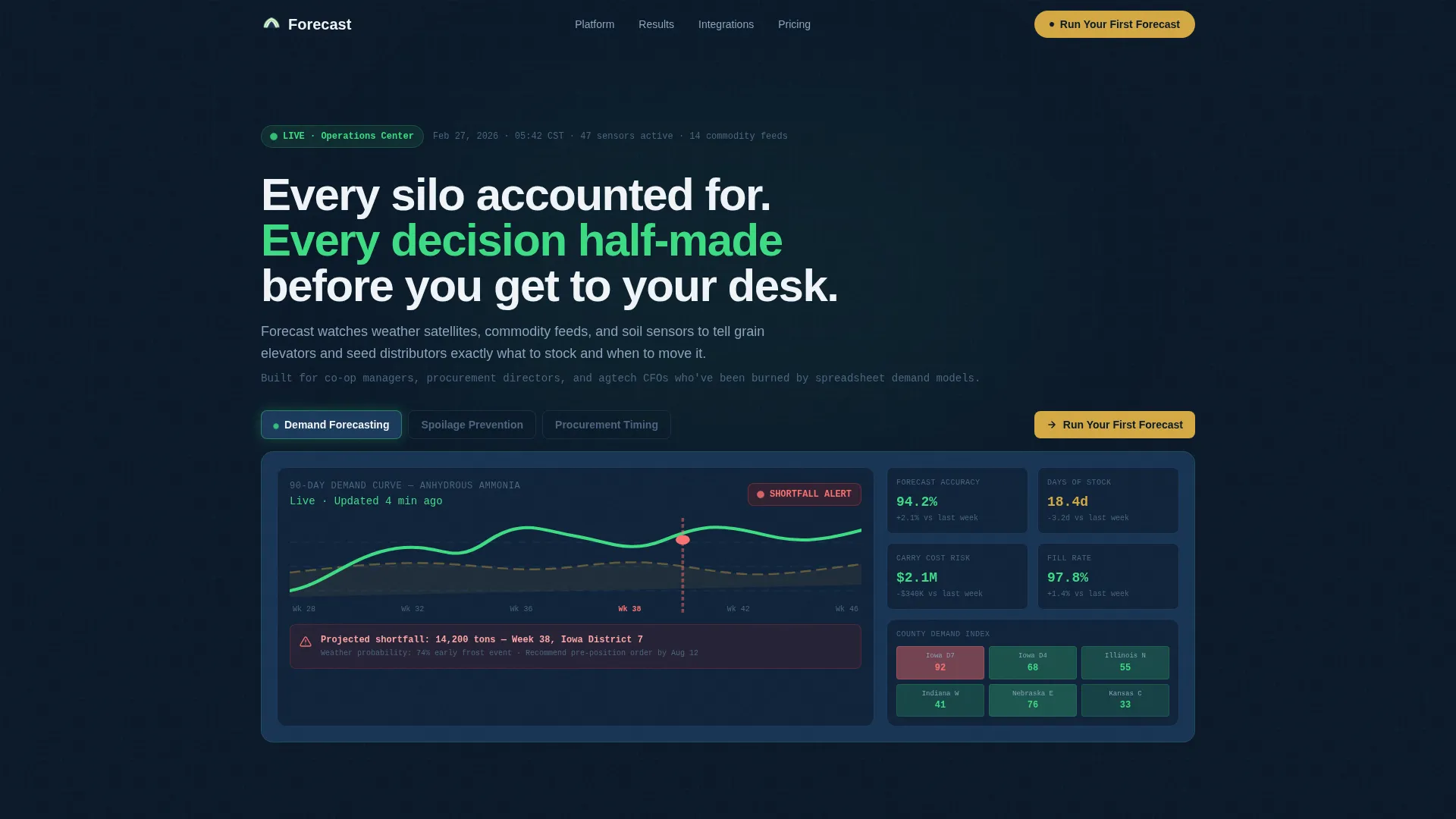
- A Feature Tab Switcher header with three labeled tabs, an animated live-styled dashboard card, and a county-level heatmap display
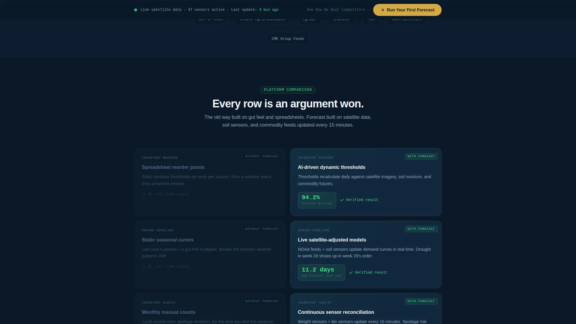
- A Feature Matrix comparison section with paired card rows contrasting old-way versus platform-way, animated KPI counters, and a competitor comparison row
- A two-step progressive sign-up form with dropdown, slider, and text inputs plus a secondary gated-PDF conversion path
Feature list
This section covers what the template is built to do, based entirely on the source brief.
Interactive Feature Tab Switcher
The header contains three tabs: "Demand Forecasting," "Spoilage Prevention," and "Procurement Timing." Each tab click redraws charts, reshuffles KPI tiles, and recolors the county-level map. A fourth tab functions as a hidden Easter egg that surfaces the primary call-to-action button directly inside the dashboard card.
Animated Comparison Card Matrix
The main scroll section arranges cards in pairs. The left card shows the old approach in muted steel-gray typography. The right card shows the platform approach in sensor-green with an animated KPI climbing in real time. Each row makes a specific argument using case-study figures: bushels saved, carrying-cost reduction percentages, and days-of-stock accuracy.
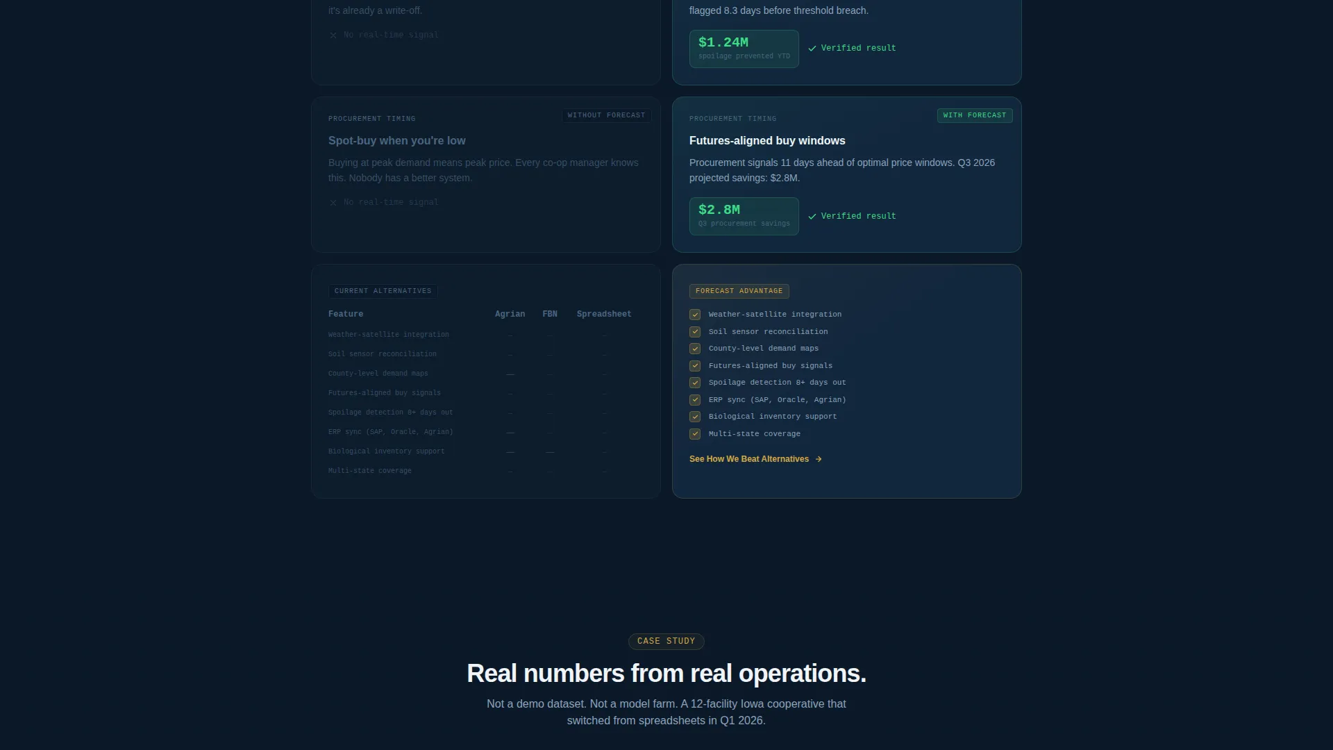
Competitor Comparison Row
The final matrix row places competitor platform logos on the left card and the platform's advantage grid on the right. Each cell uses a grain-gold checkmark or an empty dash. This single row gives buyers a scannable reason to choose without requiring them to leave the page.
Two-Step Progressive Sign-Up Form
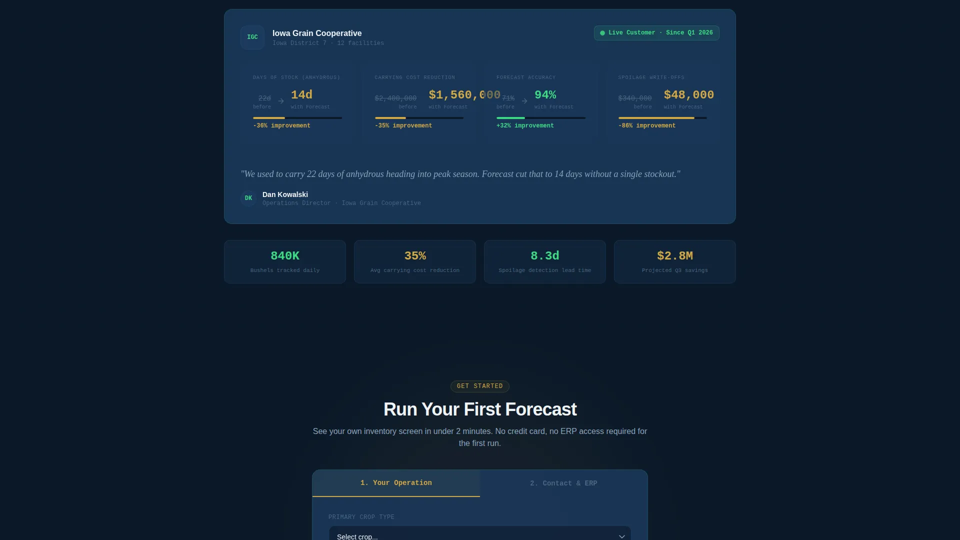
Step one collects crop type via dropdown, annual inventory volume via slider, and number of storage locations. Step two asks for name, email, and current ERP system. Splitting the form this way lowers perceived effort and lets the platform capture partial intent even if step two is abandoned.
Secondary Gated-PDF Conversion Path
A "See How We Beat [Competitor]" link leads to a gated PDF comparison matrix. It captures an email address only, making it a low-friction entry point for visitors who are not yet ready to run a full forecast but want to evaluate the platform against a current provider.
Fixed Viewport call to action Bar
After the second scroll fold, a grain-gold "Run Your First Forecast" button locks to the bottom of the viewport. It stays visible through the comparison matrix and the form section, keeping the primary action within reach at every stage of the page.
Page sections overview
| Section | Purpose |
|---|---|
| Feature Tab Header | Introduce platform capabilities through three switchable dashboard views |
| Demand Forecasting Tab | Show 90-day demand curve with weather-probability band and county heatmap |
| Spoilage Prevention Tab | Display perishable inventory risk metrics and sensor-driven alerts |
| Procurement Timing Tab | Present optimal reorder windows based on satellite and commodity data |
| Hidden call to action Tab | Surface the primary sign-up action inside the header dashboard card |
| Comparison Matrix | Pair old-way versus platform-way cards row by row with animated KPIs |
| Case Study Numbers Row | Anchor the argument with specific outcomes: bushels, cost reductions, accuracy |
| Competitor Grid Row | Stack competitor logos against platform advantage cells for direct comparison |
| Two-Step Sign-Up Form | Collect crop type, volume, and location data before contact details |
| Gated PDF Path | Capture email-only leads through a secondary comparison-matrix download |
| Fixed Viewport call to action | Keep the primary call-to-action visible after the second scroll fold |
Design & branding system
The visual system is built around the Dashboard Pro theme using a Midnight Blue color palette. The result feels like a mission-control screen in a climate-controlled grain office, where every number glows against a deep background and nothing competes for attention.
- Background uses deep terminal navy (#0B1929) with data-lake blue (#1B3A5C) card surfaces separated by a subtle 1px border, lifting each module like an instrument panel
- Sensor-green (#3DDC84) marks live metrics and positive-trend indicators with a pulse animation; grain-gold (#D4A843) appears exclusively on calls to action and critical alert moments so neither color loses its meaning through overuse
Mobile & speed optimization
The card-grid layout is built modular, which means each card row stacks cleanly at smaller viewport widths without redesigning the comparison logic. The tab switcher and fixed call to action bar are both designed to remain functional and tappable on touch screens.
- Modular card structure reflows from paired-column rows to single-column stacks on mobile viewports
- The fixed bottom call to action bar remains anchored and legible on small screens, keeping the primary conversion action accessible throughout the scroll
How this template helps you convert
The entire page is structured around the principle of earning the click. Visitors see real numbers before they see a form field.
- The header tab switcher shows specific, data-rich dashboard views immediately, so the platform feels credible within the first few seconds of a visit
- The comparison matrix builds a row-by-row case for switching, using animated KPIs and case-study figures that accumulate trust before the form appears
- The two-step form and secondary gated-PDF path offer two different commitment levels, capturing both ready-to-convert visitors and early-stage evaluators in the same page flow
Other information about this template
This template is designed specifically for the agriculture AI inventory forecasting niche. It is equally relevant for platforms serving grain elevators, seed distributors, fertilizer co-ops, and vertically integrated farming operations. The visual language and copy structure are calibrated for buyers who think in tonnage, carrying costs, and supply-chain risk rather than general software metrics.
- The template style is Card Grid (Modular), built on the Dashboard Pro theme with a Midnight Blue color system
- The creative direction follows a Feature Matrix approach, and the landing page direction is Comparison/Versus, meaning every structural choice reinforces a direct contrast between the old way and the platform's approach
- The header concept is a Feature Tab Switcher, a component that signals product depth and interactivity before a visitor has read a single line of body copy
Theme
Dashboard Pro
Creative direction
Feature Matrix
Color system
Midnight Blue
Style
Card Grid (Modular)
Direction
Comparison/Versus
Page Sections
Feature Tab Switcher Header
Animated Comparison Card Matrix
Competitor Advantage Grid Row
Two-step Progressive Sign-up Form
Secondary Gated-pdf Path
Fixed Viewport Call to Action Bar
Related questions
Who is this landing page template designed for?
Can I edit the tab labels and dashboard card content?
How does the two-step sign-up form work?
What is the secondary conversion path in this template?
Does the template include competitor logos or comparison data?



