Advanced Tech & AI Platforms Professional Website Template
Forecast is a split-screen demand forecasting landing page template built for supply chain and sales and operations planning (S&OP) teams. It pairs an interactive Feature Tab Switcher header with Spec Sheet-style proof sections, pushing visitors into a live demo without a single form field. The Dashboard Pro theme in Electric Indigo makes the product feel like mission control from the first scroll.
by Rocket studio
Quick summary
Forecast is a single-page, click-through landing page template designed for demand forecasting platforms. It opens with a 50/50 split-screen Feature Tab Switcher and stacks evidence below the fold in Spec Sheet format. Every section is self-contained and scannable in three seconds. The primary call to action pushes visitors directly into a live interactive demo environment.
Who this template is for
This template is built for teams who need to earn trust quickly with a technically sophisticated audience. If your platform replaces spreadsheet chaos with a single reliable number, this page communicates that promise clearly.
- Demand planners at mid-market consumer packaged goods (CPG) brands juggling multiple data sources daily
- Retail operations leads losing margin to preventable markdowns and stock imbalances
- Sales and operations planning (S&OP) directors who need one consensus forecast the whole room can act on
What problem this template solves
Most software landing pages bury the product behind stock photography and vague benefit statements. Demand forecasting buyers are analytical. They want proof before they book a call. This template solves the credibility gap by making the product visible and interactive before any ask is made.
- Visitors toggle between live-style dashboard views before they scroll, removing skepticism early
- Spec Sheet sections stack hard metrics and user interface screenshots so buyers self-qualify without friction
- No form on the page removes the biggest drop-off point for high-intent technical visitors
What you get with this template
You get a fully structured, single-page layout built around evidence and forward momentum. Every design decision serves the goal of getting an analytical buyer to click through to a live demo.
- A split-screen header with three switchable tab views: Accuracy, Granularity, and Speed
- Twelve Spec Sheet proof-point sections pairing oversized metrics with corresponding user interface visuals
- A sticky primary call-to-action button and one mid-page secondary callout styled as a spec card
Feature list
This template includes purpose-built components that reflect how demand forecasting platforms actually sell to technical buyers.
Interactive Feature Tab Switcher Header
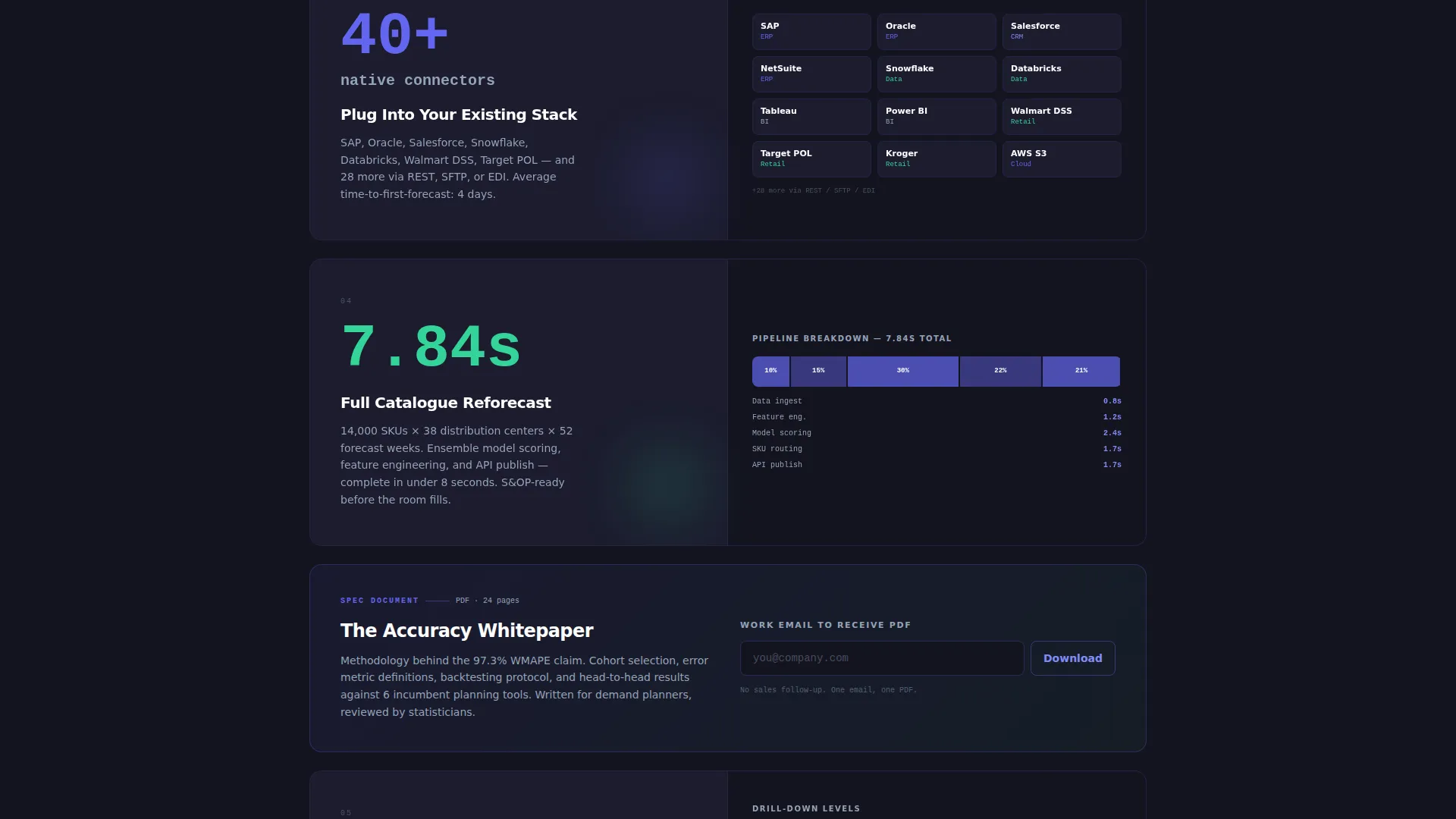
The header splits 50/50 between a tab panel and a live-style dashboard view. Three tabs labeled Accuracy, Granularity, and Speed each load a different visual: a forecast-versus-actual overlay chart with a 97.3% WMAPE (Weighted Mean Absolute Percentage Error) badge, a SKU-by-store heatmap with indigo-to-mint pulsing cells, and a countdown timer showing 14,000 SKUs re-forecast in under eight seconds. Visitors interact with the product before they read a single line of body copy.
Spec Sheet Proof Section Layout
Below the fold, each section functions as a standalone data card. The left side displays a single metric or capability in oversized typography. The right side shows the matching user interface screenshot or micro-animation. Sections stack vertically so the evidence compounds as the visitor scrolls deeper.
Sticky Primary Call-to-Action Placement
The "Explore the Live Demo" button appears in the top navigation bar and repeats automatically after every third spec card. It stays in the charcoal background with mint-colored text throughout the scroll, remaining visible without interrupting the reading flow.
Mid-Page Secondary Callout Card
One inline callout appears mid-page, styled identically to a spec card. It invites visitors to download an accuracy whitepaper in exchange for their email address. This captures intent from visitors who are not yet ready to enter the demo, without adding a separate form page.
No-Form Click-Through Architecture
The page contains no lead-capture form in the primary conversion path. The click-through model sends visitors directly into a sandbox demo instance pre-loaded with sample retail data. This reduces friction and lets the product close the sale on its own terms.
Dashboard Pro Visual System
The Electric Indigo color system gives every visual element a specific job. Deep charcoal surfaces provide contrast. Electric indigo signals live data activity. Cool slate handles secondary text and axis labels. Bright mint is reserved exclusively for positive-delta indicators and call-to-action buttons, so color always carries meaning.
Page sections overview
| Section | Purpose |
|---|---|
| Split-Screen Header | Tab-driven product demo |
| Accuracy Tab View | WMAPE proof chart |
| Granularity Tab View | SKU heatmap display |
| Speed Tab View | Re-forecast countdown timer |
| Spec Card One | First metric proof point |
| Spec Card Two | Second metric proof point |
| Spec Card Three | Third metric proof point |
| Mid-Page Callout | Whitepaper secondary capture |
| Spec Card Four | Fourth metric proof point |
| Spec Card Five | Fifth metric proof point |
| Spec Card Six | Sixth metric proof point |
| Sticky Navigation Bar | Persistent demo call to action |
Design & branding system
The Dashboard Pro theme uses the Electric Indigo color system to create a mission-control aesthetic. Every color in the palette has a defined role, so the interface feels purposeful rather than decorative.
- Deep workspace charcoal (#141420) as the base surface, cool slate (#94A3B8) for secondary text and axis labels, and electric indigo (#6366F1) for live data signals and active user interface states
- Bright mint (#34D399) used exclusively for positive-delta indicators and call-to-action buttons, reinforcing meaning through consistent color assignment
- Oversized typography for metric callouts and spec card headlines creates immediate visual hierarchy at a glance
Mobile & speed optimization
The layout is designed to remain scannable and functional when viewed on smaller screens. Spec Sheet sections that use a 50/50 split on desktop stack vertically on mobile without losing the pairing between metric and visual proof.
- The Feature Tab Switcher adapts so tab navigation remains accessible and the dashboard views remain visible without horizontal scrolling
- The sticky call-to-action bar maintains its position on mobile viewports so the primary conversion path is always one tap away
- Spec cards reflow into single-column format on narrow screens, preserving the three-second scannability target for each section
How this template helps you convert
The page is structured to earn the click before it asks for anything. Conversion happens through accumulated evidence, not a single persuasion moment.
- The interactive header puts the product in the visitor's hands immediately, creating engagement before any scrolling begins and establishing credibility in the first few seconds.
- Repeating the primary call-to-action after every third spec card means a visitor who becomes convinced at any stage never has to scroll far to act on that conviction.
Other information about this template
This template is designed for the Advanced Tech and Artificial Intelligence (AI) Platforms subcategory within the Technology sector. It is purpose-built for the demand forecasting platform niche, where buyers are analytically driven and convert best when given direct access to the product rather than a form wall.
- The template style is Split Screen (50/50), matching the visual language buyers in this space already associate with professional dashboard tools
- The Spec Sheet creative direction is suited to platforms that have real, measurable performance data to present, such as latency statistics, integration counts, and accuracy benchmarks
- The click-through landing page direction means this template works best when paired with a live demo environment or interactive sandbox that the primary call-to-action links to
- The Dashboard Pro theme with Electric Indigo color system can be adapted to other data-intensive platform categories beyond demand forecasting, including inventory optimization, revenue operations, and supply chain visibility tools


Theme
Dashboard Pro
Creative direction
Spec Sheet
Color system
Electric Indigo
Style
Split Screen (50/50)
Direction
Click-Through
Page Sections
Interactive Feature Tab Switcher
Spec Sheet Proof Sections
Sticky Demo Call-to-action Bar
Mid-page Whitepaper Callout
No-form Click-through Architecture
Electric Indigo Dashboard Pro Theme
Related questions
Does this template include a lead capture form?
Can I update the metric numbers and visuals in the spec cards?
What kind of platform is this template designed for?
How does the Feature Tab Switcher header work?
Is the sticky call-to-action button a built-in component?


