Restaurant AI Inventory Forecasting Landing Page
Forecast is a split-screen landing page template built for restaurant AI inventory forecasting platforms. It combines a Data Command visual identity with a Feature Matrix scroll layout and a Comparison/Versus conversion flow. The design speaks directly to multi-unit operators and executive chefs who need hard numbers, not storytelling, to justify a software switch.
by Rocket studio
Quick summary
Forecast is a single-page template designed for AI-powered restaurant inventory forecasting platforms. The layout splits the screen 50/50, opens with a logo authority bar, and builds its case through a clinical feature comparison matrix. Every section adds evidence. The primary call to action quantifies waste in dollars before asking for anything in return.
Who this template is for
This template is built for software founders, product marketers, and go-to-market teams promoting restaurant technology platforms. The target buyer reading the finished page is a seasoned operator, not a first-time experimenter.
- Multi-unit restaurant operators managing ten or more locations who need one clear view of food cost performance
- Executive chefs and kitchen directors tired of manual par counts and late-night clipboard audits
- Regional directors and operations leads who currently rely on disconnected spreadsheets across locations
What problem this template solves
Restaurant operators lose significant margin to over-ordering, dead stock, and food cost variance that compounds across locations. The platforms solving these problems often struggle to communicate their value clearly on a landing page. This template closes that gap.
- No clear side-by-side comparison between legacy processes and the platform's capabilities
- No structured format for showing multi-location operators exactly what they stand to save
- No conversion path for buyers who are interested but not yet ready to book a demo
What you get with this template
You get a fully structured, single-page layout purpose-built for a restaurant AI inventory forecasting platform. Every section has a defined role and a specific job to do before the visitor scrolls past it.
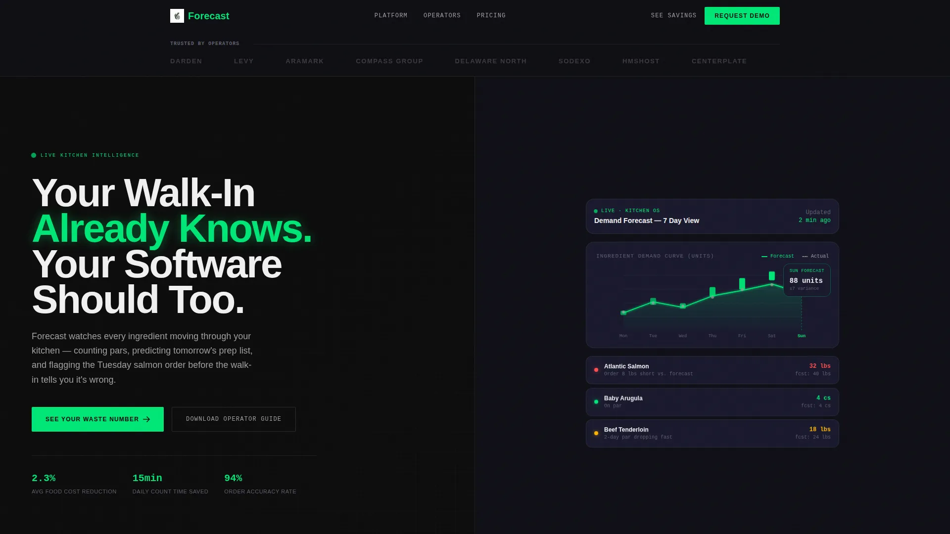
- A split-screen hero with a bold condensed headline on the left and a live-style ingredient demand dashboard on the right
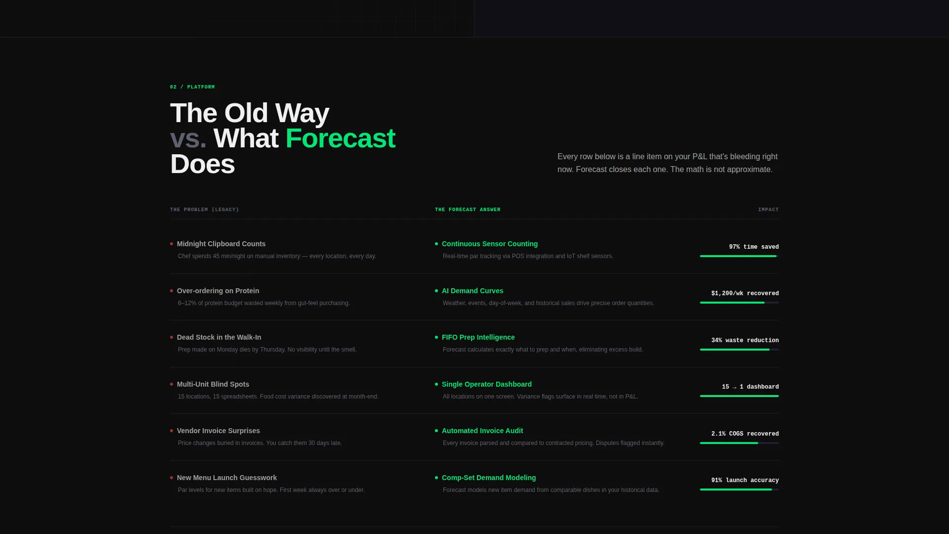
- A scrollable Feature Matrix grid pairing legacy pain points against platform capabilities row by row
- A cost comparison calculator and a dual conversion path covering both demo-ready and research-stage visitors
Feature list
This template includes a focused set of layout and interaction components drawn directly from the source brief. Each one serves the conversion logic of a data-driven operator audience.
Split-Screen Hero Layout
The hero divides the viewport into two equal halves. The left side anchors a bold condensed headline that frames the platform's core promise. The right side shows a live-style dashboard fragment with a 7-day ingredient demand curve and variance bands pulsing in signal green. The contrast between claim and data is immediate.
Logo Authority Bar
A horizontal strip of hospitality brand logos runs edge to edge across the top of the viewport. All logos appear in monochrome titanium gray. This establishes credibility before the visitor reads a single line of body copy.
Feature Matrix Comparison Grid
The scroll section presents platform capabilities against the legacy way of doing things in a structured grid format. Each row pairs a pain point on the left with the platform's answer on the right. Micro-animations populate data into empty fields as each row enters the viewport, giving the scroll a clinical, evidence-building rhythm.
Cost Comparison Calculator
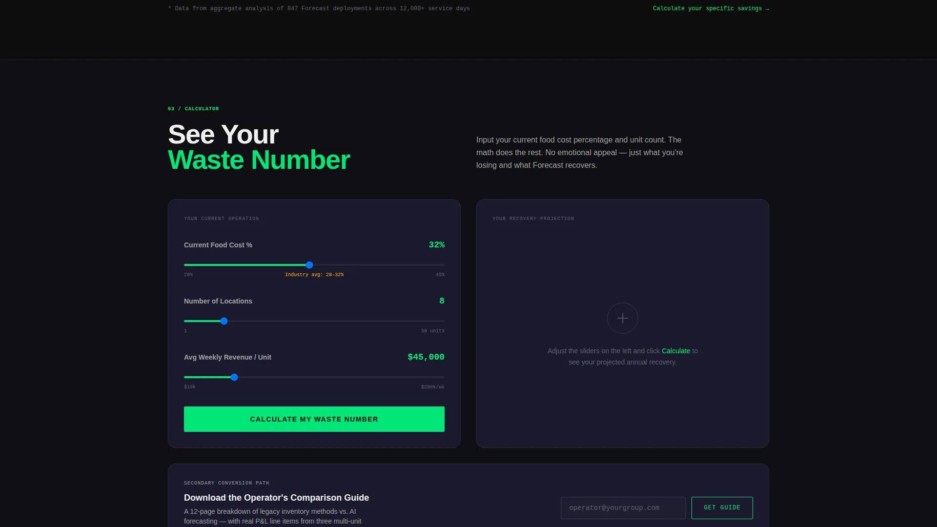
A side-by-side calculator lets operators enter their current food cost percentage and unit count. The output is a projected savings figure tied directly to their inputs. The primary call to action, "See Your Waste Number," is positioned immediately after this section.
Dual Conversion Path
The template supports two distinct conversion routes. The first is a direct demo request via the primary call to action. The second is a downloadable Operator's Comparison Guide gated behind an email capture form, serving visitors who are still evaluating options.
Data Command Visual System
The entire template uses the Carbon Fiber color system. Deep cockpit black, woven graphite, brushed titanium, and signal green work together to make the page feel like a precision instrument panel rather than a marketing brochure.
Page sections overview
| Section | Purpose |
|---|---|
| Logo Authority Bar | Establish brand credibility before any copy |
| Split-Screen Hero | Anchor headline and live dashboard fragment |
| Feature Matrix Grid | Compare legacy pain points to platform answers |
| Cost Comparison Calculator | Quantify projected savings from operator inputs |
| Primary call to action Block | Drive demo requests with "See Your Waste Number" |
| Email Gate Offer | Capture research-stage visitors with a guide download |
Design & branding system
The visual identity follows a Data Command theme built on the Carbon Fiber color system. The palette is matte and functional, designed to read like an instrument panel rather than a lifestyle brand.
- Colors: deep cockpit black (#0D0D0D) for backgrounds, woven graphite (#1A1A2E) for surface layers, brushed titanium (#A0A0A0) for secondary text and monochrome logos, and signal green (#00E676) reserved exclusively for positive-state data indicators and primary call-to-action elements
- Typography: condensed sans-serif headlines for the hero section, structured grid type for the feature matrix, clean readable body copy throughout
Mobile & speed optimization
The template is structured with a lean, single-column scroll in mind for smaller viewports. The split-screen hero and comparison grid are designed to reflow cleanly when screen width narrows.
- The 50/50 split stacks vertically on mobile so both the headline and dashboard fragment remain fully readable
- The Feature Matrix grid collapses to a single-column card layout so each pain-point-to-solution row stays legible on a small screen
How this template helps you convert
This template is built around the logic that operators respond to math, not marketing copy. Every layout decision moves the visitor toward a moment where the cost of inaction becomes visible.
- The logo bar and live-style dashboard fragment build immediate credibility and signal product maturity before any feature claim is made
- The Feature Matrix builds a cumulative case row by row, so by the time the visitor reaches the calculator, they already understand the problem the platform solves
- The cost comparison calculator makes the savings concrete and personal, giving the primary call to action a specific number to attach to rather than a generic benefit statement
Other information about this template
This template is categorized under Technology, specifically the AI for Restaurant subcategory, targeting the restaurant AI inventory forecasting niche. It is designed as a complete single-page layout that teams can adapt to their specific platform branding and copy.
- The template is built as a standalone landing page, not a multi-page site, so all conversion logic flows from top to bottom in one continuous scroll
- The dual conversion path makes it suitable for campaigns where audiences range from demo-ready buyers to early-stage evaluators still comparing options
- The Feature Matrix format is well suited to any restaurant technology platform that needs to justify a switch from manual or spreadsheet-based operations
Theme
Data Command
Creative direction
Feature Matrix
Color system
Carbon Fiber
Style
Split Screen (50/50)
Direction
Comparison/Versus
Page Sections
Split-screen Hero with Live Dashboard
Logo Authority Bar
Feature Matrix Comparison Grid
Cost Comparison Calculator
Dual Conversion Path
Carbon Fiber Visual Identity
Related questions
Who is this landing page template designed for?
What makes the Feature Matrix different from a standard feature list?
Does the template include the cost comparison calculator logic?
Can I adapt the headline and visuals to match my platform?
Is this template suitable for a single-location restaurant?



