AI & Machine Learning Reviews Website Template
Forecast is a dark-cockpit predictive analytics landing page template built for B2B SaaS platforms that surface patterns in raw data streams. It ships with an animated dashboard hero, a live interactive sandbox, a bento-grid capabilities section, social proof, and an OS-detecting download call-to-action, all wrapped in a void-black and electric indigo visual system.
by Rocket studio
Quick summary
Forecast is a single-page landing page template designed for predictive analytics platforms. It opens with a full-viewport animated cockpit, guides visitors through a hands-on sandbox, and closes with a frictionless app download flow. The template balances complex data visualization with clear, benefit-driven messaging, making it immediately useful for teams who need a compelling, conversion-ready presence.
Who this template is for
This template is built for founders, product marketers, and developers launching or promoting a predictive analytics platform. The designed experience speaks directly to buyers who deal with dense performance data every day and need a landing page that earns trust quickly.
- Operations leads who manage key metrics across multiple spreadsheets and need one dashboard to replace them all
- Data scientists tired of rebuilding the same pipeline and looking for a platform worth promoting
- C-suite executives who need a thirty-second read on business performance before their next meeting
What problem this template solves
Most analytics dashboard landing pages either look too generic or bury the product's value in static screenshots. Visitors leave before they understand what they are looking at. This template solves that by making the product tangible the moment the page loads.
- It replaces passive screenshots with an animated cockpit showing live data visualization, so visitors see the product thinking in real time
- It gives visitors interactive sliders and forecast horizon toggles, turning a time-consuming sales pitch into hands-on exploration
- It presents actionable insights visually, using color to distinguish anomalies, demand signals, and churn risk at a glance
What you get with this template
The template ships as a complete, pre built landing page with every section production-ready. Good data visualization is not just about making charts look nice, it is about communicating insights clearly, and every component here is built with that principle.
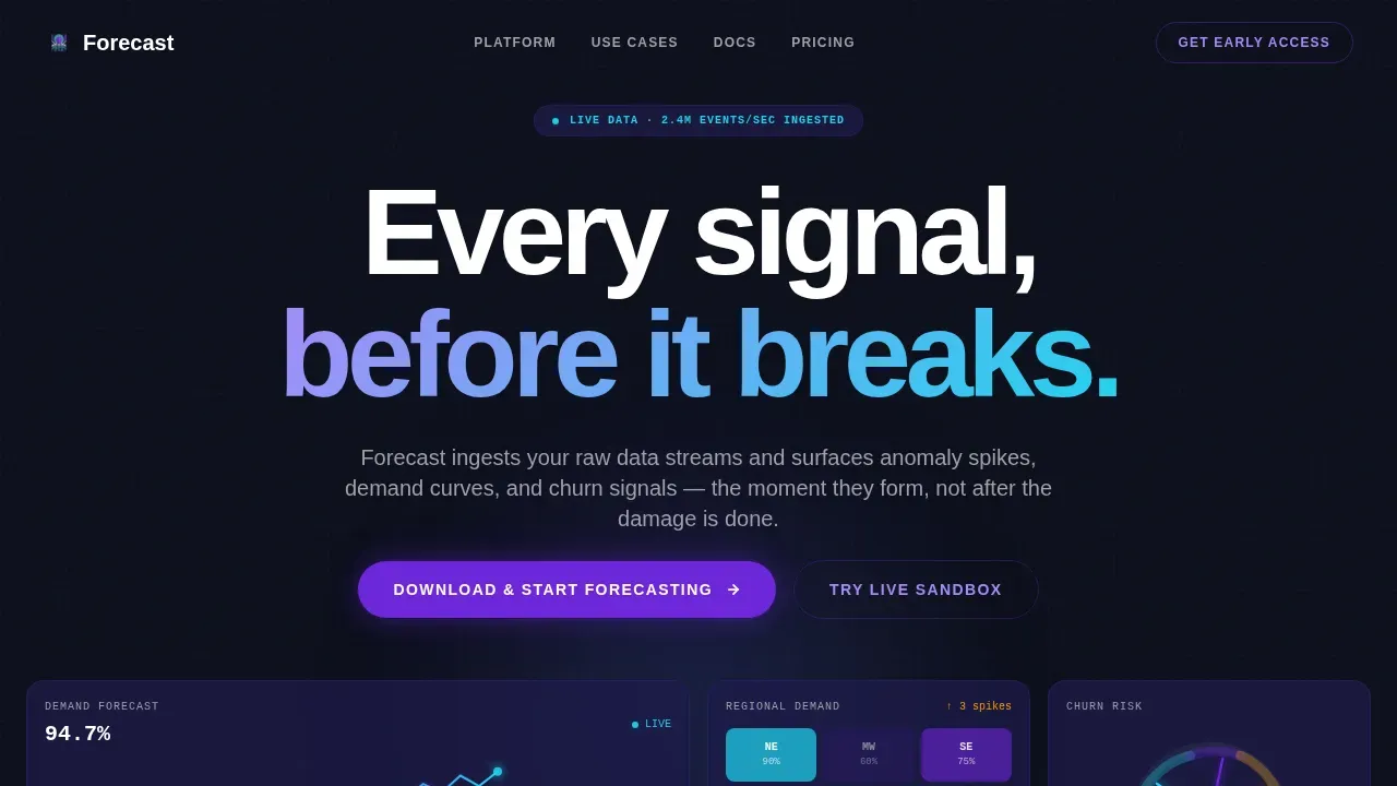
- A full-viewport animated hero dashboard with four interlocking data panels and parallax depth
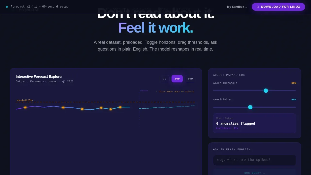
- A live sandbox section with draggable sliders and forecast-horizon toggles that reshape the prediction curve instantly
- A capabilities bento grid, a social proof section with metrics and testimonials, and an OS-detecting download call-to-action with a sixty-second setup timer
Feature list
This template includes six core capabilities, each grounded in the source brief and designed to support data driven decisions at every scroll depth.
Animated Cockpit Hero Dashboard
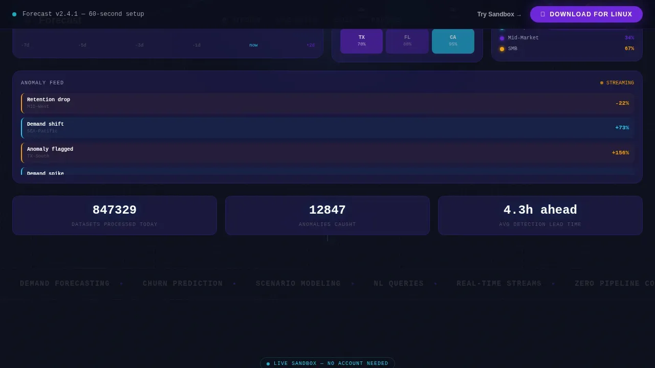
The hero is a full-viewport mock cockpit, not a static image. It renders four live data panels on load: a time-series forecast with a confidence band, a geographic heat map pulsing with regional demand, a churn-risk gauge with three cohort needles, and a streaming anomaly feed with color-coded flags. Numbers tick, chart lines draw left to right, and a subtle parallax separates foreground cards from the deep-black canvas. This animated analytics dashboard gives visitors the immediate sense that the product is already working.
Interactive Forecast Sandbox
Below the hero, visitors reach a live sandbox preloaded with a miniature dataset. They can toggle forecast horizons, drag threshold sliders, and watch the prediction curve reshape instantly. Interactive sliders allow users to simulate how changes in input variables affect future outcomes, turning passive browsing into genuine product exploration. By the midpoint of the page, the visitor has already used the product.
Capabilities Bento Grid
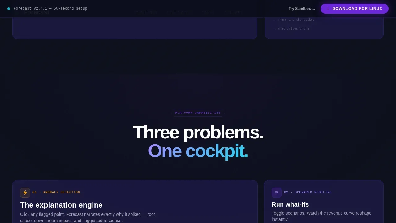
Three isolated capability blocks each pair a focused explanation with a micro-interaction. Visitors can click a data point to trigger an explanation of why it spiked, type a plain-English question to watch a chart materialize, and explore scenario modeling controls. The design uses clear visual hierarchy, with the most critical metrics displayed as the largest elements in each block.
OS-Detected Download Call-to-Action
The primary call-to-action section detects the visitor's operating system automatically and presents a single-click install button. A sixty-second setup timer appears alongside it, shrinking the perceived gap between click and first forecast. This section becomes visible in a slim top bar only after the visitor has completed the first interactive section, ensuring the prompt arrives at maximum trust.
Social Proof and Metrics Bar
A dedicated proof section displays quantified metrics, datasets processed, anomalies caught, and companies served, alongside three testimonials from an operations lead, a data scientist, and a VP. Social proof and trust signals enhance the credibility of predictive analytics models, giving undecided visitors the confidence to proceed.
Dark Cockpit Visual System
The entire template uses a cohesive Electric Indigo color system. Void-black forms the primary canvas. Deep indigo surfaces card panels. Electric violet pulses through chart lines and active states. Phosphor cyan marks real-time data points and hover states. Typography combines DM Sans for body text and JetBrains Mono for data labels, creating a server-room aesthetic where every glow is intentional.
Page sections overview
| Section | Purpose |
|---|---|
| Animated Hero Cockpit | Opens with four live data panels and parallax depth |
| Interactive Forecast Sandbox | Lets visitors toggle horizons and drag sliders |
| Capabilities Bento Grid | Isolates anomaly detection, scenario modeling, NL queries |
| Social Proof Metrics | Displays quantified stats and three testimonials |
| Download Call-to-Action | OS-detected install button with sixty-second timer |
| Developer Minimal Footer | Links and minimal structure for credibility |
Design & branding system
The template follows a Dashboard Pro theme with an Electric Indigo color system. The design of this landing page for a forecast predictive analytics dashboard balances complex data visualization with clear, benefit-driven messaging, every color choice is functional, not decorative.
- Color palette: void-black (#0B0E1A) canvas, deep indigo (#1E1B4B) card surfaces, electric violet (#6D28D9) active states, phosphor cyan (#22D3EE) real-time data points, and neutral silver (#A1A1AA) for secondary text and axis labels
- Typography: DM Sans handles headings and body copy; JetBrains Mono handles data labels, ticker values, and axis annotations for a technical, readable visual interface
- Color is used to highlight anomalies, trends, and actionable insights, phosphor cyan flags real-time events while electric violet marks predictive projections
Mobile & speed optimization
The template is desktop-first by design, reflecting the cockpit metaphor and dashboard density that the target audience expects. The layout remains fully responsive, and a minimalistic approach on smaller screens keeps attention focused on the conversion action.
- Responsive scaling ensures the dashboard panels, sandbox controls, and proof section restack cleanly on tablet and mobile viewports, keeping elements thumb-friendly
- Animations use GPU-accelerated transforms and requestAnimationFrame for smooth chart draws and number tickers without layout disruption
- The slim top-bar call-to-action remains pinned and accessible on all screen sizes, so the download path is never more than one tap away
How this template helps you convert
Data visualization dashboards are interactive reporting tools that help businesses see patterns and make informed decisions. This template applies that principle to the landing page itself, the page is the first proof of the product's value.
- The animated hero and live sandbox let visitors experience the analytics dashboard before they read a single line of sales copy, building trust through demonstration rather than description
- The OS-detecting download section removes friction at the decision moment, one button, one detected platform, and a visible sixty-second setup timer that makes the commitment feel small
- Quantified social proof metrics and three role-specific testimonials give each visitor, regardless of job role, a recognizable peer who has already made the decision
Other information about this template
This template is part of a broader ecosystem of pre built templates designed for data-intensive B2B platforms. Understanding how it fits alongside other dashboard examples helps buyers assess its scope and flexibility.
- Effective dashboards consolidate data from multiple sources to provide a holistic view of business performance. This template's sandbox and bento sections are structured so that future data sources can be wired in with minimal layout changes, making it highly scalable.
- Teams evaluating web analytics dashboard options often compare dashboard examples across categories: sales dashboard examples showing sales pipeline health and sales volume, marketing dashboard examples tracking marketing performance and ad spend, and web analytics views covering bounce rate, traffic source, website visitors, and organic search performance. This template's layout can support all of these reference contexts.
- For platforms that connect to tools like hubspot crm or pull in google analytics and google search console data, the template's data panel grid and bento grid are structured to display those feeds naturally. Teams running google ads campaigns can surface ad spend and conversion rates inside the same panel system.
- The pre built section structure supports customer support performance views, including first response rates and ticket volume, as well as financial health panels covering cash flow and average order value. Marketing teams can use the same layout to surface marketing efforts, engagement metrics, and conversion rates in one dashboard.
- Pre built templates like this one save time by removing routine layout decisions. Dashboard templates come with pre built data visualizations, allowing teams to focus on analysis rather than aggregation. The user friendly structure means any team member, regardless of technical background, can adapt the content quickly.
- Predictive analytics uses historical data and statistical algorithms to project possible future outcomes. A time-series chart in this template displays historical data on one side, with a predicted line extending toward the next period, clearly communicating sales trends, sales performance shifts, and performance changes without requiring explanation.
- Data driven decision making is most effective when key performance indicators are visible and understandable at a glance. This template is designed so that important metrics like Projected Revenue, Forecast Accuracy percentage, Total Pipeline Risk, and Inventory Turnover occupy the most prominent positions in the dashboard layout.
- Customer lifetime value and customer lifetime retention signals appear in the churn-risk gauge panel, giving customer success and revenue teams the bigger picture without switching tools. Teams can balance workloads and stay aligned around a single source of truth, cutting time consuming status meetings.
- The template supports continuous improvement cycles by making performance data visible in context. When the platform surfaces performance changes, the anomaly feed flags them immediately, enabling teams to respond before issues become costly.
- Website analytics, user behavior tracking, and online store's performance signals can all be mapped to the template's existing panel structure, making it adaptable for e-commerce and SaaS use cases alike. Average order and average order value data fit naturally into the metrics bar section.
- Business outcomes improve when teams move from reactive data pulling to proactive analysis. This template is designed to support that shift, presenting complex information as clear visuals so strategic decisions happen faster. The goal is tangible business value, not just a polished page.
Theme
Dashboard Pro
Creative direction
Interactive Explorer
Color system
Electric Indigo
Style
Dashboard/Data Grid
Direction
App Download
Page Sections
Animated Four-panel Cockpit Hero
Live Interactive Forecast Sandbox
Capabilities Bento Grid with Micro-interactions
Os-detected App Download Section
Social Proof Metrics and Testimonials
Electric Indigo Dark Cockpit Design System
Related questions
What sections does this landing page template include?
Can I adapt the dashboard panels to show my own data categories?
Is this template suitable for a marketing team or only for data scientists?
How does the OS-detected download section work in the template?
Does the template support a secondary conversion path for visitors not ready to download?



