Forecast - Predictive Telecom Landing Page Template
Forecast is a single-page AI inventory forecasting landing page built for telecom supply chain teams. It leads with animated KPI metrics, walks buyers through an eight-dimension comparison table, and closes with real carrier case studies. The template converts on a freemium trial model, using a dark Carbon Fiber palette and dynamic motion to make dense operational data feel sharp and immediate.
by Rocket studio
Quick summary
Forecast is a comparison table landing page designed for a telecom AI inventory forecasting platform. It opens with four animated KPI tiles, moves into a detailed manual-versus-AI comparison table, and supports conversion through a two-step trial signup form and a gated benchmark report download. Every visual decision reinforces precision and technical confidence.
Who this template is for
This template is built for teams that manage complex telecom inventory across multiple sites and vendors. It speaks directly to professionals who live inside procurement cycles and rollout schedules.
- Regional carrier operations directors tracking tower inventory burn rates and warehouse stock levels
- Enterprise telecom procurement leads balancing vendor minimum order quantities against active rollout timelines
- Network planning engineers who have been delayed by unexpected backorders on critical cabling or optical components
What problem this template solves
Telecom supply chain teams rely on spreadsheets and gut feel to predict what to order and when. That approach leads to costly stockouts, dead stock, and stalled site builds. This template gives a forecasting platform the right stage to prove it solves those exact problems.
- Buyers arrive skeptical, so the page leads with hard benchmark data before asking for any commitment
- The comparison table makes the gap between manual and AI-driven forecasting impossible to ignore
- Case studies ground the value proposition in specific carrier scenarios that mirror the reader's own situation
What you get with this template
You get a fully structured single-page layout that takes a visitor from awareness to trial signup through a logical, data-led sequence. Every section is purposefully placed and motion-driven.
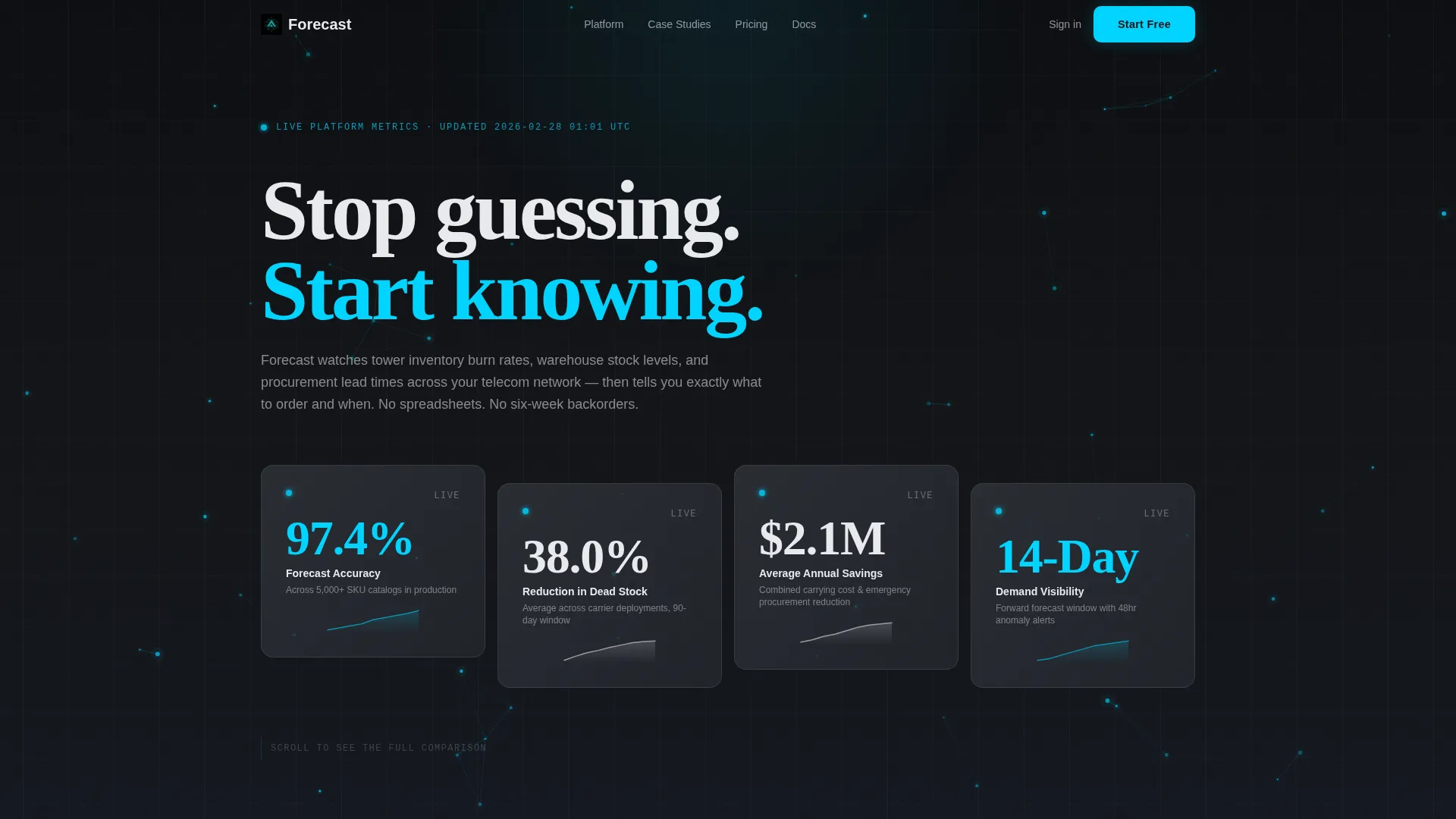
- Animated KPI header with four staggered metric tiles and micro-sparklines, set against a particle mesh background
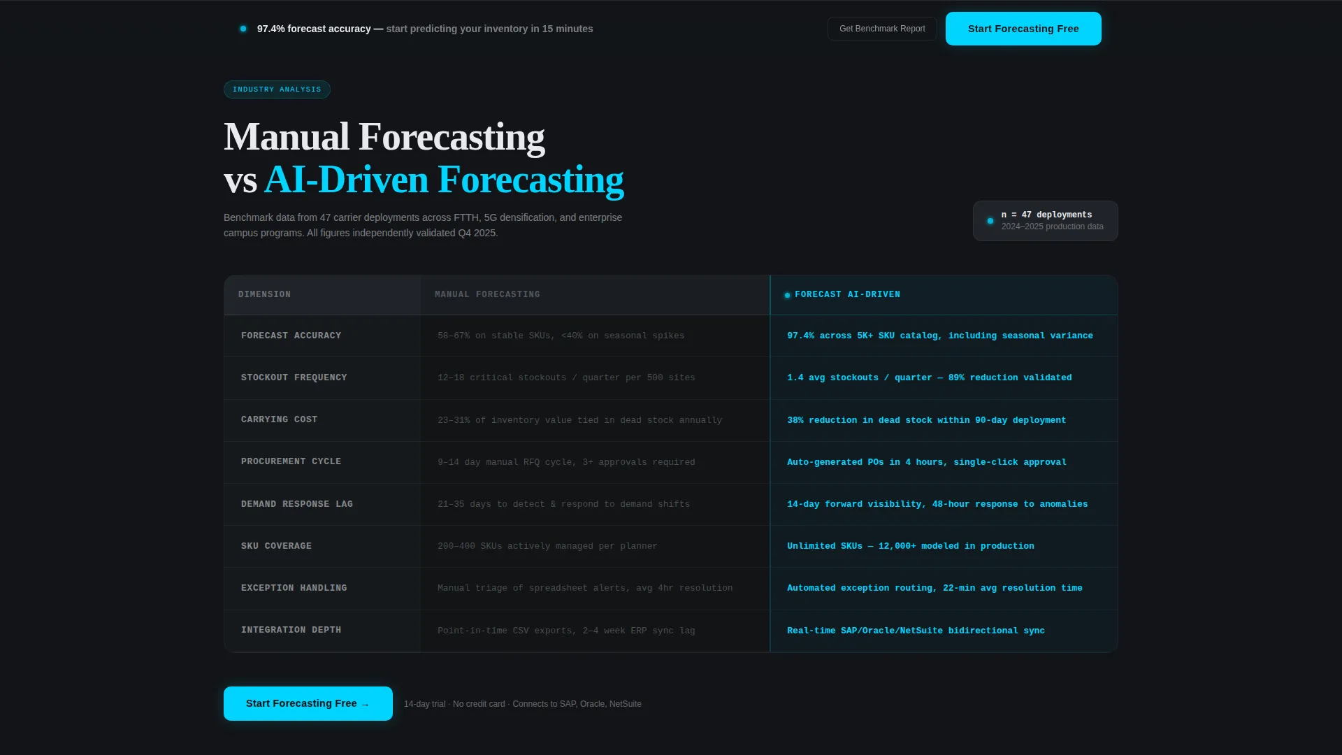
- Eight-row comparison table contrasting manual forecasting against AI-driven forecasting across key operational dimensions
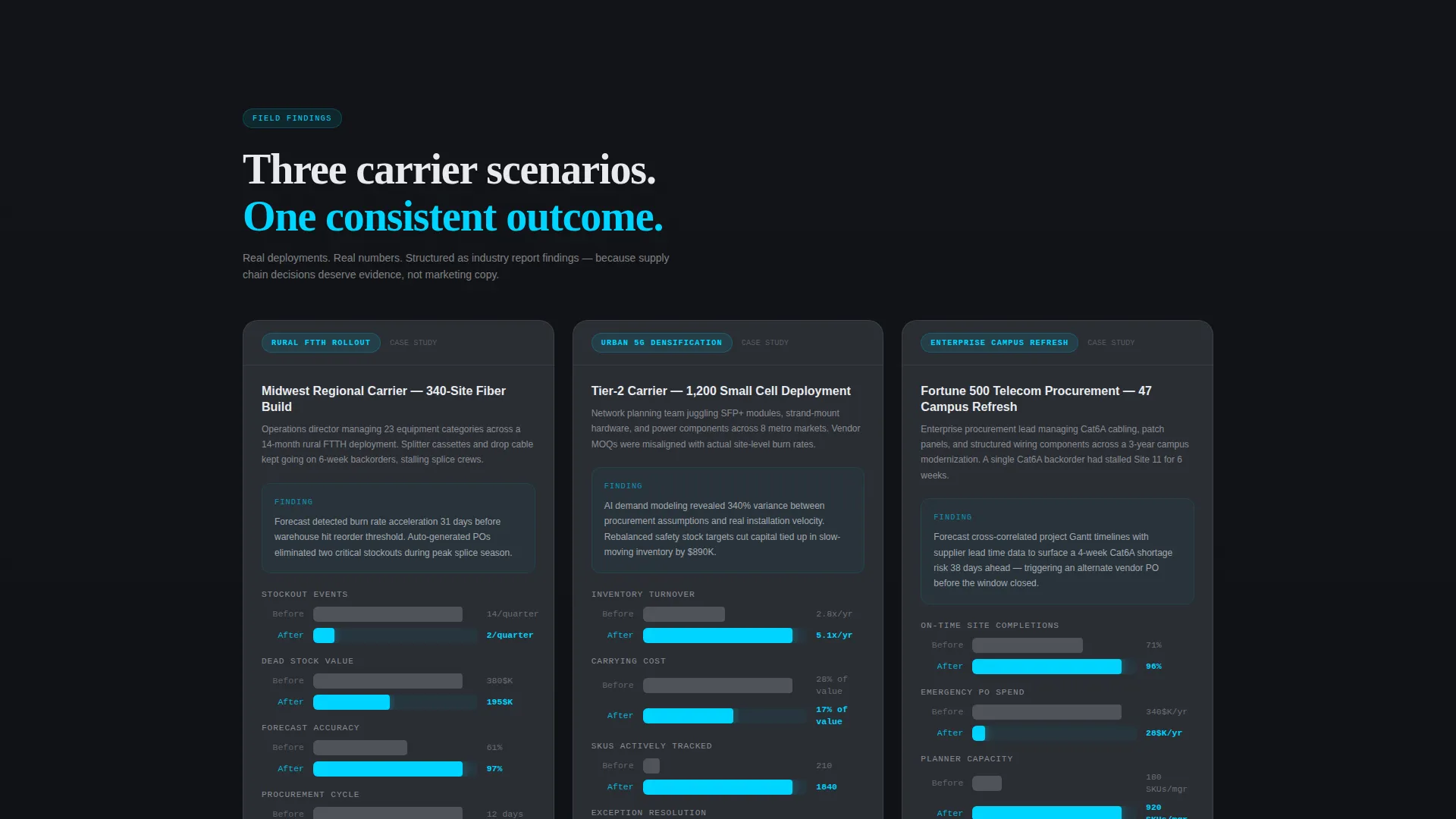
- Three mini case studies formatted as industry report findings, each with before-and-after inventory metrics
Feature list
This template delivers a focused set of components that serve telecom supply chain buyers at every stage of their decision.
Animated KPI Stats Wall
Four oversized metric tiles animate upward from zero on page load, mimicking live exchange tickers. Each tile carries a micro-sparkline to show the underlying trend. The metrics displayed are 97.4% forecast accuracy, 38% reduction in dead stock, $2.1M average annual savings, and 14-day demand visibility.
Eight-Dimension Comparison Table
The core section of the page contrasts manual forecasting against AI-driven forecasting across eight operational rows: accuracy rate, stockout frequency, carrying cost, procurement cycle time, demand response lag, SKU coverage, exception handling, and integration depth. Manual column values render in flat graphite; AI column values pulse in cyan with benchmark data.
Carrier Case Study Blocks
Three mini case studies are structured as industry report findings. Each one covers a distinct carrier scenario: a rural fiber-to-the-home rollout, an urban 5G densification project, and an enterprise campus network refresh. Every case study presents before-and-after inventory metrics with animated comparison bars.
Two-Step Trial Signup Form
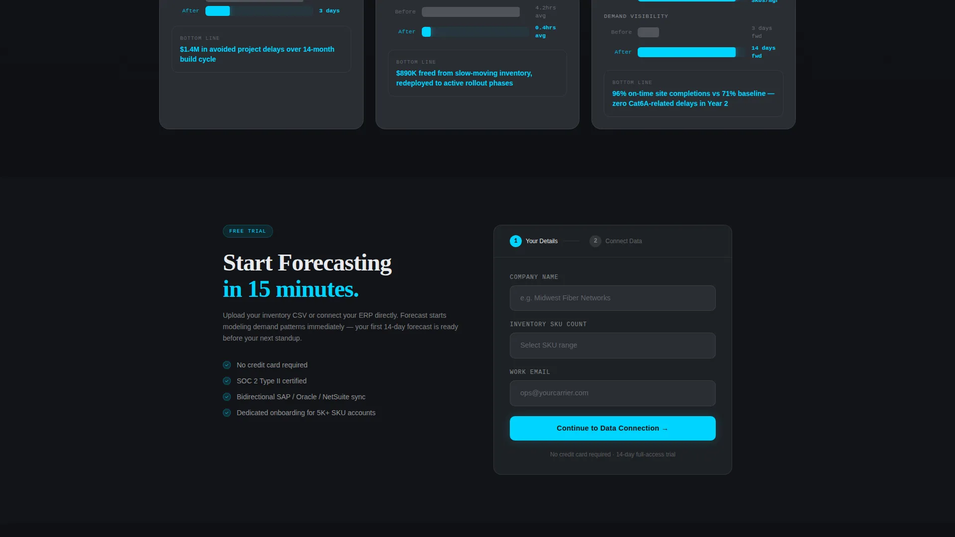
The primary conversion path uses a two-step form. Step one collects company name, inventory SKU count range via dropdown, and work email. Step two offers a CSV upload field for historical inventory data or a one-click connector selector for enterprise resource planning systems including SAP, Oracle, and NetSuite.
Gated Benchmark Report Download
A secondary lead capture path sits below the trial form. Visitors who are in research mode can download the 2024 Telecom Inventory Benchmark Report as a gated PDF. This path captures procurement and planning leads who are not yet ready to start a trial.
Persistent Bottom Bar call to action
After the case studies, a sticky bottom bar keeps the primary call to action visible. It reads "Start Forecasting Free" in pulse cyan and remains in view as the user scrolls, ensuring the conversion entry point is always accessible without interrupting the content flow.
Page sections overview
| Section | Purpose |
|---|---|
| Animated KPI Header | Opens the page with four live-style metric tiles that prove accuracy before any copy is read |
| Manual versus. AI Table | Contrasts eight operational dimensions to make the forecasting gap concrete and visible |
| Carrier Case Studies | Grounds the platform value in three specific real-world telecom deployment scenarios |
| Trial Signup Form | Converts ready buyers through a two-step form with ERP connector or CSV upload options |
| Benchmark Report Download | Captures research-mode leads with a gated PDF as a secondary conversion path |
| Persistent call to action Bar | Keeps the primary trial call to action visible after the case studies section |
Design & branding system
The Carbon Fiber color system gives the page a precise, technical feel without relying on photography or decorative illustration. Every color has a defined role.
- Deep carbon black (#121417) and woven graphite (#2A2D34) form all backgrounds, keeping the visual field dark and focused
- Signal white (#E8EAED) handles all body text and labels, ensuring readability against the dark canvas
- Pulse cyan (#00D4FF) appears exclusively on live data points, active table values, and call-to-action elements, making every interactive moment feel like a status indicator blinking online
Mobile & speed optimization
The Dynamic Motion theme is designed to remain controlled and purposeful at smaller screen sizes. Animations are scoped to reinforce data, not distract from it.
- The staggered KPI grid and comparison table reflow naturally for single-column mobile viewing without losing the visual hierarchy
- Motion effects such as ticker animations, chart draw sequences, and comparison bar races are tied to viewport entry, so they trigger only when the relevant section is visible
How this template helps you convert
The page is structured to earn trust through data before it asks for any action. Conversion happens naturally at the point where skepticism has already been answered.
- The KPI stats wall delivers four hard proof points in the first viewport, giving even the most analytical buyer a reason to keep reading
- The comparison table makes the operational cost of manual forecasting visible across eight specific dimensions, shifting the mental frame from "do I need this?" to "how do I get started?"
- The two-step trial form and the gated PDF create parallel conversion paths, capturing both trial-ready buyers and research-mode leads in a single page flow
Other information about this template
This template sits at the intersection of AI for telecommunications and predictive supply chain tooling. It is purpose-built for platforms serving regional carriers and enterprise network operators.
- The template style is a comparison table layout, which is well-suited to software and platform categories where buyers evaluate alternatives side by side
- The freemium and trial conversion model is reflected throughout the page hierarchy, with the primary call to action appearing twice and a secondary gated asset offering a lower-commitment entry point
- The industry report creative direction gives the page credibility with technically literate audiences who are accustomed to reading white papers and benchmark studies
- The particle mesh background in the header uses thin cyan filaments connecting drifting nodes, suggesting network topology without literal hardware photography
Theme
Dynamic Motion
Creative direction
Industry Report
Color system
Carbon Fiber
Style
Comparison Table
Direction
Freemium/Trial
Page Sections
Animated KPI Stats Wall
Eight-dimension Comparison Table
Carrier Case Study Blocks
Two-step Trial Signup Form
Gated Benchmark Report Download
Persistent Bottom Bar Call to Action
Related questions
What type of business is this template designed for?
Can I customize the KPI numbers and comparison table data?
What does the two-step signup form collect?
Is the gated benchmark report included in the template?
Does the template work if I do not have animated development resources?



