AI for Higher Education Cost Calculator Website Template
Forecast is a hub-and-spoke landing page template built for higher education AI inventory forecasting platforms. It opens with a live savings calculator, then guides procurement directors, operations VPs, and CFOs through a Problem-to-Solution arc that resolves supply-chain pain points one spoke at a time. The Tech Glass visual identity makes complex data feel immediately legible and trustworthy.
by Rocket studio
Quick summary
Forecast is a single-page, anchor-navigated landing page template for AI-powered inventory forecasting platforms targeting university systems. A live calculator acts as the hero, then a structured Problem-to-Solution arc walks visitors through demand sensing, automated reorder triggers, cross-campus consolidation, and budget anomaly detection, all wrapped in a dark-mode Tech Glass visual identity.
Who this template is for
This template is built for teams selling sophisticated software to higher education buyers with serious budget authority. The content arc and tone are calibrated for decision-makers who need evidence before they act.
- Procurement directors managing seven-figure annual supply budgets across multiple campuses
- Campus operations vice presidents fielding pressure from department heads over stockouts and waste
- Chief financial officers who suspect millions in preventable supply-chain losses but lack visibility to prove it
What problem this template solves
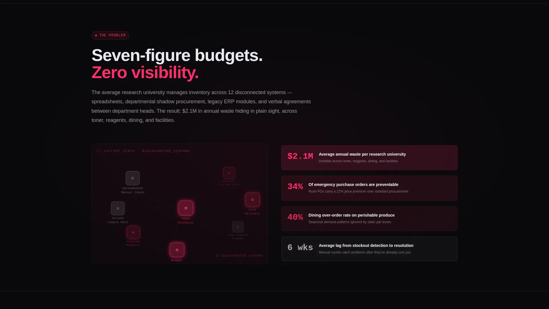
University supply chains are notoriously fragmented. Stockrooms, warehouse shelves, and procurement queues often operate in silos, producing emergency purchase orders, over-ordered produce, and depleted lab reagents with no early warning. A generic software landing page cannot carry the weight of that argument.
- Visitors arrive skeptical and need to feel the problem before they trust the solution
- Standard hero images and bullet-point feature lists fail to convey the scale of the waste being addressed
- The buying committee spans finance, operations, and procurement, each needing a different angle of proof
What you get with this template
You get a fully structured, single-page layout with a persistent left-rail anchor navigation, a functional calculator section, and five content spokes that each resolve a distinct operational pain point. Every section ends with a consistent primary call to action.
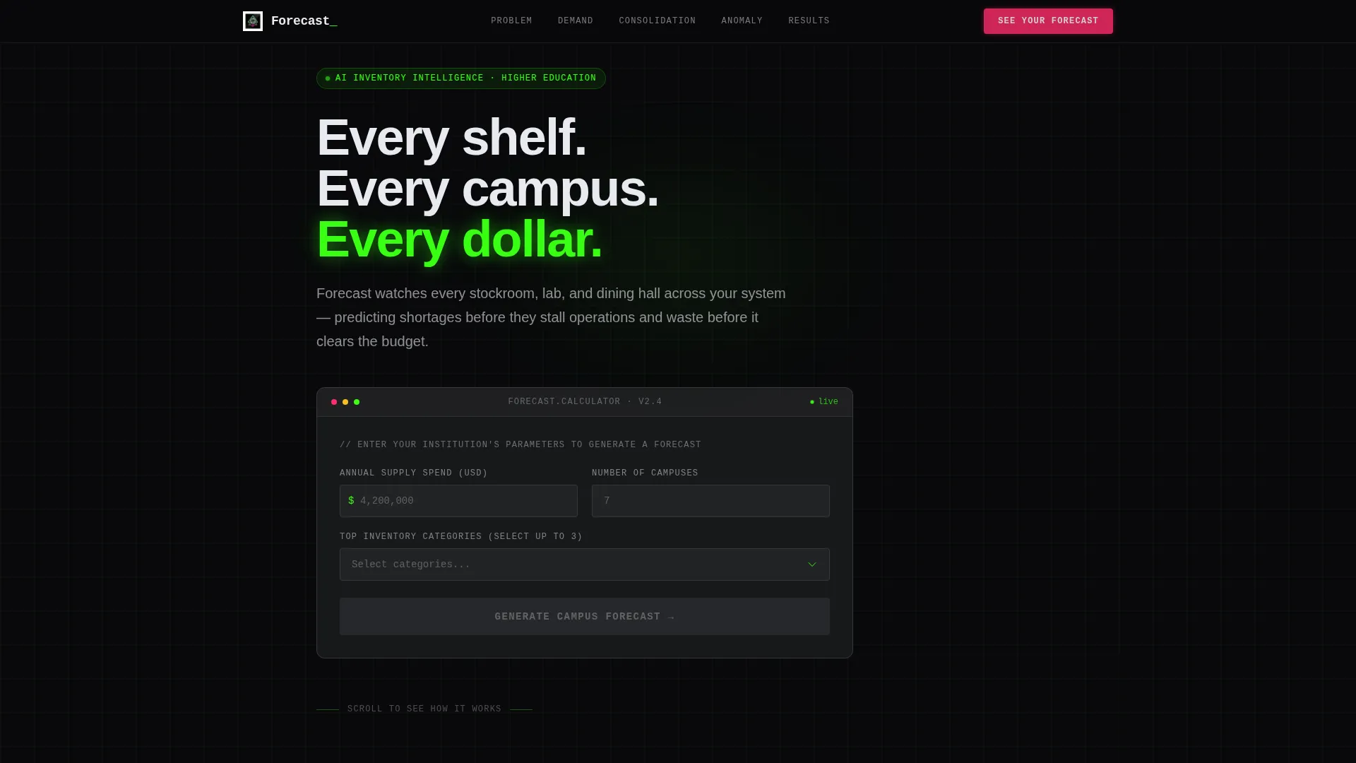
- An interactive savings calculator pre-wired as the hero, capturing institutional spend, campus count, and inventory categories
- A Problem-to-Solution arc with animated chaos visualization followed by glass-panel product screenshot sections
- A persistent phosphor-green anchor navigation rail that keeps buyers oriented across every spoke
Feature list
This template includes the following built-in capabilities drawn directly from the design brief.
Interactive Savings Calculator Hero
The header is a live calculator, not a static banner. Visitors enter their annual supply spend, number of campuses, and top inventory categories via a dropdown. A frosted-glass panel then animates open to display a projected savings range in phosphor green, an estimated waste percentage in signal magenta, and a payback timeline in months. No photography or illustration competes for attention, the tool proves value in the first interaction.
Persistent Anchor Navigation Rail
A left-rail navigation bar glows in phosphor green and stays fixed as the visitor scrolls. Each link targets one of the content spokes directly. This keeps long-scroll visitors oriented and lets returning visitors jump straight to the section most relevant to their role.
Problem Visualization Section
The first spoke renders the chaos visually. Animated nodes represent disconnected spreadsheets, manual inventory counts, and emergency purchase orders. The nodes pulse in signal magenta, establishing urgency before the solution arc begins.
Spoke-Based Solution Sections
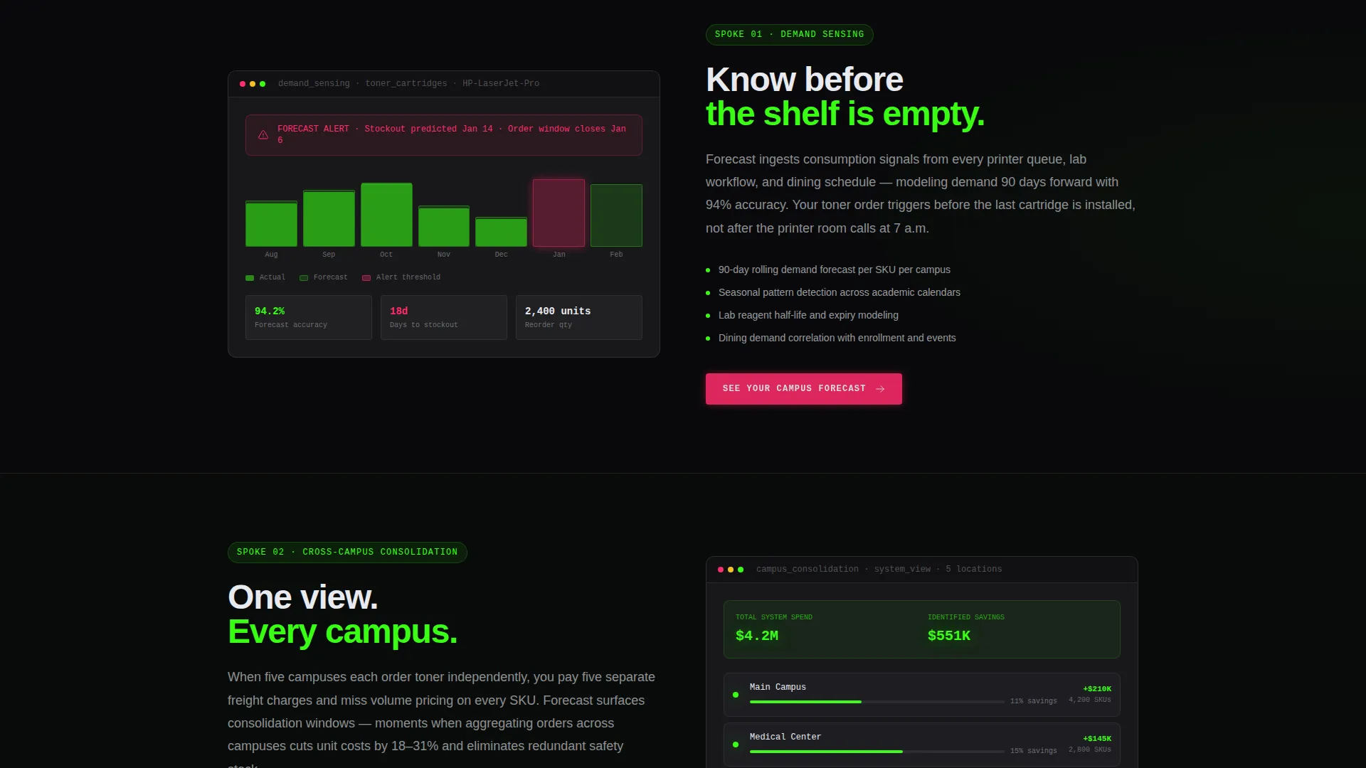
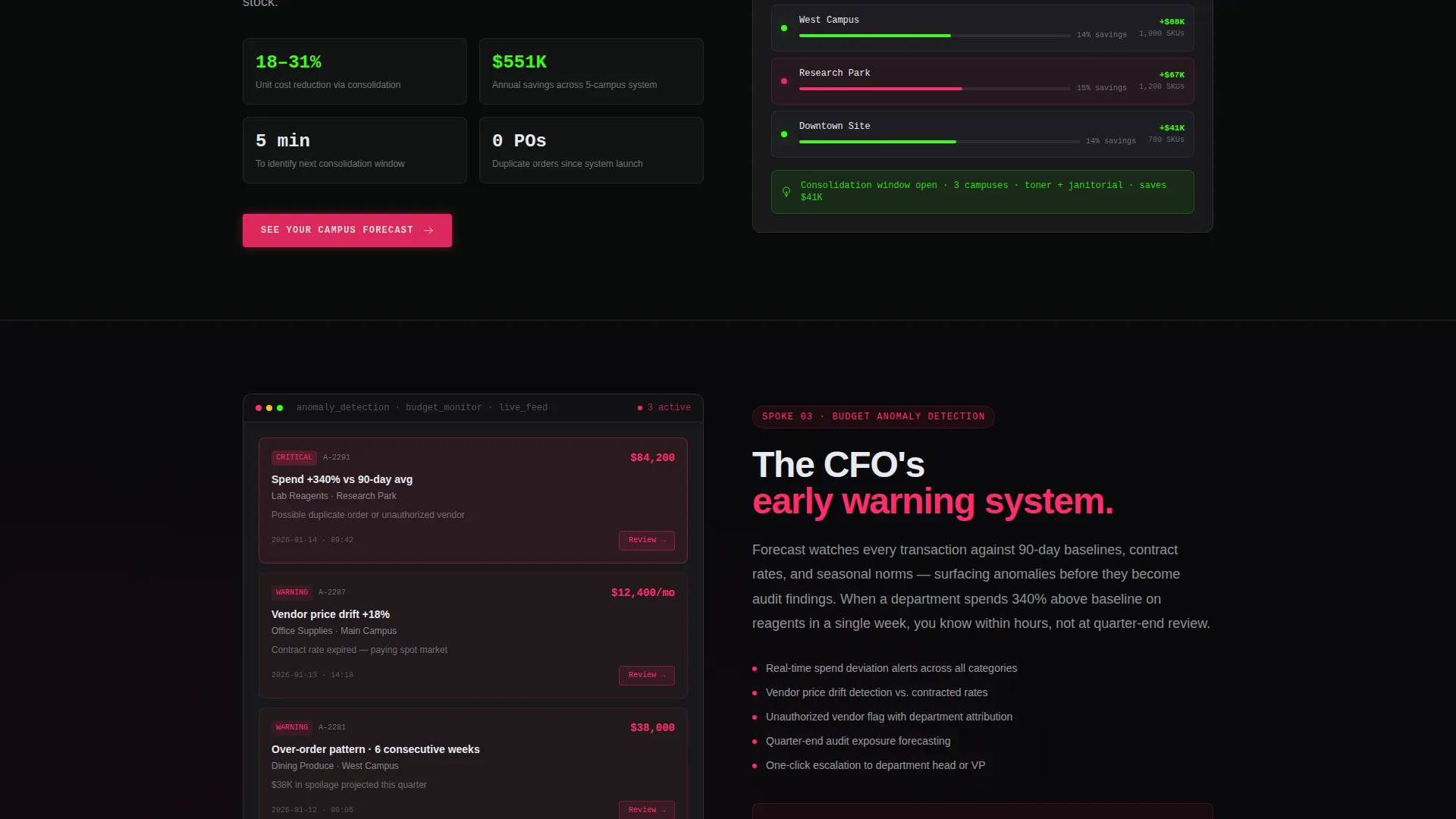
Each subsequent spoke addresses one specific pain point with a frosted-glass product screenshot. The four spokes cover demand sensing, automated reorder triggers, cross-campus consolidation, and budget anomaly detection. Stakes escalate progressively from operational inconvenience through audit risk to seven-figure budget exposure.
Contextual Repeating Call to Action
The primary call-to-action button, labeled "See Your Campus Forecast," appears first inside the calculator results panel and repeats at the close of every spoke. Each repetition deepens the promise based on the section's context, reinforcing the offer without feeling repetitive.
Secondary Low-Commitment Path
A text link labeled "Read the Purdue Case Study" appears alongside the primary call to action. It gives visitors who are not yet ready to click through a lower-commitment next step, capturing intent without friction and without requiring a form on the page.
Page sections overview
| Section | Purpose |
|---|---|
| Calculator Hero | Prove value instantly via interactive savings estimate |
| Anchor Nav Rail | Keep visitors oriented across all spokes |
| Chaos Visualization | Make the supply-chain problem visceral and urgent |
| Demand Sensing Spoke | Show how the platform predicts inventory depletion |
| Reorder Triggers Spoke | Demonstrate automated procurement threshold alerts |
| Cross-Campus Consolidation | Illustrate system-wide inventory coordination |
| Budget Anomaly Detection | Surface hidden financial waste and audit risk |
| Repeating call to action Blocks | Reinforce conversion prompt after each spoke |
Design & branding system
The visual identity uses the Acid Digital color system built on four roles. Void black (#09090B) dominates every background. Phosphor green (#39FF14) traces data lines, chart axes, and active navigation indicators. Frosted panel white (#E8EAF0) carries body text and card surfaces that appear to float above the dark background like translucent acrylic. Signal magenta (#FF2D6B) is reserved exclusively for alerts, warning-state demonstrations, and conversion moments.
- The overall aesthetic evokes a dark-mode mission control environment, where every color serves a functional role
- Glass-panel card surfaces give the layout a layered depth that makes product screenshots feel like live instrument readouts
- Typography and layout follow the Tech Glass theme, keeping complex data readable without sacrificing visual intensity
Mobile & speed optimization
The template is structured to translate the dark-mode, data-dense visual identity across screen sizes without losing hierarchy or legibility. The anchor navigation rail adapts for narrower viewports so the spoke structure remains navigable on mobile.
- Frosted-glass card components are sized to remain readable at mobile widths without collapsing the layered depth effect
- The calculator inputs and animated results panel are built to function on touch interfaces, not just desktop cursor interactions
- Signal magenta call-to-action elements retain their contrast and urgency on smaller screens where attention is harder to hold
How this template helps you convert
This template is purpose-built for a click-through conversion goal. There is no form on the page. Every element is designed to carry visitor intent forward into a personalized demo environment, using the calculator inputs as context.
- The calculator hero creates a personalized, data-backed reason to act before the visitor reads a single feature description, lowering the barrier to the first click.
- The progressive Problem-to-Solution arc escalates from operational frustration to financial risk, so by the time visitors reach the final spoke, the cost of inaction feels concrete and quantified.
- The secondary case study text link captures visitors who need social proof before committing, giving procurement and finance stakeholders a peer-validated off-ramp that still moves them closer to a demo.
Other information about this template
This template is part of a broader library of higher education technology landing page templates designed around specific buyer psychology and institutional sales cycles. It pairs well with use cases involving university procurement software, campus operations platforms, and AI-driven supply chain tools.
- The no-form page architecture is intentional: calculator inputs travel forward into the demo environment, making the first conversation more relevant and personalized
- The template is tagged under the Technology category with the AI for Higher Education subcategory, making it discoverable for teams positioning platforms at the intersection of institutional procurement and machine-learning forecasting
- The Forecast template name and its problem framing align naturally with pitches around predictive inventory management, supply waste reduction, and procurement budget optimization in multi-campus university systems
Theme
Tech Glass
Creative direction
Problem→Solution Arc
Color system
Acid Digital
Style
Hub & Spoke (Anchor Nav)
Direction
Click-Through
Page Sections
Interactive Savings Calculator Hero
Persistent Anchor Navigation Rail
Animated Problem Visualization
Progressive Solution Spoke Sections
Contextual Repeating Call to Action Button
Secondary Case Study Text Link
Related questions
Who is the primary audience for this landing page template?
Does the calculator in the header actually compute results?
Is there a contact form anywhere on this page?
How many solution sections does this template include?
Can this template support a different procurement software use case?



