Forge — Field Service Landing Page Template
Dispatch is a dark-themed, data-forward landing page template built for home services software platforms. It combines a live-look dispatcher hero, five comparison tables across core feature categories, and a friction-light lead capture form. The result is a persuasion engine that builds an undeniable operational case before asking for a single click.
by Rocket studio
Quick summary
Dispatch is a single-page, comparison-table landing page template designed for home services enterprise resource planning (ERP) platforms. It opens with a stat-driven headline, moves through a spec-sheet scroll of feature comparisons, and closes with a low-friction form. The cockpit-dark visual system keeps every data point front and center.
Who this template is for
This template is built for SaaS founders, product marketers, and growth teams selling operational software to field service businesses. If your buyers evaluate tools the way they evaluate equipment, this page speaks their language.
- Owner-operators running fleets of ten to fifty trucks who need a platform that replaces clipboards and midnight spreadsheet sessions
- Regional franchise managers juggling dozens of technicians across multiple service areas who need one unified view
- Office managers and dispatchers who currently rely on callback scheduling and manual reconciliation to keep jobs moving
What problem this template solves
Most software landing pages try to sell with screenshots and bullet promises. Field service buyers don't respond to that. They need to see numbers, head-to-head comparisons, and proof that the platform fits their workflow before they'll trust any form.
- Generic hero sections fail to communicate operational complexity or platform depth to a technical evaluator
- Scattered feature lists don't answer the core question: how does this compare to what we already use?
- Long forms and early commitment asks drive qualified leads away before the platform earns the click
What you get with this template
You get a fully structured, single-page layout that takes a skeptical field service buyer from first impression to form submission using data, not stock photography. Every section earns its place by moving the evaluation forward.
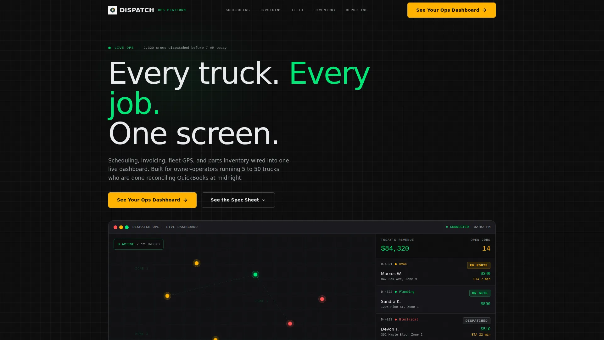
- A simulated live dispatcher view as the hero image, complete with a map, job queue, color-coded status pills, and a revenue ticker
- Five comparison table sections covering Scheduling, Invoicing and Payments, Fleet GPS, Inventory Management, and Reporting, each with specific performance metrics built in
- A primary lead capture form with four fields and a secondary gated PDF path for buyers who need to bring numbers to a decision-making meeting
Feature list
This template is built around a tight set of high-impact components. Each one is designed with a specific conversion or credibility job to do.
Stat-Driven Hero with Live Dashboard Simulation
The hero section opens with a single bold headline built around a real-time operational stat. Below it, a simulated dispatcher view shows a map with live truck indicators, a job queue with color-coded status pills, and a scrolling revenue ticker. There is no stock photography. The interface itself is the proof.
Logo Bar with Integration Partners
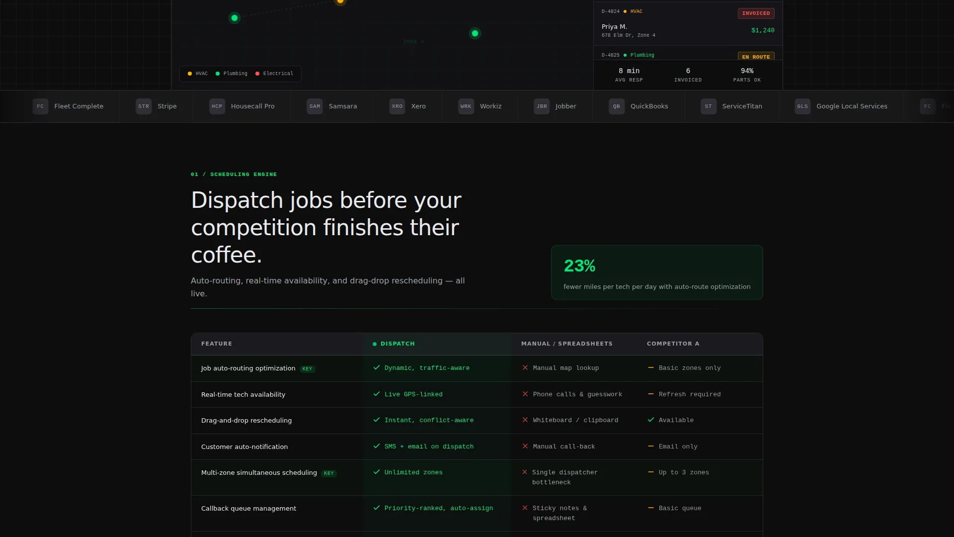
A horizontal scrolling strip sits beneath the hero headline, displaying recognizable home services brands and ecosystem integration partners. This is not decorative. It signals immediately that the platform fits into the buyer's existing operational world.
Five-Category Comparison Tables
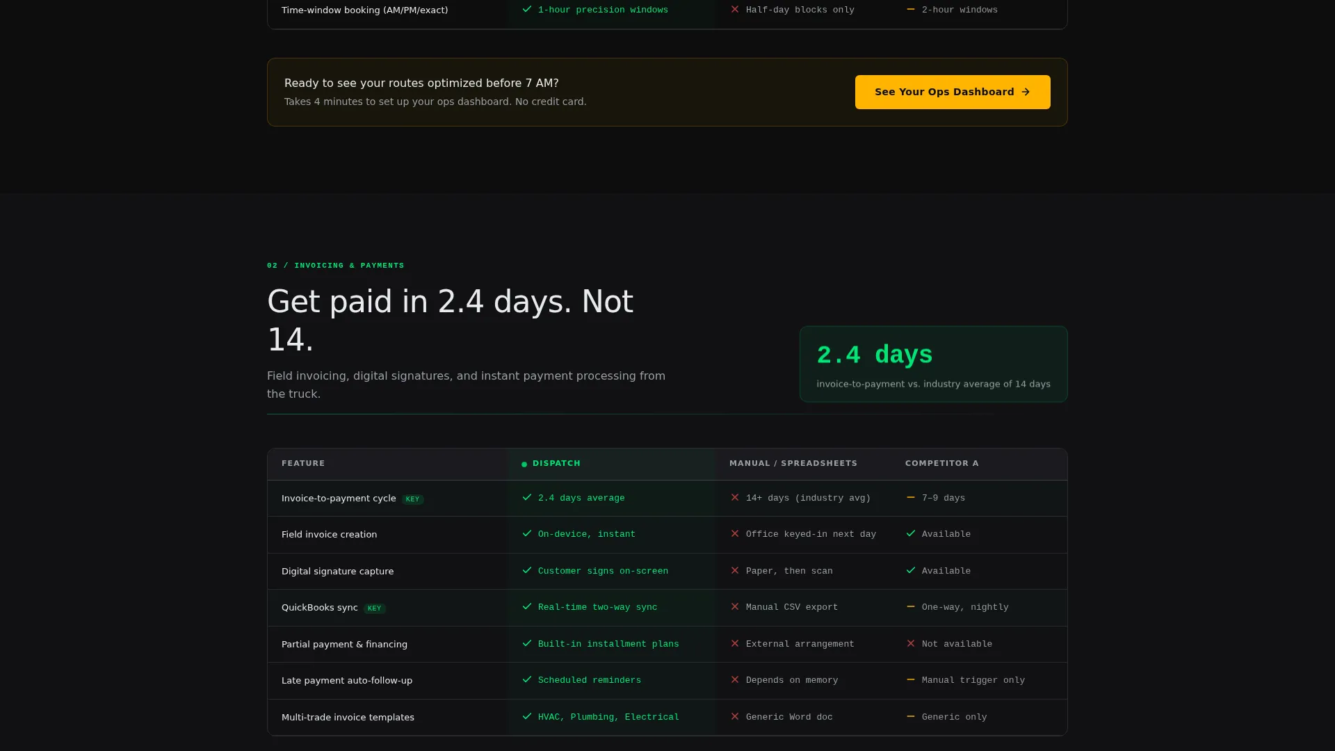
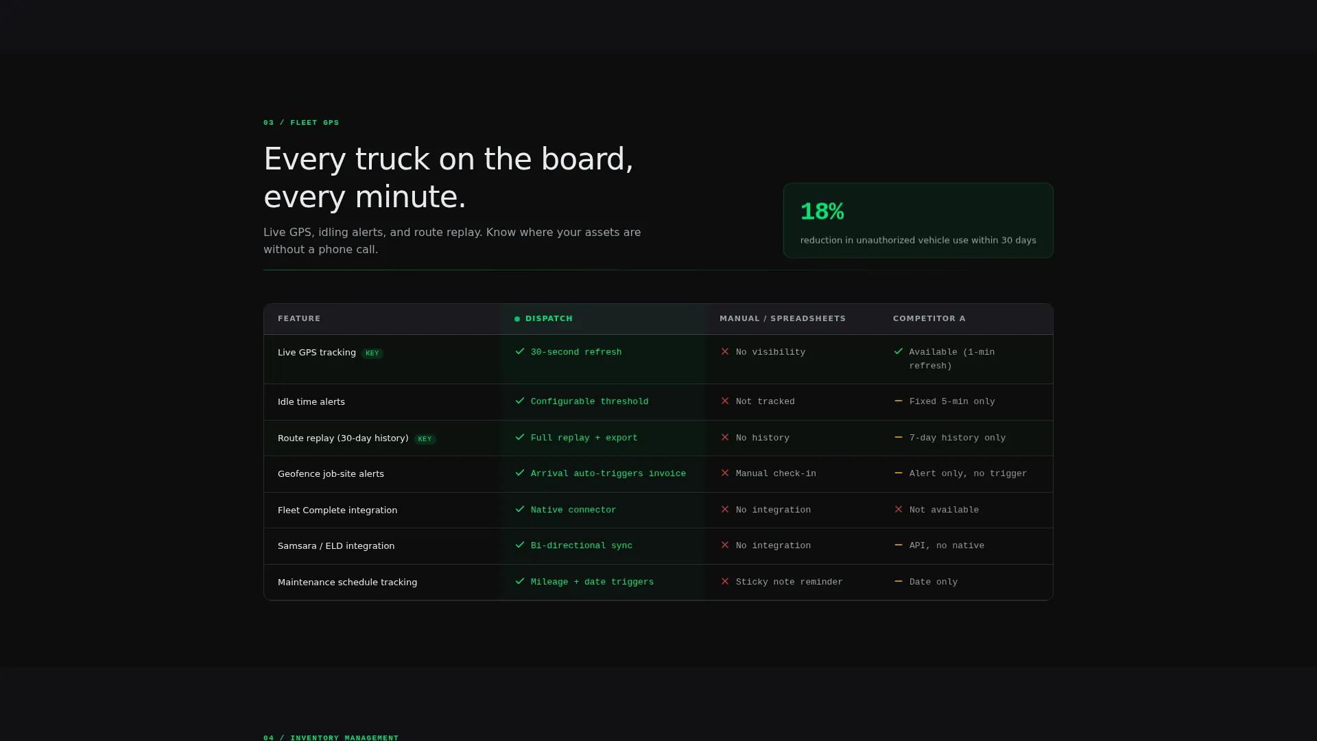
Each major feature category gets its own full comparison table. The tables pit the platform against manual methods and a generic competitor column, using specific performance metrics in every cell. Rows build the case incrementally until switching costs feel smaller than staying put.
Floating Primary Call-to-Action Button
The primary call-to-action, "See Your Ops Dashboard," appears after the first comparison table and stays pinned as a floating button throughout the scroll. It remains visible without interrupting the evaluation flow.
Low-Friction Lead Capture Form
The form collects four fields: company name, number of active trucks via a dropdown, primary trade category, and work email. No phone number is requested. The reduced field count lowers commitment anxiety for buyers who are still in evaluation mode.
Gated Secondary Download Path
A secondary conversion path offers a downloadable full specification sheet (PDF) for evaluators who need to present numbers internally. It gives cautious buyers a low-pressure way to stay engaged and move the decision forward on their own timeline.
Page sections overview
| Section | Purpose |
|---|---|
| Logo Bar Header | Establish ecosystem credibility with partner logos and a stat-driven headline |
| Live Dispatcher Hero | Replace stock imagery with a simulated operational dashboard as the hero proof point |
| Scheduling Comparison Table | Show auto-route optimization metrics against manual methods and a competitor |
| Primary call to action Placement | Capture early intent after the first comparison with a four-field lead form |
| Invoicing Payments Table | Demonstrate invoice-to-payment speed improvement with specific day counts |
| Fleet GPS Table | Present real-time truck tracking and mileage reduction data side by side |
| Inventory Management Table | Compare parts tracking accuracy and stockout rates across three columns |
| Reporting Table | Contrast live dashboard reporting against manual spreadsheet reconciliation |
| Secondary Download call to action | Offer a gated PDF specification sheet for buyers presenting to stakeholders |
| Floating call to action Button | Keep the primary conversion action visible throughout the entire scroll |
Design & branding system
The visual identity follows a Data Command theme built on a Carbon Fiber color system. Every color choice has a functional meaning, exactly like an instrument cluster in a commercial vehicle.
- Deep cockpit black (#0D0D0D) and brushed graphite (#2A2A2E) form the background layers, with alternating tones keeping sections visually separated without breaking the dark atmosphere
- Status-green (#00E676) marks live data, positive metrics, and platform advantages in comparison table cells; warning amber (#FFB300) handles alerts and call-to-action buttons so neither color appears without earning it
- Cool-white (#E8EAED) body text sits against dark panels for clear readability, and all typography prioritizes data legibility over decorative styling
Mobile & speed optimization
The template is structured to translate the cockpit experience cleanly to smaller screens without losing the comparison data that drives decisions.
- Comparison tables are designed to scroll horizontally on mobile viewports so metric-dense rows remain readable without content truncation
- The floating call-to-action button adapts its position for thumb-reach zones on smaller devices, keeping the primary conversion action accessible throughout the scroll
- Section backgrounds use flat dark fills rather than image-heavy treatments, which supports faster rendering across varied connection speeds in the field
How this template helps you convert
This template is engineered to convert evaluators, not just visitors. The entire scroll is structured as a progressive case-building exercise that earns the form submission before asking for it.
- The hero section establishes immediate operational credibility with a live-look dashboard simulation and a real-time stat headline, so the buyer feels the platform's value before reading a single feature claim
- The comparison tables do the selling row by row, presenting specific metrics that make the cost of inaction feel larger than the cost of switching, which moves a cautious evaluator toward the primary call-to-action naturally
- The dual conversion path serves two buyer types simultaneously: decision-ready buyers fill the four-field form, while evaluators who need internal sign-off take the gated PDF path, so no qualified lead leaves the page empty-handed
Other information about this template
This template is part of a focused set of high-conversion landing page templates designed for vertical SaaS and operational software platforms. A few additional details are worth noting for teams planning a build or evaluating fit.
- The template is designed with the home services ERP buyer journey in mind, where evaluation cycles are longer and internal stakeholder buy-in often requires shareable documentation
- The gated PDF path is pre-structured to complement platforms that integrate with tools common in the home services space, including field service management and accounting workflows
- The comparison table format is flexible enough to update competitor column headers and metric values to reflect your platform's actual performance data at launch
- Template style is Comparison Table with a Spec Sheet creative direction, making it a strong fit for platforms positioning against legacy manual workflows or established field service management competitors
Theme
Data Command
Creative direction
Spec Sheet
Color system
Carbon Fiber
Style
Comparison Table
Direction
Lead Generation
Page Sections
Stat-driven Hero with Dashboard Simulation
Scrolling Logo Bar for Ecosystem Credibility
Five-category Comparison Tables
Floating Call-to-action Button
Four-field Low-friction Lead Form
Gated Specification Sheet Download Path
Related questions
Who is this landing page template designed for?
Can I update the comparison table metrics with my own platform data?
How many form fields does the lead capture form include?
Does the template include a secondary conversion path for evaluators?
Is the hero section built without stock photography?



