Open-Source CMS Landing Page Template
Forge is a modular card grid landing page template built for open-source content management systems. It uses an interactive card layout to tour key CMS features, a dark Dashboard Pro visual identity with Carbon Fiber tones, and a direct click-through flow pointing developers straight into a live demo environment. No forms. No friction.
by Rocket studio
Quick summary
Forge is a single-page landing page template designed for open-source CMS products targeting developers and technical teams. Built on a card grid layout with a Dashboard Pro theme, it lets visitors explore features through hover-driven micro-interactions before clicking through to a live demo. The aesthetic is sharp, dark, and intentionally terminal-coded.
Who this template is for
This template speaks directly to the builders and decision-makers who evaluate technical infrastructure with rigor. It is not a generic SaaS template dressed in dark mode. It is built for people who read the source before they trust the product.
- Senior developers evaluating headless CMS options for enterprise client projects
- Agency technical leads who are tired of per-seat licensing that scales against them
- Solo builders who need a content backend they can customize without asking for permission
What problem this template solves
Most CMS landing pages undersell technical credibility. They lean on marketing language instead of letting the product prove itself. Forge flips that approach by making every interaction on the page feel like a fragment of the actual product.
- Generic CMS pages bury technical capability behind vague feature claims and screenshot carousels
- Developers leave pages without enough signal to justify a demo click or architecture review
- The template removes email gates and friction forms so visitors reach the demo in a single click
What you get with this template
Forge delivers a fully structured, visually cohesive landing page template ready to adapt for any open-source CMS product. Every layout decision is intentional and every interactive element serves the conversion goal.
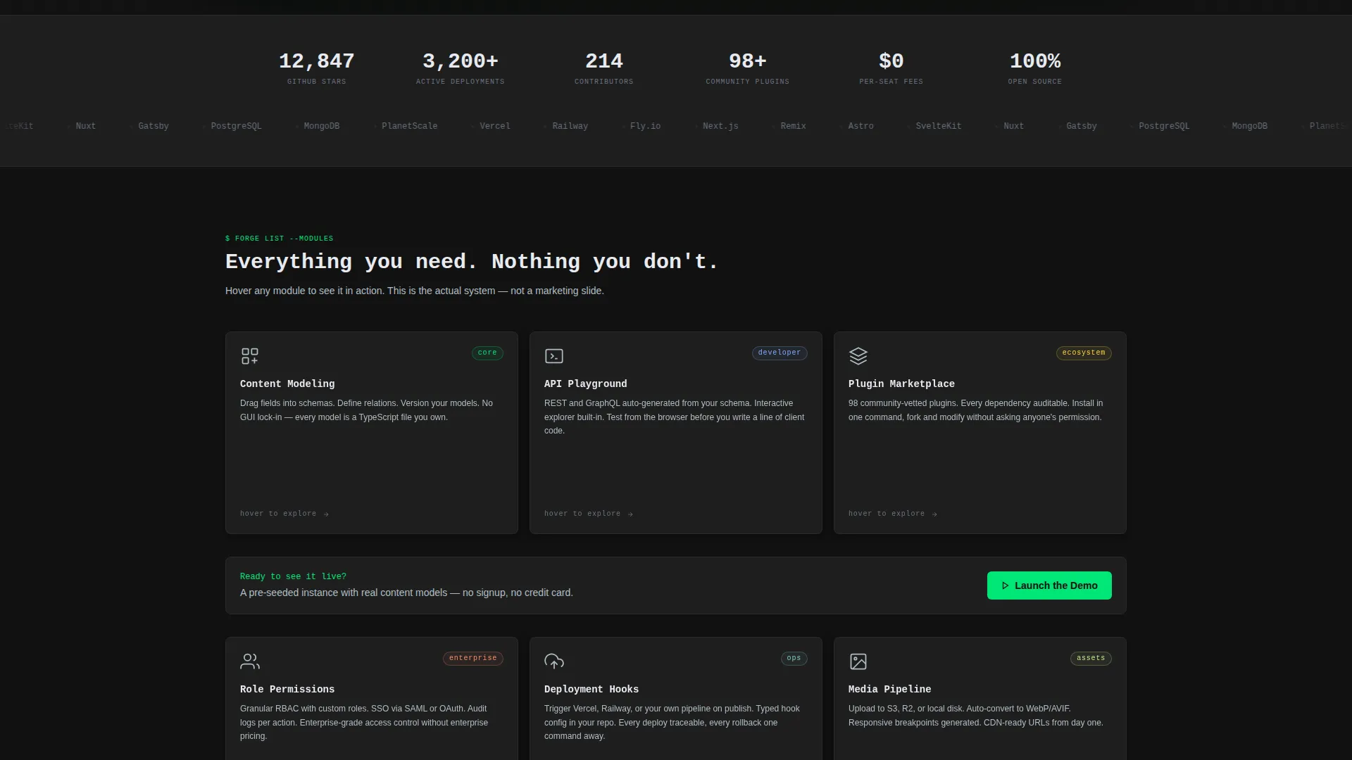
- A modular card grid with six feature module cards, each with hover-flip micro-interactions
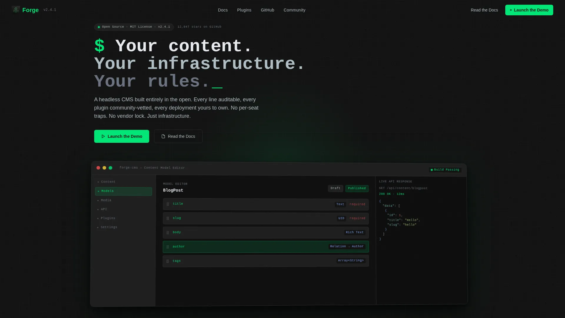
- A product screenshot header showing a live CMS admin dashboard mid-use, tilted at a subtle 2 degrees with ambient shadow
- A pinned navigation call to action and repeated inline calls to action after every second card row, both pointing to a pre-seeded demo environment
Feature list
This section covers the core capabilities built into the Forge landing page template.
Modular Card Grid Layout
Six feature module cards are arranged in a responsive grid. Each card maps to a distinct CMS capability: Content Modeling, API Playground, Plugin Marketplace, Role Permissions, Deployment Hooks, and Media Pipeline. Complexity escalates row by row, from simple content operations at the top to enterprise orchestration at the bottom.
Hover-Flip Micro-Interactions
Every card flips on hover to reveal a functional micro-interaction. Depending on the card, visitors see a live syntax-highlighted code snippet, a mini schema diagram that assembles itself, or a dependency graph that draws its own connections. These interactions let visitors feel the product before they click through to the demo.
Product Screenshot Header
The hero section features a pixel-perfect CMS admin dashboard screenshot captured mid-use. It shows a content model editor with fields being dragged into position, a live API response panel on the right, and a deployment status badge reading "Build Passing" in green. The screenshot sits at a 2-degree tilt against a pure graphite background with a soft ambient shadow.
Pinned and Inline call to action Strategy
The primary call to action, "Launch the Demo," is pinned in the navigation and repeated after every second card row. The secondary path, "Read the Docs," gives architecture-focused visitors an off-ramp without abandoning the page. Neither call to action uses a form or email gate.
Monospace Headline Typography
The hero headline uses monospace type to reinforce a terminal-native feel. The single line reads: "Your content. Your infrastructure. Your rules." This typographic choice signals immediately that the product is built for technical audiences.
Escalating Complexity Scroll Flow
The scroll journey is structured as a hands-on tour. Simple content operations appear at the top of the card grid. Enterprise-scale orchestration features appear at the bottom. Each row earns deeper engagement by proving the system scales with the visitor's own ambition.
Page sections overview
| Section | Purpose |
|---|---|
| Pinned Navigation Bar | Keeps "Launch the Demo" call to action always visible while scrolling |
| Hero Product Screenshot | Establishes product credibility with a live dashboard capture |
| Hero Headline Block | Delivers the core value proposition in monospace type |
| Feature Card Row One | Introduces Content Modeling and API Playground modules |
| Inline call to action Block | Repeats primary and secondary calls to action after the first card row pair |
| Feature Card Row Two | Presents Plugin Marketplace and Role Permissions modules |
| Inline call to action Block | Repeats primary and secondary calls to action after the second card row pair |
| Feature Card Row Three | Covers Deployment Hooks and Media Pipeline modules |
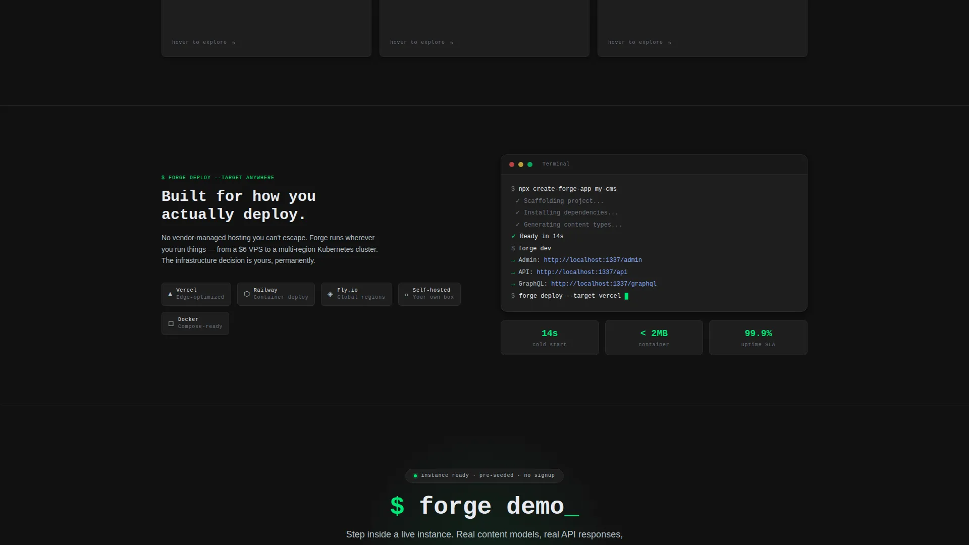
| Final call to action Section | Closes the page with a last direct push to the demo environment |
Design & branding system
The visual identity is built around the Carbon Fiber color system. Every color choice carries functional meaning. Nothing on this page is decorative.
- Deep graphite (#121212) as the page body, panel-edge charcoal (#1E1E1E) for card surfaces, and 1px borders in #2A2A2A to define edges without visual noise
- Status-green (#00E676) appears only on active states, toggle indicators, success badges, and the primary call to action, reserving its signal value for live and actionable elements
- Cool aluminum (#B0BEC5) for secondary text and dividers, keeping hierarchy clear without introducing warm tones that would break the server-rack atmosphere
Mobile & speed optimization
The card grid layout is built to reflow cleanly at smaller viewport widths. The modular structure means cards stack vertically on mobile without losing the escalating complexity flow.
- Each card module is self-contained, so the grid adapts without requiring custom breakpoint overrides for individual components
- Hover-flip interactions are scoped to pointer devices, so mobile visitors receive the card content in a static readable state rather than a broken hover state
- The pinned navigation call to action remains accessible at the top of the viewport across all screen sizes
How this template helps you convert
Forge earns the demo click by letting visitors experience the product before they commit. The conversion path is direct, frictionless, and sequenced deliberately.
- The hero screenshot and monospace headline establish technical credibility in the first viewport, so developers do not bounce before reaching the feature cards
- Each hover-flip card interaction gives visitors a taste of real CMS functionality, building confidence that the product is genuine before they click "Launch the Demo"
- The inline call to action repeats after every second card row, catching visitors at peak interest without forcing them to scroll back to the top to act
Other information about this template
Forge is built specifically for the open-source CMS niche, where trust and transparency are the primary buying signals. The template's interactive approach reflects that value directly in its design decisions.
- The template supports the open-source positioning by visually communicating auditability and developer control through its terminal-coded aesthetic
- The pre-seeded demo path (no email gate, no form) is a deliberate trust signal aligned with how open-source communities evaluate tools
- This template is categorized under Technology and Open-Source Enterprise Software, making it a strong fit for headless CMS products, self-hosted content platforms, and developer-first SaaS alternatives

Theme
Dashboard Pro
Creative direction
Interactive Explorer
Color system
Carbon Fiber
Style
Card Grid (Modular)
Direction
Click-Through
Page Sections
Modular Card Grid with Six Feature Modules
Hover-flip Micro-interactions
Product Screenshot Hero Header
Pinned Navigation and Inline Ctas
Carbon Fiber Color System
Escalating Complexity Scroll Structure
Related questions
Who is this landing page template built for?
Can I customize the six feature card modules for a different product?
Does the template include the demo environment or just the landing page?
What happens on mobile when hover interactions are not available?
Is the monospace headline font included with the template?



