Open-Source Enterprise Software Advanced Professional Website Template
Forge is a landing page template built for open-source source code management platforms. It uses a Tech Glass visual identity with a dark Monochrome Steel palette, a live-styled code snippet header, and a modular card grid layout. The page is designed to turn technical curiosity into confident clicks, driving visitors to a demo instance or source repository without a single form or email gate.
by Rocket studio
Quick summary
Forge is a single-page landing page template for open-source source code management tools. It opens with a live-styled terminal code snippet and flows into a scannable card grid of capability specs. The design uses a dark Monochrome Steel palette and a Tech Glass visual theme. Every section is built to build trust and drive a direct click to a demo or repository.
Who this template is for
This template is built for teams and individuals who ship and maintain serious software infrastructure. It speaks the language of the people actually running the tools.
- Infrastructure engineers managing large-scale monorepos who need to evaluate self-hosted version control options quickly.
- Solo maintainers running high-starred open-source projects who want a credible, no-fluff presentation page.
- DevOps leads assessing self-hosted alternatives to locked-down software-as-a-service platforms.
What problem this template solves
Most landing pages for developer tools rely on marketing language that engineers immediately distrust. Forge solves the credibility gap by replacing promotional copy with a spec-driven layout that reads like a well-structured technical document.
- Visitors cannot evaluate a tool they cannot read. This template leads with actual code, not stock imagery or vague promises.
- Comparison strips between card rows answer objections inline, so visitors never have to leave the page to verify a claim.
- Without a friction-free path to the product, curious engineers bounce. The pinned call-to-action removes that last inch of resistance.
What you get with this template
You get a complete, ready-to-customise single-page layout built around the visual and structural conventions that engineering audiences already trust.
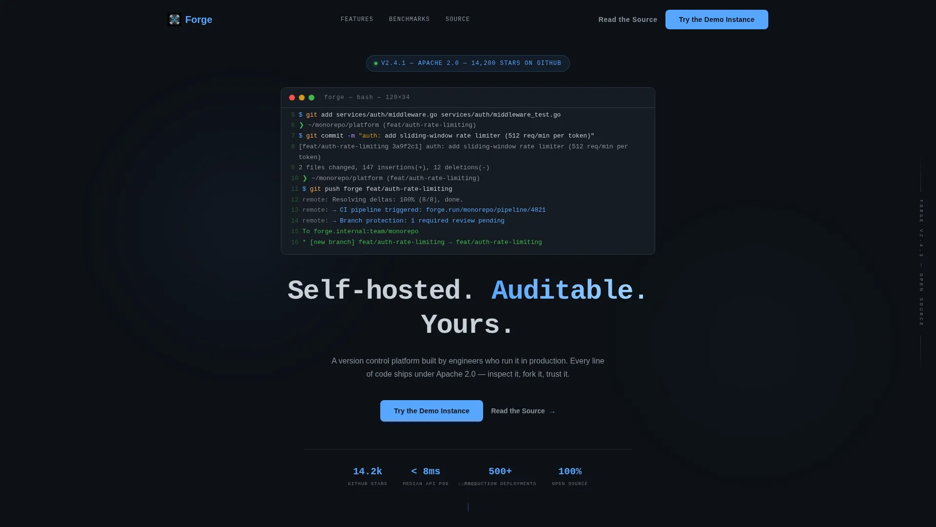
- A live-styled code snippet header showing a real git workflow, rendered in a monospaced font with syntax highlighting using the steel palette and electric blue accent.
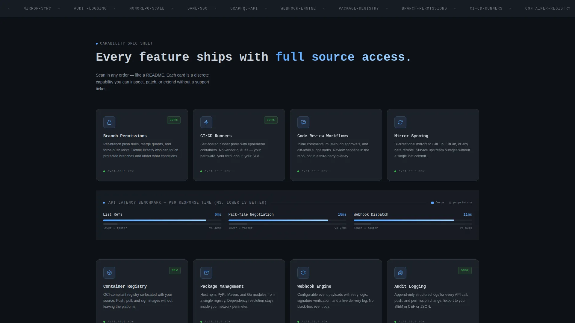
- A modular card grid where each card presents a discrete platform capability with a feature name, one-line description, and a small monochrome icon.
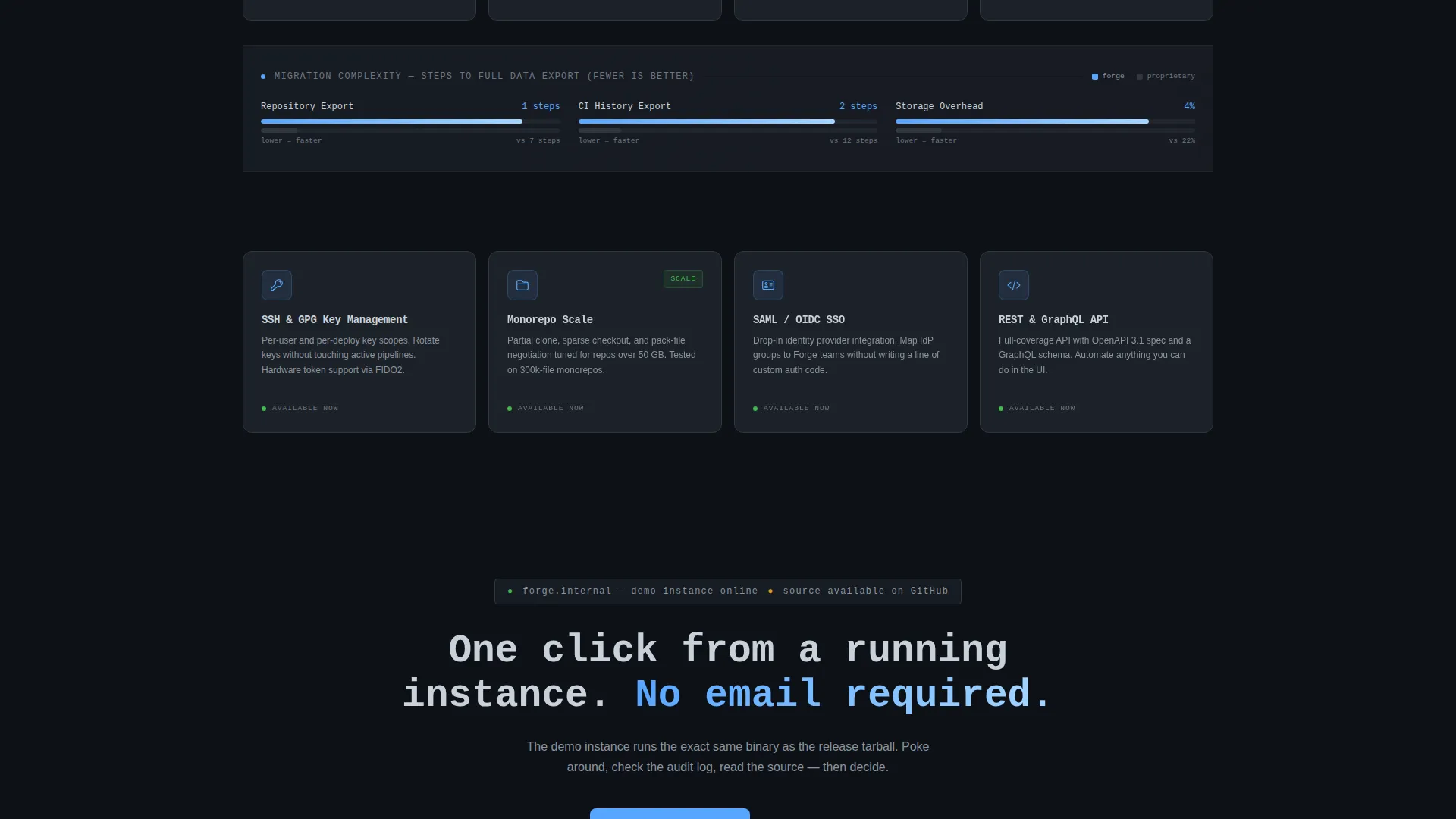
- Narrow comparison strips between card rows that benchmark against proprietary alternatives using response times, storage overhead, and migration step counts.
Feature list
This template delivers a focused set of layout and design capabilities grounded directly in the source brief.
Live-Styled Terminal Header
The top third of the viewport displays a git push sequence in a monospaced font. Syntax highlighting uses only the steel palette and the single electric blue accent. The snippet shows branch creation, staged changes, a human-written commit message, and a confirmed push response. No stock imagery is used anywhere on the page.
Modular Capability Card Grid
Each card in the grid is a self-contained spec unit. It shows a feature name, a one-line description, and a small monochrome icon. Cards are designed to be scannable in any order, the way an engineer reads a README. Covered capabilities include branch permissions, code review workflows, container registry, package management, CI/CD runners, and mirror syncing.
Inline Comparison Strips
Between card rows, narrow horizontal strips present benchmark data. Comparisons cover response times, storage overhead, and migration step counts against proprietary alternatives. Each strip gives the scroll a spec-document rhythm and answers the next likely objection before a visitor can form it.
Pinned Frosted-Glass Navigation Bar
A frosted-glass navigation bar follows the scroll throughout the page. It keeps the primary call-to-action visible at all times. The bar holds "Try the Demo Instance" as the primary button and "Read the Source" as a secondary text link.
Dual Call-to-Action Placement
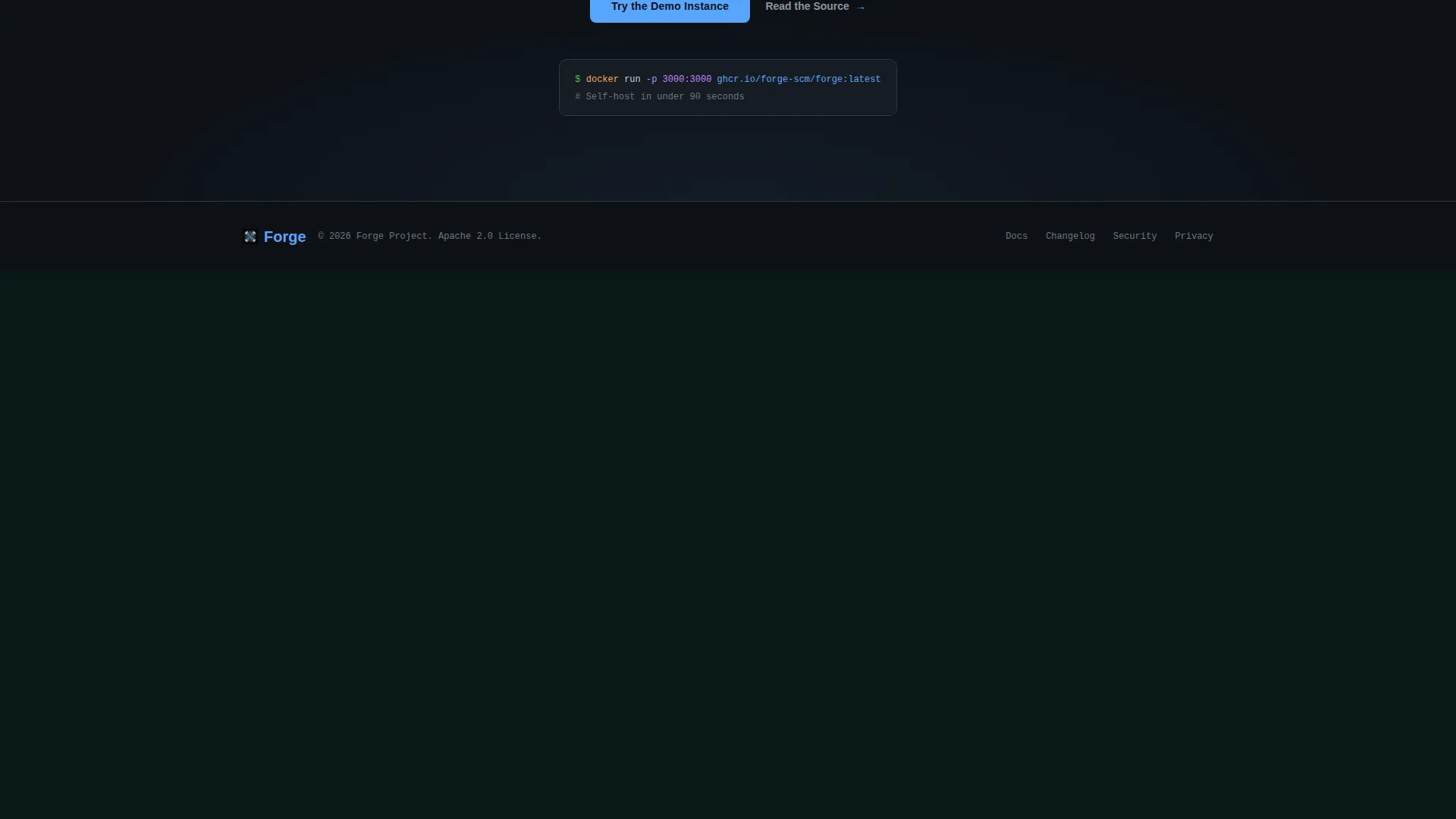
The primary call-to-action appears twice: once in the pinned navigation bar and once at the bottom of the card grid. Both placements use the electric blue accent. No form or email gate stands between the visitor and the destination.
Tagline Fade-In Display
Below the code snippet header, a single line of large display type fades in with the message "Self-hosted. Auditable. Yours." It anchors the product's core value proposition in plain language immediately after the technical demonstration.
Page sections overview
| Section | Purpose |
|---|---|
| Terminal Code Header | Opens with a live-styled git workflow snippet to establish immediate technical credibility |
| Tagline Display | Delivers the core value statement in large type directly below the code header |
| Pinned Navigation Bar | Keeps the primary and secondary calls-to-action visible throughout the entire scroll |
| Capability Card Grid | Presents each platform feature as a discrete, scannable spec card with icon and description |
| Comparison Benchmark Strips | Answers evaluation objections inline with benchmarks between card rows |
| Bottom Call-to-Action | Repeats the primary action button at the end of the card grid to capture bottom-of-page intent |
Design & branding system
The visual identity is built around a Tech Glass theme using a Monochrome Steel color system. The palette evokes the inside of a server rack at 2 a.m., with cool aluminum surfaces and a single electric status light.
- Core palette: deep terminal black (#0D1117) for backgrounds, brushed chromium (#8B949E) for secondary text, panel-edge silver (#C9D1D9) for body type, and electric blue (#58A6FF) reserved exclusively for links, active states, and call-to-action elements.
- Card surfaces lift one shade lighter than the background and carry a frosted-glass border, creating a layered depth without any photographic or illustrated imagery.
- Typography is silver-on-black at rest. Any interactive element activates the electric blue accent, giving the page a clear and consistent visual grammar for actions.
Mobile & speed optimization
The modular card grid is structured to reflow cleanly across viewport sizes. The layout prioritises legibility of code-style content at every screen width.
- Cards are designed to stack vertically on smaller screens without losing the scannable, spec-card structure of the desktop layout.
- The monospaced header code snippet scales within its container so the git workflow remains readable on mobile viewports.
- The pinned navigation bar is built to stay functional and unobtrusive across both desktop and mobile scroll contexts.
How this template helps you convert
Every structural decision in this template is aimed at reducing the distance between a first impression and a confident click.
- The terminal code header builds immediate trust with the target audience. Engineers read real code and recognise a tool that works before they read a single marketing sentence.
- The spec card grid and comparison strips handle evaluation objections progressively as the visitor scrolls, so confidence grows with each section rather than requiring a leap of faith at the end.
- The pinned call-to-action and the zero-gate destination (a demo instance or public repository) mean the moment a visitor is ready to act, the path is already in front of them.
Other information about this template
This template is categorised under Technology, specifically within the Open-Source Enterprise Software subcategory and the Open-Source SCM niche. It is a strong fit for teams presenting self-hosted version control platforms, code hosting tools, or developer infrastructure products.
- The template style is a Card Grid (Modular) layout, which makes it straightforward to add, remove, or reorder capability cards to match your platform's actual feature set.
- The creative direction follows a Spec Sheet approach, meaning the scroll rhythm is structured like a technical evaluation document rather than a traditional marketing page.
- The header concept is a Code Snippet, which can be updated to reflect your platform's actual commands, branch names, and repository context.
Theme
Tech Glass
Creative direction
Spec Sheet
Color system
Monochrome Steel
Style
Card Grid (Modular)
Direction
Click-Through
Page Sections
Live-styled Terminal Code Header
Modular Capability Card Grid
Inline Benchmark Comparison Strips
Pinned Frosted-glass Navigation Bar
Dual Call-to-action Placement
Tagline Fade-in Display Type
Related questions
Can I customise the code snippet shown in the header?
Does this template include a contact form or email capture?
How many capability cards are included out of the box?
Who is this landing page template designed for?
Can this template be used for a proprietary or closed-source tool?



