Engineering College Landing Page Template
Forge is a card grid landing page built for engineering and technology colleges. It opens with animated data counters, flows through a semester-by-semester timeline, and closes with a five-question guided assessment that recommends a specific program to each visitor. The design uses a restrained Soft Mist palette and monospaced typography to project precision and academic credibility.
by Rocket studio
Quick summary
Forge is a single-page, card grid landing page designed for engineering and technology colleges. It leads with live-animated placement statistics, guides visitors through a visual semester progression, and ends with a personalised quiz that surfaces a recommended program. Every section is built to earn trust through specificity rather than stock imagery or generic copy.
Who this template is for
This template is built for institutions that need to speak to multiple audiences at once, without diluting the message for any of them.
- High-school seniors preparing for entrance examinations who need clear program and placement information
- Working professionals researching weekend or part-time MTech programs with defined schedules and outcomes
- Parents comparing tuition costs, placement statistics, and career outcomes before committing to an institution
What problem this template solves
Most engineering college pages bury their strongest proof points inside PDFs or scatter them across five separate tabs. Visitors leave before they find what matters.
- Placement figures, median salaries, and patent counts are hidden instead of leading the conversation
- Prospective students cannot self-identify the right program without calling an admissions office
- Generic hero images and vague taglines fail to differentiate one engineering institution from another
What you get with this template
You get a fully structured, single-page layout that does the heavy lifting of both storytelling and qualification. Every section has a clear job, and every scroll step moves the visitor closer to a decision.
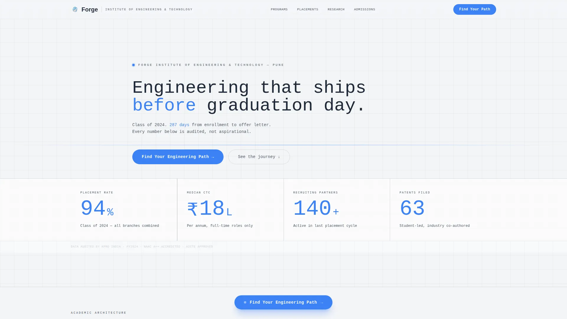
- An animated data header that opens with live counters for placement rate, median salary, recruiter count, and patent filings
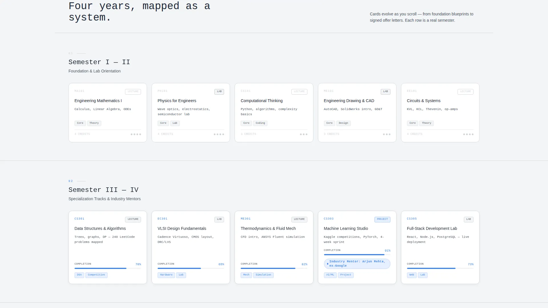
- A four-row card grid that simulates semester progression, with cards that visually evolve from wireframe simplicity to rich achievement badges
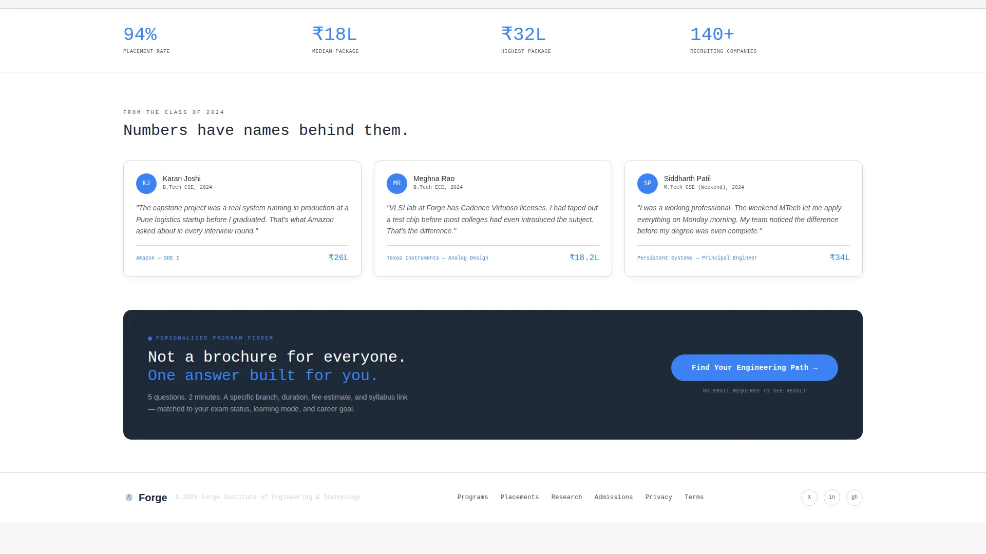
- A five-question guided assessment with a dynamic program recommendation card that includes branch name, duration, fee estimate, and a syllabus download prompt
Feature list
Forge delivers a tightly scoped set of components, each serving a defined role in the visitor journey from first impression to program inquiry.
Animated Data Counter Header
The viewport opens with a single animated counter ticking upward in signal blue against slate typography. Placement percentage, median salary, recruiter count, and patent filings each draw themselves in sequence. A single line of pencil-gray text below contextualises the numbers with a real graduating class reference.
Semester-by-Semester Card Grid
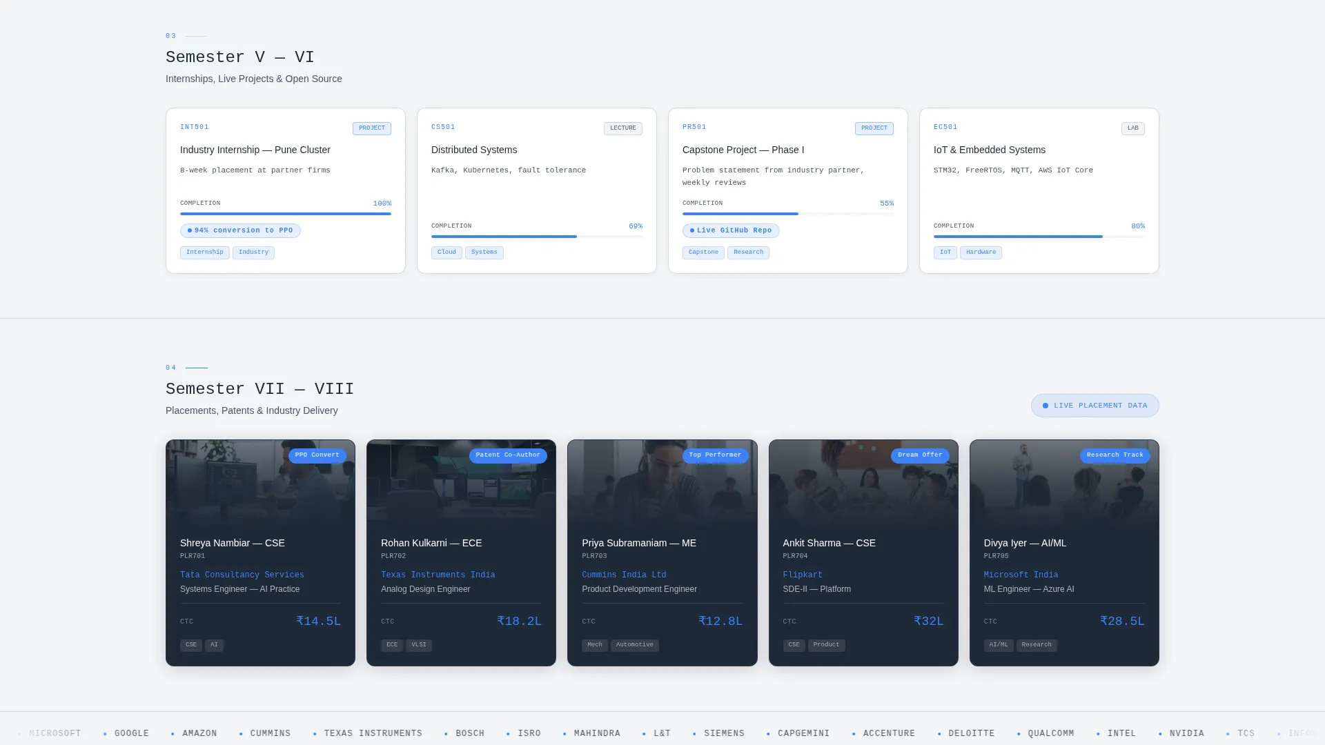
Four rows of cards represent the academic journey from foundation courses to final placements. Each row corresponds to a semester phase, and the cards within each row evolve visually as the visitor scrolls, growing from simple wireframe borders to data visualisations, progress bars, and placement cards with company logos and CTC figures.
Visual Card Evolution on Scroll
Early-stage cards use pencil-gray borders and minimal content. Mid-journey cards introduce progress bars and data visualisations. Final-row cards are fully rendered with photography and signal-blue achievement badges. This progression makes the scroll itself feel like moving through a program.
Floating and Anchored Quiz Call to Action
The primary call to action, labelled "Find Your Engineering Path", appears first as a floating pill after the second card row. It then anchors permanently in the final section. This dual placement ensures the prompt reaches both early deciders and visitors who read to the end.
Five-Question Guided Assessment
Clicking the primary call to action opens a five-question assessment covering subject preference, learning mode, entrance exam status, target graduation year, and career goal. Each answer dynamically narrows the recommendation, culminating in a program card with branch name, duration, fee estimate, and a secondary call to action to download the full syllabus.
Monospaced Data Typography
All headline numbers and key data points are set in a large monospaced typeface, readable from across a room. This typographic choice reinforces the precision engineering identity and ensures figures feel credible rather than decorative.
Page sections overview
| Section | Purpose |
|---|---|
| Animated data header | Opens with live placement and salary counters to anchor credibility immediately |
| Contextual data label | Single-line text beneath counters to ground the numbers in a real graduating class |
| Foundation semester row | First card row covering foundation courses and lab orientations |
| Specialisation semester row | Second card row introducing tracks, industry mentors, and elective paths |
| Internship semester row | Third card row featuring internship dashboards and live project repositories |
| Placement semester row | Fourth card row showing company logos, roles, and compensation figures |
| Floating quiz pill | Mid-page call to action appearing after the second card row |
| Anchored quiz section | Final-page assessment entry point with permanent call to action |
| Program recommendation card | Dynamic output card displaying branch, duration, fee estimate, and syllabus prompt |
Design & branding system
The visual identity follows a Corporate Precision theme built entirely around the Soft Mist color system. There is no warmth here by design. The palette projects the confidence of a clean lab environment, and every color choice has a functional role.
- Morning fog white (#F4F5F7) and brushed aluminum (#D1D5DB) provide the neutral background and surface layers
- Slate pencil (#4B5563) handles all body text and supporting labels, keeping contrast without visual noise
- Signal blue (#3B82F6) is reserved strictly for interactive elements, animated counter figures, and achievement badges, ensuring it always signals action or data significance
Mobile & speed optimization
The card grid layout is structured to reflow cleanly across screen sizes, so the semester progression remains readable whether a visitor is on a desktop in an office or a phone during a commute.
- Card rows stack vertically on smaller screens, preserving the visual evolution from wireframe to rich placement cards
- The floating quiz pill repositions appropriately for touch-friendly interaction on mobile viewports
- Monospaced counter text scales down without losing legibility, keeping the data header impactful on any screen width
How this template helps you convert
Forge is built around a single conversion principle: earn the click by offering something specific, not something broad.
- The animated data header replaces vague aspirational copy with real figures, giving visitors a concrete reason to keep reading within the first three seconds of landing on the page.
- The semester-by-semester card grid builds investment gradually, so by the time visitors reach the placement row they feel they have already experienced the program, making the quiz feel like a natural next step rather than a cold form.
- The five-question assessment delivers a personalised program recommendation rather than a generic brochure, which reduces friction and increases the likelihood that a visitor downloads the syllabus or submits an inquiry.
Other information about this template
Forge is built for the specific intersection of engineering institution marketing and high-intent prospective student research. It is not a general education template. The brief, the layout decisions, and the conversion flow are all calibrated for this niche.
- The template style is Card Grid (Modular), meaning individual section cards can be updated independently without restructuring the full page layout
- The header concept is Data Storytelling, a deliberate choice to lead with outcomes rather than campus photography
- The creative direction is Timeline Progression, which gives the scroll a narrative arc that mirrors the actual student journey through a program
- The primary conversion direction is Quiz and Assessment, with the guided tool designed to surface a single, specific program recommendation rather than routing visitors to a catalogue page
- This template is suitable for institutions offering undergraduate engineering programs, postgraduate technical degrees, and weekend or hybrid professional programs
Theme
Corporate Precision
Creative direction
Timeline Progression
Color system
Soft Mist
Style
Card Grid (Modular)
Direction
Quiz/Assessment
Page Sections
Animated Data Counter Header
Semester-by-semester Card Grid
Visual Card Evolution on Scroll
Five-question Guided Assessment
Dual-placement Quiz Call to Action
Monospaced Precision Typography
Related questions
Can this template support multiple engineering programs or branches?
Does the template require a hero image or campus photography?
Who is this landing page designed for?
What makes this template different from a standard college admissions page?
Can I edit the placement statistics and counter figures?



