Pharmacy Digital Presence Provider Directory Website Template
Formulary is a scroll-reveal landing page template built for pharmacy community forums. It opens with an interactive role-and-interest explorer that surfaces personalized member counts and local thread activity. A progressive section structure reveals discussion threads, a filterable member directory, a CE event calendar, and app screenshots, all driving visitors toward downloading the community app.
by Rocket studio
Quick summary
Formulary is a single-page, scroll-reveal landing page template designed for a pharmacy professional community. It combines an interactive member explorer, a live discussion mosaic, a filterable directory grid, and an event calendar into one cohesive flow. Every section fades in progressively, pulling visitors deeper into the community before a persistent app download call to action locks into the bottom bar.
Who this template is for
This template was built for founders, product teams, or community managers launching a pharmacy-focused professional network. It speaks directly to the pharmacists who would actually join, and the people building for them.
- Staff pharmacists and clinical specialists who need a peer community beyond the dispensary counter
- Pharmacy residents searching for rotation sites, preceptors, and career guidance
- Independent pharmacy owners comparing operational resources and wholesaler information with peers
What problem this template solves
Pharmacy professionals are underserved by generic social platforms. Their conversations are specialized, time-pressured, and deeply clinical. A standard forum landing page cannot convey the depth or the professional trust a pharmacist needs before signing up.
- Visitors cannot tell how active or relevant a community is before they join
- Generic layouts fail to reflect the clinical seriousness and professional identity of pharmacists
- The gap between "interested" and "downloaded the app" is too wide without a personalized, tangible reason to act
What you get with this template
This template delivers a fully structured, progressively animated landing page with every section pre-built and editable. The layout moves from discovery to conversion in a deliberate, layered flow.
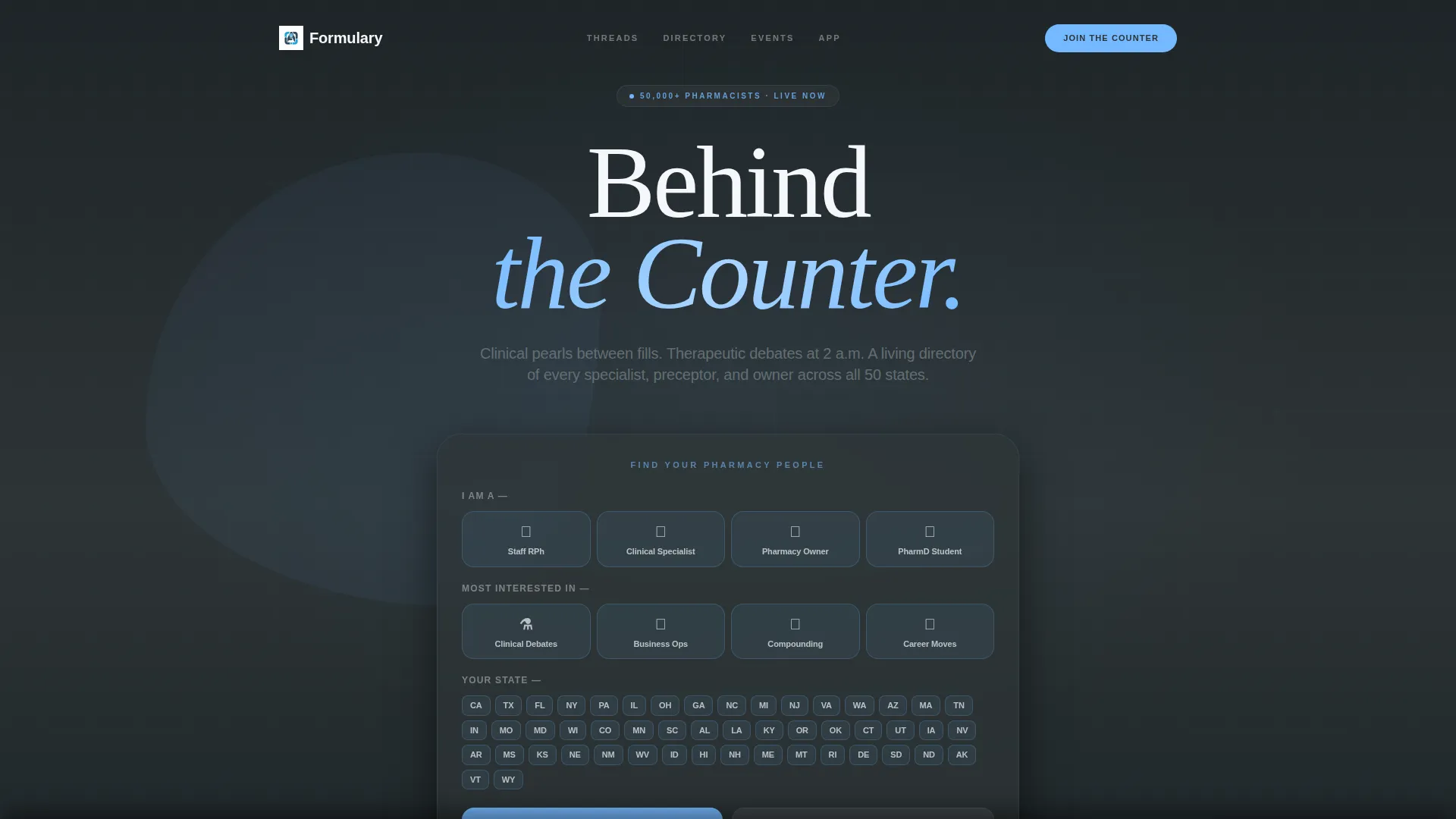
- An interactive "Find Your Pharmacy People" role and interest explorer with a live results preview
- A scroll-reveal section sequence covering discussion threads, member directory, event calendar, and app screenshots
- A dual-path call to action that routes mobile visitors to app store badges and desktop visitors to an SMS download link
Feature list
This template includes purpose-built components that work together to make the community feel real and worth joining. Each one is grounded in the lived experience of pharmacy professionals.
Interactive Member Explorer Header
The page opens with a role-selector estimator. Visitors choose their role (staff pharmacist, clinical specialist, owner, or student), their top interest, and their state from a map interface. As each selection registers, a live preview populates with personalized member counts, active thread topics, and local specialist counts, making the community's depth feel immediate and concrete.
Progressive Scroll Reveal Sections
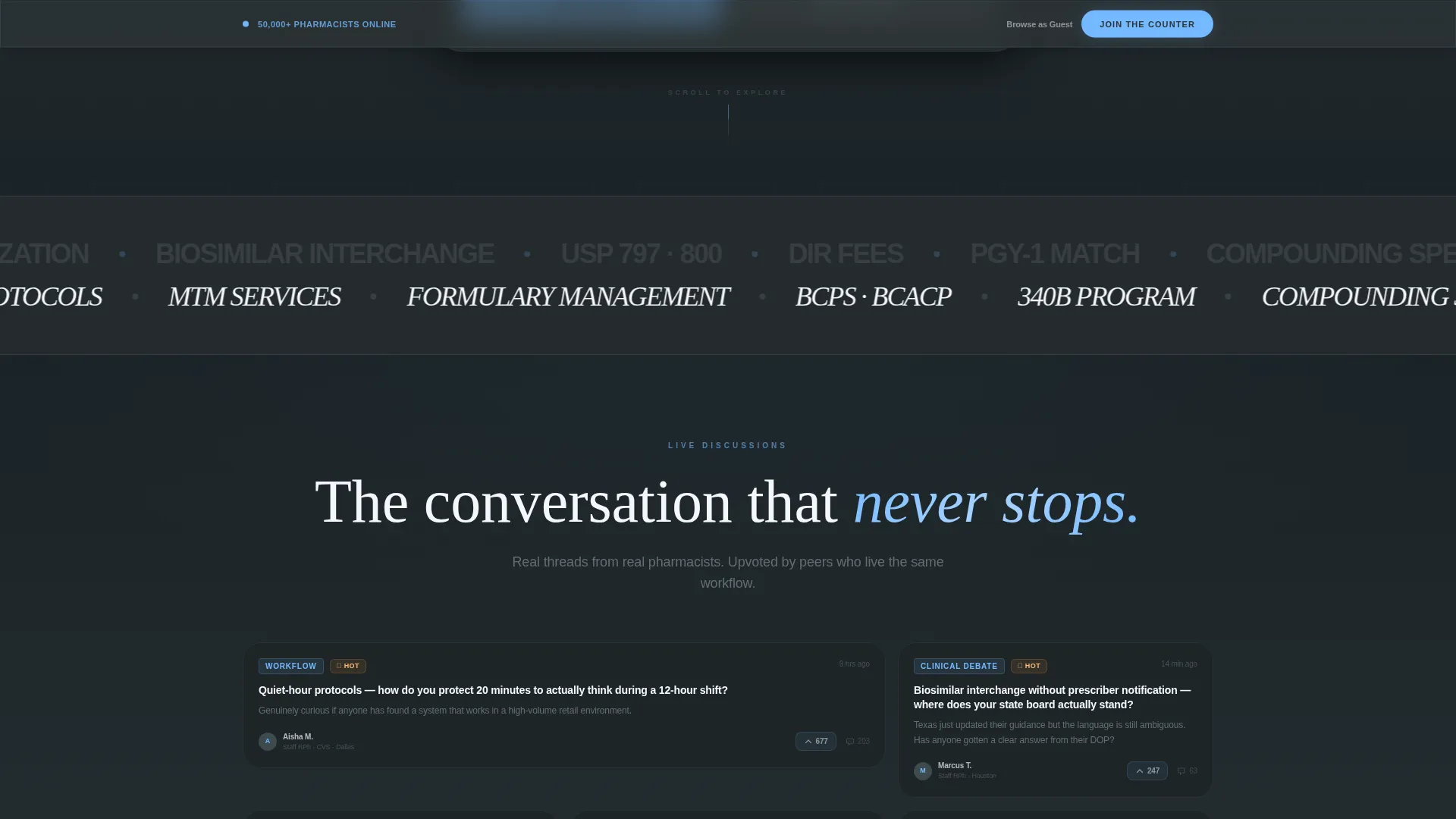
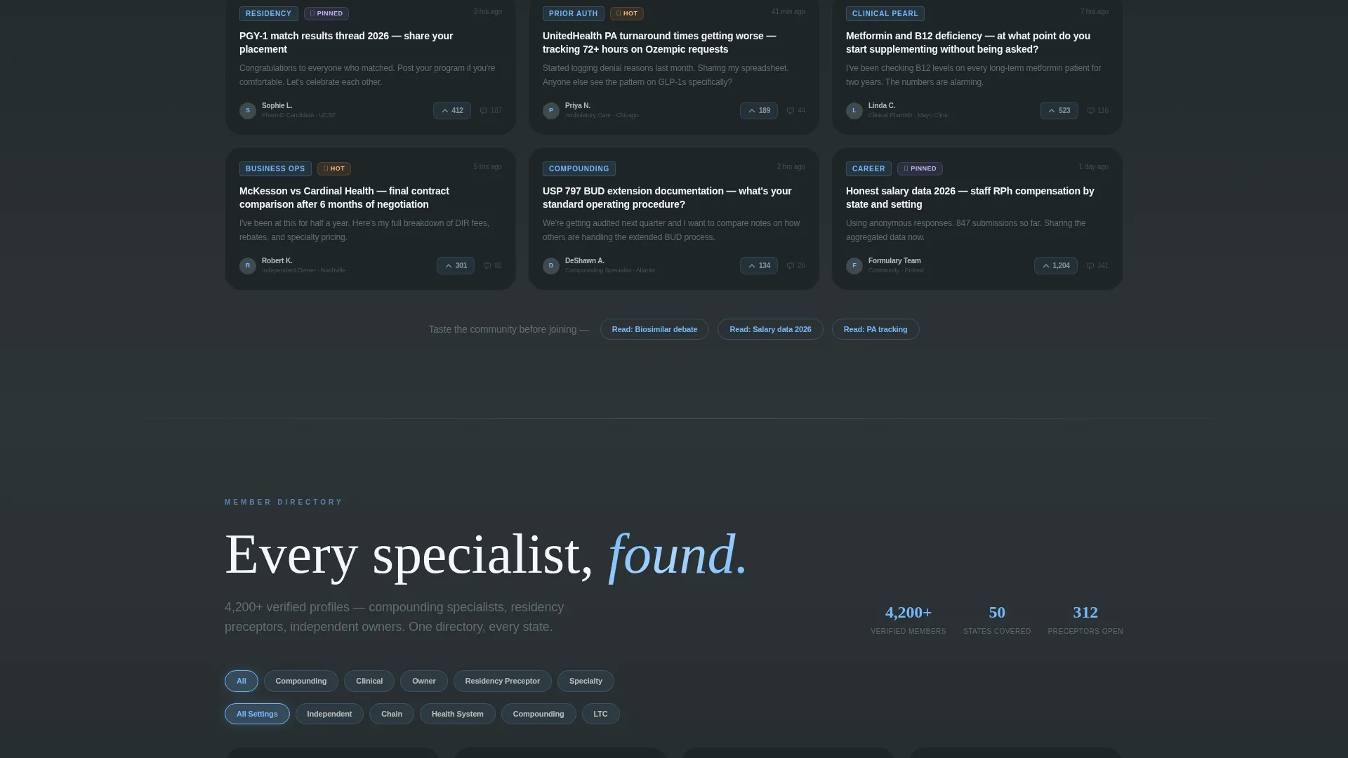
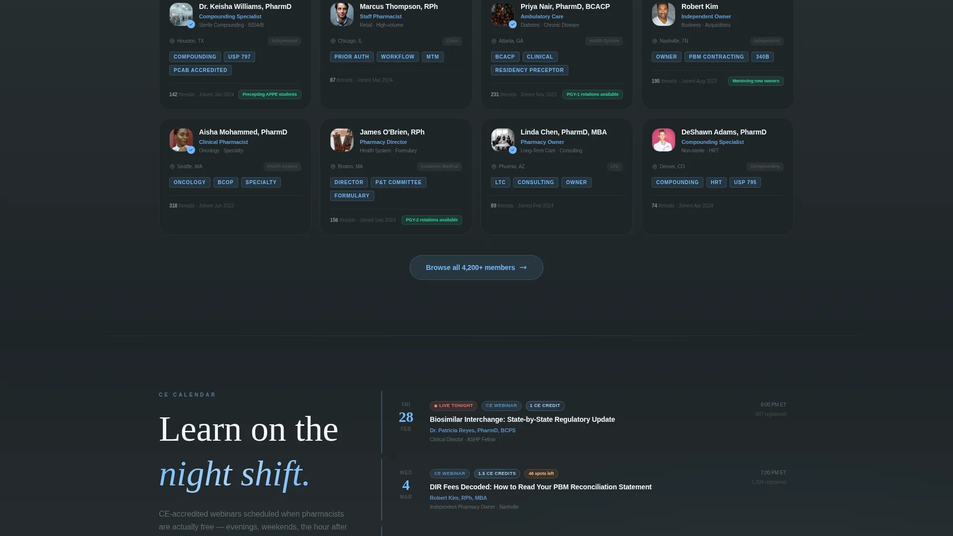
Each scroll event uncovers a new community layer. A discussion thread mosaic fades in first, showing upvote counts and reply depths. A filterable directory card grid follows, with member profiles appearing in sequence. A live event calendar with CE-accredited (continuing education) webinar listings slides into view next. Finally, mobile app screenshot carousels close the sequence with dark-mode interface previews.
Filterable Member Directory Grid
The directory section presents community members as card-style profiles that appear progressively, one by one, like pharmacy labels printing off a queue. Visitors can filter by role, specialty, or location to find compounding specialists, residency preceptors, or independent owners relevant to their practice.
Persistent Bottom Bar Call to Action
After the second scroll reveal, the primary "Join the Counter" call to action locks into a fixed bottom bar. It stays visible as visitors continue scrolling, ensuring the conversion path is never out of reach. The bar does not interrupt reading, it anchors the action without breaking the flow.
Dual-Path App Download Flow
The call to action is device-aware by design. Mobile visitors see App Store and Google Play badges for a direct download. Desktop visitors enter a phone number and receive an instant SMS link. Both paths lead to the same outcome without friction or redirection confusion.
Guest Browse Secondary Path
A secondary "Browse as Guest" link connects skeptical visitors to three read-only discussion threads. This gives undecided visitors a real taste of community content before they commit to downloading the app or creating an account.
Page sections overview
| Section | Purpose |
|---|---|
| Interactive Member Explorer | Opens with role, interest, and state selection that populates live community stats |
| Discussion Thread Mosaic | Reveals real thread tiles with upvote counts and reply depth on first scroll |
| Member Directory Grid | Filterable card grid of community profiles appearing progressively |
| CE Event Calendar | Slides in a live calendar of continuing education webinars and community events |
| App Screenshot Carousel | Shows dark-mode mobile interface screenshots from active late-night threads |
| App Download Call to Action | Dual-path conversion block with device-aware badge and SMS link options |
| Guest Browse Preview | Three read-only thread links giving undecided visitors a no-commitment taste |
Design & branding system
The visual identity follows a Directory and Discovery theme built on the Slate and Sky color system. The palette was chosen to reflect the emotional contrast pharmacists know well: the institutional weight of a clinical environment alongside the openness of stepping outside after a long shift.
- Deep charcoal slate (#2D3436) anchors primary backgrounds; clinical mid-gray (#636E72) handles secondary text and dividers; clean dispensing white (#F5F6FA) surfaces card wells and content areas
- Open-sky blue (#74B9FF) drives every interactive element, including hover states, clickable links, notification badges, and call-to-action buttons
- The overall aesthetic is calm, professional, and directional, serious enough for a pharmacist, open enough to feel like a community
Mobile & speed optimization
The template is structured with a mobile-first interaction layer built directly into its core conversion path. The device-aware call to action is the clearest expression of this, it renders differently depending on how the visitor arrives.
- Mobile visitors see native App Store and Google Play download badges without any additional steps
- Desktop visitors receive an SMS download link entry field, removing the friction of manually finding the app
- The scroll-reveal animation sequence is designed to deliver content progressively, keeping each section focused and uncluttered on any screen size
How this template helps you convert
The conversion strategy in this template works by making the community feel real before asking for any commitment. Personalization and progressive revelation do the heavy lifting.
- The interactive explorer creates a personalized result the moment a visitor arrives, local member counts and active thread previews make the community feel like it already exists around them, not as a generic sign-up pitch.
- The persistent bottom bar call to action appears after visitors have already seen two sections of community evidence, so the prompt to "Join the Counter" lands when trust is already forming rather than at the cold open.
Other information about this template
This template is part of a broader Formulary design system built around the pharmacy professional niche. It is suited for teams building community-led growth products in the pharmacy digital presence space.
- The template style is Scroll Reveal (Progressive), meaning sections animate into view as the visitor scrolls rather than loading all at once
- The header concept is a Calculator and Estimator interaction, a pattern well-suited to community platforms where showing scale early drives sign-up intent
- The creative direction follows an Interactive Explorer approach, where each section behaves like opening a new drawer in a well-organized dispensary
- The landing page direction is App Download, and all conversion paths in the template point toward that single outcome through two device-specific routes
Theme
Directory & Discovery
Creative direction
Interactive Explorer
Color system
Slate & Sky
Style
Scroll Reveal (Progressive)
Direction
App Download
Page Sections
Interactive Role and Interest Explorer
Progressive Scroll Reveal Layout
Filterable Member Directory Cards
Device-aware App Download Call to Action
Persistent Bottom Bar Conversion
Guest Browse Preview Path
Related questions
Who is this landing page template designed for?
Can I edit the member counts and thread previews in the explorer?
What does the Browse as Guest path do?
Does the call to action work differently on mobile and desktop?
Can this template support a pharmacy forum that already has an active member base?



