AI for Pharmaceutical Professional Website Template
Formulary is a pharmaceutical AI recommendation engine landing page built as a bento grid. It features a live drug interaction checker as the hero, a spec-sheet capability grid, and a seven-metric vendor comparison table. Designed for hospital pharmacists, health system technology leaders, and pharmacy benefit managers who need fast, credible answers before committing to a clinical decision support platform.
by Rocket studio
Quick summary
Formulary is a single-page bento grid landing page for a pharmaceutical AI recommendation engine. The template leads with a functional drug interaction checker embedded directly in the header, then inventories platform capabilities cell by cell through animated spec-sheet modules. The entire layout is built to earn trust from clinical evaluators before they ever speak to sales.
Who this template is for
This template is built for teams selling or showcasing a clinical decision support platform in the B2B healthcare space. It speaks directly to high-stakes evaluators who compare vendors on hard data, not marketing language.
- Hospital pharmacists managing prior authorization queues who need a faster lookup workflow
- Health system Chief Technology Officers evaluating clinical decision support vendors against a shortlist
- Pharmacy benefit managers looking to optimize formulary coverage without a lengthy integration cycle
What problem this template solves
Evaluators of pharmaceutical AI tools often cannot tell from a standard landing page whether the platform actually works. A wall of copy and a generic request-demo button do not answer the technical questions that procurement teams carry into every vendor review.
- Buyers have no way to test a tool before booking a sales call, so they disengage early
- Lengthy comparison processes stall decisions when key metrics are buried in PDF datasheets
- Clinical stakeholders distrust marketing copy that lacks precise data points and real capability proof
What you get with this template
You get a complete, conversion-oriented landing page that puts the product experience front and center. Every section is built to answer a specific evaluator question with a visible data point or interactive element.
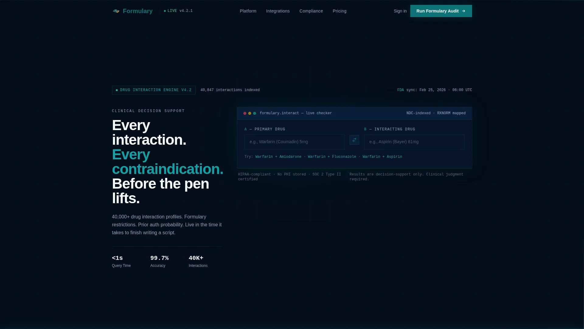
- An interactive drug interaction checker embedded in the hero viewport, with two input fields, autocomplete, and a live output panel showing severity, alternatives, and prior authorization approval probability
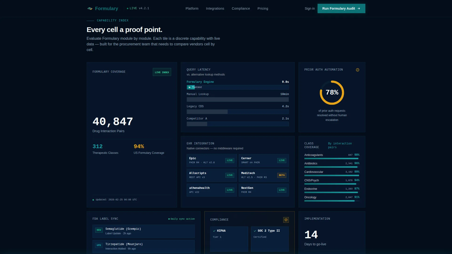
- A bento grid of capability modules covering formulary breadth, query latency benchmarks, and electronic health record integration status badges
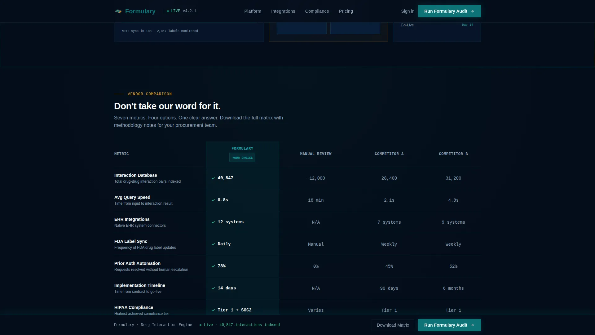
- A seven-metric vendor comparison table, a gated secondary download path, and a persistent call-to-action bar that appears after scroll depth reaches 40 percent
Feature list
This template is built around a set of tightly scoped components that work together to move a skeptical clinical buyer toward action.
Live Drug Interaction Checker
The hero section contains a functioning drug interaction checker with two side-by-side input fields labeled "Enter Drug A" and "Enter Drug B." Autocomplete dropdowns follow real National Drug Code naming conventions. The live output panel below previews interaction severity, alternative recommendations, and an estimated prior authorization approval probability displayed as a percentage gauge.
Animated Bento Grid Modules
Below the header, discrete capability cells each carry a single data argument. One cell shows formulary coverage breadth including drug count, therapeutic class count, and an updated-as-of timestamp. An adjacent cell runs an animated bar race benchmarking query response latency against manual lookup times. Cells reveal with staggered animations and count-up number effects on scroll.
Electronic Health Record Integration Map
A wider bento cell maps integration compatibility across major electronic health record platforms, displaying status badges per system. This gives technology evaluators an immediate read on deployment fit without requiring a discovery call.
Seven-Metric Vendor Comparison Table
The mid-page comparison table measures the platform against manual review workflows and two anonymized competitor categories. The seven metrics are interaction database size, average query speed, electronic health record integrations, FDA label sync frequency, prior authorization automation rate, implementation timeline, and Health Insurance Portability and Accountability Act compliance tier.
Gated Vendor Matrix Download
A secondary conversion path offers a downloadable vendor comparison matrix. Access is gated behind a work email address and health system name input, creating a qualified lead capture point without interrupting the primary evaluation flow.
Persistent Audit Call-to-Action Bar
A "Run Your Formulary Audit" call-to-action appears both inside the header estimator and as a persistent bottom bar that activates after the visitor scrolls past 40 percent of the page. This dual placement keeps the primary action visible throughout the evaluation journey.
Page sections overview
| Section | Purpose |
|---|---|
| Hero Interaction Checker | Lets visitors run a live drug interaction query before any sales contact |
| Bento Capability Grid | Inventories platform proof points as discrete, scannable data modules |
| Latency Benchmark Cell | Visualizes query speed advantage over manual lookup with bar race animation |
| EHR Integration Map | Shows compatibility status badges for major electronic health record systems |
| Vendor Comparison Table | Compares platform against manual workflows and anonymized competitors across seven metrics |
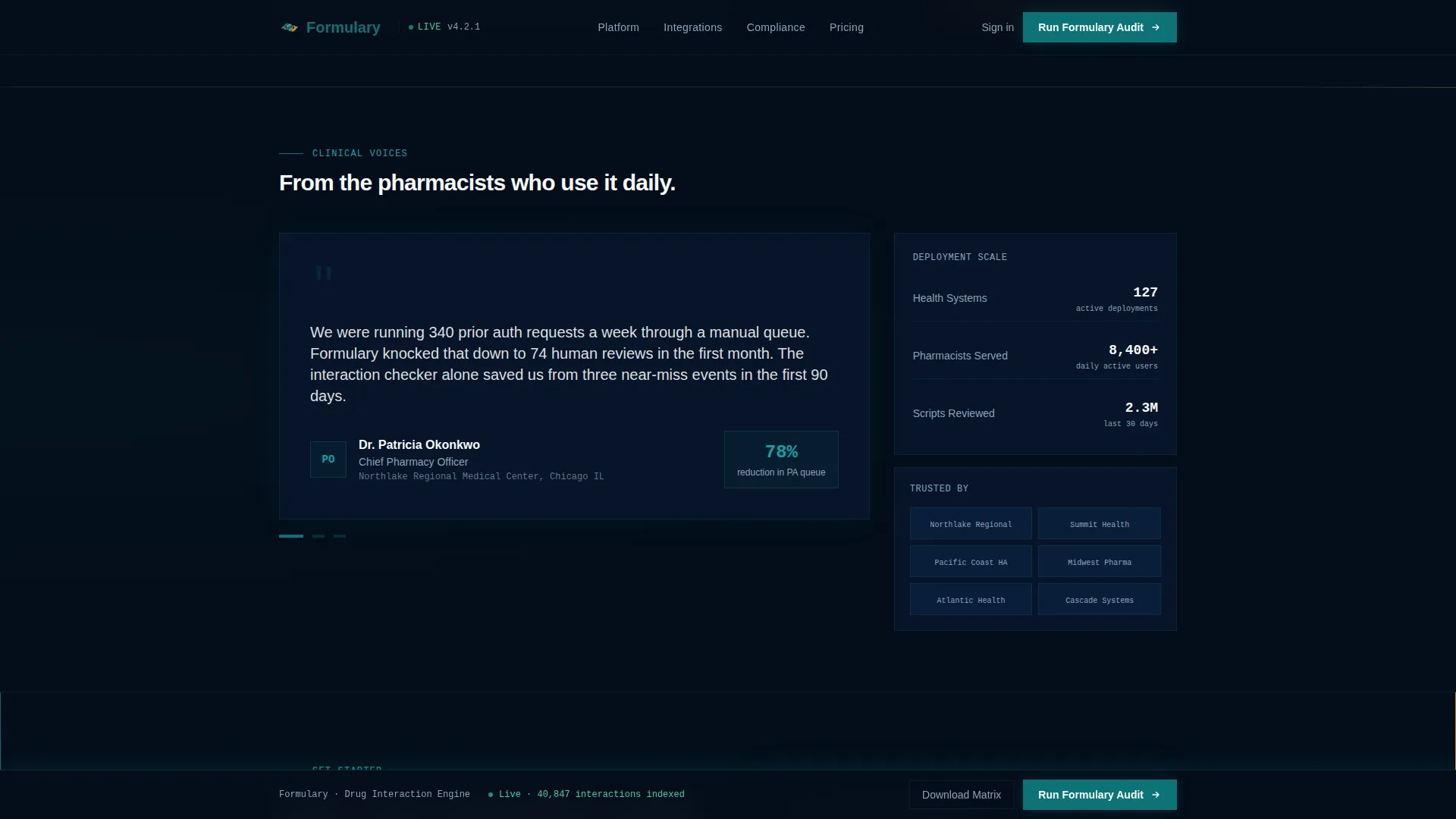
| Social Proof Rail | Displays health system logos and pharmacist-sourced testimonials |
| Gated Matrix Download | Captures qualified leads through a vendor comparison matrix behind a short form |
| Persistent call to action Bar | Keeps the primary audit action visible once scroll depth passes 40 percent |
| Footer | Single-row linear layout with navigation and contact essentials |
Design & branding system
The visual identity uses a Teal Catalyst color system designed to feel like controlled chemical precision. Deep pharma teal carries the primary brand weight, while reaction-state amber signals alerts and interactive highlights. The overall effect is clinical and alive at the same time.
- Deep pharma teal (#0D7377) as the primary identity tone, clinical white (#F7FAFA) for card backgrounds and breathing space, reaction-state amber (#E8A317) for alert states and comparison highlights, and carbon charcoal (#1C2833) for body text and data labels
- JetBrains Mono handles all data outputs in the interaction checker and metric cells, creating a machine-precision signal; DM Sans handles labels and body copy for human readability
- Beam border animations, staggered bento cell reveals, and animated count-up numbers reinforce the spec-sheet aesthetic throughout the scroll experience
Mobile & speed optimization
The template is built desktop-first, reflecting the primary audience of pharmacists and technology leaders working at clinical workstations. Responsive layouts ensure the bento grid and comparison table remain readable on smaller screens.
- Static sections use server-side rendering for fast initial load; the interactive drug checker and animations load as client components to keep performance balanced
- The bento grid reflows into a single-column stack on mobile so capability modules remain scannable on any device
- High-animation elements including beam borders, bar race cells, and count-up numbers are scoped to client rendering to avoid blocking the initial page paint
How this template helps you convert
The conversion strategy is built around letting the prospect use the product before they ever speak to a salesperson. Every design decision reduces the distance between arriving on the page and experiencing real platform value.
- The drug interaction checker in the hero is the first thing a visitor can touch. Running a live query creates immediate product familiarity and builds confidence faster than any written claim could.
- The bento grid follows spec-sheet logic, giving procurement evaluators a cell-by-cell inventory of capabilities they can reference in a vendor review without needing a demo.
- The dual call-to-action placement and the gated download create two distinct conversion paths that match different buyer readiness levels, capturing both ready-to-act and still-evaluating visitors in the same scroll session.
Other information about this template
This template belongs to the Directory and Discovery theme family and uses the Spec Sheet creative direction, making it well suited for any B2B platform that needs to demonstrate capability density rather than tell a brand story. The bento grid template style is particularly effective when the product has multiple discrete, comparable features that each deserve their own proof point.
- The Comparison/Versus landing page direction means the layout is structured to win vendor evaluations, not just generate awareness
- The Calculator/Estimator header concept positions the tool itself as the hero, which works for any platform where the core value is interactive and demonstrable
- This template is built for the pharmaceutical AI recommendation engine niche but the layout structure adapts well to other clinical decision support or healthcare data platform products
Theme
Directory & Discovery
Creative direction
Spec Sheet
Color system
Teal Catalyst
Style
Bento Grid
Direction
Comparison/Versus
Page Sections
Live Drug Interaction Checker Hero
Animated Bento Capability Grid
EHR Integration Status Badges
Seven-metric Vendor Comparison Table
Dual Conversion Path Design
Related questions
Who is this landing page template designed for?
Can visitors actually use the drug interaction checker on the page?
What does the vendor comparison table include?
How does the gated download work?
Is this template desktop-first or mobile-first?



