Advanced Pharmaceutical Digital Presence Comparison Website Template
The Formulary landing page template is built for pharmaceutical intelligence platforms that convert hospital pharmacy directors, managed-care pharmacists, and biotech business development leads into trial members. It pairs a Data Command visual identity with a glassmorphic comparison table, a freemium trial conversion flow, and a Problem-to-Solution scroll arc that proves platform depth before asking for a signup.
by Rocket studio
Quick Summary
This landing page template is purpose-built for a gated pharmaceutical intelligence platform. It opens with a full-bleed dark hero, flows through a signal-versus-noise visualization, and delivers a glassmorphic Free versus Pro comparison table. The primary goal of the page is to convert pharmacy and healthcare professionals into 14-day trial members using institutional credibility and redacted intelligence previews.
Who This Template Is For
This template serves teams creating a high-stakes landing page for a pharmaceutical membership site. The page is designed for buyers and builders who need to earn trust from technically rigorous, time-scarce professionals before asking for a signup.
- Hospital pharmacy directors who benchmark biosimilar switches and need a page that speaks their language
- Managed-care pharmacists building formulary dossiers who evaluate platforms on data depth and source transparency
- Biotech business development leads tracking competitor mechanism-of-action overlaps who rely on early pipeline signals
What Problem This Template Solves
Pharmacy and healthcare professionals are drowning in FDA filings, patent records, and pipeline catalogs. The traditional Pharmacy and Therapeutics (P&T) process is often inefficient because it relies on lagging data and manual review. Most platforms offer raw data without context. What pharmacists and clinicians actually need is parsed, prioritized intelligence they can act on before the rest of the market catches up.
This landing page template gives you a structured, high-converting page that communicates that value instantly. Visitors take only a few seconds to determine the usefulness and quality of a webpage, and this template is engineered to clear that threshold. It solves three specific problems for the person building the page:
- No clear way to show the gap between free-tier limitations and the depth of pro-tier intelligence in a single view
- No ready-made visual language that feels credible to pharmacy professionals, not like a generic software website
- No conversion flow built around the freemium trial model with a gated PDF secondary path and sticky call-to-action bar
What You Get With This Template
This template delivers a complete, production-ready landing page with every section pre-built and visually coherent. The page teaches visitors that without the platform, they are drinking from a firehose. Each section compresses raw complexity into a single parsed output. You get a page that generates trust, captures institutional emails, and moves users toward trial signup without friction.
- A full glassmorphic comparison table with Free and Pro tier rows, phosphor cyan glow states, and hover interactions built in
- A hero section featuring an animated wireframe molecule, pipeline data constellation overlays, and a benefit-driven headline in clinical white
- A freemium conversion system including a 14-day trial signup form, a sticky bottom call-to-action bar triggered at 60 percent scroll depth, and a gated PDF modal for the sample pipeline brief
Feature List
This landing page template ships with six purpose-built sections and a suite of interactive components. Each feature is grounded in the Data Command design system and the freemium-to-trial conversion model described in the source brief.
Animated Dark Full-Bleed Hero
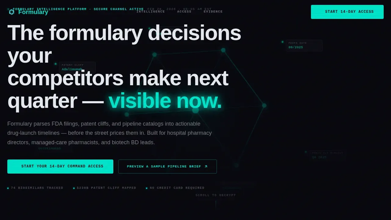
The hero opens on a void black viewport where a single compound molecule structure rotates slowly in wireframe cyan. Real pipeline data points fade in around it like constellations: PDUFA dates, patent cliff identifications, and Phase III readout windows. The headline materializes in clinical white, immediately communicating the platform's predictive power. No stock photography, no smiling pharmacists. Just signal. This section sets the tone for every pharmacy and healthcare professional who lands on the page.
Glassmorphic Free versus. Pro Comparison Table
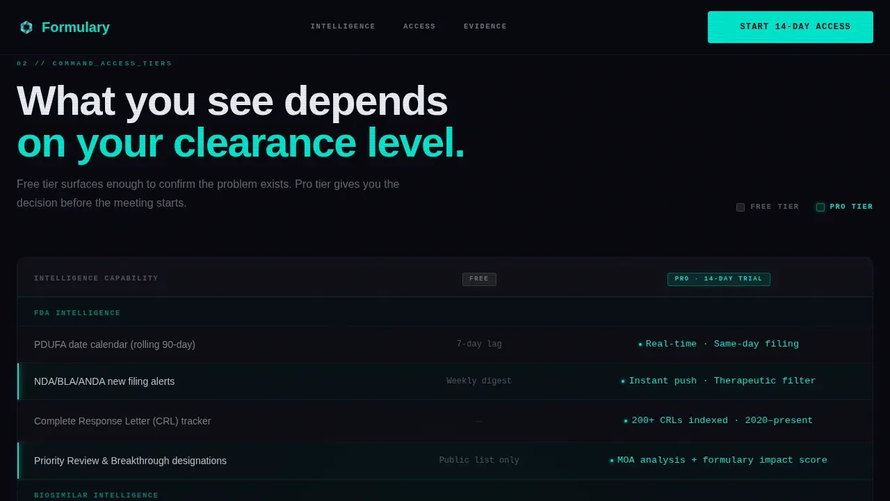
The comparison table is the centrepiece of the landing page. It is built as a frosted-glass panel where Free tier rows glow dimly and Pro tier rows burn full phosphor cyan. Each row communicates a specific capability difference: access to FDA filing analysis, pipeline catalog depth, patent cliff timelines, drug interaction flagging, and dosing data coverage. The table functions as a central educational tool that helps decision-makers visualize complex data at a glance, making the cost of staying on the free tier immediately legible.
Signal versus. Noise Visualization Section
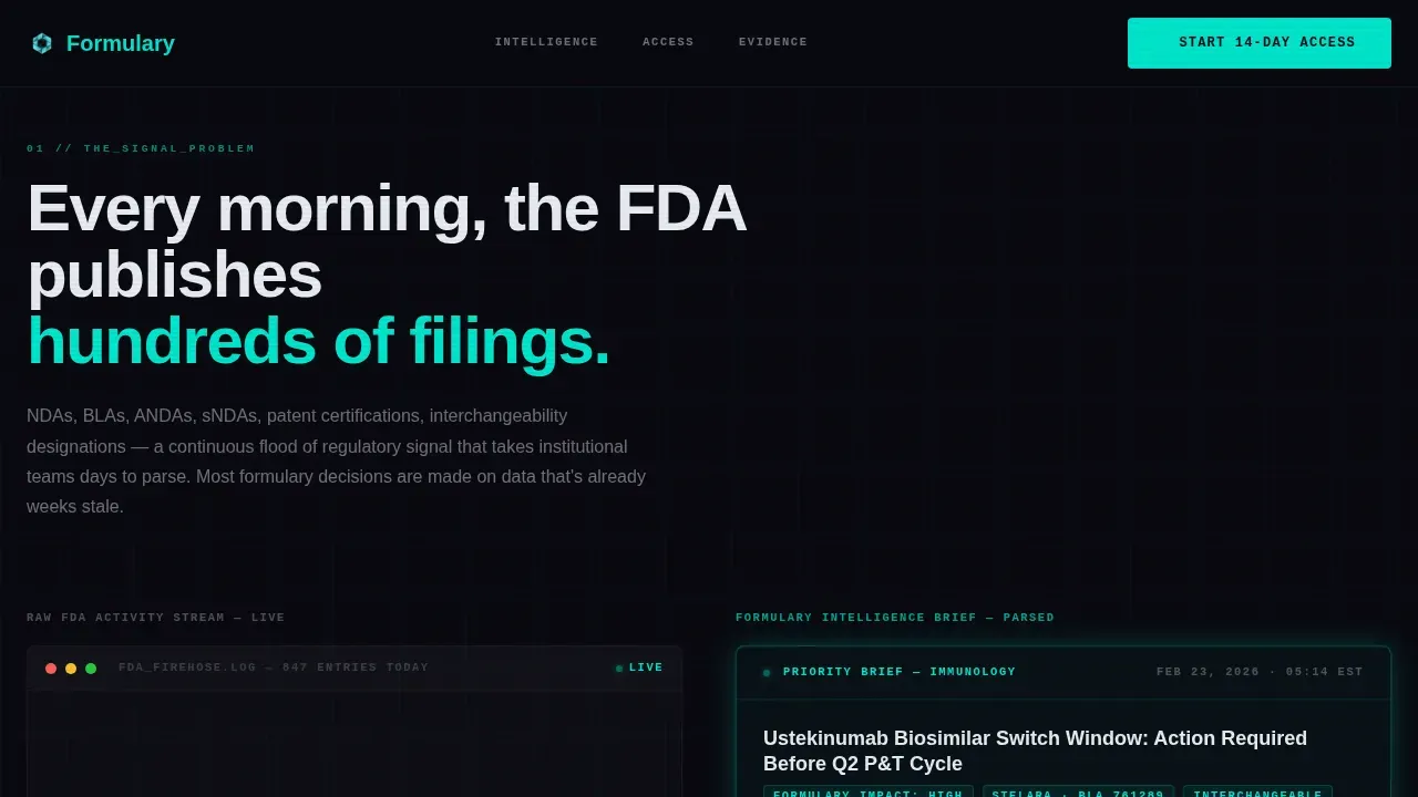
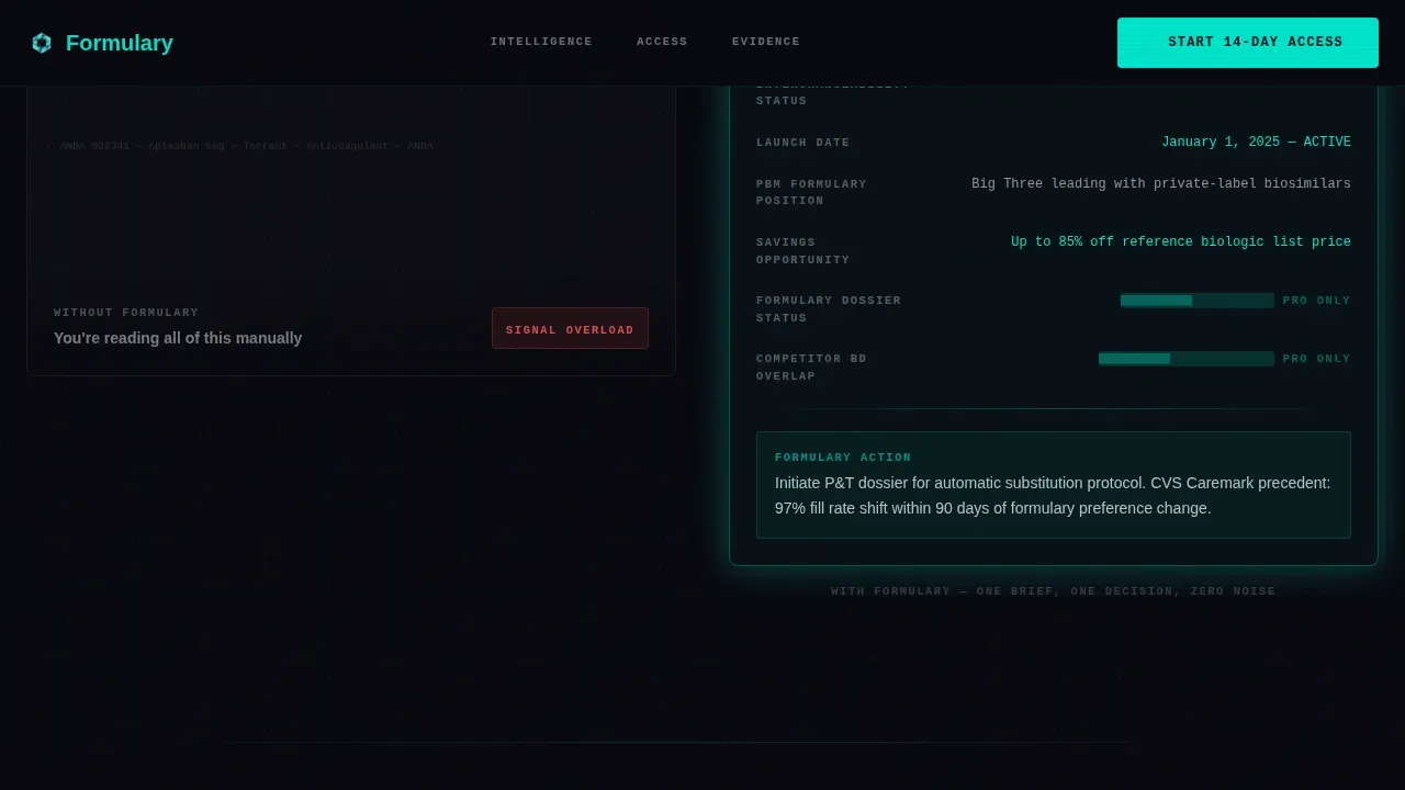
This section opens with a visualization of hundreds of NDAs, BLAs, and ANDAs streaming past in muted text, representing the raw volume of FDA activity. The animation then collapses into a single, clean glassmorphic card showing one actionable insight. The visual rhythm teaches the visitor what the platform actually does: it filters noise into signal. This is where the page earns its description as a clinical decision support tool rather than a data aggregator.
Freemium Trial Conversion Form
The primary call-to-action reads "Start Your 14-Day Command Access." The form asks only for an institutional email address and a therapeutic area of interest selected from a dropdown: oncology, immunology, rare disease, or cardiovascular. No credit card is required. The form appears first beneath the comparison table, then again inside the sticky bottom bar after scroll depth reaches 60 percent. This dual placement captures users who convert early and users who need more page context before they commit.
Gated PDF Modal for Pipeline Brief Preview
A secondary conversion path lets visitors preview a sample pipeline brief as a gated PDF. The modal captures the same institutional email field, creating a lower-friction entry point for visitors who are not yet ready for the full trial. The PDF preview shows redacted glimpses of real intelligence: enough depth to prove the platform's quality, not enough to satisfy without access. This information gap is the mechanic that drives trial signups.
Institutional Social Proof Section
The social proof section features named institutional testimonials with specific outcome metrics: biosimilar switch results, formulary dossier completion timelines, and pipeline identification leads. These are not generic quotes. They are positioned to resonate with pharmacists and clinicians who evaluate services on measurable outcomes. The section reinforces that real healthcare professionals, working in real health systems, rely on this platform to protect formulary strategies and improve patient care decisions.
Page Sections Overview
| Section | Purpose |
|---|---|
| Hero Full-Bleed | Rotates wireframe molecule with pipeline data constellation overlays and a benefit-driven headline |
| Signal versus. Noise | Visualizes FDA filing volume collapsing into one parsed glassmorphic intelligence card |
| Comparison Table | Displays Free versus. Pro tier rows with phosphor cyan glow to clarify access differences |
| Social Proof | Presents institutional testimonials with specific outcomes for pharmacists and healthcare professionals |
| Trial Signup Form | Captures institutional email and therapeutic area to start 14-day Command Access |
| Sticky call to action Bar | Triggers at 60 percent scroll depth with the primary trial call-to-action |
| Gated PDF Modal | Secondary conversion path for visitors to preview a sample pipeline brief |
| Footer Pattern | Horizontal footer layout with platform links and brand mark |
Design & Branding System
The visual identity follows a Data Command theme executed through a glassmorphic color system. Every design decision supports the feeling of pulling up a classified terminal at 5 a.m., glow on your face, certain you are seeing something others will not find for weeks. The palette is dark, layered, and surgically legible. The typography pairing keeps data labels precise and body copy readable.
- Color system: void black (#09090F) as the base, translucent card layers at rgba(255,255,255,0.05), phosphor cyan (#00E5CC) for live-data accents and glowing borders, and clinical white (#E8ECF1) for all body text
- Typography: JetBrains Mono for data labels, drug name displays, FDA filing references, and dosing values; DM Sans for paragraph body copy, descriptions, and call-to-action text
- Animation system: rotating molecule SVG in the hero, matrix-style data stream in the Signal versus. Noise section, GSAP scroll reveals across section transitions, and counter animations on key metric callouts
Mobile & Speed Optimization
The template is designed desktop-first because pharmacy directors and clinicians work at terminals. The layout prioritizes the full comparison table experience and animated hero on large screens. Responsive behavior carries the core experience cleanly to tablet viewports, where the most critical content, the comparison table and signup form, remains fully functional and readable.
- Desktop-first layout with responsive scaling to tablet, preserving comparison table legibility and form usability at smaller breakpoints
- Server Components power the static sections of the page for fast initial load, while Client Components handle animations, sticky bar behavior, and modal interactions
- Images and SVG assets are optimized for professional display on high-resolution screens, supporting the premium brand impression the page depends on
How This Template Helps You Convert
This landing page is engineered around a freemium-to-trial conversion model. Every section is sequenced to build information debt: the visitor sees enough to understand the platform's depth, and not enough to act without signing up. The page does not rely on aggressive selling. It relies on demonstrated intelligence and a carefully designed information gap.
- The comparison table creates immediate conversion pressure by showing exactly what Pro tier access unlocks. Free tier rows glow dimly. Pro tier rows burn full cyan. The visual difference communicates value faster than any paragraph of copy. A high-converting landing page for pharmaceutical intelligence must feature a detailed comparison table as its central trust mechanism, and this template delivers exactly that.
- The dual call-to-action placement, first under the comparison table and again in the sticky bar at 60 percent scroll, captures both early converters and visitors who need the full social proof and gated PDF sections before they commit. The signup form asks only for an institutional email and therapeutic area, removing every barrier that is not essential to starting the trial.
Other Information About This Template
This template is specifically built for the pharmaceutical intelligence niche within the broader healthcare industry. It reflects real formulary management workflows and the strategic pressures facing pharmacy teams and biotech professionals today. The following notes provide additional context for buyers evaluating this template.
- A formulary is a continually updated list of prescription drugs covered by a health plan or stocked by a healthcare facility. The template's comparison table structure mirrors the tiered logic that pharmacy and therapeutics (P&T) committees use when they evaluate which drugs make it onto a formulary and determine their tier placement.
- Formularies are organized into tiers: Tier 1 typically has the lowest copay for generic drugs, while higher tiers incur greater costs for patients. The comparison table in this template maps Pro versus Free access using the same tiered visual logic, so pharmacists instantly recognize the framework.
- Formularies can be categorized as open, which covers most drugs but may have higher costs, or closed, which excludes many drugs and favors preferred, cheaper products. This context shapes the kind of formulary dossier work the platform's members perform, and the template's messaging reflects those use cases.
- Utilization management rules within formularies can include prior authorization requirements, step therapy protocols, and quantity limits. These are the workflows that managed-care pharmacists navigate daily, and the platform's intelligence is positioned to streamline the analysis behind those decisions.
- Drug patent data is emerging as a critical strategic asset for healthcare organizations. The ability to track patent expirations and litigation statuses is crucial for formulary managers. Integrating real-time patent information into decision-making workflows allows pharmacies and hospitals to automate and sharpen their formulary strategies.
- The 180-Day Generic Drug Exclusivity period is granted to the first generic company that successfully challenges a brand-name drug's patent. Pharmacies can use patent data to support patient counseling and adherence when switching from brand-name drugs to generic alternatives.
- Artificial intelligence and machine learning are reshaping how pharmacy professionals search and evaluate drug pipeline data. AI-driven clinical decision support systems enhance diagnostic accuracy and medication selection. Machine learning algorithms predict drug responses and flag potential drug-drug interactions, supporting safer and faster formulary decisions. The integration of artificial intelligence in healthcare is progressively transforming diagnostic workflows and therapeutic decision-making across health systems.
- Predictive analytics and the predictive power of machine learning models allow clinicians and pharmacists to evaluate risk before adverse effects reach patients. AI systems can analyze large datasets to identify drug-drug interactions and adverse drug reactions, supporting patient safety at scale.
- The platform's intelligence covers clinical data including clinical trial data, patent cliff timelines, pipeline catalog depth, and biosimilar readout windows. These data layers support analysis across indications including oncology, immunology, rare disease, and cardiovascular drug classes.
- Comparing a drug across multiple pharmacy benefit managers (PBMs) helps manufacturers identify preferred or non-preferred tier placements and understand potential access gaps. A formulary comparison table can also highlight trends in utilization management constraints and inform contract negotiations with payers.
- This template is a comprehensive guide for teams creating a pharmaceutical membership landing page. It covers the full formulary pharmaceutical intelligence comparison table landing page template pattern: hero, signal-versus-noise, comparison table, social proof, trial form, and footer.
- The design system avoids a black box approach to data presentation. Data integrity signals are built into the page layout, and every intelligence card is positioned to show source transparency rather than obscuring where the data comes from.
- Healthcare professionals who rely on this type of platform include hospital pharmacy directors, managed-care pharmacists, and biotech business development leads. Case studies and institutional testimonials from these professionals are featured in the social proof section to build credibility with the same audience the page is targeting.
- The page's freemium model protects the platform's full intelligence behind the trial wall, while the gated PDF path creates a lower-friction entry point. This dual-path approach is designed to generate signups from visitors at different stages of evaluation, whether they are ready to start a trial today or want to review a sample pipeline brief first.
- Cost savings are a meaningful outcome for healthcare organizations that automate formulary strategies using real-time patent and pipeline intelligence. The template's messaging is structured to communicate this benefit without overpromising specific financial outcomes.
- Security for institutional data is a design consideration in the template's form architecture: the signup flow collects only institutional email and therapeutic area of interest, minimizing data exposure at the point of first contact.
Theme
Data Command
Creative direction
Problem→Solution Arc
Color system
Glassmorphic
Direction
Freemium/Trial
Page Sections
Animated Dark Full-bleed Hero
Glassmorphic Free Versus. Pro Comparison Table
Signal Versus. Noise Visualization
Freemium Trial Conversion Form
Gated PDF Pipeline Brief Modal
Institutional Social Proof Section
Related questions
What are the three types of formulary systems?
What drug comparison resources are available on a platform like this?
What is artificial intelligence in pharmaceutical analysis?
What is the future of pharmacy with AI?
Does this template support a freemium conversion model?



