AI for Pharmaceutical Professional Website Template
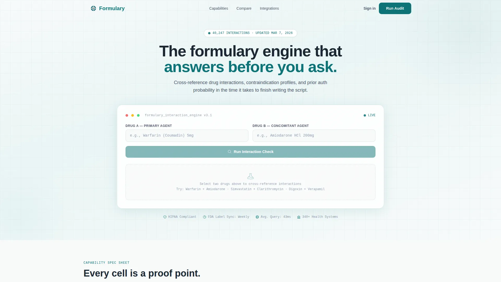
Formulary is a bento grid landing page template built for pharmaceutical AI decision support tools. It features a live drug interaction checker in the hero, spec-sheet capability tiles, a seven-metric vendor comparison table, and a persistent audit call to action. The Teal Catalyst color system and monospaced data typography give it a clinical, high-trust feel built for enterprise evaluators.
by Rocket studio
Quick summary
Formulary is a single-page landing page template designed for pharmaceutical AI recommendation engines. The hero embeds a functioning drug interaction checker directly in the viewport. Below it, a bento grid of capability modules inventories proof cell by cell. A mid-page comparison table and a persistent call-to-action bar guide enterprise buyers toward conversion without requiring a sales call first.
Who this template is for
This template speaks directly to enterprise healthcare technology buyers who need hard evidence before committing to a vendor. It is built for teams operating in regulated, high-stakes clinical environments where ambiguity costs time and patient safety.
- Hospital pharmacists managing heavy prior authorization queues who need faster drug interaction lookups
- Health system Chief Technology Officers evaluating clinical decision support vendors against competing platforms
- Pharmacy benefit managers seeking formulary optimization tools that avoid lengthy integration timelines
What problem this template solves
Most pharmaceutical software landing pages bury their capabilities in marketing copy. Evaluators in clinical environments want data, not promises. This template solves the credibility gap by turning the product itself into the first interactive experience a visitor has.
- Prior authorization workflows are slow, and prospects need to see speed proof before trusting a vendor
- Vendor comparison is tedious without a side-by-side reference, so buyers default to familiar but inefficient manual processes
- Generic healthcare SaaS pages fail to communicate clinical precision, causing qualified prospects to disengage early
What you get with this template
You get a complete, conversion-focused landing page template structured around proof and interactivity. Every section earns its place by delivering a discrete, verifiable argument rather than decorative copy.
- A live drug interaction checker hero with dual input fields, autocomplete dropdowns, and a live output panel showing severity, alternatives, and prior authorization probability
- A bento grid of spec-sheet capability tiles covering formulary breadth, latency benchmarks, and electronic health record integration status badges
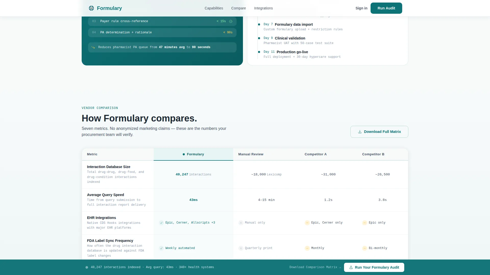
- A seven-metric vendor comparison table, a gated secondary download path, and a persistent "Run Your Formulary Audit" call-to-action bar triggered at 40 percent scroll depth
Feature list
This template is built around interactive proof, clinical visual design, and enterprise conversion architecture. Each feature below maps directly to a section or component in the template.
Live Drug Interaction Checker Hero
The header embeds a fully interactive drug interaction checker in the viewport. Two side-by-side input fields accept drug names using National Drug Code (NDC) naming conventions with autocomplete dropdowns. A live output panel below displays interaction severity, alternative drug recommendations, and an estimated prior authorization approval probability shown as a percentage gauge.
Bento Grid Capability Modules
Below the hero, a bento grid arranges discrete spec-sheet tiles. Each tile presents a single data point with its own micro-interaction. One cell shows formulary coverage breadth including drug count, therapeutic classes, and an updated-as-of timestamp. An adjacent cell runs an animated bar race benchmarking query response latency against manual lookup times.
Electronic Health Record Integration Status Panel
A wider bento cell maps integration compatibility across Epic, Cerner, and Allscripts using color-coded status badges. This gives Chief Technology Officers an instant compatibility snapshot without reading documentation. The visual format mirrors the spec-sheet logic used throughout the rest of the page.
Seven-Metric Vendor Comparison Table
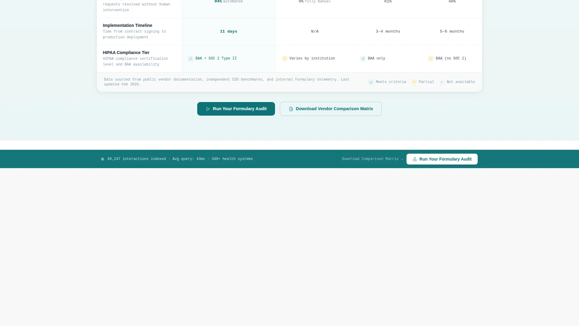
A mid-page comparison table pits the engine against manual review workflows and two anonymized competitor categories. The seven metrics are interaction database size, average query speed, electronic health record integrations, Food and Drug Administration (FDA) label sync frequency, prior authorization automation rate, implementation timeline, and HIPAA compliance tier.
Persistent Audit Call-to-Action Bar
After a visitor scrolls past 40 percent of the page, a persistent bottom bar appears with the primary call to action: "Run Your Formulary Audit." This keeps the conversion path visible without interrupting the evaluation flow. The bar complements the same call to action embedded inside the hero calculator.
Gated Vendor Comparison Download
A secondary conversion path offers a downloadable vendor comparison matrix. Access requires a work email address and health system name. This gates a high-value asset behind minimal friction while qualifying the lead before any sales contact occurs.
Page sections overview
| Section | Purpose |
|---|---|
| Hero Interaction Checker | Embeds live drug interaction tool directly in the opening viewport |
| Formulary Breadth Tile | Displays drug count, therapeutic classes, and data freshness timestamp |
| Latency Benchmark Tile | Animated bar race comparing query speed against manual lookup time |
| EHR Integration Panel | Status badges for Epic, Cerner, and Allscripts compatibility at a glance |
| Vendor Comparison Table | Side-by-side seven-metric comparison against manual workflows and competitors |
| Gated Download Form | Collects work email and health system name to release comparison matrix |
| Persistent call to action Bar | Keeps "Run Your Formulary Audit" visible after 40 percent scroll depth |
| Footer Row | Linear single-row footer with navigation and supporting links |
Design & branding system
The Teal Catalyst color system anchors the visual identity in clinical authority while keeping the interface alive with data-driven energy. Typography pairs monospaced data outputs with a humanist sans-serif for labels, creating a deliberate contrast between machine precision and human readability.
- Deep pharma teal (#0D7377) as the primary identity tone, clinical white (#F7FAFA) for card backgrounds and whitespace, reaction-state amber (#E8A317) for alerts and interactive comparison highlights, and carbon charcoal (#1C2833) for body text and data labels
- JetBrains Mono for all data outputs and numeric readouts, DM Sans for labels, body copy, and navigation elements
- Directory and Discovery theme expressed through the bento grid layout, where each cell functions as a self-contained information module rather than decorative content
Mobile & speed optimization
The template is built desktop-first, reflecting the workstation context of hospital pharmacists and health system technology evaluators. Static layout sections use server-rendered components to keep initial load fast. Interactive elements are isolated as client components so they do not block the rest of the page.
- Server Components handle all static bento tiles, the comparison table, and the footer to minimize JavaScript payload on load
- The interactive hero calculator runs as a dedicated Client Component, keeping interactivity scoped and load performance predictable
- Scroll-triggered animations, counter reveals, and the persistent call-to-action bar activate progressively as the visitor moves down the page
How this template helps you convert
This template is structured so that every scroll depth earns trust before asking for action. The conversion architecture follows a show-first, ask-second logic that matches how enterprise clinical buyers actually evaluate software.
- The hero calculator lets visitors use the product immediately, building functional trust before any marketing copy appears, and the embedded "Run Your Formulary Audit" button captures intent at peak engagement
- The bento grid tiles and comparison table deliver verifiable proof metrics that satisfy the analytical evaluation style of Chief Technology Officers and pharmacy benefit managers, reducing the need for a discovery call
- The persistent bottom bar and gated download form create two distinct conversion paths at different commitment levels, capturing both ready buyers and earlier-stage evaluators in the same visit
Other information about this template
This template is built specifically for the pharmaceutical AI recommendation engine niche, where the buying cycle is long and proof-heavy. The design choices reflect that context throughout, from the spec-sheet aesthetic to the FDA and NDC naming conventions used in the hero tool.
- The template follows a Comparison/Versus landing page direction, a structure optimized for enterprise software categories where buyers arrive with a shortlist and need a definitive reason to advance one option
- The bento grid template style and Directory and Discovery theme make the page scannable for evaluators who jump between sections rather than reading linearly
- The Spec Sheet creative direction means each tile is a self-contained argument, which suits vendor evaluation contexts where procurement teams review sections independently
- The Calculator/Estimator header concept is the most distinctive structural choice: it positions the tool itself as the hero rather than a tagline or image, which is appropriate for a clinical decision support product where capability is the message

Theme
Directory & Discovery
Creative direction
Spec Sheet
Color system
Teal Catalyst
Style
Bento Grid
Direction
Comparison/Versus
Page Sections
Live Drug Interaction Checker Hero
Bento Grid Spec-sheet Tiles
EHR Integration Status Panel
Seven-metric Vendor Comparison Table
Persistent Scroll-triggered Call to Action Bar
Gated Comparison Matrix Download
Related questions
What type of buyer is this landing page template designed for?
Can the drug interaction checker in the hero be connected to a real database?
How does the vendor comparison table work?
What triggers the persistent call-to-action bar?
Is this template suitable for a team without an existing design system?



