Pharmacy Digital Presence Comparison Website Template
Formulary is a pharmacy knowledge base landing page template built for speed and clarity. It pairs a live-rendered dashboard header with animated comparison tables to show visitors exactly how this platform outperforms legacy drug references. The monochrome steel palette and pulse-blue accents keep the interface feeling clinical and focused, while a simple role-based sign-up form removes every last barrier to entry.
by Rocket studio
Quick summary
Formulary is a single-page landing page template designed for pharmacy knowledge base platforms. It leads with a dashboard preview header showing a live drug interaction query, then guides visitors through animated comparison tables that contrast this tool against traditional reference workflows. The result is a focused, high-trust page that turns skeptical pharmacists and students into sign-ups.
Who this template is for
This template is built for teams launching or promoting a clinical pharmacy reference platform. It speaks directly to the people who need fast, reliable drug information at work.
- Hospital pharmacists managing complex polypharmacy regimens under time pressure
- Clinical pharmacy students preparing for licensing board examinations
- Retail pharmacists handling prior authorization questions while serving a full patient queue
What problem this template solves
Most pharmacy professionals juggle four or more separate references mid-shift. That friction costs time and introduces risk. This template addresses that workflow problem head-on.
- The page names the pain of toggling between multiple outdated drug references
- Animated comparison tables show a clear feature gap between legacy tools and this platform
- The layout moves visitors from frustrated recognition to confident action in one scroll
What you get with this template
You get a fully structured comparison landing page that functions as both a product introduction and a conversion engine. Every section is purpose-built and ready to populate with your platform's real data.
- A dashboard preview header with a pre-filled search bar and visible drug interaction results
- Sequential comparison table blocks with animated row reveals and pulse-blue checkmark indicators
- A two-call to action layout with a pinned sign-up prompt after the first table and again at the page bottom
Feature list
This template ships with a focused set of visual and structural components drawn directly from the source brief.
Live Dashboard Header
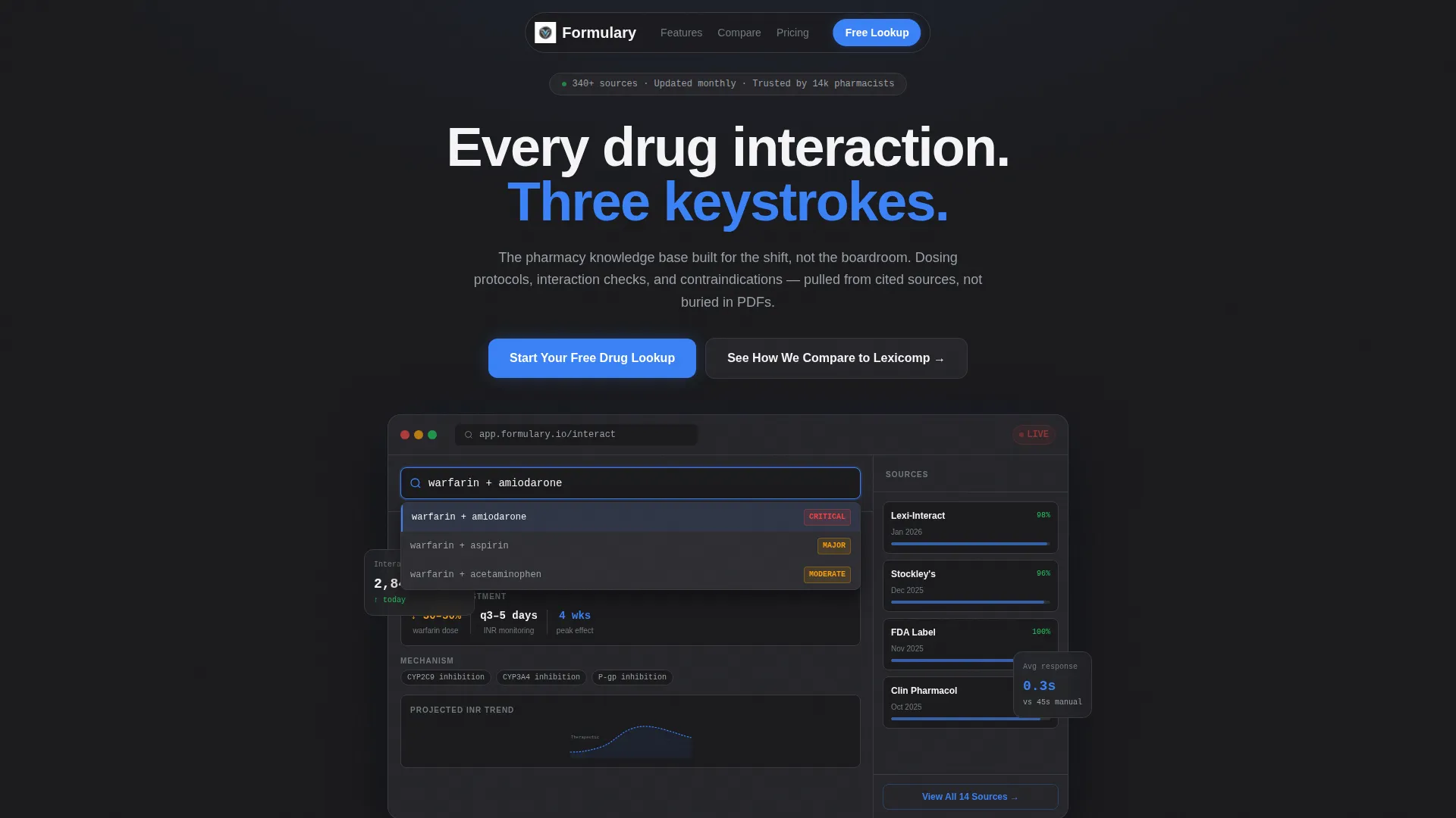
The header renders a mid-query screenshot of the knowledge base. It shows a drug interaction check between warfarin and amiodarone, complete with severity flags, dosing adjustments, and an open citation panel. The search bar is pre-filled and results are already populating, so the tool looks in use from the first second.
Parallax Depth Effect
A subtle parallax drift animates the dashboard panels as the visitor arrives on the page. The movement reinforces the Dynamic Motion theme without pulling attention away from the data on screen.
Motion-Animated Browser Tab Visual
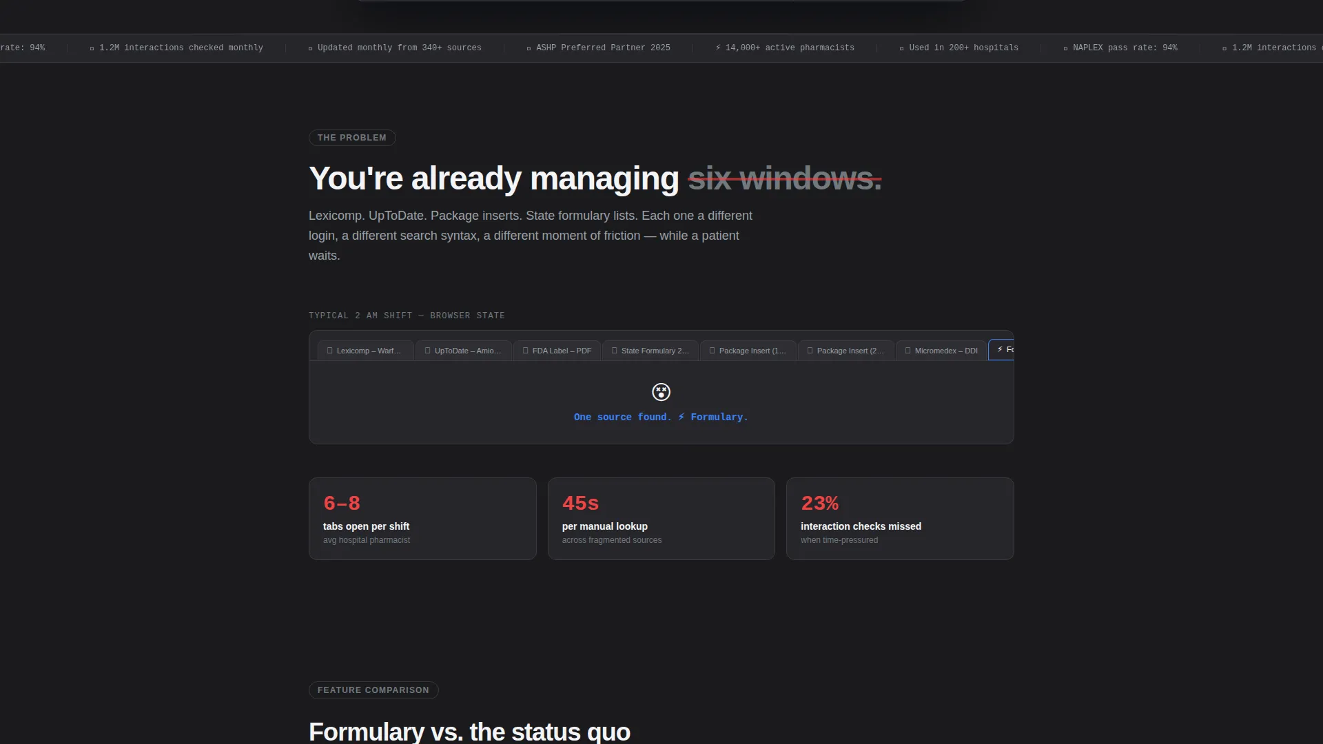
The first content section below the header includes a motion-animated visual of browser tab multiplication. This communicates the scattered-reference problem instantly and viscerally before any comparison table appears.
Sequential Comparison Tables
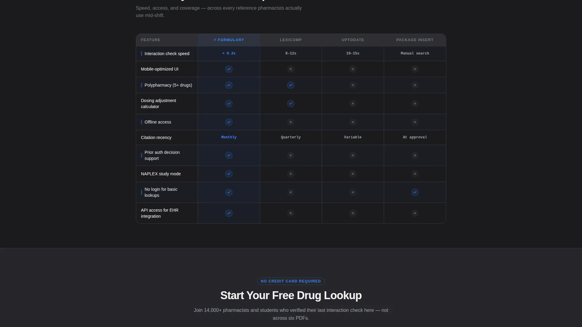
Feature-by-feature grids compare this platform against legacy drug references across speed, mobile access, interaction-check depth, citation recency, and offline availability. Each table row animates in with steel borders drawing into place and pulse-blue checkmarks arriving with a micro-bounce.
Role-Based Sign-Up Form
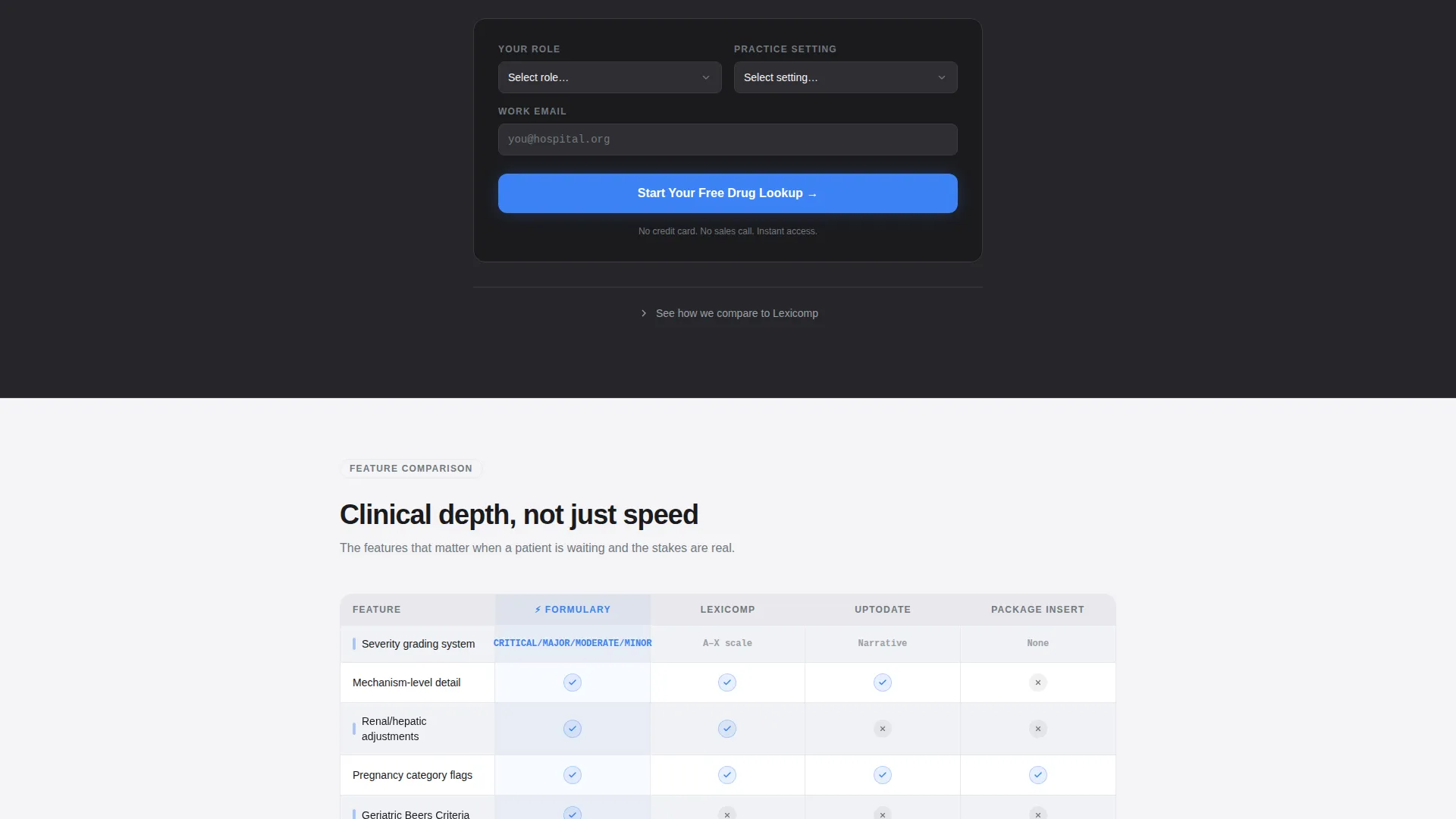
The primary call-to-action form collects three fields: role (pharmacist, student, or technician), practice setting (hospital, retail, or long-term care), and email address. There is no credit card field, which reduces friction at the final conversion point.
Anchor-Link Secondary Path
A secondary call to action reads "See How We Compare" and functions as an anchor link. It jumps visitors directly to the mid-page comparison section, serving users who arrive with a specific comparison question already in mind.
Page sections overview
| Section | Purpose |
|---|---|
| Dashboard Preview Header | Opens with a live-rendered drug query to establish immediate tool credibility |
| Problem Statement Block | Names the multi-reference pain point with a motion-animated browser tab visual |
| First Comparison Table | Delivers the first feature-by-feature grid with animated row reveals |
| Pinned Primary call to action | Captures sign-ups after the first table with a role-based, no-card form |
| Additional Comparison Tables | Continues the feature gap argument across multiple reference categories |
| Page-Bottom call to action | Repeats the primary sign-up prompt for visitors who scrolled the full page |
Design & branding system
The visual identity follows a Monochrome Steel palette under a Dynamic Motion theme. Every color choice reinforces clinical trust and keeps the eye moving to the right place.
- Surgical steel (#71797E) and deep charcoal (#1B1B1E) handle borders, backgrounds, and secondary text; clinical white (#F4F4F6) separates comparison blocks
- Pulse-blue (#3B82F6) appears only on interactive states, active table rows, checkmarks, and call-to-action elements to guide attention without decoration
Mobile & speed optimization
The template is designed to stay readable and functional on smaller screens where many pharmacists will access it between patient interactions.
- Comparison tables are structured to reflow cleanly on mobile viewports without losing row context
- Animation sequences are kept lightweight so the Dynamic Motion effects do not interfere with page usability on slower connections
How this template helps you convert
The entire page is architected around a Problem-to-Solution arc that builds conviction before asking for anything.
- The dashboard header establishes immediate credibility by showing the tool already working, which lowers skepticism before a visitor reads a single headline.
- The animated comparison tables make the feature gap between this platform and traditional references impossible to ignore, so the sign-up form feels like a logical next step rather than a sales ask.
Other information about this template
This template is part of the Pharmacy Digital Presence subcategory within the broader Technology category on the marketplace. A few additional details worth noting before you decide:
- The template style is Comparison Table, purpose-built for platforms that benefit from side-by-side feature positioning
- The creative direction follows a Problem-to-Solution Arc, meaning section order is intentional and should be preserved for best conversion results
- The header concept is a Dashboard Preview, which works best when populated with real query data rather than generic placeholder content
- The landing page direction is Comparison/Versus, making it well-suited for audiences who arrive after searching for alternatives to established clinical reference tools
Theme
Dynamic Motion
Creative direction
Problem→Solution Arc
Color system
Monochrome Steel
Style
Comparison Table
Direction
Comparison/Versus
Page Sections
Live Dashboard Preview Header
Parallax Motion on Arrival
Animated Comparison Tables
Role-based Conversion Form
Anchor-link Comparison Path
Problem Statement Animation Block
Related questions
Who is this landing page template designed for?
What sections does this template include?
Does the sign-up form require a credit card?
Can I use this template for a drug interaction checker or formulary reference tool?
How do the animated comparison tables work?



