Fortify — Cyber Defense Landing Page Template
Shield is a dark-themed, modular card grid landing page built for endpoint security and antivirus platforms. It features a live-simulated threat dashboard header, data-driven industry report cards, and a friction-free freemium trial flow. Designed for IT directors, startup CTOs, and managed security providers, it turns threat data into a compelling, trust-building case before a visitor ever clicks a button.
by Rocket studio
Quick summary
Shield is a single-page, card grid landing page template for endpoint security and antivirus products. It opens with an interactive browser-rendered threat dashboard, then builds urgency through modular data cards styled like an annual threat report. A pinned freemium trial bar and inline signup form drive conversions at multiple scroll depths without requiring a credit card or sales call.
Who this template is for
This template is built for security-focused product teams who need to communicate speed, precision, and trust to a technically literate audience. It speaks directly to buyers who have already seen what a breach costs and are evaluating tools right now.
- Overworked IT directors at companies with 200 to 2,000 seats who need fast, credible proof of protection
- Startup CTOs shipping quickly with lean security teams who want a no-friction trial path
- Managed security service providers (MSSPs) who stack endpoint licenses across multiple client tenants and need a page that closes fast
What problem this template solves
Most cybersecurity landing pages lead with feature lists and trust badges. Visitors scan them quickly and leave unconvinced. Shield flips this by leading with live simulated evidence, then building the argument with data before the product ever pitches itself.
- Buyers arrive skeptical; the animated threat simulation makes the value tangible in the first three seconds
- Long sales cycles stall when visitors want proof, not promises; industry report cards deliver the numbers upfront
- Conversion drops when commitment feels high; the freemium inline form removes every barrier except an email address
What you get with this template
Shield delivers a fully structured, dark-themed landing page with every section pre-built and ready to customize. The layout is modular, so individual cards can be reordered, swapped, or extended without redesigning the page.
- An interactive header simulation with clickable device nodes, animated threat events, and a typewriter headline
- A staggered card grid mixing stat tiles, mini case-study cards, and feature deep-dive cards in escalating urgency order
- A pinned conversion bar, a midpoint conversion card, and a final-row call-to-action, each opening the same inline freemium signup form
Feature list
This section covers the core built-in capabilities that make Shield work as a high-converting endpoint security landing page.
Live Threat Dashboard Simulation
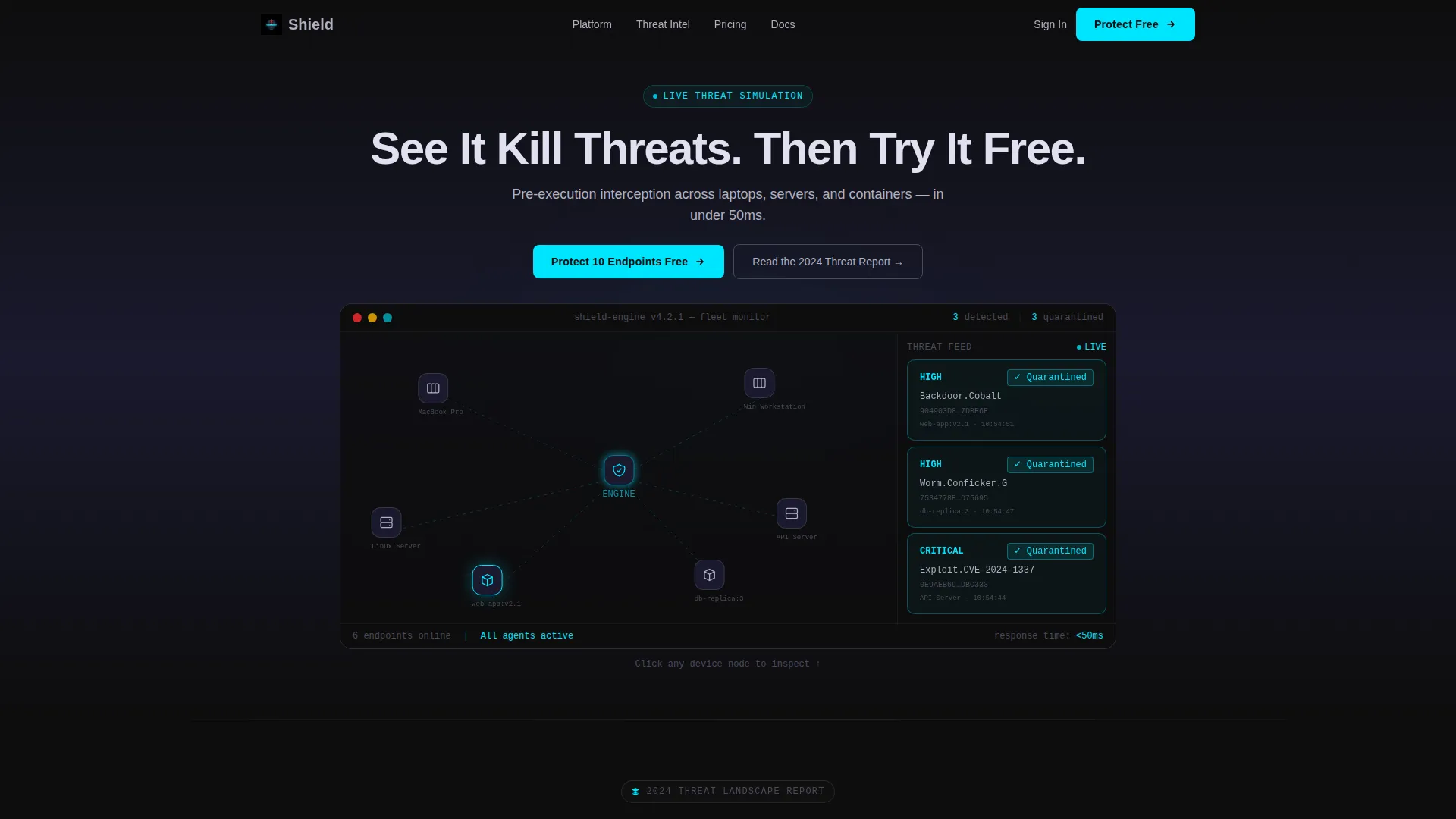
The header renders a functioning browser simulation, not a static screenshot. Six device icons representing laptops, a Linux server, and a Docker container connect via faint pulse lines to a central detection engine. Every two seconds a threat event fires: a card slides in with a file hash, a severity tag glowing red, and a "Quarantined" badge that flips to cyan. Visitors can click any device node to expand a mini detail panel.
Typewriter Headline Animation
The headline "See It Kill Threats. Then Try It Free." types itself letter by letter above the dashboard simulation. The effect creates a sense of real-time activity and reinforces the interactive feel of the header without relying on video or heavy media assets.
Industry Report Card Grid
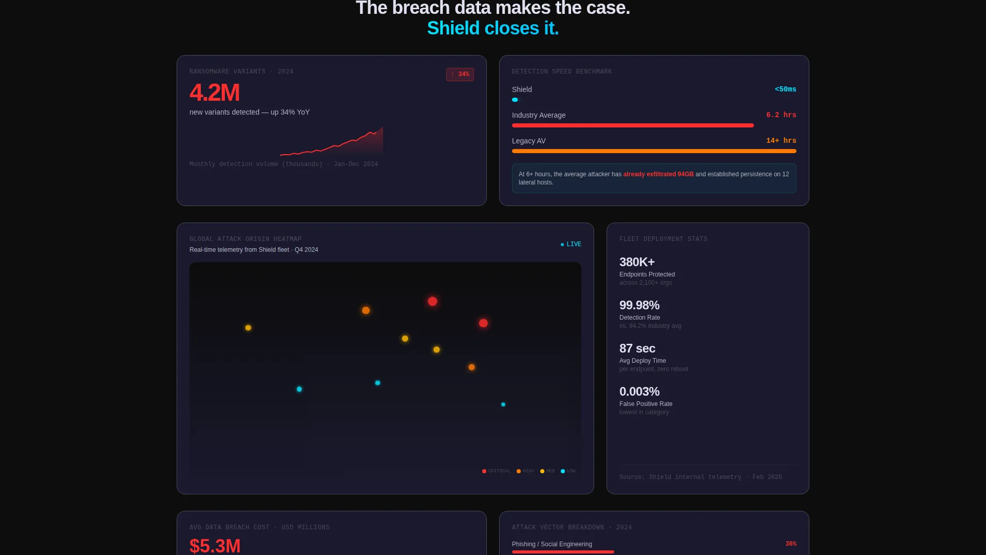
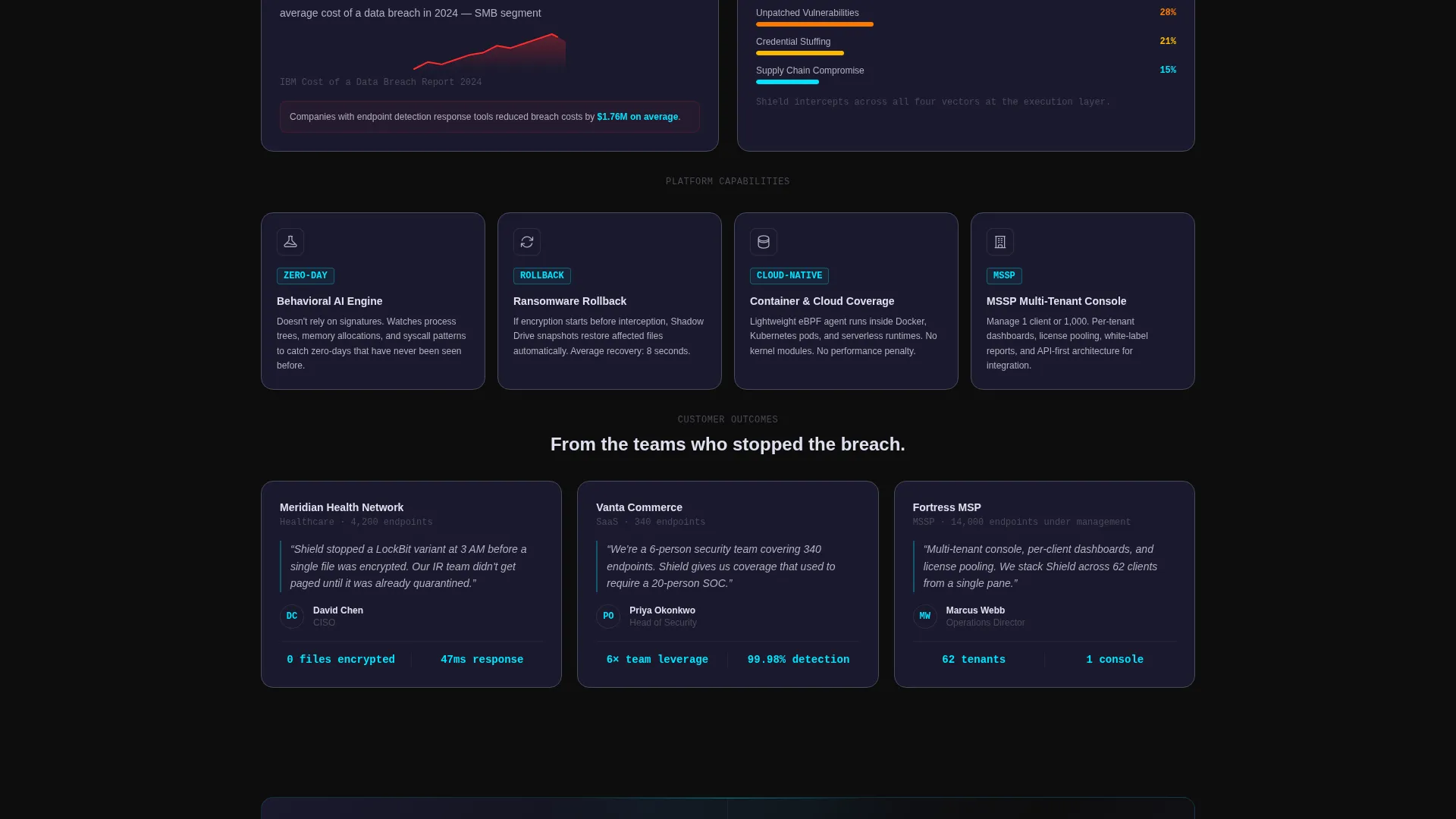
Each modular card functions as an evidence tile drawn from a fictional but realistic annual threat landscape study. The grid alternates between stat cards with spark-line charts, mini case-study cards covering a SaaS company, a hospital network, and an MSSP, and feature deep-dive cards. Rows escalate in urgency as visitors scroll.
Pinned Freemium Trial Bar
After the visitor scrolls past the header simulation, a slim dark bar pins to the viewport with the primary call-to-action: "Protect 10 Endpoints Free." It stays visible throughout the scroll journey and repeats inside the midpoint conversion card and the final row, so the offer is never more than a glance away.
Inline Frictionless Signup Form
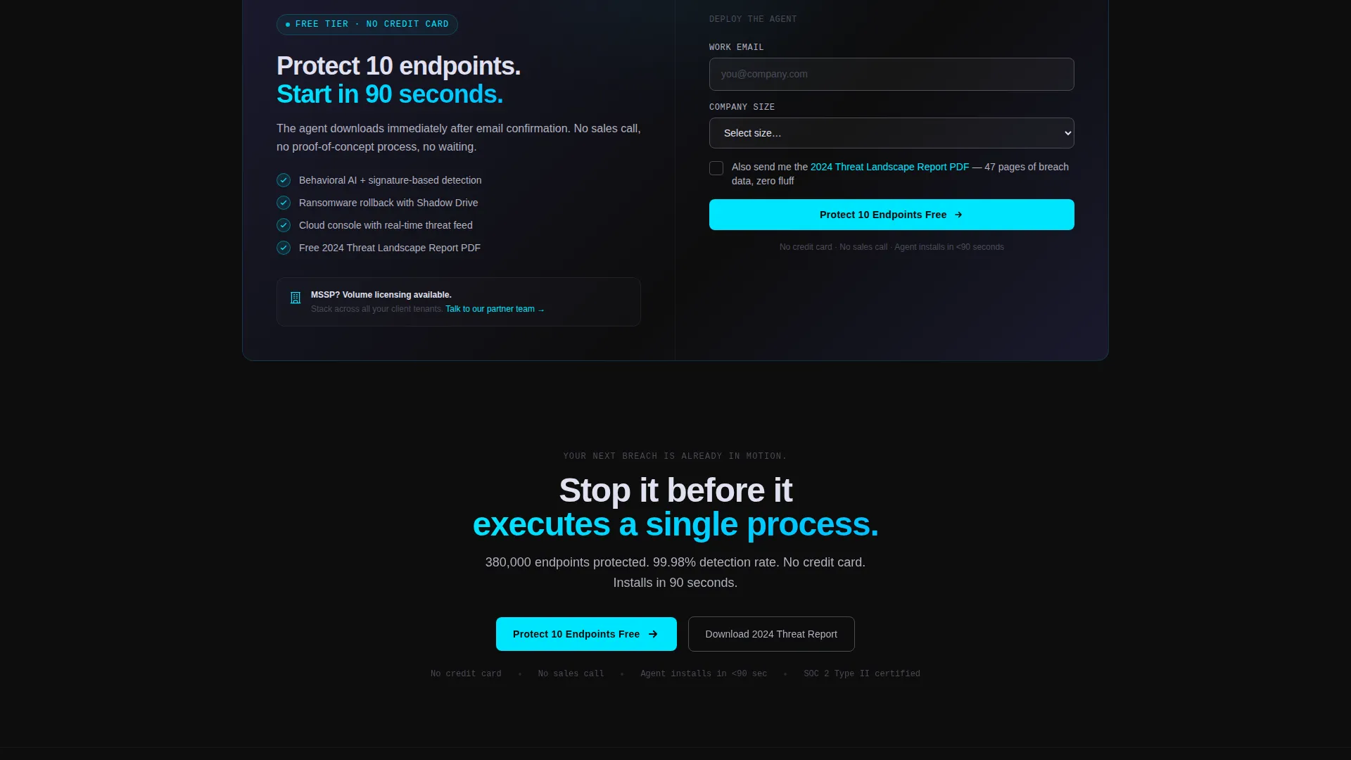
Clicking any conversion trigger opens an inline form with three fields: work email, company size dropdown (1 to 50, 51 to 500, or 500 and above), and a single checkbox for the 2024 Threat Report PDF. No credit card. No sales call. The agent downloads immediately after email confirmation, and the threat report captures leads at a lower commitment level.
Modular Card Layout
The template is built on a responsive card grid that staggers stat cards, case-study cards, and feature cards across each row. Cards float on a dark surface with subtle titanium borders and are fully modular, meaning rows can be reordered or extended to match any product's evidence set.
Page sections overview
| Section | Purpose |
|---|---|
| Interactive Dashboard Header | Simulate live threat detection to hook visitors immediately |
| Typewriter Headline Block | Animate the primary value proposition letter by letter |
| Ransomware Stat Card | Show 4.2M new ransomware variants with a spark-line chart |
| Detection Speed Card | Benchmark sub-50ms response against 6-plus hour industry average |
| Global Heatmap Card | Visualize worldwide attack origin data on a threat heatmap |
| Deployment Stats Card | Display 380K endpoints protected and 99.98% detection rate |
| Mini Case Study Cards | Feature SaaS, hospital, and MSSP deployment stories |
| Feature Deep-Dive Cards | Cover behavioral AI, ransomware rollback, and cloud console |
| Midpoint Conversion Card | Repeat the freemium trial offer at the scroll midpoint |
| Final Row Call-to-Action | Close the page with a third freemium trial trigger |
Design & branding system
Shield uses a Carbon Fiber color system under the Startup Velocity theme. Every color decision is intentional: backgrounds stay dark, card surfaces float slightly lighter, and high-energy accent colors appear only where action is needed.
- Core palette: deep carbon black (#0D0D0D) and woven graphite (#1A1A2E) for backgrounds; titanium mid-tone (#4A4A5A) for card borders and body text carrier; electric threat-red (#FF2D2D) reserved exclusively for threat indicators and alert states; reactive cyan (#00E5FF) for calls-to-action, progress rings, and confirmed-safe signals
- Card surfaces sit at #1A1A2E with a 1px titanium border; body text uses a desaturated #B0B0C0 to maintain legibility without competing with accent colors
- The cyan activates only on interactive elements, so every clickable surface pulses visibly against the dark void background
Mobile & speed optimization
The card grid layout is responsive by design. Staggered multi-column rows reflow cleanly into single-column stacks on smaller screens without losing the escalating urgency of the content order.
- The dashboard simulation is browser-rendered, keeping the header interactive and lightweight without requiring video files or external embeds
- The inline signup form condenses to a single-column layout on mobile, keeping the three-field structure intact and easy to complete on any device
How this template helps you convert
Shield is structured so that every scroll depth has a conversion opportunity, and every conversion opportunity matches the visitor's readiness level.
- The interactive header simulation creates immediate product credibility. Visitors see threats get neutralized before reading a single marketing claim, which builds trust faster than any headline alone.
- The industry report card grid escalates urgency row by row using data, benchmarks, and peer case studies. By the time a visitor reaches the midpoint conversion card, the evidence has already made the case.
- The three-point conversion structure (pinned bar, midpoint card, final row) paired with the low-commitment inline form means the primary offer and the secondary threat report PDF capture leads at two different intent levels without adding friction to either path.
Other information about this template
Shield is designed specifically for the endpoint security and antivirus niche, where buyers are informed, skeptical, and short on time. The template's creative direction treats the page itself as a product demo, not a brochure.
- The template style is Card Grid (Modular), making it straightforward to extend with additional stat cards or case studies as new data becomes available
- The Freemium/Trial landing page direction is built in from the start, with the conversion structure pre-planned across three trigger points
- The Industry Report creative direction means the grid can be refreshed annually by swapping the stat cards with updated threat landscape numbers
- The header concept is Interactive Preview, a pattern that works especially well for security tools because it lets the product speak before the copy does
- This template is suited for antivirus software platforms, endpoint detection and response products, and managed detection and response service pages where demonstrating speed and coverage is more persuasive than listing specifications
Theme
Startup Velocity
Creative direction
Industry Report
Color system
Carbon Fiber
Style
Card Grid (Modular)
Direction
Freemium/Trial
Page Sections
Live Browser-rendered Threat Simulation
Typewriter Headline Animation
Escalating Industry Report Card Grid
Three-point Freemium Conversion Structure
Low-friction Inline Signup Form
Modular Dark Card Layout
Related questions
Can I customize the stat cards with my own threat data?
Does the header simulation require a video file or external service?
How does the two-path conversion model work?
Is this template suitable for managed security service providers?
Can the pinned conversion bar be repositioned or restyled?



