Insurance Agency Privacy Policy Website Template
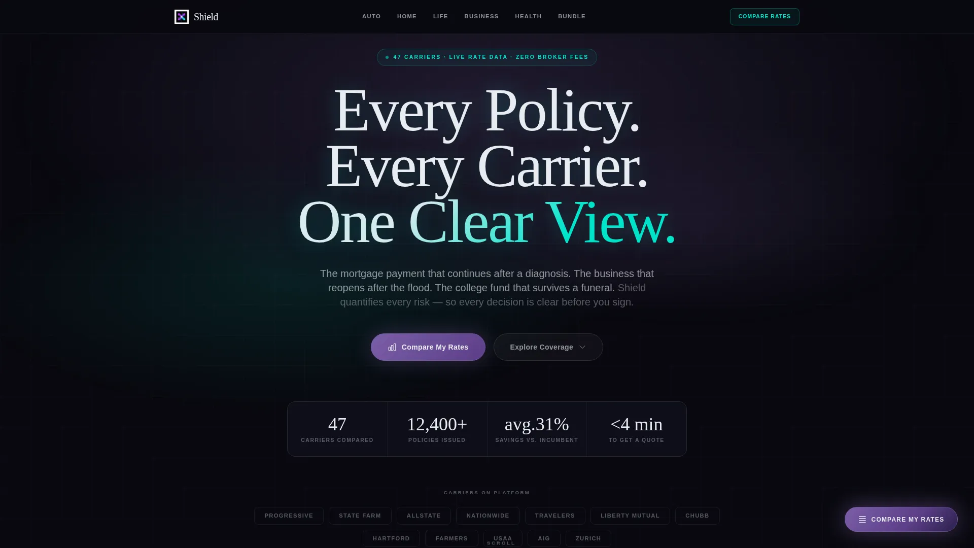
Shield is a hub-and-spoke insurance agency landing page template built around a dark Data Command visual identity and a Feature Matrix layout. Anchor navigation guides visitors across six coverage spokes, Auto, Home, Life, Business, Health, and Bundle, while comparison grids, highlighted tiers, and a persistent rate-comparison call-to-action turn complex policy decisions into clear, scannable choices.
by Rocket studio
Quick summary
Shield is a single-page insurance agency landing page template designed for agencies that help clients compare coverage across multiple carriers. A pinned anchor nav connects six coverage spokes, each built around a comparison matrix. The dark iridescent visual system and floating "Compare My Rates" button keep visitors oriented and ready to act from the first scroll.
Who this template is for
This template is built for insurance agencies and independent brokers who serve a broad client base. It works especially well when your agency handles multiple coverage lines and competes directly against carrier-direct pricing.
- Insurance agencies presenting multi-line or bundled policy options
- Independent brokers competing against renewal quotes from incumbent carriers
- Agencies targeting first-time buyers, small business owners, and HR directors shopping group plans
What problem this template solves
Most insurance agency pages bury comparison data inside paragraphs. Visitors arrive with specific questions about tiers, deductibles, and carrier differences, and they leave frustrated before they ever reach a form. Shield is built to close that gap.
- Visitors scan a comparison grid instead of reading dense policy copy
- Coverage lines are separated into dedicated spokes so shoppers stay focused
- The progressive disclosure form collects context before asking for commitment
What you get with this template
Shield delivers a complete single-page layout with every structural element a modern insurance agency needs. The template is visual-identity-complete and conversion-ready from day one.
- A dark full-bleed header with a shifting iridescent glow behind the headline
- Six coverage-spoke sections, each containing a three-column carrier comparison matrix
- A floating "Compare My Rates" button and a multi-step progressive disclosure form
Feature list
Shield's feature set is drawn directly from its Data Command design system and hub-and-spoke layout architecture. Each component serves a specific job inside the comparison-first conversion flow.
Pinned Anchor Navigation Bar
A thin horizontal navigation bar pins to the top of the page as the visitor scrolls. Each of the six spokes, Auto, Home, Life, Business, Health, and Bundle, is labeled in plain language, letting visitors jump directly to the coverage type they care about.
Scroll-Animated Comparison Matrix
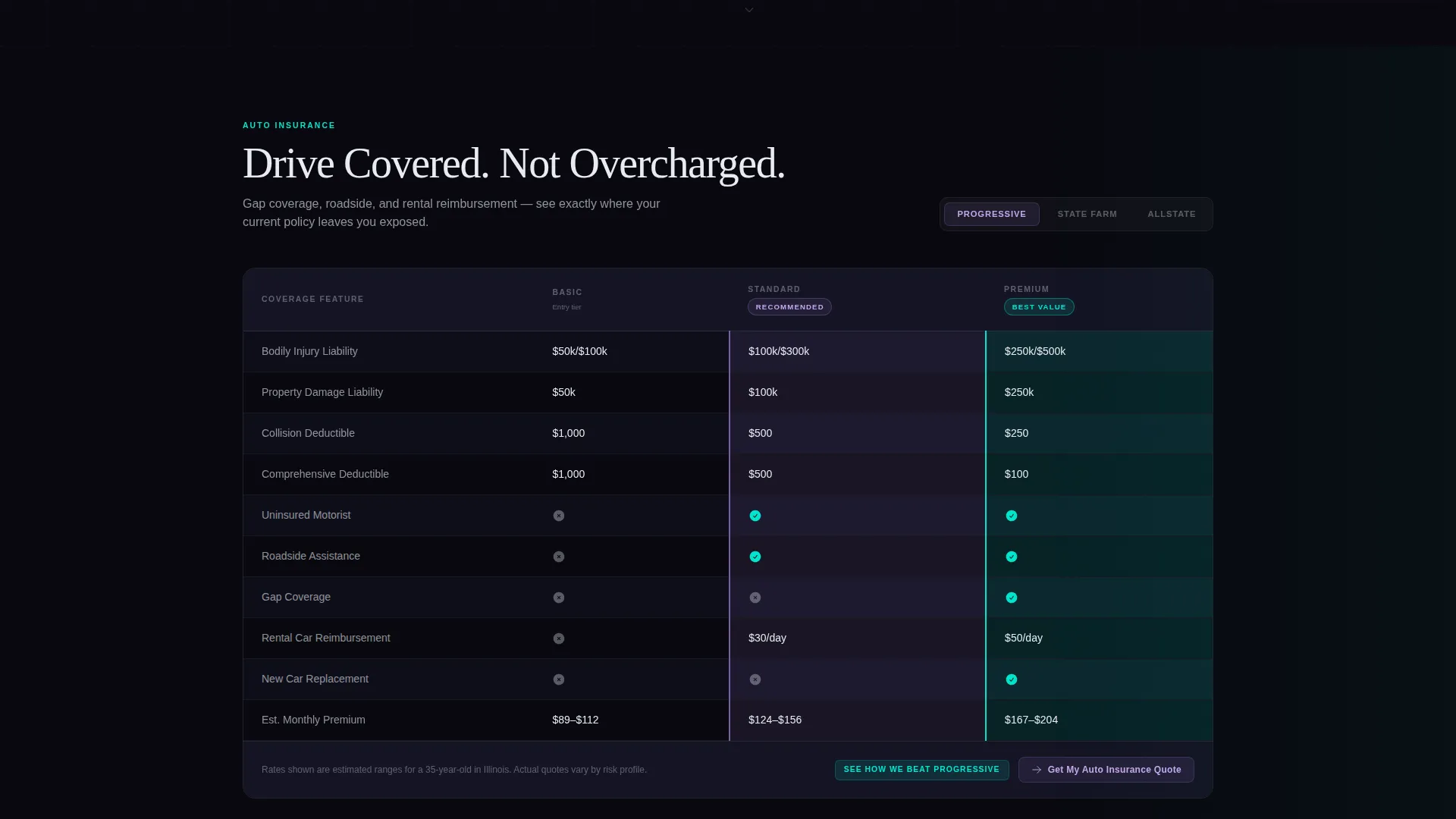
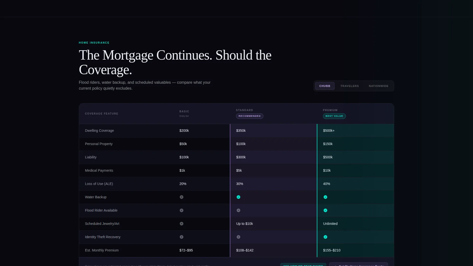
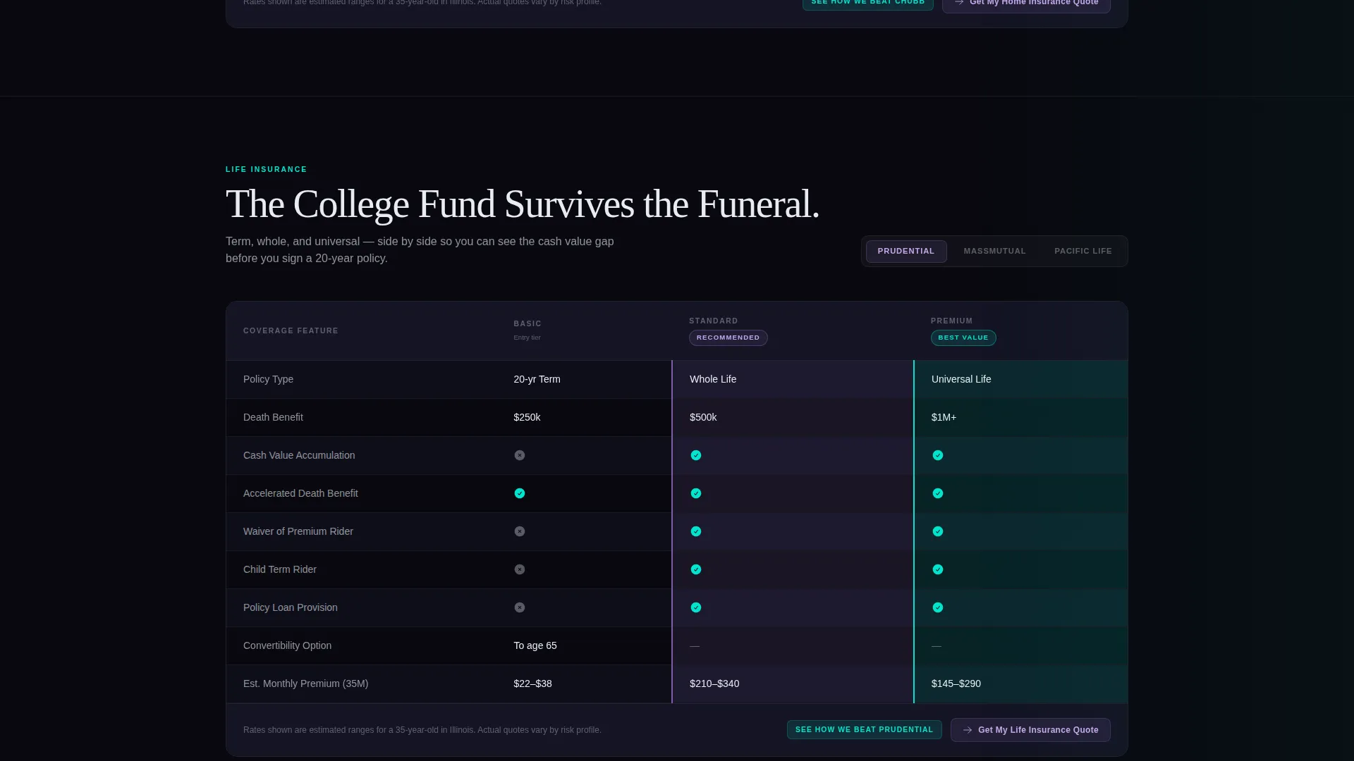
Each coverage spoke contains a three-column matrix that lays coverage tiers side by side. Rows animate in on scroll, and the grid is toggleable between carriers. Violet highlights mark recommended tiers; cyan flags mark best-value options. The pattern repeats across every spoke for a consistent, hypnotic rhythm.
Floating Rate-Comparison Button
A persistent "Compare My Rates" button anchors to the bottom-right corner and follows the visitor throughout the entire page. It stays visible across all six spokes without interrupting the comparison experience.
Progressive Disclosure Form
Clicking the floating button opens a staged form. It starts with ZIP code, then asks for coverage type, pre-filled when the visitor arrives from a specific spoke, and finishes with three qualifier questions covering current carrier, renewal date, and bundling interest.
Versus Breakdown Deep Links
Inside every matrix column, a secondary call-to-action reads "See How We Beat [Carrier Name]." Clicking it deep-links to a dedicated versus breakdown for that carrier. This path converts visitors who are already comparing and just need one final push.
Dark Full-Bleed Glow Header
The hero section fills the full viewport with pure black. A soft, shifting iridescent gradient blooms behind the headline. The headline is rendered in phosphor white with a faint cyan text-shadow that makes the letters feel backlit. No photography or illustration is used.
Page sections overview
| Section | Purpose |
|---|---|
| Hero Header | Sets tone, displays headline, and anchors iridescent glow visual |
| Anchor Nav Bar | Pins to top on scroll; links to each of the six coverage spokes |
| Auto Spoke | Comparison matrix for auto coverage tiers and carrier options |
| Home Spoke | Comparison matrix for homeowners coverage tiers and carriers |
| Life Spoke | Comparison matrix for life policy tiers and carrier options |
| Business Spoke | Comparison matrix for commercial and liability coverage |
| Health Spoke | Comparison matrix for individual and group health plans |
| Bundle Spoke | Matrix showing multi-line bundling options and savings tiers |
| Rate Comparison Form | Progressive disclosure form triggered by the floating button |
| Versus Breakdown | Deep-linked carrier-versus-carrier comparison panels |
Design & branding system
Shield uses an AI Iridescent color system built on four core values that create a high-contrast, data-focused visual environment. The palette is designed to feel readable under long sessions without sacrificing visual impact.
- Core colors: void black (#09090F) for backgrounds, holographic violet (#7B5EA7) and signal cyan (#00E5CC) trading off as accent and hover states, and phosphor white (#E8ECF1) for body text
- Typography floats clean against the dark background; the hero headline uses a faint cyan text-shadow to produce a backlit, luminous effect
- Violet highlights mark recommended coverage tiers inside the matrix; cyan flags identify best-value cells, creating a consistent visual language across all six spokes
Mobile & speed optimization
The Data Command layout is designed to remain readable and navigable on smaller screens. The anchor nav and matrix grids are structured to adapt without losing the comparison clarity that drives conversions.
- The pinned anchor nav collapses gracefully so spoke labels stay accessible on narrow viewports
- Comparison matrix columns are structured for horizontal scrolling on mobile, keeping tier data intact and legible
- The floating "Compare My Rates" button maintains its fixed position on touch devices so the primary call-to-action is always reachable
How this template helps you convert
Shield earns the click before it asks for one. The layout is sequenced so visitors build confidence through comparison data, then reach the form already informed.
- The scroll-animated matrix grids show coverage gaps and value differences before any form appears, so visitors arrive at the call-to-action with context rather than hesitation.
- The progressive disclosure form reduces perceived friction by asking for ZIP code first, then layering in coverage type and qualifying questions step by step.
- Versus breakdown deep links inside the matrix columns capture high-intent visitors who are already in a direct carrier comparison mindset and need one final, specific data point to act.
Other information about this template
Shield fits naturally into a broader insurance agency digital presence. A few additional details worth knowing before you build:
- The template style is hub and spoke with anchor navigation, making it suitable as a standalone homepage or a primary comparison landing page within a larger site
- The Data Command theme and AI Iridescent color system are fully defined in the template, including all four hex values, so brand application is consistent from the start
- The "See How We Beat [Carrier Name]" versus path is designed for agencies that compete directly against named carriers and want to address objections inside the comparison experience
- The six spoke labels, Auto, Home, Life, Business, Health, and Bundle, can be relabeled to match the specific coverage lines your agency actually offers
- This template is suited for agencies using tools like Webflow, as the dark visual system and scroll-animation components align well with that platform's interaction and design capabilities
Theme
Data Command
Creative direction
Feature Matrix
Color system
AI Iridescent
Style
Hub & Spoke (Anchor Nav)
Direction
Comparison/Versus
Page Sections
Pinned Anchor Navigation Bar
Scroll-animated Comparison Matrix
Floating Rate-comparison Button
Progressive Disclosure Form
Versus Breakdown Deep Links
Dark Full-bleed Glow Header
Related questions
Can I change the six coverage spoke labels to match my agency's product lines?
Does the floating 'Compare My Rates' button stay visible across all six spokes?
How does the progressive disclosure form pre-fill coverage type?
Is this template suitable for an agency that only offers one or two coverage lines?
What is included in the AI Iridescent color system?