Higher Education Digital Presence Specialist Directory Website Template
Forum is a split-screen landing page template built for higher education community platforms. It showcases a live forum interface alongside a bold headline, driving visitors toward free registration. Designed for provosts, deans, and program directors, the template uses a teal and charcoal palette to project credibility, warmth, and urgency, all without a single stock campus photo.
by Rocket studio
Quick summary
Forum is a single-page, click-through landing page template for higher education community forums. It uses a 50/50 split-screen layout to show the product in action on the left and a persuasive call to action on the right. The design targets faculty, administrators, and institutional staff who want a peer-driven discussion space built around real academic challenges.
Who this template is for
This template is built for teams launching or promoting a digital forum community aimed at higher education professionals. It speaks directly to the people who actually run universities day to day.
- Associate deans and provosts looking for peer discussion spaces
- Institutional researchers and program directors seeking benchmarks and syllabi
- Community builders targeting faculty, staff, and academic administrators
What problem this template solves
Higher education professionals rarely have a dedicated space to share hard-won knowledge across institutions. Generic social platforms feel wrong for serious academic discourse, and email threads get buried fast.
- No central forum exists for candid, role-specific higher ed conversations
- Administrators struggle to find peer benchmarks and policy precedents quickly
- First-time visitors to a new forum need trust signals before they commit to signing up
What you get with this template
You get a fully structured landing page that puts the forum product front and center. Every design decision serves one goal: turning curious visitors into registered members.
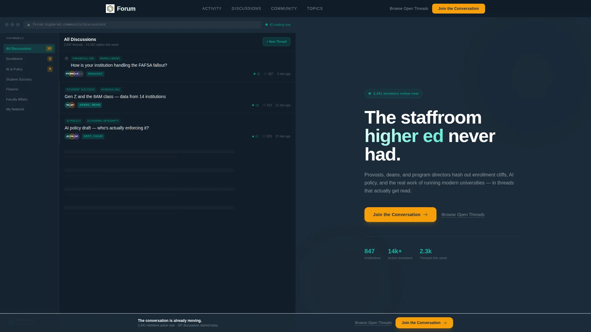
- A 50/50 split-screen header with a live forum screenshot on the left and a headline with primary call to action on the right
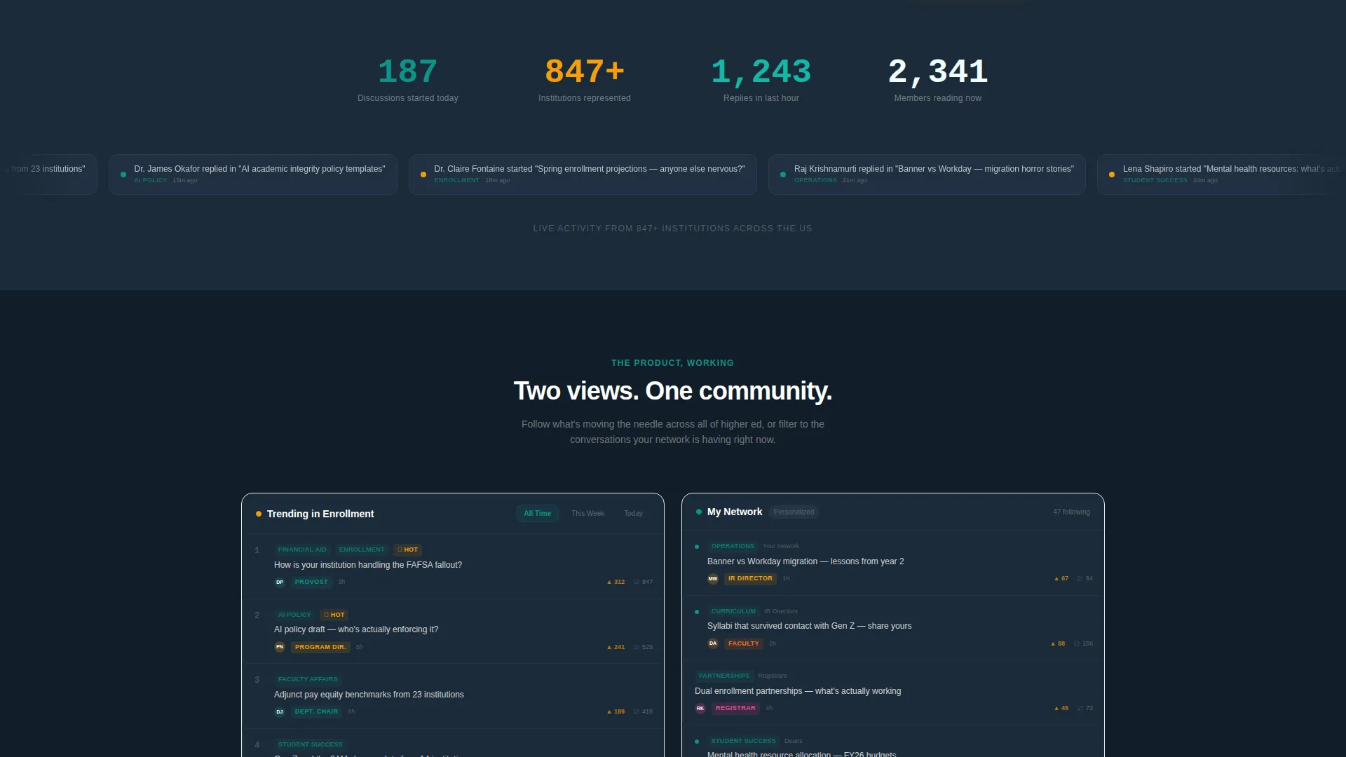
- A scrolling momentum section with a real-time activity ticker, animated institution counter, and dual forum feed showcase
- A sticky call-to-action bar that reappears after the second scroll, keeping registration one click away at all times
Feature list
This template packs several purposeful components that work together to build confidence and drive sign-ups.
Split-Screen Header Layout
The header divides the viewport equally. The left panel displays the forum interface mid-conversation, complete with a pinned thread, reply counts, verified role badges, and a live reader pulse indicator. The right panel holds the headline and the primary "Join the Conversation" call to action button in catalyst amber.
Live Activity Indicators
A real-time activity ticker below the fold shows discussions started today alongside an animated counter of institutions represented. These elements signal that the community is already active, reducing the hesitation a first-time visitor might feel.
Dual Forum Feed Showcase
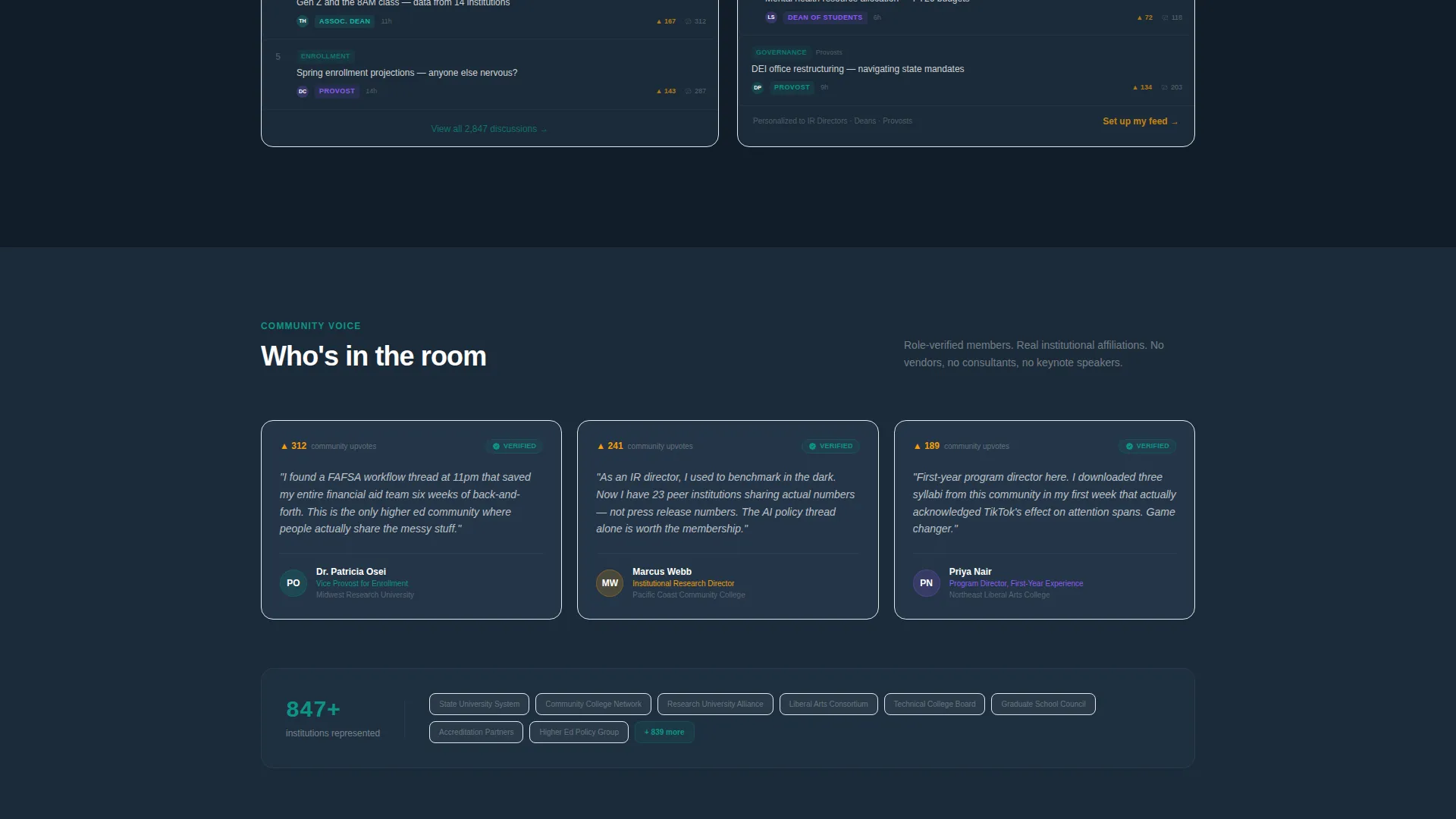
Two forum views appear side by side: a curated "Trending in Enrollment" feed and a personalized "My Network" stream. This contrast helps visitors understand the breadth and personalization the platform offers before they ever sign up.
Sticky Call-to-Action Bar
After the visitor scrolls past the second section, a persistent sticky bar carries the primary call to action across the rest of the page. It keeps the registration path visible without interrupting the reading experience.
Context-Aware Click-Through Flow
The primary call-to-action button carries selected interest tags that the visitor interacted with during browsing. Those tags pre-populate the two-step sign-up flow, asking only for an institutional email and role title.
Secondary Trust Link
A text link labeled "Browse Open Threads" gives skeptical visitors a low-commitment path to explore content before registering. This reduces friction and builds confidence in the community's value.
Page sections overview
| Section | Purpose |
|---|---|
| Split-screen header | Headline, forum screenshot, primary call to action |
| Activity ticker strip | Shows live discussion volume and institution count |
| Dual feed showcase | Compares trending and personalized forum views |
| Sticky call to action bar | Persistent registration prompt after second scroll |
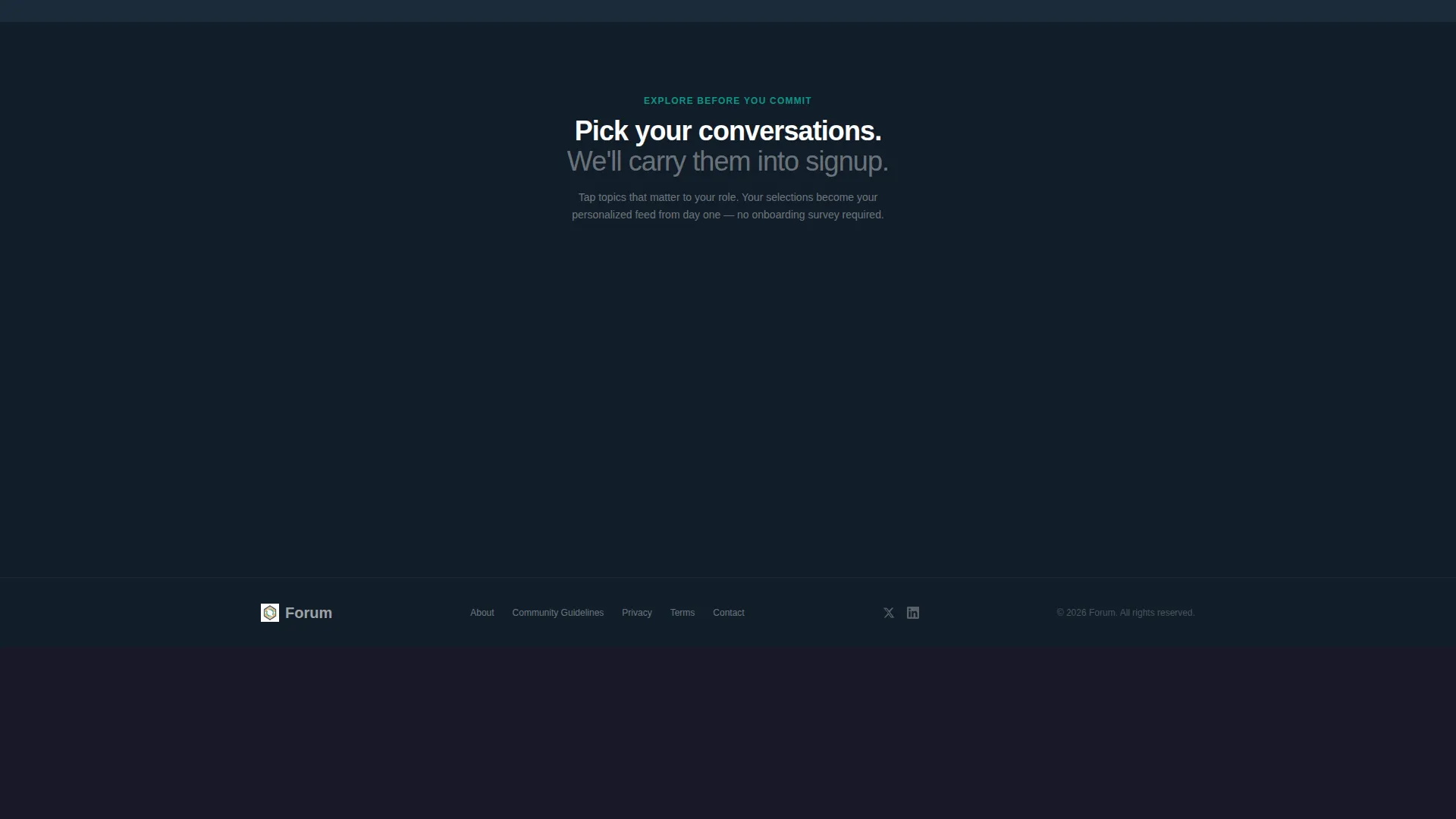
| Topic preview tiles | Lets visitors tap interest tags before clicking through |
Design & branding system
The visual identity follows a Dashboard Pro theme using the Teal Catalyst color system. It blends research-dashboard seriousness with the informal warmth of a late-night messaging channel.
- Deep lecture-hall charcoal (#1B2A38) as the dominant background, active teal (#0D9488) for interactive elements and highlights, chalk-dust white (#F0FDFA) for content surfaces, and catalyst amber (#F59E0B) reserved for badges, upvote counts, live-now indicators, and primary call-to-action buttons
- Clean sans-serif typography across all headings, keeping the layout sharp and free of decorative excess
- No stock campus photography used anywhere; the forum interface itself serves as the hero visual
Mobile & speed optimization
The split-screen layout is designed to adapt cleanly across device sizes. Mobile visitors see the same key signals without losing the core conversion path.
- The 50/50 split stacks vertically on smaller screens, keeping the forum screenshot and call to action both visible without horizontal scrolling
- The sticky call-to-action bar remains functional on mobile, so the registration prompt stays accessible throughout the scroll
How this template helps you convert
Every section of this template is sequenced to move a skeptical visitor toward clicking "Join the Conversation" with growing confidence.
- The split-screen header delivers immediate proof that the community exists and is active, pairing a live forum screenshot with a direct headline and a high-visibility amber call-to-action button.
- The scrolling sections compound urgency by showing real-time activity numbers and dual feed previews, making visitors feel like the community is already in motion without them.
- The "Browse Open Threads" secondary link and the context-aware click-through flow reduce sign-up friction by letting visitors explore first and carry their interests directly into a minimal two-step registration form.
Other information about this template
This template is part of a broader set of higher education digital presence templates. A few practical notes for teams evaluating it:
- The template is categorized under Technology and the Higher Education Digital Presence subcategory, making it a strong fit for institutions and edtech teams building community-focused products
- The Dashboard Pro theme and Teal Catalyst color system are designed to feel at home in a higher education digital context without borrowing from typical campus stock imagery
- The click-through landing page direction means no form lives on this page; the conversion goal is a single focused click that carries visitor context into the registration flow
- The template style is Split Screen (50/50), which suits community platforms where showing the product in action is more persuasive than describing it
Theme
Dashboard Pro
Creative direction
Launch Energy
Color system
Teal Catalyst
Style
Split Screen (50/50)
Direction
Click-Through
Page Sections
Split-screen Header with Live Forum View
Real-time Activity Ticker
Dual Forum Feed Showcase
Sticky Call-to-action Bar
Context-aware Click-through Path
Secondary Trust Link
Related questions
Does this template include the actual forum or registration system?
Can I change the color palette or headline copy?
Is this template suitable for a private institutional forum?
What does the context-aware click-through feature mean in practice?
Do I need design experience to use this template?



