Forumhub - Dynamic Community Landing Page Template
Forumhub is a single-page Webflow community landing page template built on a Dynamic Motion theme and Carbon Fiber color system. It combines an interactive forum preview header, an animated comparison table, member spotlight cards, and a progressive lead-generation form to convert curious visitors into signed-up community members before they leave the page.
by Rocket studio
Quick summary
Forumhub is a high-energy, interaction-led landing page template designed for community forum launches. It opens with a live-feeling forum preview in a 3D browser frame, escalates through an animated comparison table, and closes with a progressive sign-up form. Every section rewards interaction. Every detail signals that the community behind it obsesses over craft.
Who this template is for
This template is built for people who want their community to feel as considered as the work it celebrates. The design speaks directly to technical creatives who can spot sloppy craft from three pixels away.
- Freelance web designers and no-code builders launching a niche community around their practice
- Startup founders and agency leads who need to validate a community concept and capture early members fast
- Webflow practitioners building a documentation or support hub that needs to stand out from generic forum pages
What problem this template solves
Most community landing pages look like a signup form stapled to a paragraph of marketing copy. They give visitors no reason to believe the community is alive, valuable, or worth their email address.
- Visitors leave before converting because there is no proof of activity or quality inside the community
- Generic forum pages fail to differentiate from free alternatives like social media groups or chat platforms
- Friction-heavy sign-up flows lose interested visitors who are not yet ready to commit fully
What you get with this template
You get a complete, single-page layout that moves a visitor from first impression to form submission through layered interaction and escalating social proof.
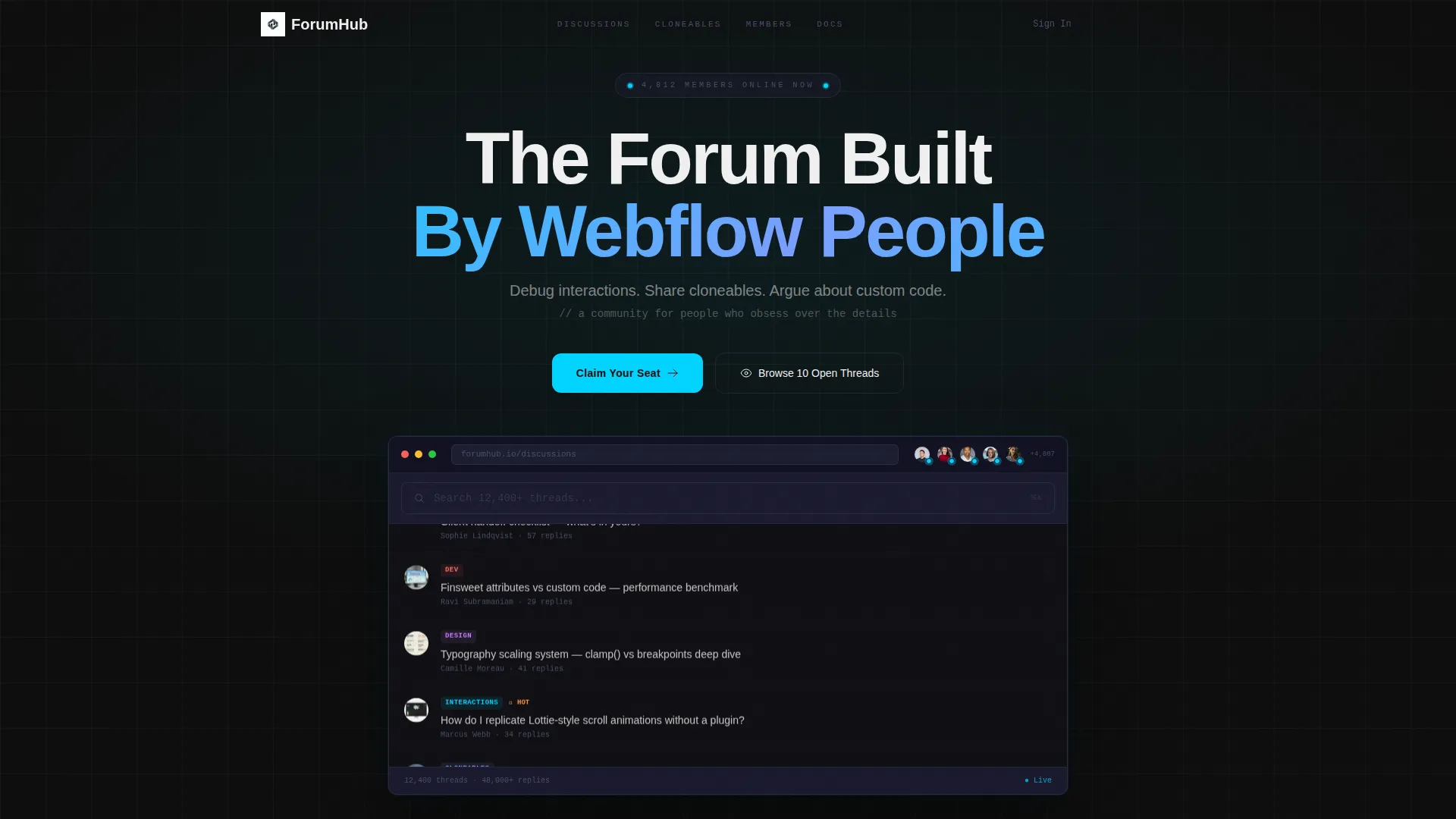
- An interactive header section rendering a live-feeling mini-forum preview inside a 3D-rotating browser chrome frame
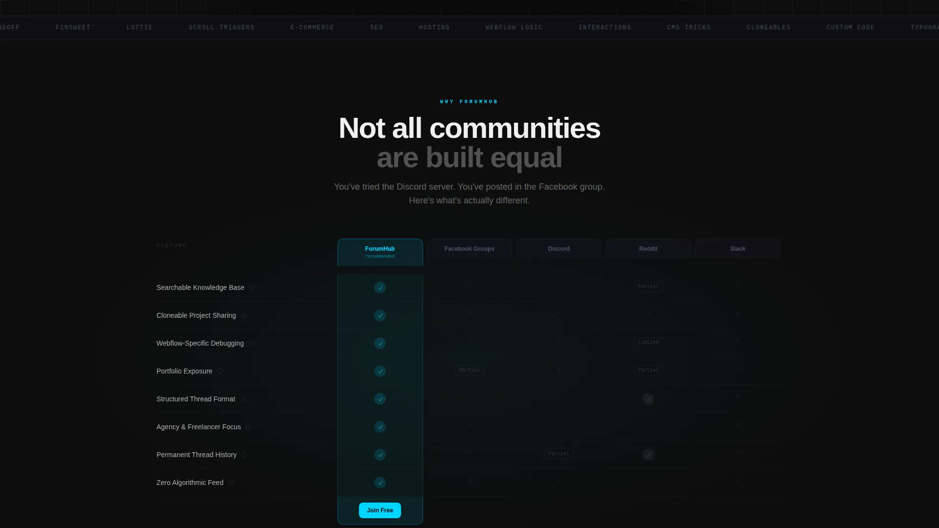
- An animated comparison table that enters column by column on scroll, with hover-triggered micro-case-study tooltips on each cell
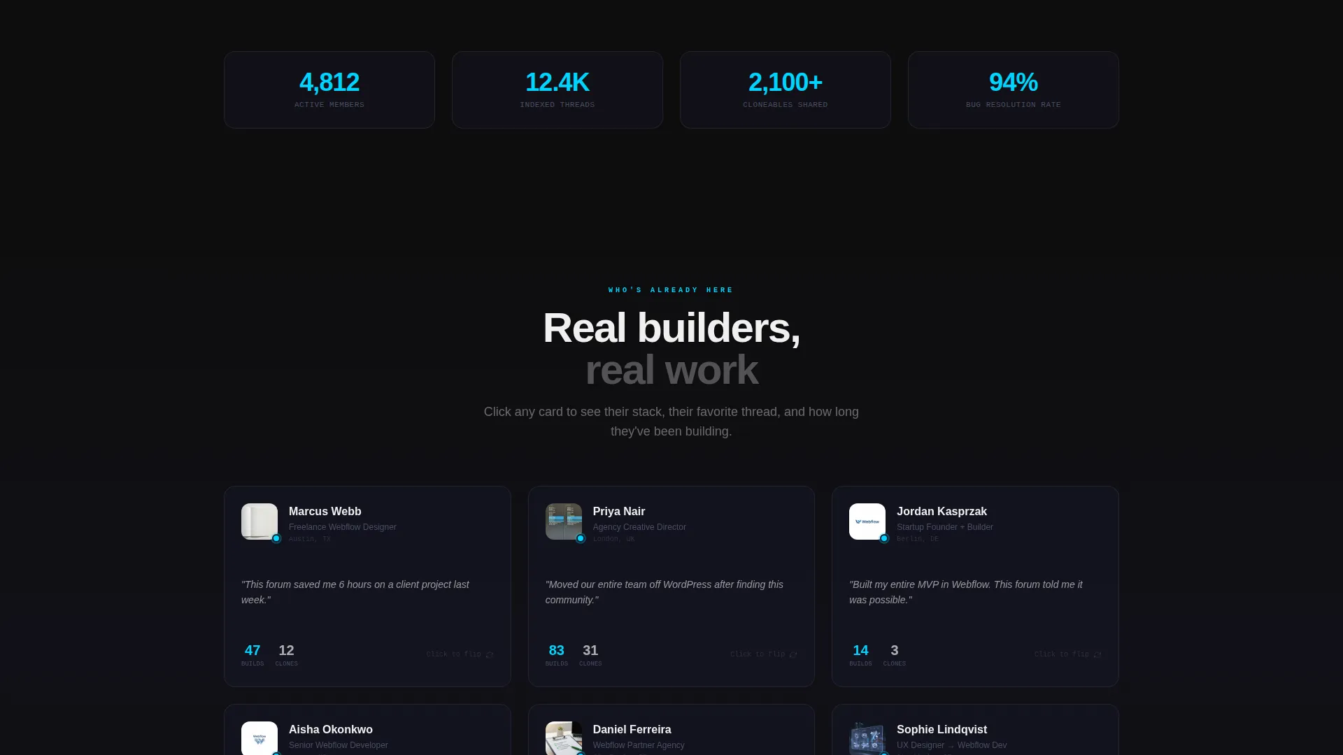
- Member spotlight cards that flip on click to reveal individual stack details, favorite threads, and build counts
- A progressive lead-generation form that starts with one low-friction field and expands to capture experience level, primary interest, and email
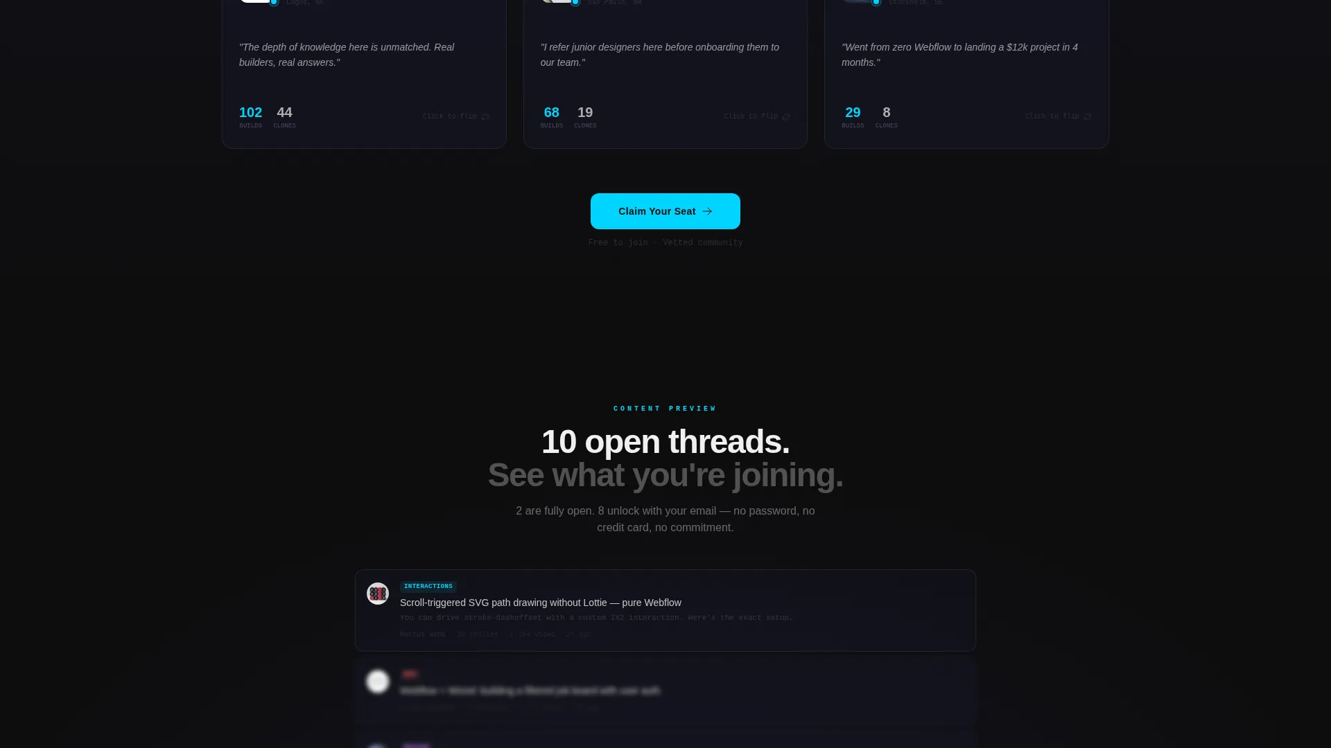
- A secondary conversion path offering a gated preview of open threads requiring only an email address
Feature list
This template packs deliberate, interaction-focused components into a single disciplined layout. Each feature is designed to move visitors forward, not just impress them visually.
Interactive Forum Preview Header
The header renders a functioning mini-forum directly in the viewport. Real thread titles scroll upward, member avatars pulse with live online indicators, and a search bar auto-completes community topics as you type. The entire preview sits inside a browser-chrome frame that rotates subtly in 3D space as the visitor moves their cursor, creating an immediate signal of craft.
Animated Comparison Table
The comparison table enters the viewport column by column as the visitor scrolls, contrasting the forum against common alternatives across rows covering searchable knowledge bases, cloneable project sharing, platform-specific debugging, and portfolio exposure. Every row activates with a motion-blur entrance. Hovering any individual cell expands a micro-case-study tooltip that adds real context to the comparison.
Member Spotlight Cards
Each spotlight card shows a community member at a glance. Clicking any card flips it to reveal that member's technology stack, their favorite forum thread, and their total build count. This section moves the page from abstract claims about community value to tangible, human evidence.
Progressive Sign-Up Form
The lead form starts with a single field asking for a portfolio link or profile URL, which immediately signals this is a vetted, quality-conscious community. Submitting that field expands the form to reveal experience level, primary interest category, and email. The staged reveal reduces early friction while collecting richer information from motivated applicants.
Cursor Trail and Scroll Motion Effects
Cursor movement leaves a subtle filament-blue glow trail across the page. Scroll-triggered animations activate section by section, using motion-blur entrances and hover state highlights tied to the filament-blue accent color. These micro-interactions give the page a persistent sense of energy without overloading the layout.
Sticky Navigation with Repeated call to action
After the first scroll, the primary call-to-action button locks into the navigation bar and follows the visitor down the page. The same call-to-action reappears after the comparison table and again after the member spotlights, ensuring there is always a clear next step visible regardless of how far the visitor has scrolled.
Page sections overview
| Section | Purpose |
|---|---|
| Interactive Forum Header | Opens with a live-feeling mini-forum preview in a 3D-rotating browser chrome frame with scroll-triggered cursor trail effects |
| Animated Comparison Table | Contrasts the forum against alternative community platforms row by row with motion-blur column entrances and hover tooltips |
| Member Spotlight Cards | Flip cards revealing individual member stacks, favorite threads, and build counts to humanize the community |
| Progressive Sign-Up Form | Staged form beginning with a portfolio URL field and expanding to collect experience level, interest category, and email |
| Gated Thread Preview | Secondary conversion path offering access to open threads in exchange for an email address only |
| Sticky call to action Navigation | Persistent call-to-action bar that locks into the header after first scroll and repeats at key section breaks |
Design & branding system
The Carbon Fiber color system gives this template a look that feels technical and deliberate without tipping into generic dark-mode territory. Every color has a specific structural job, and together they create a palette that rewards close attention.
- Deep carbon black (#0D0D0D) dominates all backgrounds, woven graphite (#1A1A2E) separates content layers, and titanium mid-tone (#4A4E69) handles secondary text and borders throughout the layout
- Bright filament blue (#00D4FF) fires on every hover state, active toggle, scroll-triggered element, and cursor trail, acting as the single source of visual energy across the page
- Signal white (#F0F0F0) carries all primary body text and headings, maintaining strong contrast against the dark background layers without introducing harsh pure white
Mobile & speed optimization
The template is structured for responsive display across screen sizes, with interaction-rich components designed to adapt gracefully when cursor-based behavior is unavailable on touch devices.
- 3D browser-chrome rotation and cursor trail effects are designed to degrade cleanly on touch screens, keeping the layout functional and readable without losing its visual hierarchy
- Sticky navigation, comparison table scroll animations, and card flip interactions are all built to work within a single-column mobile layout without requiring horizontal scrolling or layout restructuring
How this template helps you convert
This template is engineered around the idea that conversion happens when a visitor feels like a member before they have technically joined. Every layout decision serves that goal.
- The interactive header creates immediate engagement by making the visitor feel inside the community from the first second, long before they reach any sign-up prompt
- The comparison table neutralizes hesitation by visually resolving the question of why this community is worth joining over free alternatives, row by provable row
- The progressive form structure lowers the psychological cost of signing up by asking for just one thing at a time, turning a full registration into a series of small, easy steps
Other information about this template
This template is categorized under documentation and support, specifically within the Webflow community forum niche. It is a strong fit for teams or individuals building a hub around Webflow-specific knowledge sharing, no-code education, or visual development communities.
- The template style is a comparison table landing page, making it well-suited for any niche where differentiation from competing platforms is a core part of the pitch
- The Dynamic Motion theme and Interactive Explorer creative direction mean the template is best suited for audiences who value craft and interactivity as signals of quality
- The header concept is classified as an Interactive Preview, which can be adapted to showcase any type of community content beyond forum threads, including portfolios, project galleries, or documentation libraries
- This template is built in Webflow, which means all animations, interactions, and layout components are native to the Webflow designer environment and fully editable without writing custom code for most use cases
Theme
Dynamic Motion
Creative direction
Interactive Explorer
Color system
Carbon Fiber
Style
Comparison Table
Direction
Lead Generation
Page Sections
Interactive Forum Preview Header
Animated Comparison Table
Member Spotlight Flip Cards
Progressive Lead-generation Form
Cursor Trail and Scroll Motion System
Sticky Call to Action with Repeated Placement
Related questions
Can I customize the comparison table rows and columns?
Do I need coding skills to use this template?
Can I replace the Carbon Fiber color system with my own brand colors?
Does the interactive header work on mobile devices?
What does the gated thread preview ask visitors to provide?



