Premium Platform Engineering Landing Page Template
Scaffold is a bento grid landing page template built for open-source platform engineering projects. It opens with a live metrics wall, walks visitors through head-to-head comparisons, and closes with a single kubectl command call to action. Styled in a dark terminal palette with teal accents, this template is written for senior engineers who need data, not decoration, before they commit.
by Rocket studio
Quick summary
Scaffold is a single-page, bento grid landing page template designed for open-source platform engineering projects. It leads with a data-first metrics wall, moves through structured comparison sections, and converts visitors with a copyable kubectl command. Every component is styled in a dark terminal theme with teal on black, built to feel like a well-organized engineering dashboard.
Who this template is for
This template is built for technical builders and engineering leaders who need a landing page that speaks their language before it asks for anything. It is not a generic SaaS page. It is written for people who read DORA metrics before they read marketing copy.
- Senior platform engineers and DevOps leads managing Kubernetes clusters at Series C and beyond
- Engineering directors who need a page that justifies platform investment to leadership with real numbers
- Open-source maintainers who want a developer portal showcase that earns trust through data, not promises
What problem this template solves
Most open-source project pages bury the value proposition under hero images and vague taglines. Platform engineers close those tabs in seconds. The Scaffold template solves the credibility gap by making data the headline and comparison the structure.
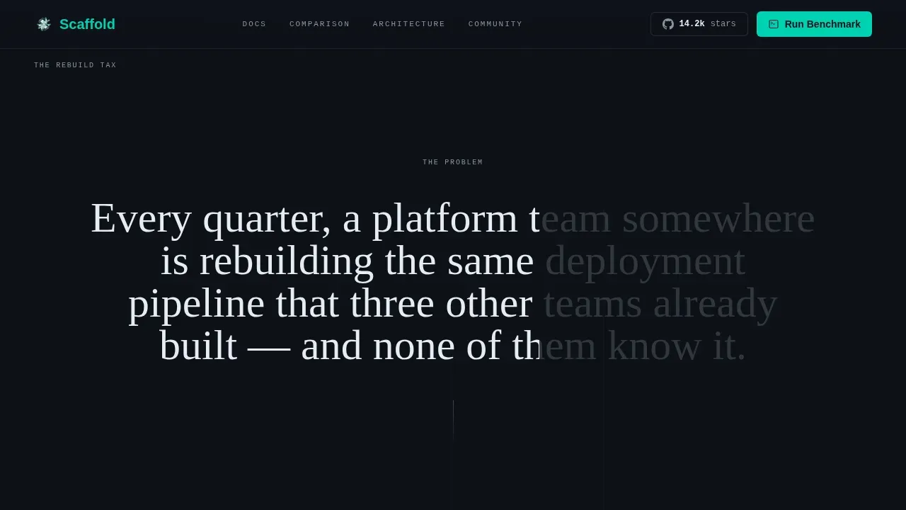
- Engineering teams waste cycles rebuilding deployment pipelines from scratch each quarter because no central page clearly shows what already exists and what it costs to ignore it
- Visitors arrive skeptical and leave unconvinced when a page leads with lifestyle imagery instead of deployment frequency deltas and contributor counts
- Internal developer portal projects struggle to generate adoption because the page never shows a side-by-side workflow cost comparison that developers and directors can both act on
What you get with this template
You get a complete, ready-to-use landing page file set written in a bento grid layout. Every section is pre-filled with placeholder content that mirrors the structure described in the source brief, so you can modify copy and swap data without rebuilding from scratch.
- A full five-section page: metrics wall header, comparison section, architecture bento, social proof block, and a dual-call to action footer form
- Teal Catalyst color system applied across all components, with default teal, slate, terminal black, and catalyst white tokens ready to configure
- High-interactivity code components including spotlight card hover states, a copy-to-clipboard kubectl tile, scroll scrub animations, and a staggered reveal workflow for each section
Feature list
This template ships with purpose-built components designed for platform engineering landing pages. Each feature below reflects what is included in the template as described in the source brief.
Data-First Metrics Wall Header
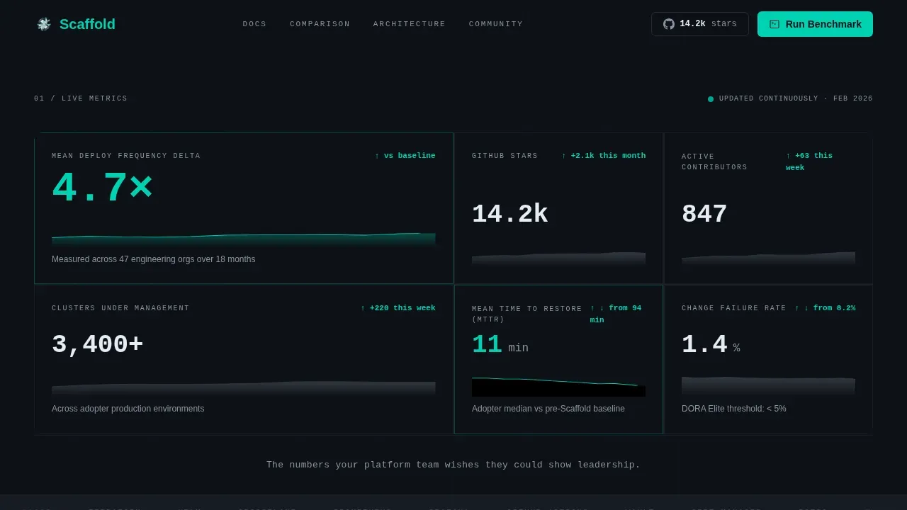
The header section is a bento grid of metric tiles. Each tile holds a large-format number, a micro-sparkline image, and a teal delta arrow. The layout is designed so visitors read deployment frequency, contributor count, and GitHub star data before any headline copy appears. The numbers are the hero. No decorative image is used in this section.
Head-to-Head Comparison Section
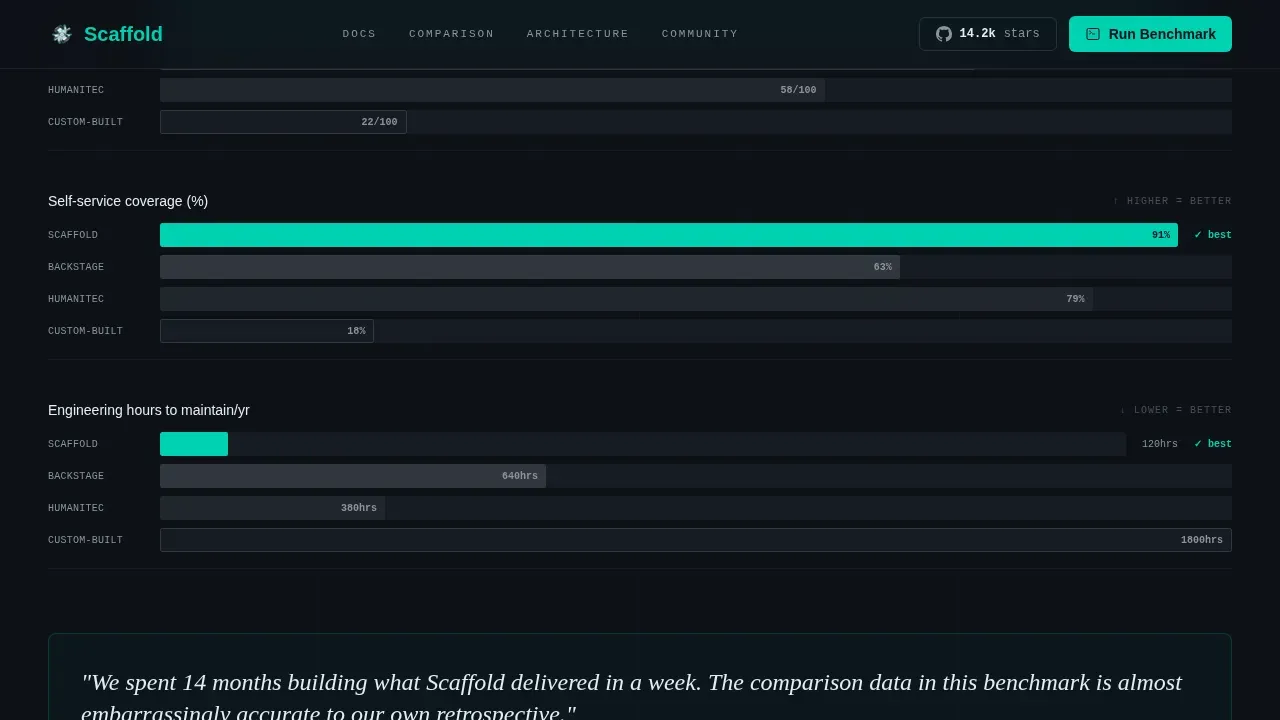
The comparison section presents structured data across multiple axes. Mini comparison tables and horizontal bar charts rendered in teal against slate let users see scaffold scoring versus alternative approaches at a glance. Each row addresses a specific workflow or service cost metric, making the data useful for engineering directors who need to generate a business case.
Golden Paths Architecture Bento
The architecture section uses a bento grid to show what gets wired together: Kubernetes clusters, an internal developer portal, and golden path templates. Each bento tile describes a specific entity in the platform lifecycle, including time-to-first-deploy parameters and service onboarding workflow steps. Developers can navigate the section to understand the full setup without reading separate documentation.
Social Proof and Adopter Block
Pull-quote callouts from named engineering leads are formatted as standalone card components. Adopter company logo tiles sit alongside contributor count and clusters-under-management data. This section gives the page credible, named voices rather than anonymous testimonials, which matters to a skeptical technical audience.
Dual-call to action Conversion Section
The page closes with two conversion paths. The primary call to action is a kubectl command tile with a copy-to-clipboard interaction. The secondary path is a lightweight gate form with two input fields: work email and a current platform stack dropdown. The form is pre filled with a default placeholder so users understand exactly what to input before they click.
Terminal Dark Theme with Teal Catalyst Tokens
The full page is styled using the Teal Catalyst color system. Every interactive state, every metric trending up, and every clickable element uses the primary teal token. Slate handles secondary text and grid dividers. Terminal black holds the page background. Catalyst white surfaces code blocks and card content. Typography is set in JetBrains Mono for numbers and code, Fraunces for headlines, and DM Sans for body language.
Page sections overview
| Section | Purpose |
|---|---|
| Bento Metrics Wall | Opens with DORA data and deployment stats before any headline |
| Comparison Tables | Shows scaffold versus alternatives across workflow and service cost axes |
| Architecture Bento | Maps Kubernetes, developer portal, and golden path entity connections |
| Social Proof Block | Displays named engineering lead quotes and adopter logo tiles |
| Dual call to action Section | Offers kubectl command tile and a gated PDF download form |
| Single-Row Footer | Provides links, project name, and repository access in a compact bar |
Design & branding system
The Teal Catalyst system is applied consistently across every component on this landing page. The palette is built for dark, focused engineering contexts where color carries meaning rather than decoration. Teal is reserved strictly for interactive states, rising metrics, and primary call-to-action elements.
- Color tokens: terminal black #0D1117 as the page base, primary teal #00D1B2 for all active and interactive components, muted slate #8B949E for dividers and secondary text, catalyst white #E6EDF3 for card surfaces and headline copy
- Typography stack: JetBrains Mono for all numerical data and code display, Fraunces for editorial headlines, DM Sans for body and form label language
- Animation layer: spotlight mouse tracking, parallax dot grid, marquee elements, scroll scrub transitions, and staggered section reveal workflow, all executed via GPU-accelerated transforms and Intersection Observer to keep performance clean
Mobile & speed optimization
The template is designed desktop-first. The primary audience uses large monitors with terminal windows open alongside browser tabs. That said, the bento grid layout and component structure are written to adapt gracefully at smaller viewport sizes without losing hierarchy.
- All animation and interactivity components use GPU-accelerated transforms only, keeping the page responsive under heavy visual load
- Intersection Observer handles every scroll-triggered reveal, so components do not execute off-screen and the page loads quickly in production
- The bento grid column system collapses cleanly at tablet and mobile breakpoints, preserving the metric tile hierarchy and comparison table readability
How this template helps you convert
This landing page is structured as an escalating argument. Each section adds evidence before asking anything of the visitor. By the time users reach the call to action, they have already processed enough data to justify sending a Slack message to their team.
- The metrics wall hits first, giving visitors concrete numbers to anchor their evaluation before a single claim is made in prose, which means skeptical developers stay on the page longer
- The comparison section builds cost-of-inaction awareness by showing what other methods and tools actually require in engineering hours, making the call to action feel like a logical next step rather than a sales push
- The dual-call to action form closes with minimal friction: one input for work email, one dropdown to configure the current stack, and a kubectl command that users can clone and execute immediately without creating an account
Other information about this template
This section covers additional context helpful for evaluating whether the Scaffold template fits your project and workflow needs.
- The template is written in a structure compatible with landing page frameworks built using Tailwind CSS, so developers can configure the default utility classes and modify the design system without rewriting components from scratch
- Code scaffolding is a technique used to generate source code from a pre-defined set of templates, and this page template applies the same philosophy: boilerplate code includes a project's foundational structure, folder systems, and initial configurations so you start with a working directory rather than a blank file
- Scaffolding tools like Cookiecutter automate project creation from templates, and the Scaffold landing page template follows the same pattern by providing a reusable set of files to generate a new project page with established organizational standards
- The template repository is structured to make it straightforward to clone, configure metadata such as project name and page description, and deploy to a production environment using the following command pattern described in the included setup guide
- For teams evaluating other types of internal tooling, internal developer portals can facilitate self-service onboarding workflows where developers trigger automated processes by submitting a form with basic service details, and this page template is designed to showcase exactly that kind of workflow effectively
- Platform engineering aims to create a consistent developer experience by organizing tools into a unified, self-service interface, and the template's comparison section is built to communicate that value to both technical users and engineering leadership
- The scaffold open source platform engineering landing page template includes query parameters support in the gated download form, allowing teams to track progress on lead sources and pre-populate form fields for specific campaign links
- Infrastructure as Code tools allow engineers to define infrastructure via code, and this template is built to sit alongside that ecosystem, giving new services a public-facing page that reflects the same level of rigor applied to the underlying platform
- Static code analysis can be applied to the template's component files to enforce coding conventions before any changes reach the main repository, helping teams maintain governance across their documentation and marketing assets
- GitHub repository access, GitHub Actions workflow integration, and automated service registration patterns are referenced throughout the template's placeholder content, giving developers helpful examples of how to connect the page to their existing toolchain

Theme
Data Command
Creative direction
Industry Report
Color system
Teal Catalyst
Style
Bento Grid
Direction
Comparison/Versus
Page Sections
Data-first Bento Metrics Wall
Head-to-head Comparison Tables
Golden Paths Architecture Bento
Social Proof with Named Voices
Dual-path Call to Action with Kubectl Tile
Teal Catalyst Dark Theme System
Related questions
What technology stack does this template use?
Can I clone this template and deploy it for my own open-source project?
Does this template support a form for gated content?
Who is the primary audience for this landing page template?
How does this template compare to building a page from scratch?



