Site Build Landing Page Template
Dispatch is a bold brutalist construction order management landing page template built for platforms that unify material orders, delivery windows, and subcontractor schedules into one live board. It leads with an interactive cost-of-delay calculator and a sharp product screenshot header, then unfolds into a modular card grid designed to drive visitors straight to a live product demo.
by Rocket studio
Quick summary
Dispatch is a single-page, card grid landing page template built for construction order management platforms. It opens with a pixel-sharp product screenshot header, immediately follows with a value-giving cost-of-delay calculator, then expands into a modular feature grid. The entire flow is engineered to move a skeptical general contractor from "what am I losing?" to "show me the dashboard."
Who this template is for
This template is built for software teams and founders marketing a construction order management or site logistics platform. It speaks directly to the people who live inside the chaos of active job sites.
- General contractors managing multiple active construction sites simultaneously
- Procurement managers tracking rebar, concrete, and material delivery schedules
- Project engineers who need real-time visibility into purchase order approvals and delivery ETAs
What problem this template solves
Construction teams lose measurable money when material delays go untracked. A missed concrete delivery can idle a full crew for a day. The template addresses this pain head-on, before asking for anything in return.
- Delayed material orders and missed delivery windows create invisible budget bleed
- Subcontractor schedules and vendor communications live in scattered channels with no single source of truth
- Procurement bottlenecks, pending purchase order approvals, and site-level status gaps slow down every pour and pallet
What you get with this template
You get a fully structured, single-page landing page template that leads with proof of value and closes with a clear path to a live product demo. Every section is purpose-built for a construction software audience.
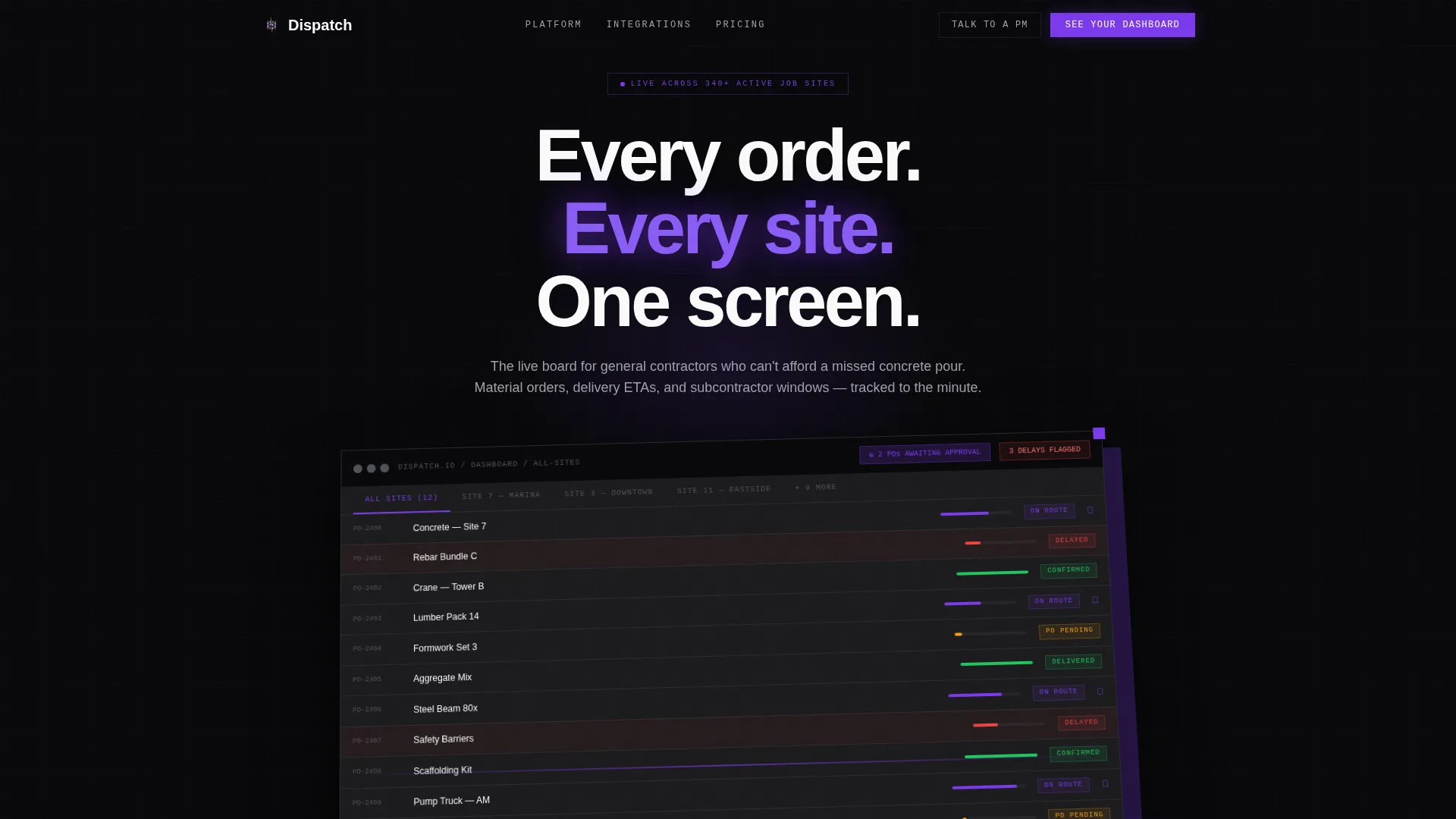
- A full-width product screenshot header with a heavy grotesque headline and brutalist drop shadow framing
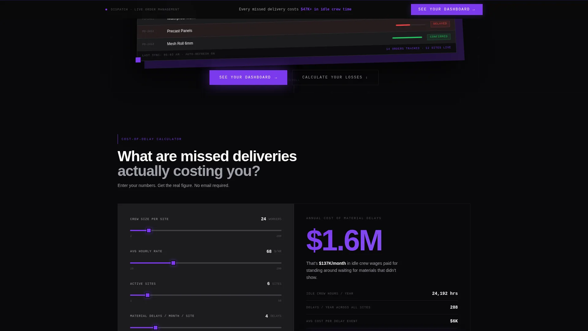
- An embedded, interactive cost-of-delay calculator that outputs personalized annual loss figures before asking for a signup
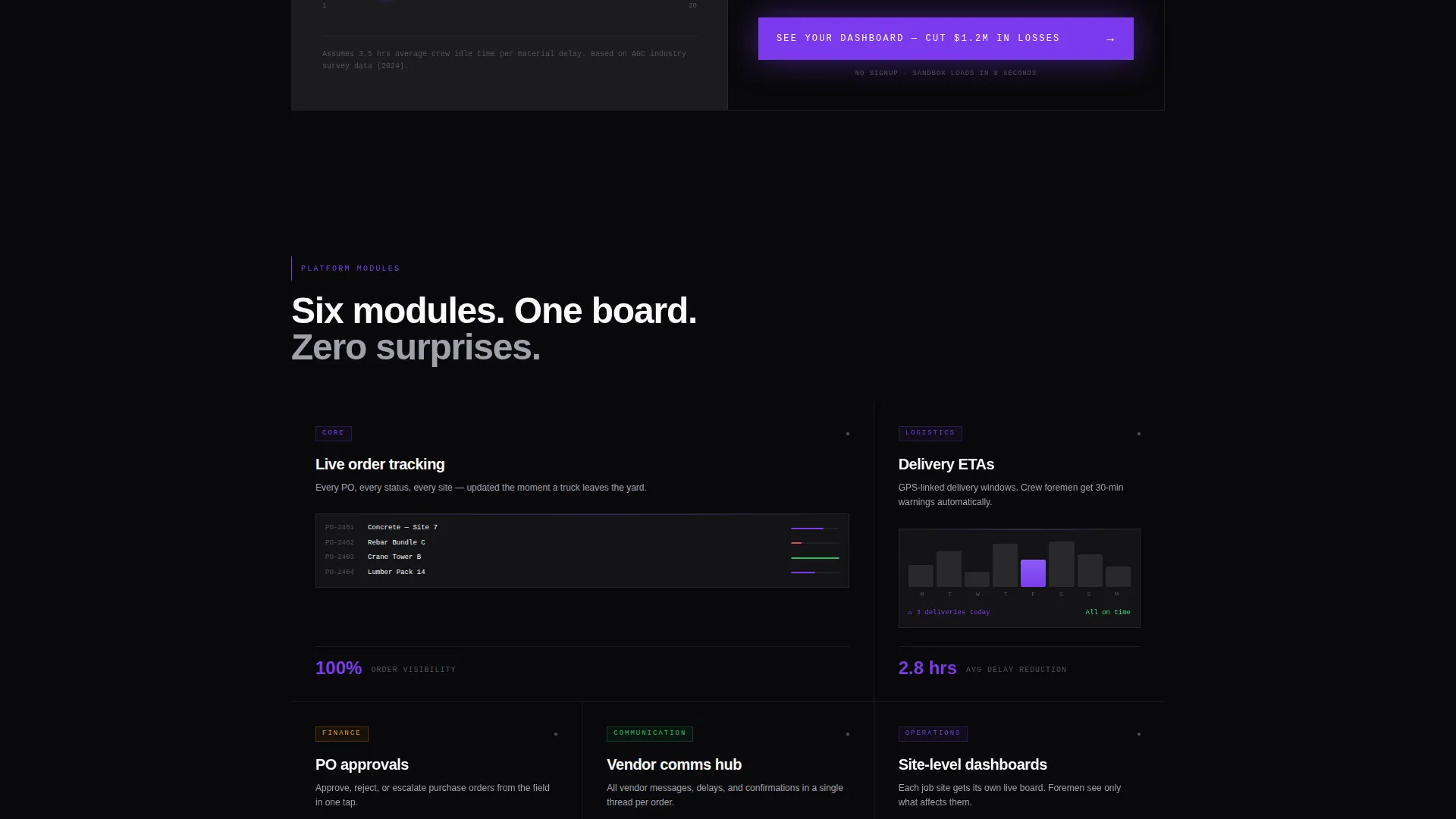
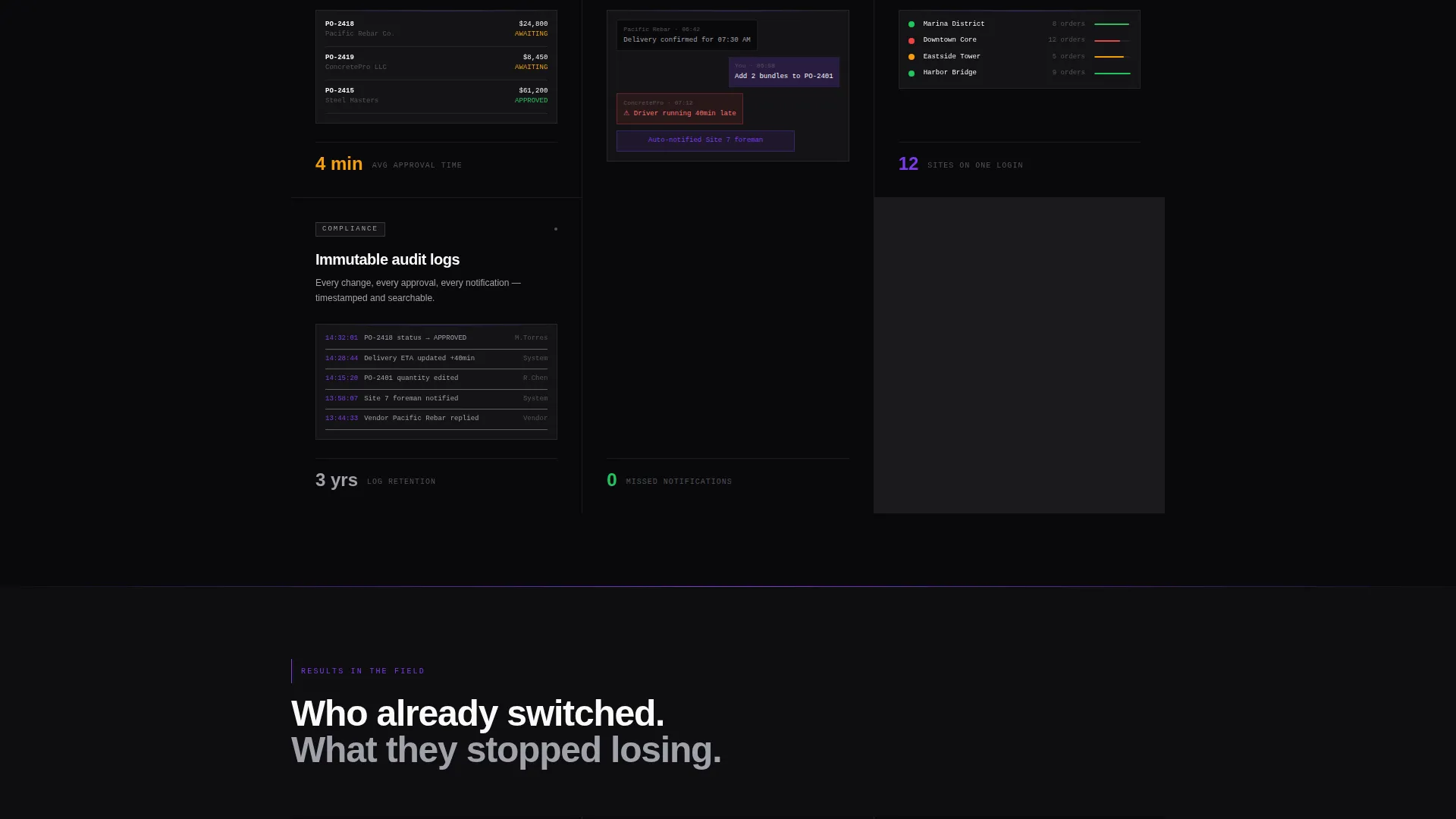
- A modular card grid of feature tiles, each with a micro-screenshot, a one-line benefit statement, and a concrete outcome stat
Feature list
This template packs a specific set of components that work together to validate the platform and accelerate the decision to try it.
Interactive Cost-of-Delay Calculator
The calculator sits immediately below the header. Visitors enter crew size, average hourly rate, and number of active sites. The tool outputs annual dollars lost to material delays in oversized violet numerals on a void black card. It gives real value before requesting anything.
Product Screenshot Hero Header
The header is a full-width, pixel-sharp dashboard screenshot showing fourteen material orders in various states, three flagged delays highlighted in electric violet, a delivery timeline with truck icons, and a notification badge for pending purchase order approvals. The screenshot is slightly rotated on a Z-axis with a brutalist drop shadow.
Modular Feature Card Grid
Each card is a self-contained brutalist tile covering a distinct platform capability: order tracking, vendor communications, delivery ETAs, purchase order approvals, site-level dashboards, and audit logs. Cards lead with outcomes and stats, not feature descriptions.
Tiered Call-to-Action System
The primary call to action, "See Your Dashboard," appears first below the calculator output, reappears as a sticky bottom bar after the fourth card, and closes the page as a full-width brutalist block. A secondary "Talk to a PM" option lives in the top navigation for enterprise buyers.
Site-Office Visual Tone
The page is designed to feel like a current, controlled site office: every board updated, every status known. This emotional framing builds immediate trust with general contractors and procurement managers who are used to disorder.
Page sections overview
| Section | Purpose |
|---|---|
| Top Navigation Bar | Houses secondary "Talk to a PM" call to action for enterprise buyers |
| Product Screenshot Header | Anchors credibility with a live dashboard capture and headline |
| Cost-of-Delay Calculator | Delivers instant, personalized value before any signup ask |
| Calculator Results Card | Outputs annual loss figure in violet numerals to prime call to action |
| Primary call to action Block | Drives visitors to no-signup sandbox demo environment |
| Feature Card Grid | Proves platform outcomes across six modular capability tiles |
| Sticky call to action Bottom Bar | Reinforces demo call to action after fourth card scroll point |
| Social Proof Section | Shows who has already switched to the platform |
| Closing call to action Block | Full-width brutalist end block repeating primary demo action |
Design & branding system
The visual identity follows a Bold Brutalist theme built around the Void and Violet color system. It feels like a parking structure at night lit by a single ultraviolet strip: industrial, uncompromising, and impossible to ignore.
- Color palette: absolute void black (#09090B) for card backgrounds, poured-concrete gray (#1C1C1E) for surface layers, electric violet (#7C3AED) for all interactive elements including buttons, toggles, and progress bars, and exposed-steel silver (#A1A1AA) for secondary text and dividers
- Typography: heavy grotesque typeface for headlines, creating a hard-edged visual weight that matches the brutalist grid structure
- Layout: card grid with brutalist drop shadows where each module floats in darkness, no lifestyle photography, no stock hard hat imagery, the product interface is always the visual hero
Mobile & speed optimization
The modular card grid structure is inherently responsive. Each brutalist tile is a self-contained unit that stacks cleanly on smaller screens without losing its visual weight or readability.
- Card grid columns reflow naturally for tablet and mobile viewports, keeping each feature tile legible at any size
- The sticky call to action bottom bar is particularly effective on mobile, remaining visible as visitors scroll through the feature grid
- The calculator component is designed for touch input, making the crew size and hourly rate fields easy to interact with on a phone screen
How this template helps you convert
The entire page is structured as a progressive commitment path. It does not ask for trust upfront. It earns it through a sequence of value moments.
- The cost-of-delay calculator gives visitors a personalized financial figure before the first call to action appears, making "See Your Dashboard" feel like a direct solution to a number they just calculated themselves.
- The modular card grid shifts the conversation from features to outcomes, using concrete stats and micro-screenshots to prove the platform works rather than simply claiming it does.
- The no-signup sandbox demo removes the final barrier: clicking through lands on a pre-populated live environment, so the decision to explore costs nothing.
Other information about this template
This template is a strong fit for construction software marketing teams building a dedicated landing page for a dispatch, logistics, or order management platform. It is a click-through landing page, meaning every design and copy decision points toward one goal: getting a qualified visitor into the sandbox demo.
- Template style: Card Grid (Modular), making it straightforward to extend or reorder feature tiles as the platform evolves
- Creative direction: Calculator First, a proven approach for platforms where the cost of inaction is quantifiable and significant
- The template does not include a blog, documentation pages, or pricing table by default; it is scoped as a focused single-page conversion asset
- Suitable for construction technology products competing in the construction software and site logistics space
Theme
Bold Brutalist
Creative direction
Calculator/Tool First
Color system
Void & Violet
Style
Card Grid (Modular)
Direction
Click-Through
Page Sections
Interactive Cost-of-delay Calculator
Product Screenshot Hero Header
Modular Feature Card Grid
Tiered Call-to-action System
Bold Brutalist Visual Identity
Related questions
Who is the target visitor for this landing page?
Does the calculator require a backend or special setup?
Can I customize the feature cards to match my platform?
Is the sandbox demo link included in the template?
Does this template work for a platform with a different visual brand?



