Foundry - Brutalist Startup Landing Page Template
Foundry is a brutalist comparison landing page built for a startup community forum. It leads with utility, a tab switcher that previews live threads, a burn-rate calculator, and a member network graph, before dropping into a confrontational comparison table. The design is raw, flat, and fast, built to earn the signup before asking for it.
by Rocket studio
Quick summary
Foundry is a single-page, tool-first landing page for a startup community forum. It skips the pitch and opens with working features: a thread preview, a startup cost calculator, and a network graph. A brutalist comparison table then stacks the forum against alternatives, row by row, until the decision feels obvious and the "Claim Your Founder Handle" button is already on screen.
Who this template is for
This template is built for founders who want their community to speak for itself. It works best when the product is genuinely differentiated and the audience values directness over polish.
- Solo founders and bootstrappers launching a community or forum product
- Second-time founders or community builders who want a high-signal, low-fluff signup page
- Startup studio teams or accelerator communities positioning against Reddit, Slack groups, and generic forums
What problem this template solves
Most community landing pages look like every other SaaS page. They lead with a tagline, bury the value, and ask for an email before proving anything. Founders are skeptical visitors. They scan fast, trust slowly, and leave quickly if the page feels like marketing.
- The tool-first layout proves value before asking for commitment
- The comparison table removes the need to self-describe, it just shows the gap
- The dual conversion paths match different intent levels, from ready-to-sign-up to just-exploring
What you get with this template
You get a complete, single-page layout designed around conversion through demonstrated utility. Every section is intentional, and every interactive element earns its place before the call to action appears.
- A three-tab feature switcher showing a live thread preview, an interactive burn-rate calculator, and a force-directed member network graph
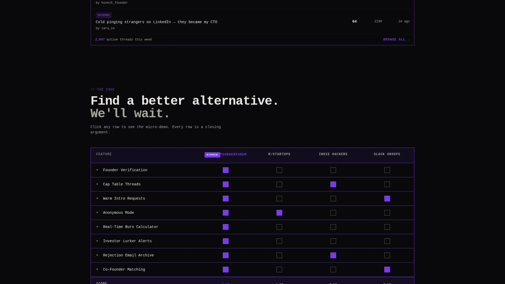
- A brutalist comparison table with expandable rows, filled violet checkmarks, and void-state empty cells for competitor gaps
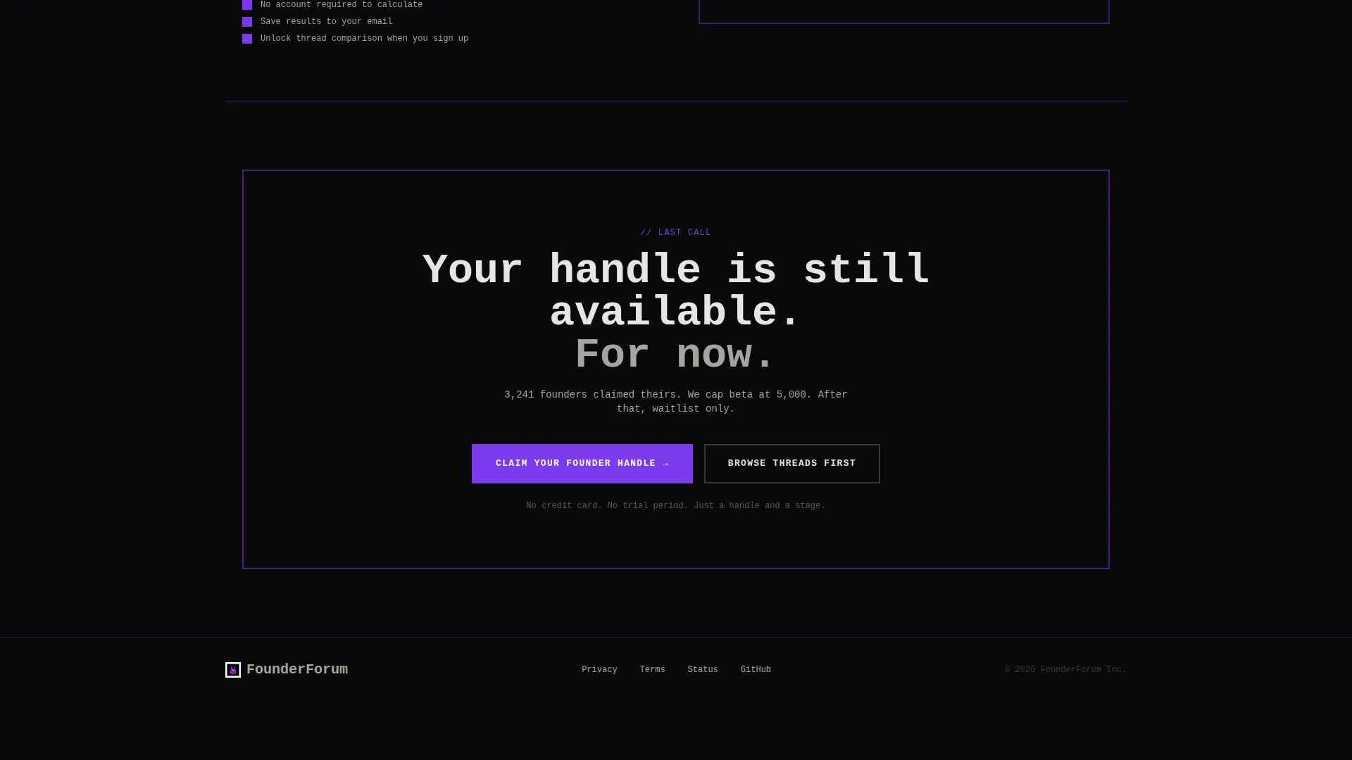
- Two conversion paths: a sticky "Claim Your Founder Handle" form and a soft calculator-first email capture below the table
Feature list
This section describes what is built into the template based on the source brief.
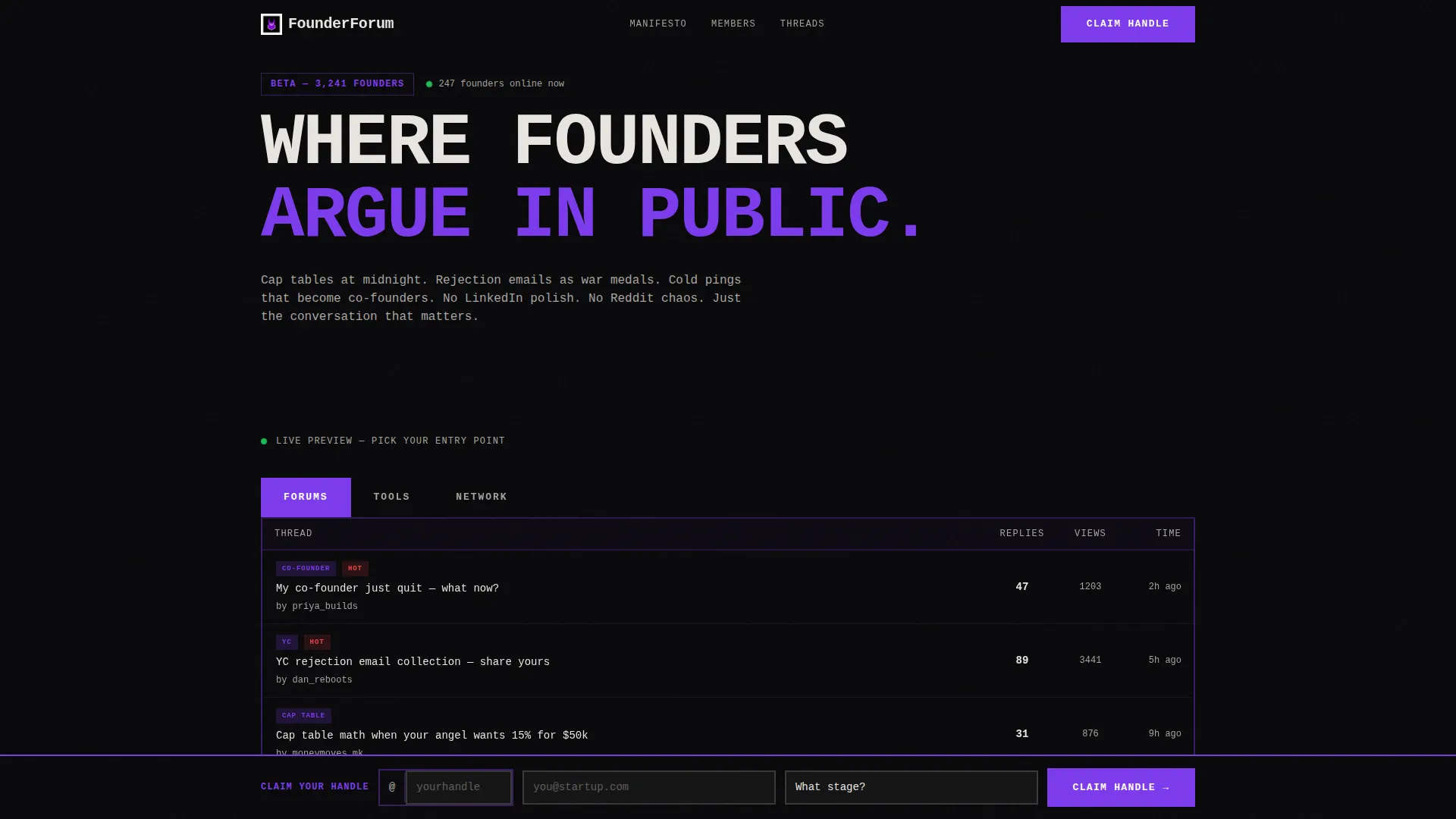
Three-Tab Feature Switcher Header
The header replaces a traditional hero with three oversized brutalist tabs labeled "FORUMS," "TOOLS," and "NETWORK." Each tab snaps the viewport to a different live preview, a real forum thread, an interactive calculator, and a pulsing member graph. There is no tagline. The interface is the pitch.
Interactive Startup Cost Calculator
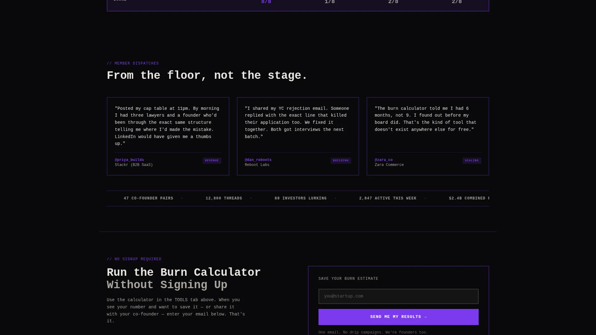
The Tools tab surfaces a real-time burn-rate calculator. Visitors enter team size, runway months, and city to receive an estimated monthly burn. The calculator does visible work for the visitor before any signup is requested, making the secondary email capture feel like a natural next step.
Force-Directed Member Network Graph
The Network tab displays a force-directed graph of member connections. Violet nodes pulse to communicate activity and density. This visual replaces a testimonial grid and communicates community signal through structure rather than words.
Brutalist Comparison Table
The comparison table pits the forum directly against alternatives across rows including "Founder Verification," "Cap Table Threads," "Warm Intro Requests," "Anonymous Mode," "Real-Time Burn Calculator," and "Investor Lurker Alerts." Checkmarks are filled violet squares; missing features are empty void cells. Each row expands on click to reveal a micro-demo or screenshot.
Dual Conversion Path System
The primary conversion is a sticky "Claim Your Founder Handle" button that appears after the first table row scrolls into view. It collects a handle, an email, and a single stage dropdown. The secondary path sits below the table and captures email only after the visitor has used the calculator and wants to save their result.
Void and Violet Visual System
Every background is absolute void black. Interactive elements, toggle states, and winner badges use electric violet. Text and table cells use exposed concrete white. The palette is flat, edgeless, and deliberately terminal-coded, no gradients, no rounded corners, no softness anywhere.
Page sections overview
| Section | Purpose |
|---|---|
| Tab Switcher Header | Previews forum thread, calculator, and network graph |
| Forum Thread Preview | Shows a real thread with reply counts and timestamps |
| Burn-Rate Calculator | Lets visitors estimate startup costs before signing up |
| Member Network Graph | Visualizes community connections with violet nodes |
| Comparison Table | Stacks forum features against competitor alternatives |
| Sticky Primary call to action | Surfaces "Claim Your Founder Handle" after first scroll |
| Secondary Email Capture | Collects email after calculator result is revealed |
Design & branding system
The visual identity is built on a Void and Violet color system. Every design decision pushes rawness over refinement, this is a page that looks like it was built by someone who had something to prove.
- Color palette: absolute void black (#09090B) for all backgrounds, electric violet (#7C3AED) for interactive elements and badges, deep ultraviolet (#4C1D95) for depth states, and exposed concrete white (#E8E5E0) for all text and table cells
- Typography and layout: monospaced, oversized tab labels, thick 2px violet borders on all table cells, flat surfaces, sharp edges, and zero gradients throughout
Mobile & speed optimization
The layout is designed to remain confrontational and functional at smaller viewport sizes. The tab switcher, comparison table, and calculator all need to deliver their impact on a phone screen just as clearly as on a desktop.
- The tab switcher snaps cleanly between previews without requiring horizontal scrolling
- The comparison table is structured so expanded row demos remain readable on narrow screens
How this template helps you convert
The page is structured around earning the click rather than demanding it. Each layer of the page adds evidence before asking for anything.
- The calculator delivers a personalized result first, making the email capture feel like a save action rather than a gate
- The comparison table stacks evidence row by row, so by the time the sticky call to action is visible, the visitor has already seen the gaps in every alternative
Other information about this template
This template is built inside the Foundry design system and carries a Bold Brutalist theme throughout. It is category-matched to the Technology vertical with a Startup Digital Presence subcategory focus.
- Template style: Comparison Table landing page with a Calculator and Tool First creative direction
- Theme and system: Bold Brutalist theme using the Void and Violet color system, designed for startup community forum use cases
- The header concept is a Feature Tab Switcher, and the conversion direction is Comparison and Versus, both are baked into the page structure, not optional add-ons
Theme
Bold Brutalist
Creative direction
Calculator/Tool First
Color system
Void & Violet
Style
Comparison Table
Direction
Comparison/Versus
Page Sections
Three-tab Feature Switcher Header
Interactive Burn-rate Calculator
Force-directed Network Graph
Expandable Comparison Table
Dual Conversion Path System
Void and Violet Design System
Related questions
Can I replace the forum thread shown in the tab switcher?
Does the burn-rate calculator require a backend connection?
Can the comparison table rows be edited to match different competitors?
How does the secondary email capture work?
Is this template suited for an early-access or waitlist launch?



