Avant-Garde Eyewear Landing Page Template
Frame is an avant-garde eyewear landing page template built around a modular card grid. It pairs a dramatic spotlight header with staggered card reveals, scarcity-driven product copy, and a hover-activated archival red accent system. The result is a browsing experience that feels less like a shop and more like a curated lookbook, designed to convert curious visitors into committed buyers.
by Rocket studio
Quick summary
Frame is a single-page, card grid landing page template built for avant-garde eyewear brands. It opens with a hard-lit spotlight header and unfolds into a modular product grid. The Ink & Paper color system, staggered card reveals, and scarcity copy work together to make every frame feel like a collectible object worth clicking through.
Who this template is for
This template was built for brands that treat eyewear as wearable sculpture. It suits design houses, independent eyewear labels, and editorial-facing retailers whose products carry a point of view.
- Independent eyewear designers presenting seasonal collections to creative professionals
- Boutique opticians or concept stores targeting architects, stylists, and creative directors
- Avant-garde fashion brands launching a curated product drop with limited-run framing
What problem this template solves
Most product landing pages flatten distinctive objects into commodity grids. For avant-garde eyewear, that approach kills the story before the customer even leans in.
- Generic templates prioritize volume over atmosphere, undermining the perceived value of sculptural or limited-edition pieces
- Standard grids lack the hover behavior and scarcity signals that turn passive browsing into urgent, intent-driven clicks
- Flat color systems and predictable layouts fail to communicate the brand language that creative-director buyers respond to
What you get with this template
You get a complete, ready-to-customize landing page that fuses gallery aesthetics with deliberate click-through architecture. Every visual decision serves the product and the buyer's decision-making process.
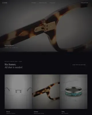
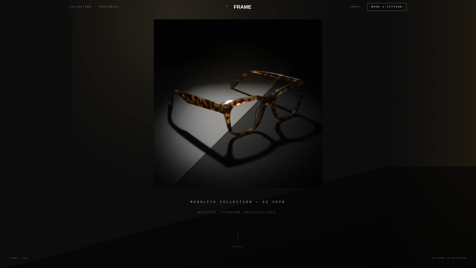
- A full-page spotlight header section with a three-quarter product shot, hard directional lighting concept, and tracked-out uppercase collection name
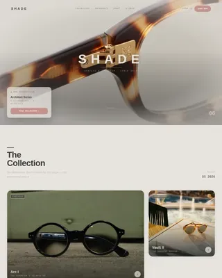
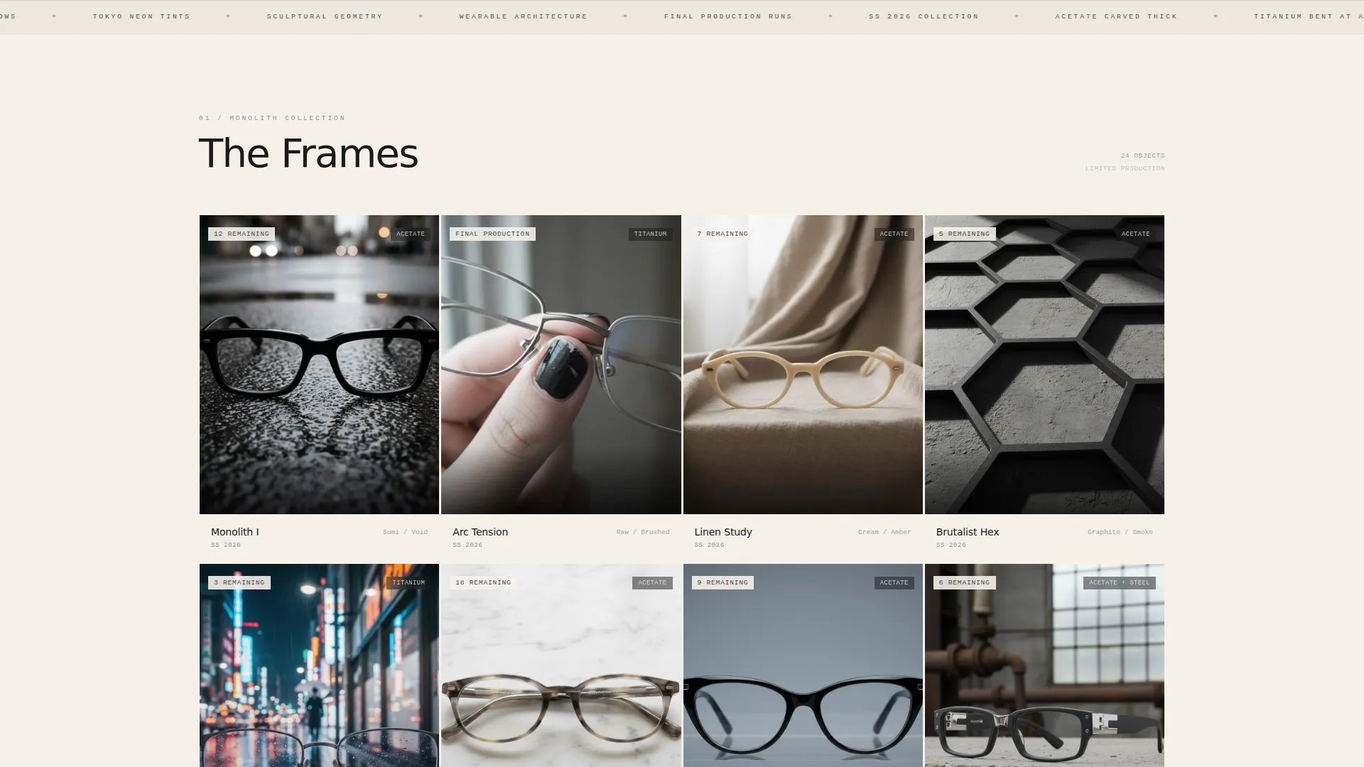
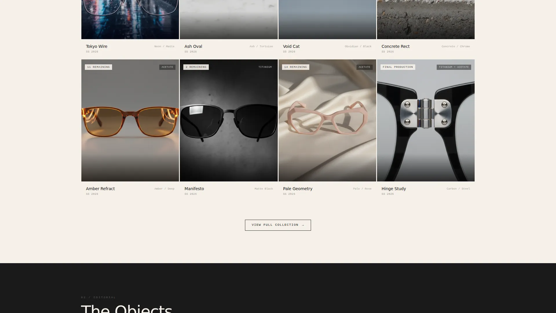
- A modular card grid with staggered fade-in reveals, per-card mood photography placeholders, and hover-state interactions including archival red border accent and "View Frame" call to action in small caps
- A persistent top navigation bar carrying a secondary "Book a Fitting" path for in-person or virtual try-on visitors
Feature list
This section outlines the core built-in capabilities of the Frame template.
Spotlight Header Section
The header places a single eyewear object center-screen against absolute black. A hard directional light casts a razor-sharp diagonal shadow across the lower third. The collection name appears below in tracked-out uppercase grotesque type. This opening sets the tone before any product grid appears.
Staggered Card Grid Reveals
The product grid fades in card by card at slightly different rhythms rather than loading all at once. This pacing gives the scroll a gallery-wall quality. Each card acts as a contained world with its own mood photography placeholder, keeping the grid visually cohesive while allowing contrast between shots.
Hover-Activated Accent System
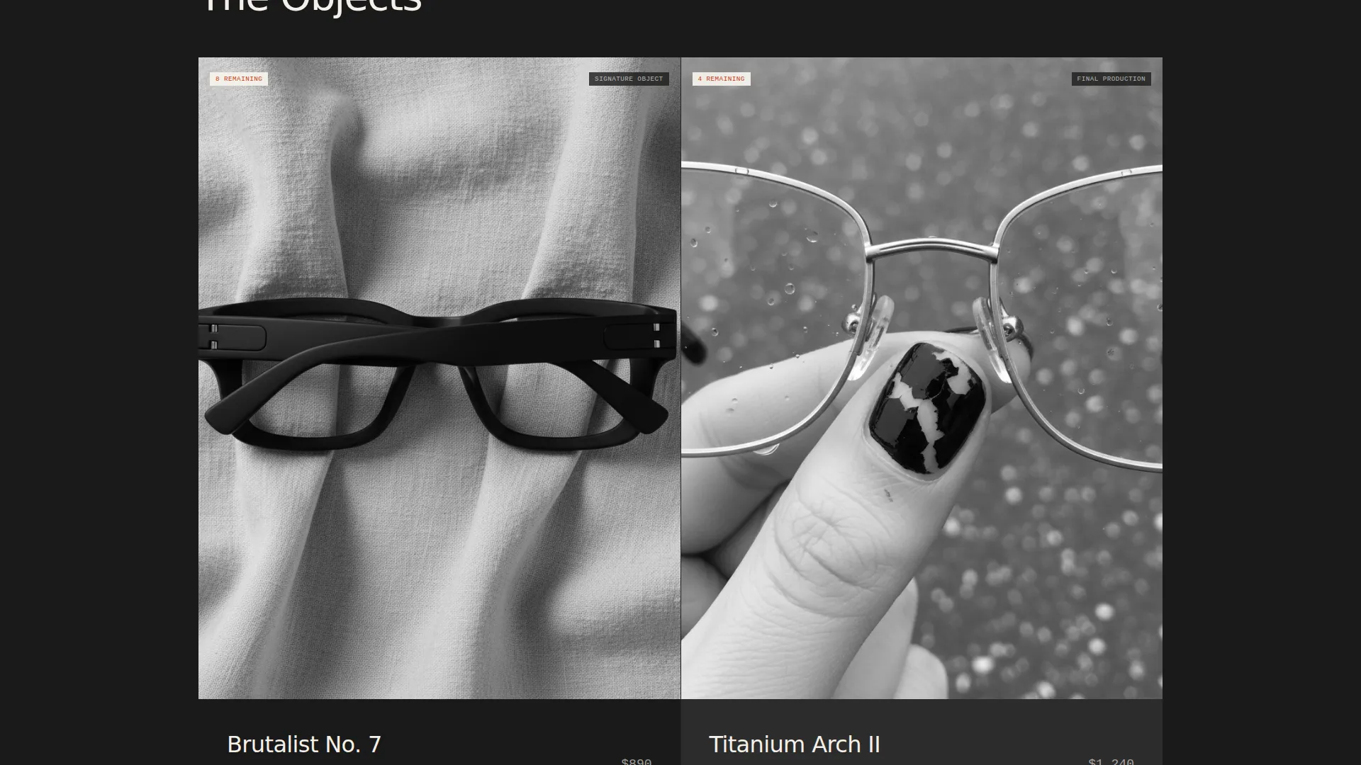
Hovering any card triggers a subtle background shade shift and bleeds the archival red accent into the card border. The price appears as a quiet aside and the "View Frame" call to action surfaces in small caps with a red underline. No hover state is decorative, each one nudges the visitor toward a click.
Per-Card Scarcity Signals
Each card supports embedded scarcity copy such as "12 remaining" or "Final Production" directly inside the grid. This language is baked into the card layout so it reads as editorial context, not pushy sales copy. It reframes browsing as a form of collecting.
Persistent Top Navigation Bar
A fixed top bar carries the secondary conversion path throughout the full scroll. The "Book a Fitting" link stays visible at all times for visitors who prefer to experience frames in person or through virtual try-on before committing.
Ink & Paper Color System
The palette uses four values: deep sumi ink black (#1A1A1A), uncoated stock cream (#F5F0E8), graphite pencil gray (#4A4A4A), and archival red (#C23B22). The red is reserved exclusively for hover states and cart interactions. This constraint makes the accent feel intentional every time it appears.
Page sections overview
| Section | Purpose |
|---|---|
| Spotlight Header | Introduces the collection with a single dramatic product shot and collection name |
| Persistent Top Bar | Keeps the "Book a Fitting" secondary path accessible throughout the full scroll |
| Modular Card Grid | Displays individual eyewear frames with mood photography and scarcity context |
| Card Hover Layer | Surfaces price, "View Frame" call to action, and red accent on interaction |
Design & branding system
The visual identity follows a Marketplace Grid theme through an Ink & Paper color system. The palette feels like a freshly printed independent magazine, where negative space carries as much weight as any element on the page.
- Four-value color system: sumi ink black (#1A1A1A) as primary, cream (#F5F0E8) as surface, graphite gray (#4A4A4A) as secondary text, and archival red (#C23B22) reserved for hover and cart states only
- Typography uses a thin grotesque typeface set in tracked-out uppercase for headlines, keeping text nearly invisible against the dark field while remaining fully legible on close reading
- Photography placeholders are framed to support high-contrast, directional-lit product shots across varied mood backdrops including wet asphalt, draped linen, and hand-held angles
Mobile & speed optimization
The card grid layout is built to adapt across screen sizes without losing its modular rhythm. The staggered reveal behavior and hover states are designed for the contexts where this template is most likely to be used.
- The grid columns reflow cleanly for smaller viewports so each card retains its full visual weight on mobile
- Hover-state interactions are scoped to pointer devices, keeping the card layout clean and tap-friendly on touch screens
How this template helps you convert
The template earns its clicks through atmosphere rather than aggressive calls to action. Every structural and visual decision moves the visitor from passive browsing to deliberate product engagement.
- The spotlight header creates immediate brand trust, signaling that this is a considered product and not a mass-market catalog
- Staggered card reveals and per-card scarcity language introduce a sense of urgency that reframes browsing as collecting, pushing hesitant visitors toward the "View Frame" click
Other information about this template
Frame sits at the intersection of editorial fashion presentation and functional product discovery. It works as a standalone collection launch page or as a permanent storefront layer for brands that release in drops.
- The template style is Card Grid (Modular), suited to brands presenting multiple distinct pieces within a single curated release
- The Atmosphere & Mood creative direction and Spotlight header concept make this template especially well-suited to editorial-first fashion and lifestyle brands
- The Click-Through landing page direction means the page has no on-page cart or form; its sole conversion goal is driving visitors into individual product detail pages or toward the fitting booking path
- The template is categorized under Fashion and Lifestyle, specifically within the Avant-Garde Fashion subcategory, targeting the Avant-Garde Eyewear Brand niche
Theme
Marketplace Grid
Creative direction
Atmosphere & Mood
Color system
Ink & Paper
Style
Card Grid (Modular)
Direction
Click-Through
Page Sections
Spotlight Header with Directional Lighting
Staggered Card Grid Reveals
Hover-activated Red Accent System
Per-card Scarcity Copy
Persistent Top Navigation Bar
Ink & Paper Four-value Color System
Related questions
Can I replace the card photography with my own product shots?
Does this template include a shopping cart?
How do I update the scarcity text on each card?
Can the 'Book a Fitting' link point to an external booking or try-on page?
Is this template a good fit for a limited-edition product drop?