Pro Construction Landing Page Template
Scaffold is a construction knowledge base landing page template built for teams who need fast, credible answers on the job. It uses a hub-and-spoke anchor navigation layout, comparison tables, and a live-search demo to show buyers what the product can do before they ever sign up. The design is sharp, high-contrast, and field-ready.
by Rocket studio
Quick summary
Scaffold is a single-page, anchor-navigated landing page template for a construction knowledge base product. It leads with a logo bar, drives visitors through five comparison spokes, and converts through a live-search demo and a primary call to action. Every section reads like a spec sheet: structured, high-contrast, and built for fast decisions.
Who this template is for
This template is for teams building or marketing a construction knowledge base product. It is designed to speak directly to field-oriented professionals who evaluate tools by evidence, not by pitch.
- Project managers juggling submittals and documentation across multiple active jobs
- Estimators who need quick access to current cost data and local labor references
- Junior engineers and site staff who need code guidance before a pour or inspection
What problem this template solves
Construction teams waste time hunting through scattered tools, PDFs, and field guides when they need a single reliable answer fast. This template positions the product as the replacement for that fragmented workflow.
- No unified search across specs, codes, and methods leads to slow, costly mistakes
- Comparison tables show feature-by-feature gaps between the knowledge base and the tools it displaces
- The live-search demo removes skepticism mid-scroll by letting visitors query the product before committing
What you get with this template
You get a fully structured, single-page landing page built around five anchor navigation spokes. The layout is comparison-first, evidence-led, and designed to move a technical buyer from skepticism to a free-trial click.
- A sticky anchor navigation bar with five labeled spokes: Coverage, Speed, Accuracy, Integrations, and Pricing
- Comparison tables with checkmarks, response-time benchmarks, and source counts across every spoke
- A live-search demo pre-loaded with a real construction query, embedded between the third and fourth spokes
- A primary call-to-action button and a gated secondary conversion offer built into the page structure
Feature list
This template is packed with purpose-built components. Each one reflects how a construction professional actually evaluates a tool.
Anchor Navigation Bar
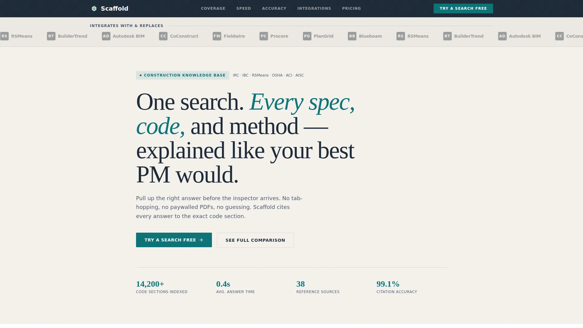
A sticky top bar pins five spoke labels to the screen as users scroll. Visitors can jump directly to Coverage, Speed, Accuracy, Integrations, or Pricing without losing their place on the page.
Logo Bar Header
A horizontal scroll of construction software logos appears above the main headline. The logos are rendered in monochrome gray, forming a credibility row that signals compatibility and competitive context before a single word is read.
Comparison Tables with Tooltips
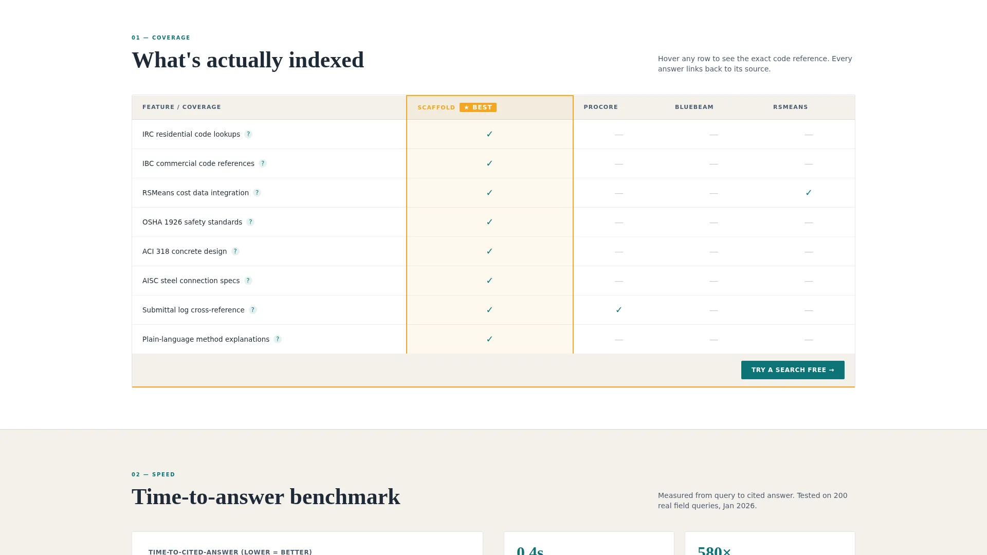
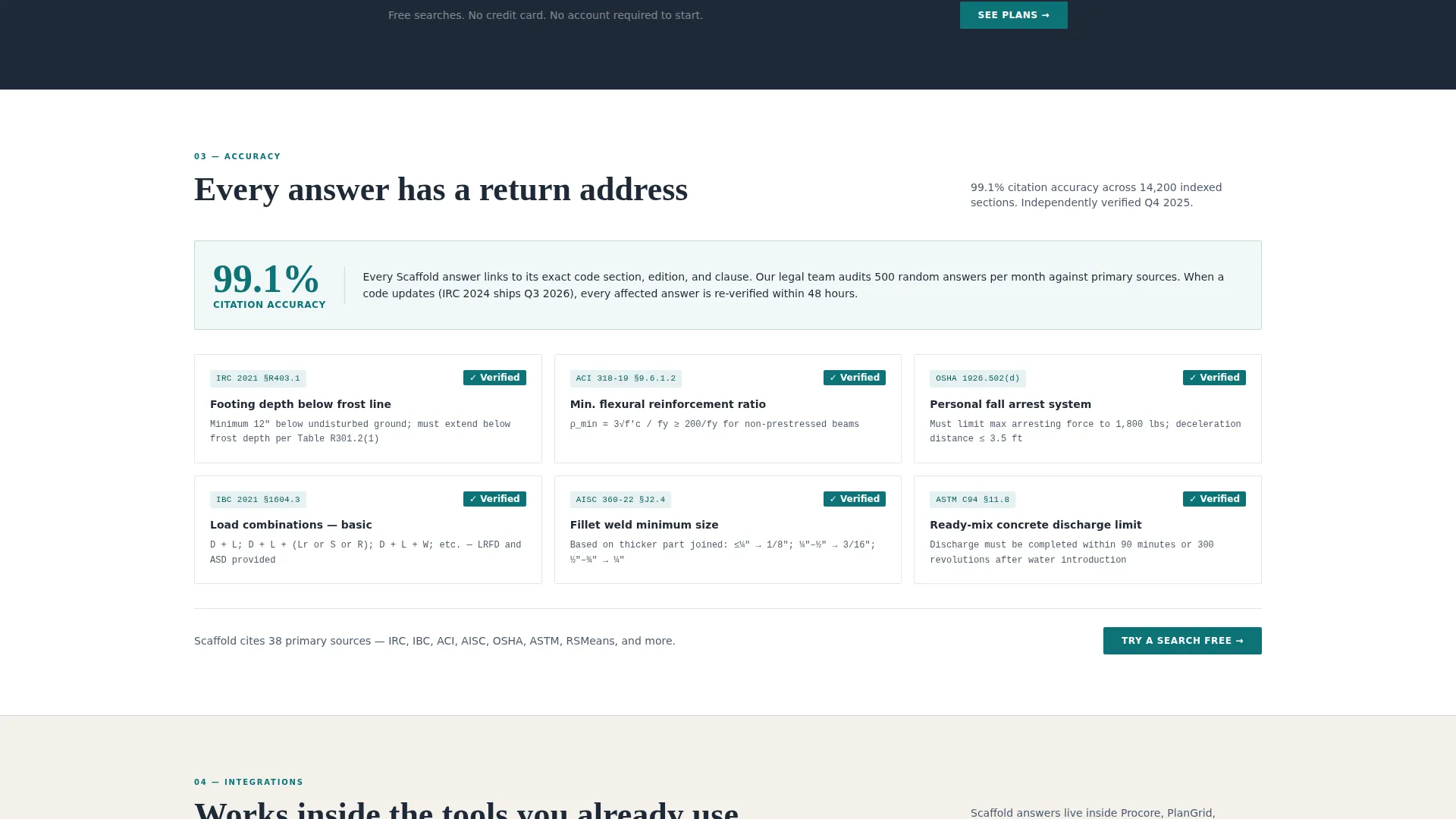
Each spoke section includes a structured comparison table. Hover states reveal tooltips citing specific code references, such as IRC 2021 Section R403.1, to demonstrate depth without cluttering the grid.
Embedded Live-Search Demo
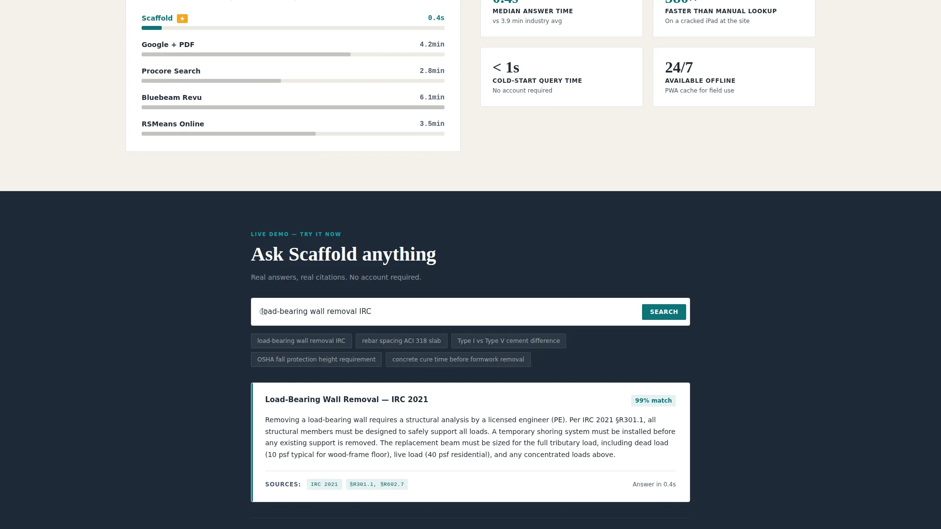
A functional search input is embedded between the third and fourth spokes. It loads pre-filled with the query "load-bearing wall removal IRC" so visitors see a real, formatted answer before reaching the pricing section.
Dual Conversion Paths
The primary call to action, "Try a Search Free," appears in the sticky nav and at the bottom of every comparison table. The secondary offer, "See Full Comparison PDF," is gated behind a work-email field and a company-size selector.
Safety-Vest Amber Highlights
The amber accent color is reserved exclusively for comparison highlights and winning-column indicators. This creates an instant visual signal that guides the reader's eye to the product's strongest differentiators.
Page sections overview
| Section | Purpose |
|---|---|
| Logo Bar Header | Establishes credibility with known construction software logos before the headline |
| Main Headline | Delivers the product promise in a single line above the fold |
| Sticky Anchor Nav | Lets visitors jump between Coverage, Speed, Accuracy, Integrations, and Pricing |
| Coverage Spoke | Compares source breadth and spec coverage against displaced tools |
| Speed Spoke | Shows response-time benchmarks in a structured comparison table |
| Accuracy Spoke | Highlights sourcing quality and code-reference depth |
| Live-Search Demo | Embeds a real query result mid-scroll to demonstrate product value |
| Integrations Spoke | Addresses compatibility context relative to common construction tools |
| Pricing Spoke | Presents plan structure with amber-highlighted winning columns |
| Footer call to action | Closes the page with the primary free-trial call to action |
Design & branding system
The visual identity follows the Startup Velocity theme through a Teal Catalyst color system. Every design choice reads like a freshly printed spec sheet on an aluminum clipboard: technical, high-contrast, and intentional.
- Deep site-tarp teal (#0D7377) is the primary action color used for buttons and interactive elements
- Crane-cable charcoal (#1E2A38) anchors headers, navigation, and table headers for maximum contrast
- Poured-slab off-white (#F4F1EC) covers content background areas to keep reading comfortable and clean
- Safety-vest amber (#F5A623) is reserved strictly for comparison highlights and winning-column indicators
Mobile & speed optimization
The template is laid out to hold up under field conditions. A site foreman pulling it up on a tablet mid-job needs content that loads and reads without friction.
- The anchor navigation collapses cleanly for smaller viewports, keeping the five spokes accessible on tablet and phone
- Comparison tables are structured for horizontal scroll on narrow screens, preserving column clarity without breaking layout
- The embedded live-search demo and logo bar are designed to stay functional and legible on touch devices
How this template helps you convert
This template converts by turning skepticism into engineering confidence. Every section adds a row of evidence rather than a layer of sales language.
- The live-search demo placed between spoke three and spoke four lets visitors experience product speed before they see the price, removing the biggest objection at the most critical scroll point.
- The dual call-to-action structure captures both ready-to-try buyers through the free-trial button and research-phase buyers through the gated comparison PDF, so no intent level is left without a next step.
Other information about this template
This template is built to compete directly in a space occupied by established tools. Its structure reflects that competitive intent at every scroll depth.
- The Spec Sheet creative direction means every section is formatted the way construction professionals already read documentation
- The Hub and Spoke anchor navigation style is purpose-matched to a comparison or versus page flow, keeping each evaluation category self-contained
- The Logo Bar header concept references Procore, PlanGrid, Bluebeam, RSMeans, and BuilderTrend as the competitive software context the product positions against
- The Comparison/Versus landing page direction means the page functions as a persistent sales asset, not just a brand page
- This template sits at the intersection of the Technology category and the Construction Digital Presence subcategory, making it suitable for SaaS products serving construction teams
Theme
Startup Velocity
Creative direction
Spec Sheet
Color system
Teal Catalyst
Style
Hub & Spoke (Anchor Nav)
Direction
Comparison/Versus
Page Sections
Sticky Anchor Navigation
Logo Bar with Credibility Row
Comparison Tables with Code Tooltips
Embedded Live-search Demo
Dual Call-to-action Structure
Amber Highlight System
Related questions
Can I edit the comparison table content and spoke labels?
Is the live-search demo a functional component?
How does the gated PDF conversion work?
Who is this template best suited for?
Can I change the color palette to match my own branding?



