Franchise - Modern Email Landing Page Template
Dispatch is a bento grid landing page template built for franchise email marketing platforms. It walks visitors through a problem-to-solution arc, showing the chaos of disconnected location tools before revealing a unified control system. Designed for franchise marketing directors managing dozens to thousands of locations, the page is built to generate qualified pipeline through comparison-led conversion.
by Rocket studio
Quick summary
Dispatch is a single-page bento grid template for a franchise email marketing platform. It opens with a feature tab switcher, moves through a pain-point-to-solution scroll arc, and closes with a comparison table built to convert franchise marketing directors into demo requests. The design runs on a deep void black background with iridescent violet and teal gradient accents.
Who this template is for
This template is built for franchise software companies and email platform vendors selling to multi-location operators. It speaks directly to the franchise marketing director who manages brand compliance across dozens or hundreds of locations every week.
- Franchise email marketing platform founders and product marketers
- Software vendors targeting franchise marketing directors at mid-to-large networks
- Agency teams building campaign tools for multi-location franchise brands
What problem this template solves
Franchise marketing teams face a specific and exhausting problem: every location wants to send its own emails, but no one can agree on a template, a tool, or a brand standard. This page template is designed to make that chaos visible and then immediately resolve it inside a single scroll.
- Franchisees using inconsistent tools and ignoring brand guidelines
- Corporate teams spending days on compliance reviews for every campaign
- Marketing directors with no visibility into which locations are actually sending
What you get with this template
This template delivers a complete, conversion-focused landing page layout for a franchise email marketing platform. Every section is purpose-built to move a skeptical franchise marketing director from recognition to request.
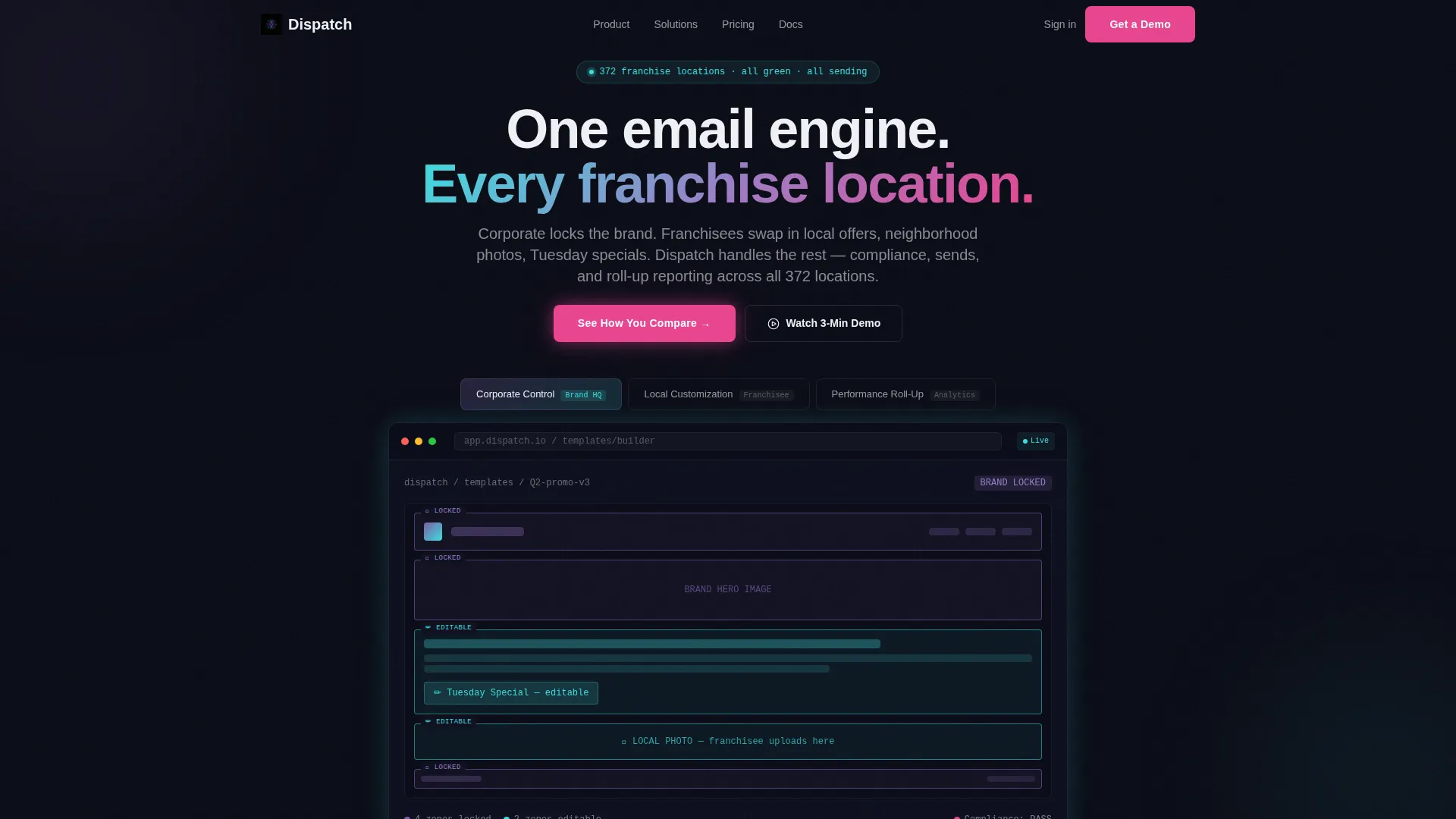
- A Feature Tab Switcher header showing three distinct product screens inside a browser-frame mockup
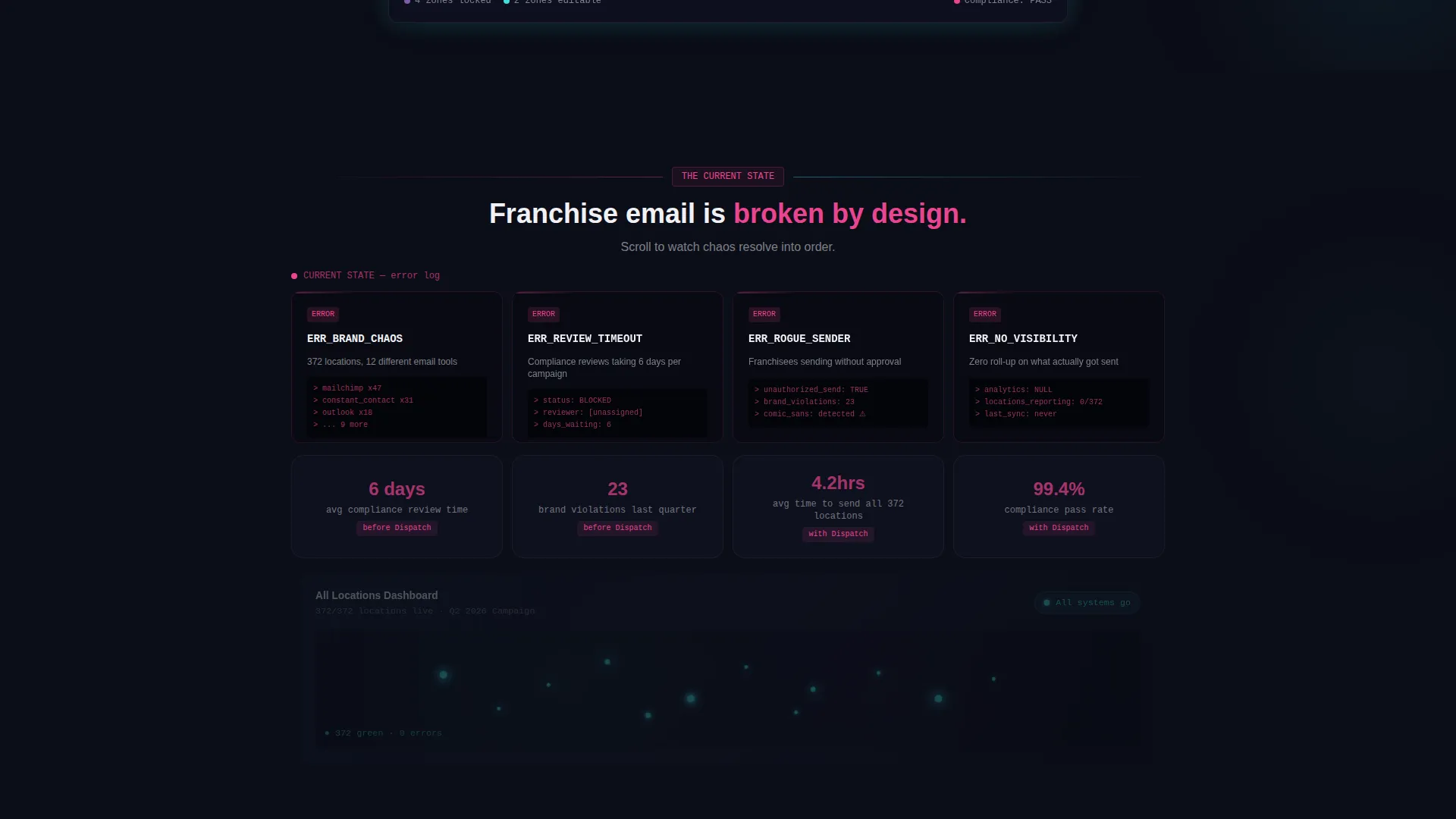
- A scrolling bento grid that transitions visually from pain-point error cards to clean solution cards
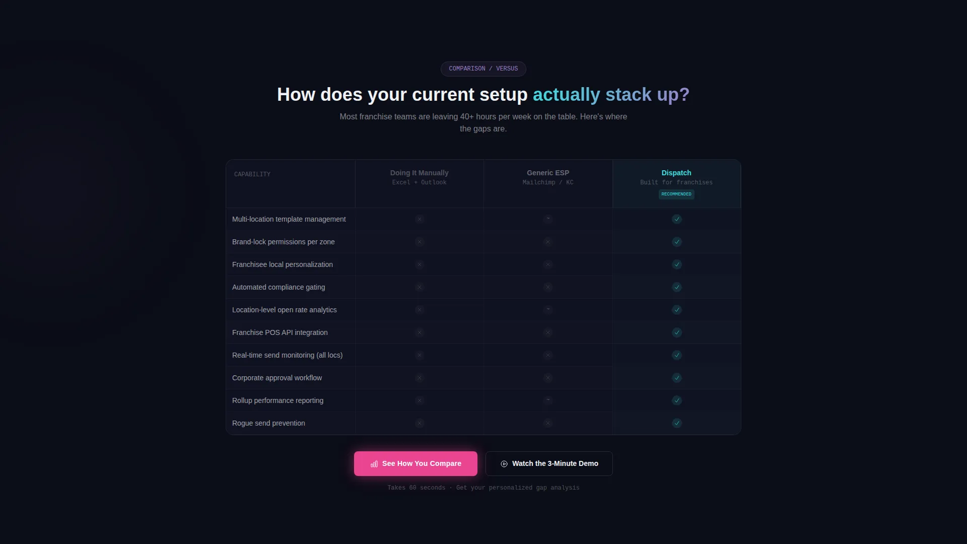
- A sticky three-column comparison table with a primary interactive call to action and a secondary demo call to action
Feature list
This template packs a focused set of interactive and visual components that work together to tell a product story without relying on walls of text.
Feature Tab Switcher Header
Three clickable tabs labeled "Corporate Control," "Local Customization," and "Performance Roll-Up" each reveal a different product screen. The default view shows a drag-and-drop email builder with locked brand zones in violet and editable local zones in teal. Tab switching is instant and requires no page reload.
Problem-to-Solution Bento Grid
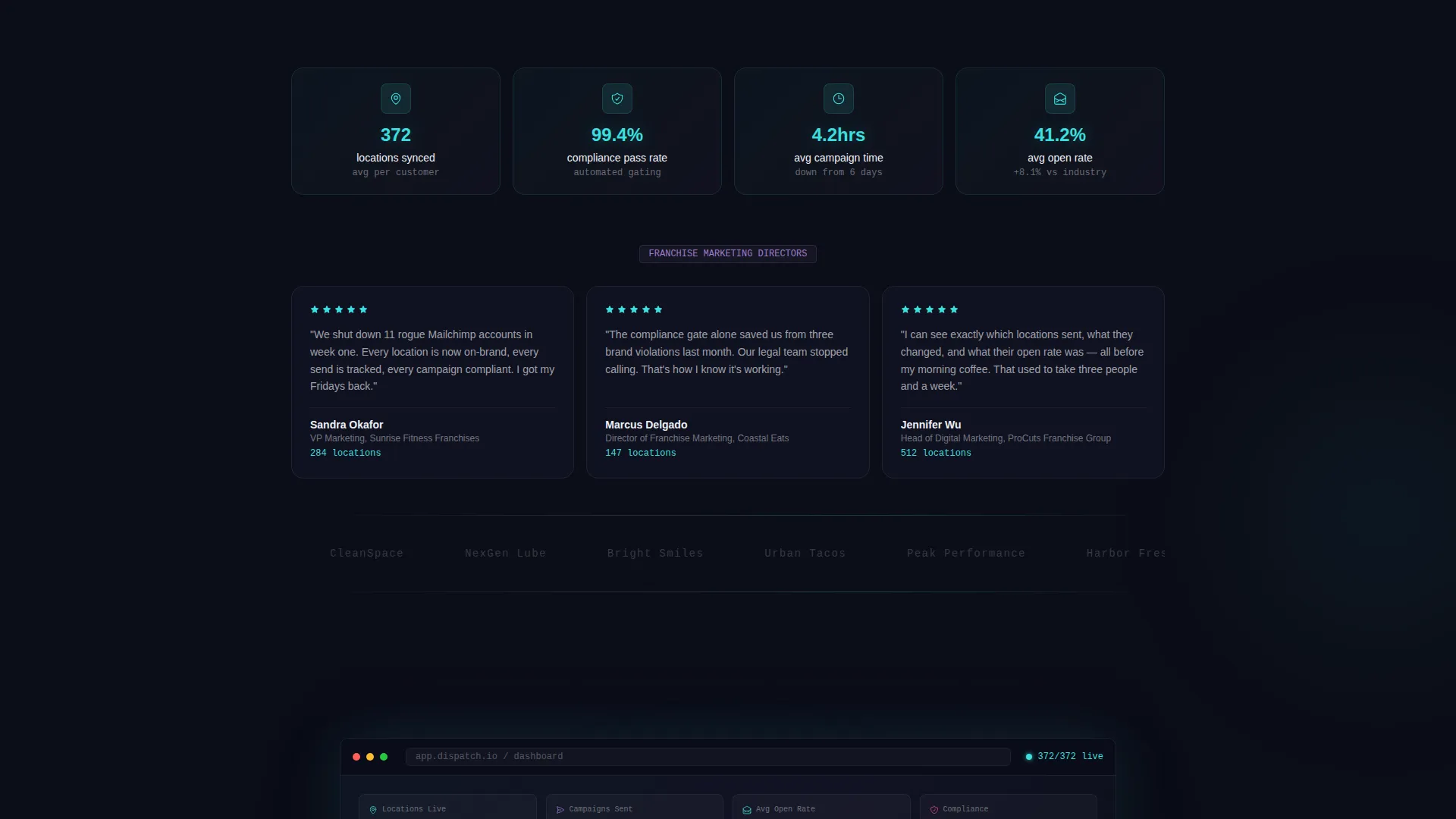
The bento grid opens with dark, monospace-styled pain-point cards mimicking error logs. As the visitor scrolls, the grid restructures: cards brighten, gradients appear, and each pain card flips into its solution counterpart. The scroll arc ends with a single unified dashboard screenshot glowing against the void background.
Sticky Comparison Table
A three-column table presents "Doing It Manually" versus "Generic ESP" versus the platform, with iridescent teal checkmarks and muted gray X-marks across rows covering multi-location personalization, brand-lock permissions, location-level analytics, and franchise point-of-sale integration.
Interactive Gap Analysis call to action
The primary call to action, "See How You Compare," triggers a short assessment asking number of locations, current email tool, and biggest pain point. The result is a personalized gap analysis delivered to the visitor's inbox, turning a click into a qualified lead.
Secondary Demo call to action
A "Watch the 3-Minute Demo" button sits beneath the comparison table for visitors not ready to submit their information. It captures attention-ready prospects who want proof before committing to a conversation.
AI Iridescent Visual System
The color system uses deep void black as the base, with shifting holographic violet and electric teal bleeding across bento card edges. Hot signal magenta is reserved for calls to action and alert states, creating a dark-control-room aesthetic that feels synthetic, alive, and purposeful.
Page sections overview
| Section | Purpose |
|---|---|
| Tab Switcher Header | Show three product screens inside a browser-frame mockup |
| Pain Point Grid | Surface franchise email chaos using glitchy monospace error cards |
| Solution Bento Grid | Flip each pain card into its solution as the visitor scrolls |
| Comparison Table | Compare manual workflows, generic tools, and the platform side by side |
| Interactive Assessment call to action | Qualify leads by collecting location count, current tool, and pain point |
| Secondary Demo call to action | Capture intent from visitors not ready to share their details |
| Dashboard Finale Row | Close the scroll arc with a unified platform screenshot |
Design & branding system
The template runs on a Startup Velocity theme powered by an AI Iridescent color system. Every visual choice reinforces the feeling of a dark control room where everything has finally gone green.
- Deep void black (#0B0D17) as the primary background, interface white (#F0F1F5) for all text and data labels
- Holographic violet (#7B5EA7) and electric teal (#3CDFDF) as gradient accents bleeding across bento card edges
- Hot signal magenta (#E94590) reserved exclusively for call to action buttons and alert state indicators
Mobile & speed optimization
The bento grid layout is structured to reflow naturally from a multi-column desktop arrangement to a single-column mobile stack. Visual density is managed so that each card communicates its point even at a smaller viewport.
- Bento cards are designed to read independently, so mobile visitors get the full narrative without needing side-by-side context
- Tab switcher and comparison table are built for touch interaction with clear active states
- Heavy gradient and animation elements are scoped to card boundaries to avoid layout-breaking reflow on smaller screens
How this template helps you convert
This template is engineered around a single conversion goal: get a franchise marketing director to either complete the gap analysis or watch the demo. Every section earns the next click.
- The tab switcher in the header lets visitors self-identify their workflow before reading a word of copy, creating immediate product recognition and lowering the barrier to scroll.
- The problem-to-solution bento arc builds emotional momentum, making the platform feel like relief rather than another software pitch by the time the visitor reaches the comparison table.
- The interactive assessment call to action converts intent into a personalized deliverable, giving the visitor a reason to share their details and giving the sales team a qualified, context-rich lead.
Other information about this template
This template is built inside a single-page bento grid format and does not include multi-page routing or a backend dashboard. The interactive assessment and gap analysis delivery depend on the email service and form logic connected to the platform implementation.
- Template style: Bento Grid with a Startup Velocity theme
- Header concept: Feature Tab Switcher with three labeled product screens
- Creative direction: Problem-to-Solution Arc with scroll-driven visual restructuring
- Landing page direction: Comparison/Versus with dual call to action paths
- Color system: AI Iridescent, dark-mode-first with iridescent gradient accents
- Category: Technology, Franchise Software, Franchise Email Marketing
Theme
Startup Velocity
Creative direction
Problem→Solution Arc
Color system
AI Iridescent
Style
Bento Grid
Direction
Comparison/Versus
Page Sections
Feature Tab Switcher with Browser Mockups
Problem-to-solution Bento Grid Arc
Sticky Three-column Comparison Table
Interactive Gap Analysis Assessment
AI Iridescent Dark-mode Color System
Related questions
Who is this landing page template designed for?
Can I customize the tab switcher screens for a different product?
Does the interactive assessment call to action require a specific email tool to work?
How does the bento grid shift from pain cards to solution cards?
Is this template suitable for smaller franchise networks?



