Franchise Command - Powerful Social Management Landing Page Template
FranchiseCommand is a hub-and-spoke landing page template built for franchise social media management platforms. It opens with a live calculator that personalizes the pitch instantly, then guides visitors through five anchor-nav sections built like dashboard cards. The Void and Violet color system and feature comparison toggles make the case that manual or generic approaches are costing money at every location.
by Rocket studio
Quick summary
FranchiseCommand is a single-page landing page template designed for franchise social media management platforms. A live estimator opens the experience, five anchor-nav spokes let visitors audit features at their own pace, and real-time comparison toggles frame every section against the cost of doing it manually or with generic tools.
Who this template is for
This template speaks directly to the people managing brand consistency across dozens or hundreds of franchise locations. They already know the problem. This page helps them see the solution in their own numbers.
- Franchise development VPs managing brand compliance across multiple states and markets
- Multi-unit operators running several territories who need one clear view of all social activity
- CMOs at emerging franchise brands who have crossed the 100-location mark and watched brand voice fragment
What problem this template solves
Franchise brands leak brand equity every day when individual locations post off-brand content, go quiet, or improvise graphics that were never approved. The cost is real, but it is hard to quantify until a visitor types their own numbers into a calculator.
- No clear way to show prospects the financial cost of their current disorganized social setup
- Generic software landing pages do not speak the language of franchise operations or compliance
- Visitors leave before trusting the platform because they never feel like they have already used it
What you get with this template
You get a fully structured, dark-theme landing page with interactive components baked into the layout. Every section is built to feel like a product the visitor is already inside.
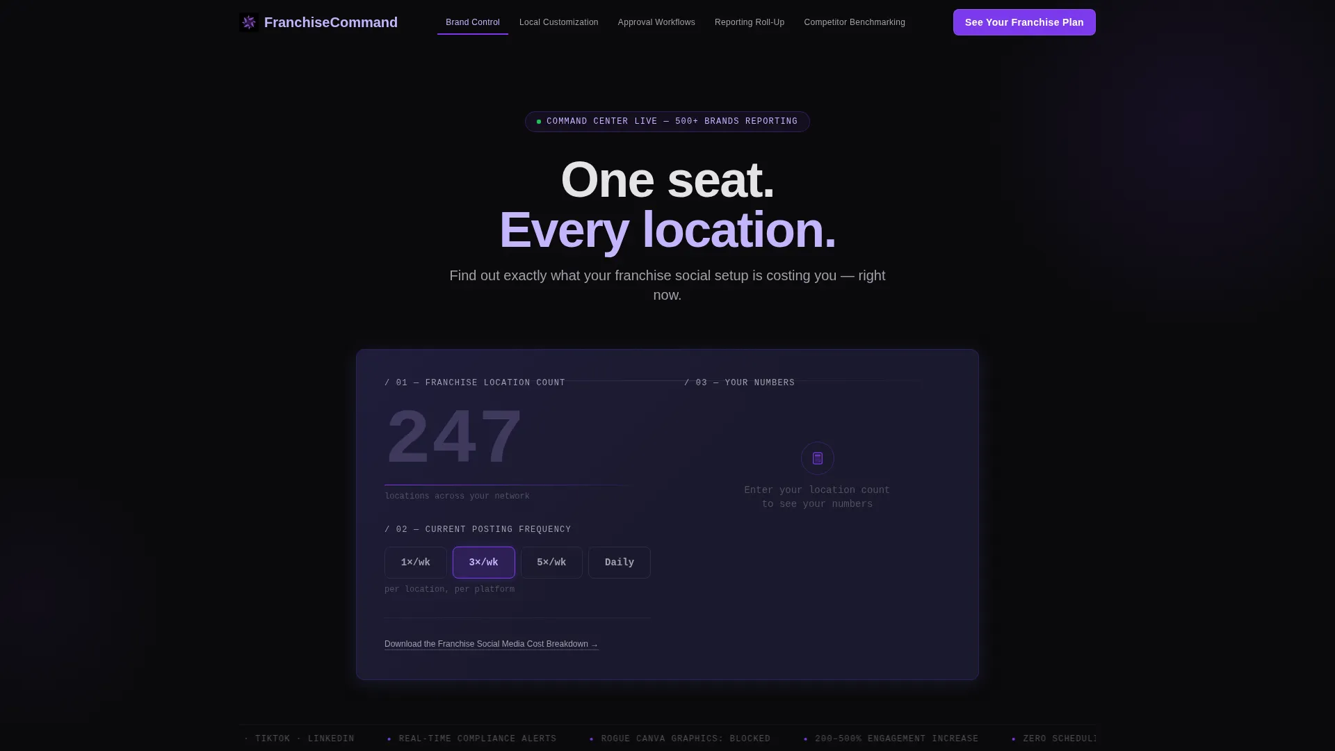
- A live calculator header that takes location count and posting frequency and outputs three personalized metrics
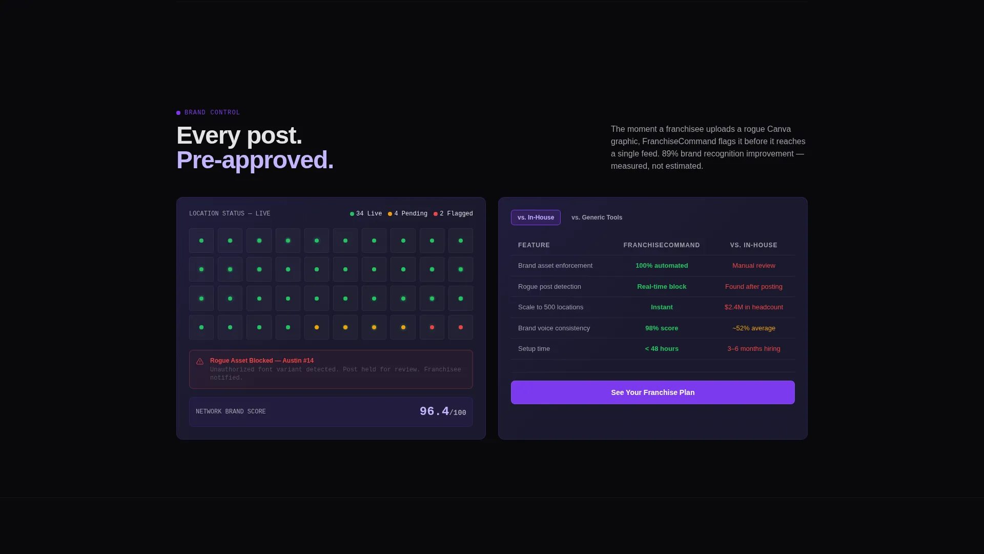
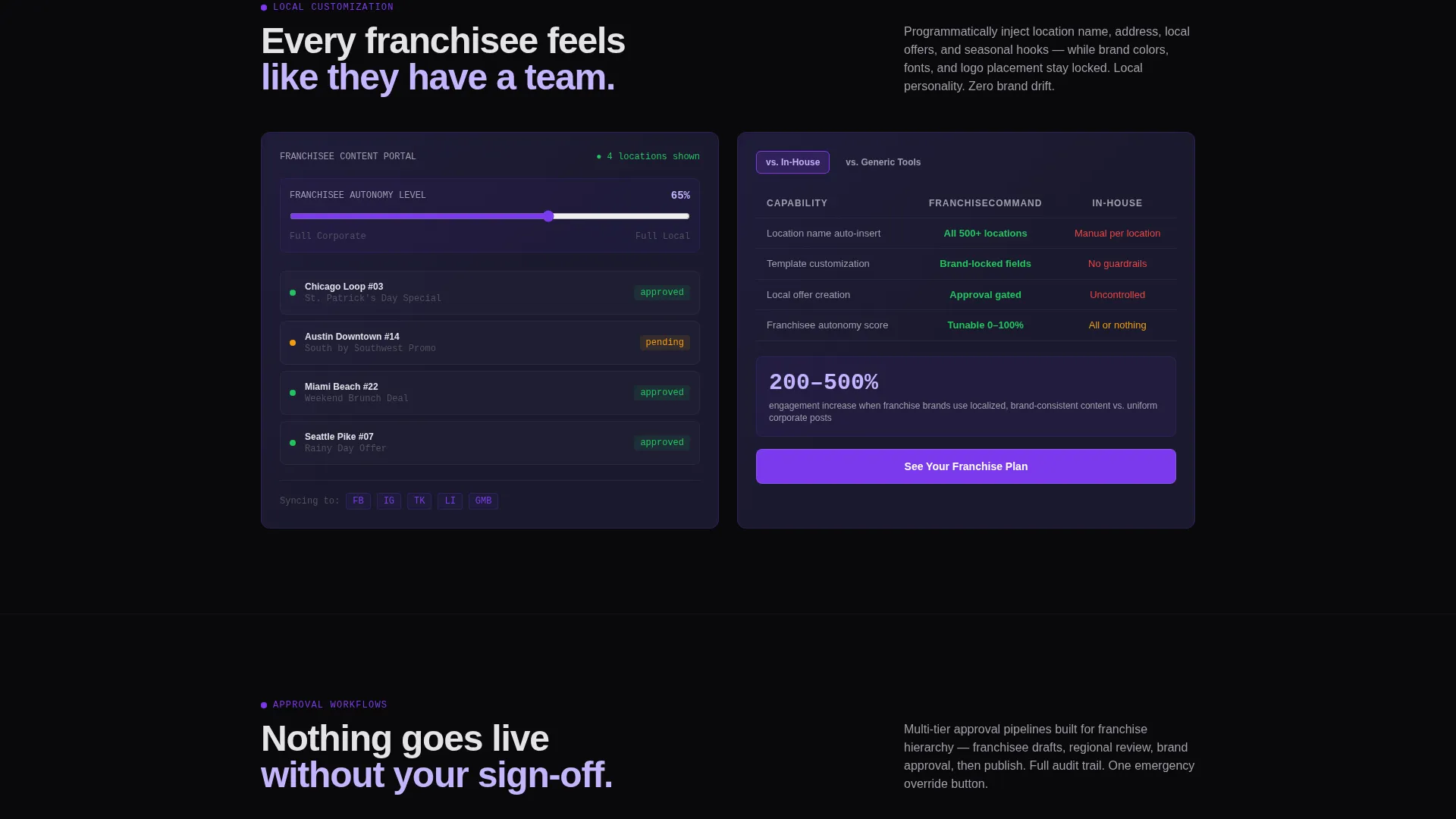
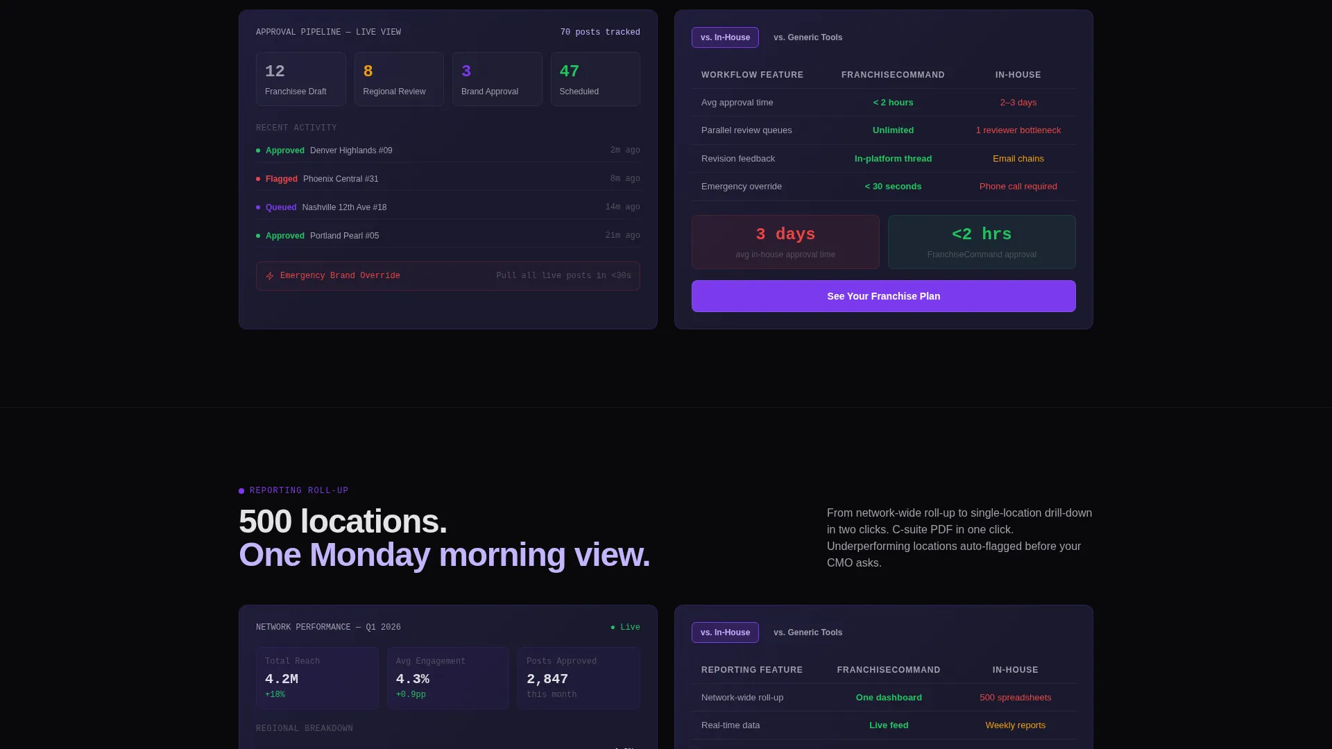
- Five anchor-nav spoke sections, each styled as a dashboard card with an animated mockup and a comparison table
- Two conversion paths: a primary modal call to action and a secondary gated content download linked from the calculator
Feature list
This template includes the interactive, comparison-focused components described below. Each one is grounded in the source brief and designed to advance franchise buyer trust.
Live Franchise Cost Calculator
The header section features an oversized input field where visitors enter their location count and select a posting frequency. Three output numbers animate into view: hours saved per month, cost per location versus hiring in-house, and brand consistency score improvement. The numbers pulse once in electric lavender on calculation, making the visitor's own data the first thing they engage with.
Anchor Navigation with Spoke Sections
A sticky anchor nav pins to the top after scroll and labels each spoke in franchise-specific language: Brand Control, Local Customization, Approval Workflows, Reporting Roll-Up, and Competitor Benchmarking. Visitors can jump to any section directly, mirroring how franchise operators audit their own systems rather than reading a linear sales story.
Real-Time Comparison Toggle
Each spoke section includes a toggle that swaps the comparison column between "versus. In-House" and "versus. Generic Tools." Numbers slide and color-code from red to green in real time, turning abstract feature claims into visible cost and quality comparisons without leaving the page.
Dashboard Card Section Layout
Every spoke section is built as a dark panel with a violet accent border, an animated user interface mockup on one side, and a tight feature comparison table on the other. The layout mirrors a real operations dashboard, reinforcing platform credibility through visual language the target audience already trusts.
Two-Step Conversion Modal
The primary call to action, "See Your Franchise Plan," appears sticky in the nav and at the close of every spoke section. Clicking it opens a two-step modal: step one captures location count and current tools used via a named dropdown, and step two asks for name, work email, and brand name.
Gated Secondary Download Path
A quieter text link below the calculator offers a downloadable franchise social media cost breakdown, gated behind email only. This secondary path captures visitors who are not yet ready for a full demo but are still in active research mode.
Page sections overview
| Section | Purpose |
|---|---|
| Calculator Header | Personalizes pitch with visitor-entered location and frequency data |
| Brand Control Spoke | Highlights centralized content publishing and approval oversight |
| Local Customization Spoke | Shows how franchisees can personalize within brand-safe guardrails |
| Approval Workflows Spoke | Demonstrates the review and sign-off process for location-level posts |
| Reporting Roll-Up Spoke | Presents aggregated performance data across all franchise locations |
| Competitor Benchmarking Spoke | Compares location metrics against market context |
| Sticky Anchor Nav | Lets visitors jump to any spoke section after initial scroll |
| Primary call to action Modal | Two-step sign-up flow gated by location count and tool context |
| Secondary Download Link | Low-friction email capture below the calculator section |
Design & branding system
The visual identity follows a Dashboard Pro theme built on a Void and Violet color system. Every color choice is intentional: black is negative space that makes data readable, and violet signals that something is active and reporting back.
- Core palette: absolute void black (#09090B), deep interstellar violet (#7C3AED), muted graphite panel (#1A1A2E), electric lavender (#C4B5FD) for hover and active states, and cool zinc white (#E4E4E7) for body text
- Violet owns the interactive layer: toggles, progress rings, comparison highlights, and active nav indicators all use violet to guide attention
- No stock photography and no people imagery; data visualizations and animated user interface mockups carry the entire visual story
Mobile & speed optimization
The template layout is structured to remain usable and visually coherent on smaller screens. The anchor nav and dashboard card layout adapt to narrower viewports without losing the comparison functionality that drives conversions.
- The sticky anchor nav collapses cleanly on mobile so spoke navigation remains accessible without consuming screen space
- Comparison toggle interactions and calculator inputs are sized for touch input, keeping the most critical interactive elements functional on any device
How this template helps you convert
The page is built on a Comparison and Versus direction. Every interaction is designed to make the visitor feel like they have already used the product before clicking the primary call to action.
- The calculator makes the pitch personal from the first second. A visitor who has entered their own location count and seen their own cost estimate is already invested in the outcome, not just browsing a feature list.
- The comparison toggles in each spoke section reframe the decision. Instead of asking visitors to trust generic feature claims, the template shows them a color-coded cost comparison against the exact alternatives they are currently using, making the switch feel logical rather than risky.
Other information about this template
This template is built specifically for the franchise software category within the broader technology space. It is designed for platforms that sit at the intersection of franchise operations and social media management.
- The two-step modal dropdown names current tools explicitly, which is consistent with a Comparison and Versus landing page direction and speaks directly to buyers already evaluating alternatives
- The Hub and Spoke anchor nav structure means visitors do not need to read the page in order; they can audit it the way they audit franchise operations, jumping to the section most relevant to their current pain point
- The Feature Matrix creative direction means each spoke section earns its place by showing a direct comparison, not just a capability statement
- This template is well suited for platforms competing in the franchise social media management space, where buyers are often already using broader social media management tools and need a reason to switch to a franchise-specific solution
Theme
Dashboard Pro
Creative direction
Feature Matrix
Color system
Void & Violet
Style
Hub & Spoke (Anchor Nav)
Direction
Comparison/Versus
Page Sections
Live Franchise Cost Calculator
Sticky Anchor Nav with Spoke Sections
Real-time Comparison Toggle
Dashboard Card Section Layout
Two-step Conversion Modal
Gated Secondary Download Path
Related questions
Who is this landing page template designed for?
Can I customize the calculator inputs and output metrics?
How does the comparison toggle work in each spoke section?
What are the two conversion paths included in this template?
Does this template work for smaller franchise networks under 100 locations?



