Advanced Franchise Digital Presence Reviews & Social Proof Website Template
Franchisewarroom is a bold, brutalist-themed bento grid landing page built for franchise membership sites. It puts a real multi-unit performance dashboard front and center, drives free sign-ups through a two-field form, and uses hard-cut scroll motion to stack evidence fast. Designed for multi-unit operators, emerging franchisors, and franchise consultants who need a command-center presence online.
by Rocket studio
Quick summary
Franchisewarroom is a single-page bento grid landing page template designed for franchise membership sites. It opens with a raw, full-scale product screenshot, moves through layered bento cards that show playbook tools and benchmarking data, and closes with a no-credit-card freemium sign-up. The visual identity is Bold Brutalist: void black, electric violet, and exposed concrete white.
Who this template is for
This template is built for people who operate or support franchise networks and need a high-conviction digital presence that matches the complexity of their business.
- Multi-unit franchise operators who manage several locations and need a site that communicates scale and control
- Emerging franchisors who have sold their first few licenses and now need systems-driven positioning to attract serious candidates
- Franchise consultants who broker deals and want live performance data front and center to build confidence with prospects
What problem this template solves
Most franchise landing pages look like brochures. They list benefits, show a smiling storefront photo, and hope visitors convert. That approach fails when your audience is a seasoned operator who can spot surface-level marketing in seconds.
- There is no standard template that captures the command-center urgency of a real franchise management platform
- Operators and consultants need to see the product working before they commit, not just read about it
- Generic page builders produce slow, generic layouts that do not match the industrial precision franchise professionals expect
What you get with this template
You get a fully structured, single-page bento grid layout that places product evidence ahead of every sales ask. Every section is built to show the system in action before asking for a sign-up.
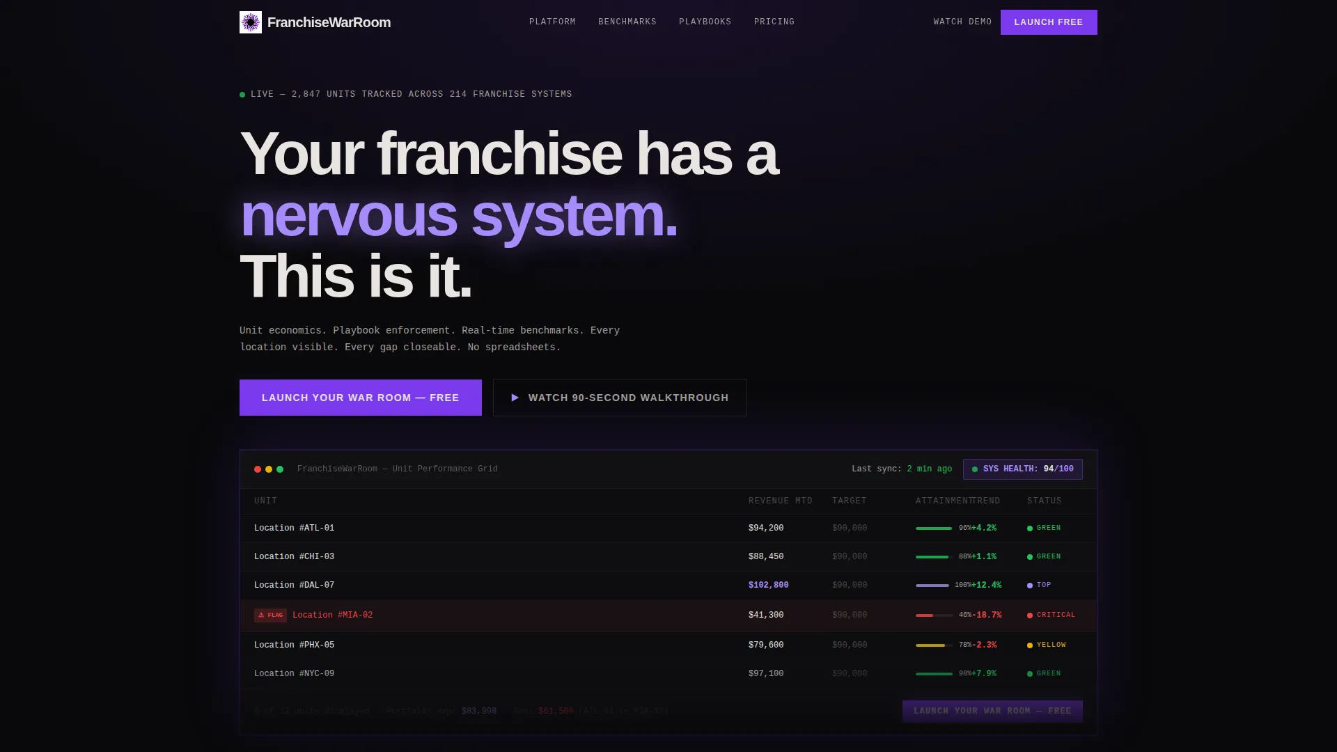
- A full-scale product screenshot header showing a multi-unit performance grid with store-by-store revenue columns and a system health score
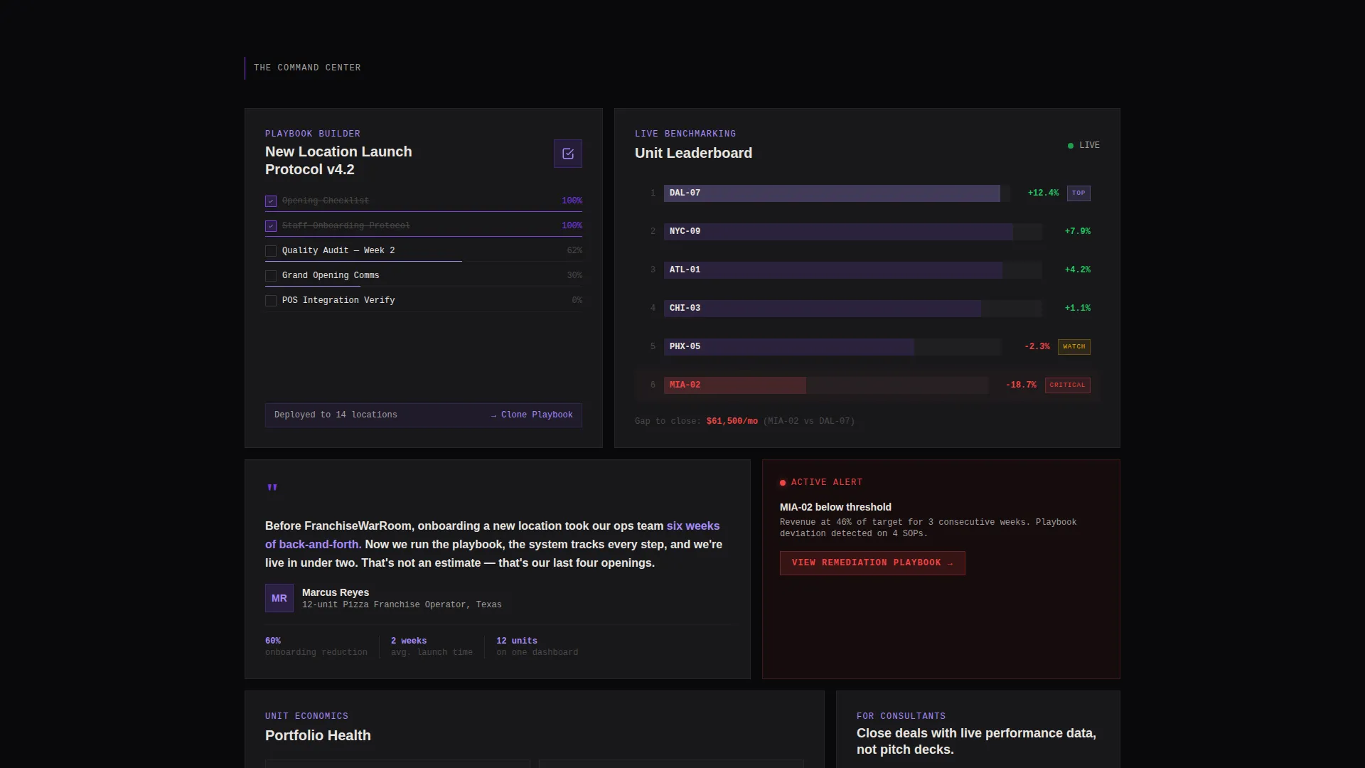
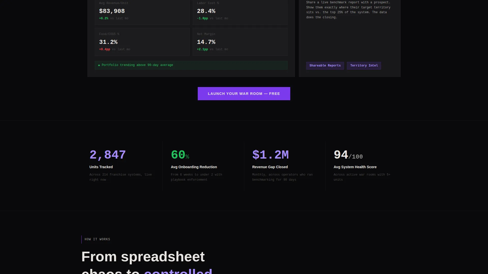
- A bento card grid with varied card sizes displaying the playbook builder, a benchmarking leaderboard, and a social proof testimonial
- A freemium conversion flow with a primary call to action that appears inside the header and anchors to the bottom of every bento row, plus a secondary video walkthrough path
Feature list
This template delivers a focused set of design and structural capabilities drawn directly from its brief. Each feature serves the franchise membership site use case specifically.
Full-Scale Dashboard Header
The header is a raw, cropped product screenshot blown up to brutal scale. It shows a multi-unit franchise performance grid with store-by-store revenue columns glowing violet against void black, one location flagged in red, and a system health score of 94 pulsing in the corner. There is no laptop frame or browser chrome, just the interface itself.
Bento Grid Card Layout
Cards arrive in varied sizes: some tall, some wide, breaking the grid just enough to feel intentional rather than templated. Each card holds a distinct piece of evidence: the playbook builder view, the benchmarking leaderboard, and a testimonial from a twelve-unit pizza franchisee who cut onboarding time by 60 percent.
Freemium Sign-Up Conversion Flow
The primary call to action reads "Launch Your War Room, Free" and appears first inside the header section, as if it is a button within the product itself. It then repeats anchored at the bottom of every bento row. Clicking opens a two-field form asking only for a business email and number of franchise units, with no credit card required.
Secondary Video Walkthrough Path
Visitors who are not ready to sign up immediately are offered a "Watch the 90-Second Walkthrough" option. This secondary path captures an email address on play, giving the page two distinct conversion lanes without friction.
Launch Energy Scroll Motion
The scroll behavior is designed to feel like a countdown. Motion is abrupt, using hard cuts and snap entrances rather than gentle fades. Each new section increases velocity and stakes, stacking evidence progressively until inaction feels costly.
Bold Brutalist Visual System
Typography uses a heavy grotesque typeface set at commanding scale. The color system keeps void black as the dominant background, uses electric violet only where the eye needs to go, and places exposed concrete white on card surfaces for a raw, unpolished feel.
Page sections overview
| Section | Purpose |
|---|---|
| Dashboard Header | Opens with full-scale product screenshot and primary call to action |
| Playbook Builder Card | Shows the operational standardization tool across locations |
| Benchmarking Leaderboard Card | Displays store-versus-store performance comparison in real time |
| Social Proof Card | Testimonial from a multi-unit operator with a specific result |
| Anchored Call to Action | Repeats the free sign-up prompt at the end of each bento row |
| Video Walkthrough Path | Secondary conversion lane capturing email on play |
Design & branding system
The design language is Bold Brutalist, built around a Void and Violet color system that feels industrial and urgent at the same time. Black dominates every background. Violet appears only where attention is required.
- Color palette: absolute void black (#09090B) for backgrounds, electric violet (#7C3AED) for buttons and live metrics, ultraviolet glow (#A78BFA) for hover states and data highlights, and exposed concrete white (#E8E5E0) for text and card surfaces
- Typography uses a heavy grotesque typeface at large scale, with headlines set in a single aggressive weight that matches the brutalist structure
- Card surfaces use the concrete white tone to feel raw and unpolished, as if content is poured into place rather than styled
Mobile & speed optimization
The bento grid layout is built to translate from desktop to smaller screens without losing the visual weight that makes this template distinctive. Hard-cut animations are handled at the layout level, keeping motion intentional rather than performance-heavy.
- Varied card sizes reflow for smaller viewports while preserving the asymmetric grid feel
- Snap entrance animations are designed to fire on scroll depth rather than on load, keeping initial render fast
- The two-field sign-up form is minimal by design, reducing interaction cost on touch devices
How this template helps you convert
This template is structured around a single principle: show the product working before you ask for anything. Every layout decision supports that goal.
- The header screenshot puts a real, recognizable interface in front of visitors immediately, making the product feel tangible before any copy is read
- Bento cards stack specific, concrete evidence at each scroll depth, including a testimonial with a measurable outcome, so trust builds progressively
- The two-lane conversion system gives both ready-to-sign-up visitors and cautious researchers a path forward, capturing intent at different commitment levels without friction
Other information about this template
This template is categorized under Technology and the Franchise Digital Presence subcategory. It is built specifically for the franchise membership site niche, where the audience is experienced enough to ignore vague marketing but responds to operational credibility.
- Template style is Bento Grid, which supports varied card sizes and asymmetric layouts that feel alive rather than gridlocked
- The creative direction is Launch Energy, meaning the page is intentionally structured to increase urgency and stakes with every scroll depth
- The header concept is Product Screenshot, a deliberate choice that bypasses lifestyle imagery in favor of showing the actual interface at work
- The freemium and trial conversion direction means the page is optimized for a no-barrier first step, removing credit card friction to lower sign-up resistance
- The Intersection Match Score for this template is 13, reflecting a tight alignment between the design system, creative direction, and niche use case
Theme
Bold Brutalist
Creative direction
Launch Energy
Color system
Void & Violet
Style
Bento Grid
Direction
Freemium/Trial
Page Sections
Full-scale Dashboard Header
Bento Grid Card Layout
Freemium Sign-up Conversion Flow
Secondary Video Walkthrough Path
Launch Energy Scroll Motion
Bold Brutalist Visual System
Related questions
Who is this landing page template designed for?
Does the sign-up form require a credit card?
What makes this template different from a standard marketing page?
Can this template support a franchise platform that covers multiple locations?
What is the scroll animation style in this template?



