Consumer App & Platform Professional Website Template
Frond is a dynamic, single-page plant identification landing page template built around an interactive dashboard experience. It features a live stats header, hover-triggered specimen identification animations, a filterable living data grid, and a direct app download call to action. The template is designed to let visitors experience the product before they ever tap "download."
by Rocket studio
Quick summary
Frond is a high-motion, single-page landing page template for a plant identification app. It opens with an animated stats dashboard, flows into an interactive plant explorer with hover-triggered identification previews, and closes with a direct download call to action. Every section is designed to prove the app's value through interaction rather than description alone.
Who this template is for
This template suits teams and builders who need to convert curious, visual-first audiences into app downloads without relying on long explanations. It works especially well when your product's core promise is best shown rather than told.
- App developers and indie founders launching a plant identification tool who want a landing page that doubles as a live product demo
- Nature-tech startups and consumer app studios targeting hikers, new plant owners, and field researchers who respond to visual proof over feature lists
- Designers and agencies building mobile-first product pages where interactivity and motion are central to the brand experience
What problem this template solves
Most app landing pages describe features using static screenshots and bullet points. Visitors read, shrug, and leave. Frond solves this by replacing passive reading with active discovery. The visitor interacts with the product before they ever reach a download button.
- Static screenshots fail to communicate a real-time identification experience, and this template replaces them with hover-animated plant specimens and live-style metric counters
- Traditional call-to-action pages ask for trust before earning it, while this template earns trust section by section through simulated accuracy, filterable data, and a browser-based demo path
- Audiences with low patience and high visual sensitivity need immediate proof, and this template delivers that proof through motion, interactivity, and animated social proof from the very first scroll
What you get with this template
You get a complete, single-page landing page built around five distinct sections, each one designed to move a visitor from curiosity to download. The layout follows a dashboard and data grid structure with a Dynamic Motion visual identity throughout.
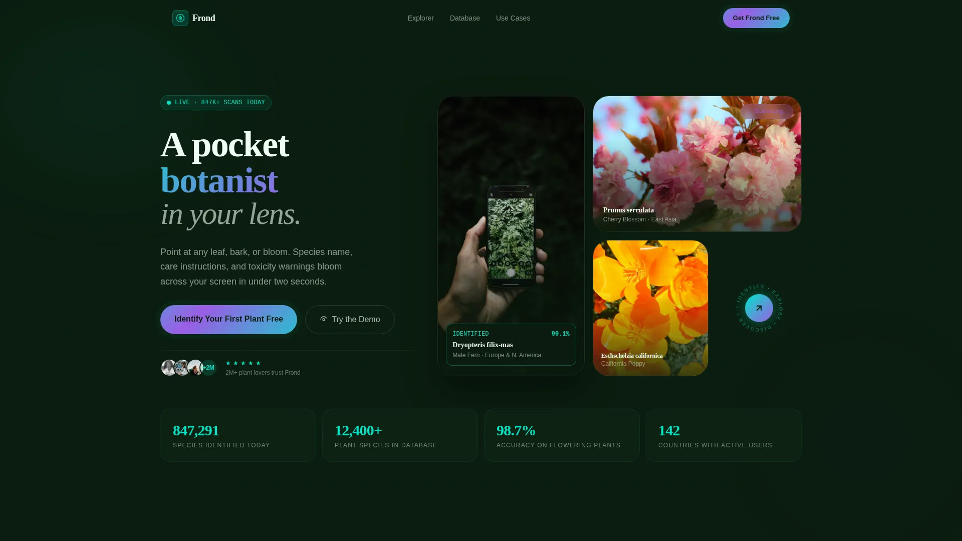
- A live stats hero header with animated counters, a looping background video of the identification experience in action, and an asymmetric bento-style camera viewfinder layout
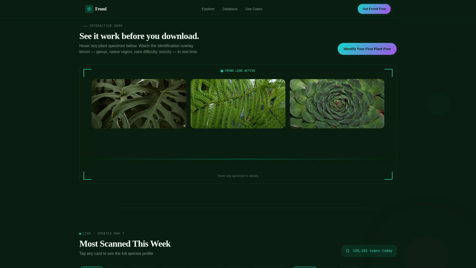
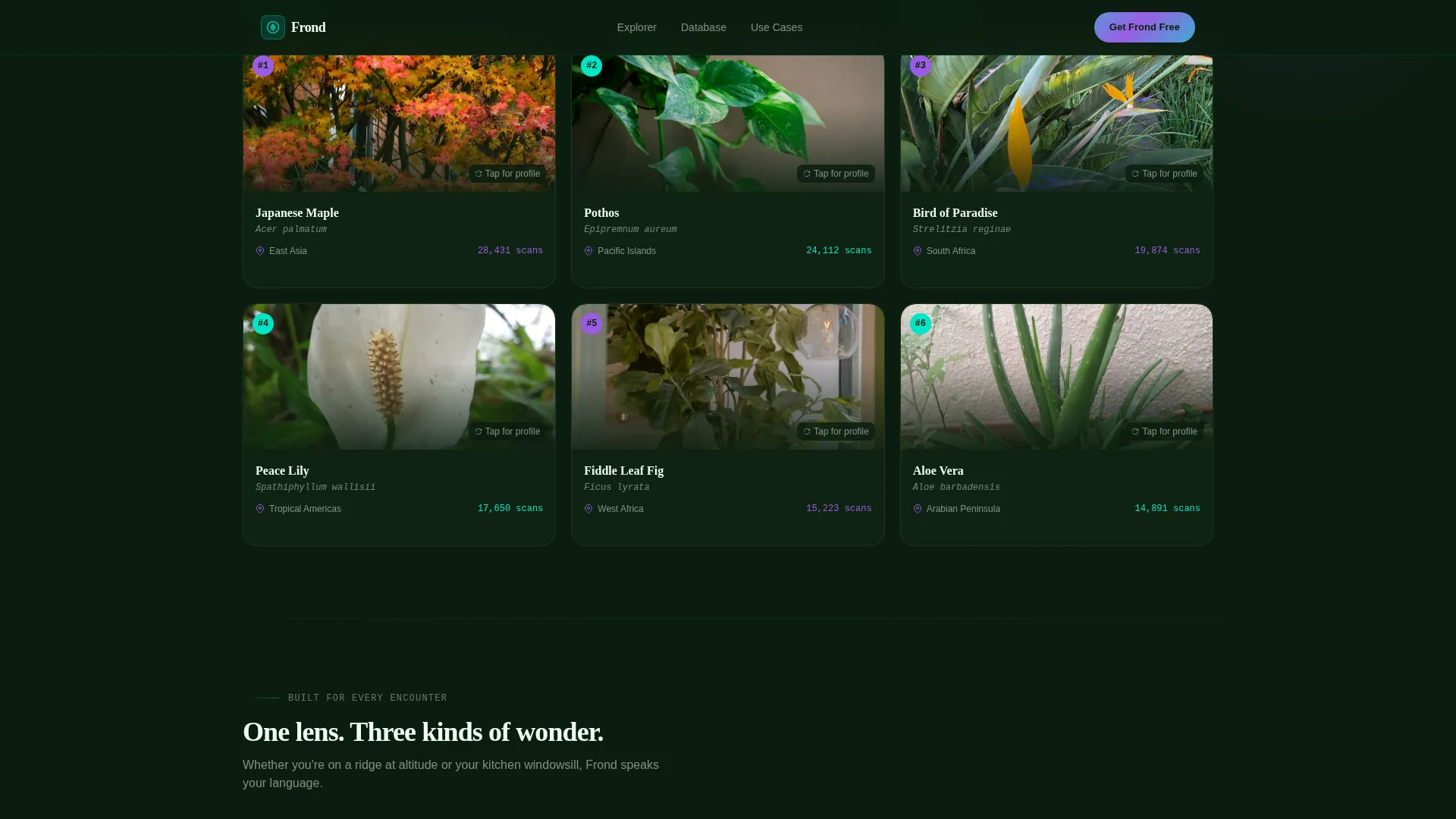
- An interactive plant explorer section with hover-triggered identification overlays showing genus, native region, and care difficulty, followed by a filterable living data grid of the most-scanned plants by region and season
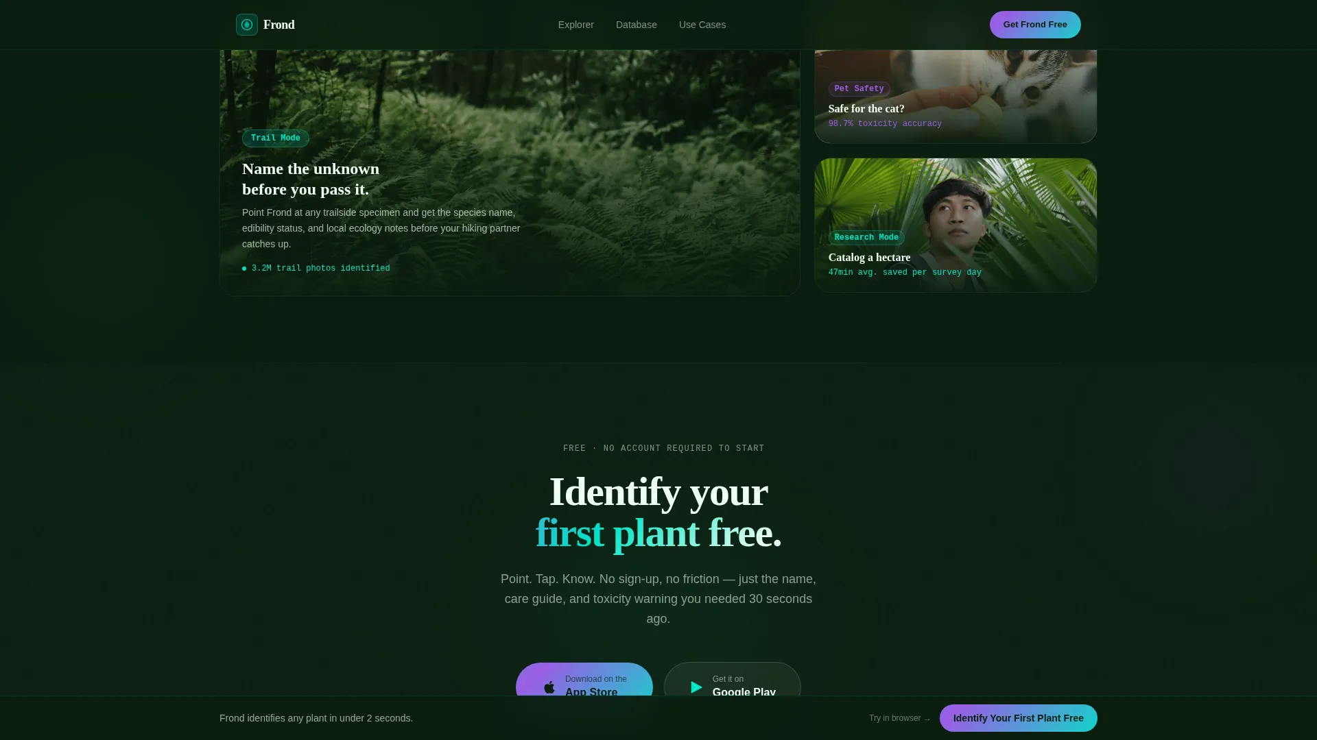
- A direct download call to action section with paired app store badge buttons that pulse with iridescent shimmer, a sticky bottom bar that reappears after the data grid, and a secondary browser demo path for hesitant visitors
Feature list
This template ships with purpose-built components designed specifically for a plant identification app landing page. Each feature serves a clear role in moving the visitor from first impression to first download.
Animated Live Stats Header
The hero section opens with a grid of animated counters ticking upward in real time. Metrics such as species identified today, total plant species in the database, and identification accuracy on flowering plants are displayed as breathing, living numbers. A looping slow-motion video plays behind the grid, showing the app's identification overlay materializing over a fern leaf.
Hover-Triggered Plant Explorer
Below the hero, illustrated plant specimens respond to mouse hover with a full identification animation. Each hover reveals the plant's genus, its native region, and a care difficulty meter. Visitors experience the core app interaction directly inside the page before any download prompt appears.
Filterable Living Data Grid
A data grid displays the most-scanned plant species from the current week. Visitors can filter cards by region and by season. Each card flips on click to reveal a full species profile, making the grid feel like a live catalog rather than a static list.
Dual Download Call to Action
The primary call to action reads "Identify Your First Plant Free" and is paired with both app store badge buttons. The buttons carry a gentle iridescent pulse animation. The call to action appears first after the interactive explorer and returns as a sticky bottom bar after the data grid section.
Browser Demo Secondary Path
Visitors who are not yet ready to download can tap "Try It in Your Browser" to access a web-based demo scanner. The demo requests camera permission and allows the visitor to experience plant identification before committing to an install. This path is designed to convert skeptical users through experience rather than persuasion.
Use Case Audience Cards
Three bento-style cards present distinct audience scenarios: curious hikers photographing unknown trailside plants, new plant owners checking toxicity for pets, and field researchers cataloging biodiversity. Each card frames the same core technology through a different emotional lens.
Page sections overview
| Section | Purpose |
|---|---|
| Live Stats Hero | Opens with animated metrics and looping identification video to establish credibility instantly |
| Interactive Plant Explorer | Hover-triggered specimen demos let visitors simulate the identification experience |
| Living Data Grid | Filterable, flippable plant cards prove database depth and real-time relevance |
| Use Case Cards | Three audience bento cards connect the technology to specific personal situations |
| Download Call to Action | App store badges with iridescent pulse and browser demo path drive the final conversion |
| Sticky Download Bar | Persistent bottom bar keeps the primary call to action visible after the data grid |
| Footer | Horizontal flow footer pattern completes the page with clean navigation closure |
Design & branding system
The visual identity follows a Dynamic Motion theme built on an AI Iridescent color system. The overall feeling is a greenhouse at night lit by a scanning laser: organic shapes caught in computational light, with colors that shift like oil on water as the visitor scrolls.
- Color palette includes deep chlorophyll black (#0B1D0F) for the background, bioluminescent teal (#00E5C7) as the primary accent, neural-pulse violet (#9B5DE5) for secondary highlights, and living white (#F0FFF4) for card surfaces
- Typography pairs Fraunces as the display serif for headlines with DM Sans as the body typeface, creating a contrast between organic warmth and clean digital legibility
- Motion design uses GSAP-powered counter animations, Intersection Observer section reveals, CSS keyframe iridescence on buttons, and GPU-accelerated transforms to keep the page feeling alive without sacrificing visual clarity
Mobile & speed optimization
The template is built mobile-first, which is the natural priority for an app download product. Desktop layouts extend the mobile base rather than the other way around.
- GPU-accelerated CSS transforms handle the heavy animation load, keeping motion smooth on mid-range mobile devices without relying on JavaScript-heavy runtime calculations
- Lazy loading is applied to images throughout the page, so the initial load focuses on the hero stats and video rather than pulling the entire asset library at once
- The sticky download bar is designed to remain accessible at the bottom of the screen on mobile viewports, ensuring the primary call to action never scrolls out of reach
How this template helps you convert
The conversion strategy is built around progressive proof. Each section earns a little more trust before the next download prompt appears, so the visitor is never asked to act on faith alone.
- The animated stats header establishes credibility in the first three seconds by showing live-style identification volume, database size, and accuracy figures before the visitor reads a single sentence of copy
- The interactive plant explorer and filterable data grid turn passive scrolling into active product use, so the visitor arrives at the download call to action already having experienced the core feature firsthand
- The browser demo secondary path removes the final barrier for hesitant visitors by letting them scan a real plant with their camera before committing to a store install
Other information about this template
This template is categorized under Technology, specifically within the Consumer App and Platform subcategory, with a niche focus on plant identification. It was designed with an Intersection Match Score of 13, indicating a tight alignment between the creative direction and the target use case.
- The template style is Dashboard and Data Grid, which is unusual for app landing pages and is the key differentiator that makes the page feel like a product preview rather than a marketing brochure
- The header concept is Stats and Metrics, a deliberate choice to lead with quantified proof rather than emotional taglines, which works especially well for accuracy-dependent products like a plant identification tool
- The creative direction is Interactive Explorer, meaning every section is built around something the visitor can do rather than something they can only read
- The landing page direction is App Download, so all layout decisions from section order to call-to-action placement prioritize a single tap to the app store as the primary conversion event
- The footer uses a Vercel Horizontal Flow pattern, keeping the page closure clean and navigable without introducing visual noise at the end of a motion-heavy scroll experience
Theme
Dynamic Motion
Creative direction
Interactive Explorer
Color system
AI Iridescent
Style
Dashboard/Data Grid
Direction
App Download
Page Sections
Animated Live Stats Hero Dashboard
Hover-triggered Plant ID Explorer
Filterable Living Data Grid
Dual App Download Call to Action
Browser Demo Secondary Path
Use Case Audience Bento Cards
Related questions
What sections are included in this template?
Can I change the color palette to match a different brand?
Does the template include the hover and animation interactions?
Is this template suited for a web app or only a mobile app?
How does the filterable data grid work?



