High Converting Development Landing Page Template
Frontmatter is a single-column landing page template built for a monthly frontend development deep-dive publication. It combines an editorial magazine aesthetic with a lead generation structure, guiding senior engineers and tech leads from a bold typographic hero through curated technical excerpts to a frictionless email signup. The design is restrained, deliberate, and built to earn the subscription.
by Rocket studio
Quick summary
Frontmatter is a single-column landing page template designed for a monthly frontend development publication. It blends editorial magazine aesthetics with a focused lead generation flow. The layout moves readers from a cinematic header through structured technical excerpts to a single-field email form, earning every scroll with genuine depth.
Who this template is for
This template is built for publishers and developers who need a landing page that speaks to a technically sophisticated audience. It suits anyone launching or growing a frontend development newsletter or deep-dive publication.
- Senior frontend engineers who read specifications for pleasure and want synthesized, architectural insight
- Tech leads evaluating framework decisions with real career consequences
- Independent developers building a subscriber base around rigorous monthly writing
What problem this template solves
Most newsletter landing pages treat their audience like beginners. For a frontend development publication targeting engineers with five or more years of experience, that approach fails immediately. Visitors need to feel the editorial depth before they hand over their email address.
- Generic newsletter templates offer no way to demonstrate content quality before the signup ask
- Single-field forms buried under weak copy do not convert skeptical, senior technical readers
- Most templates lack the visual restraint needed to communicate credibility to engineers who notice design decisions
What you get with this template
You get a fully structured, single-column landing page that doubles as an editorial artifact. Every section is designed to give away enough technical substance that readers feel the gap between the excerpt and the full issue.
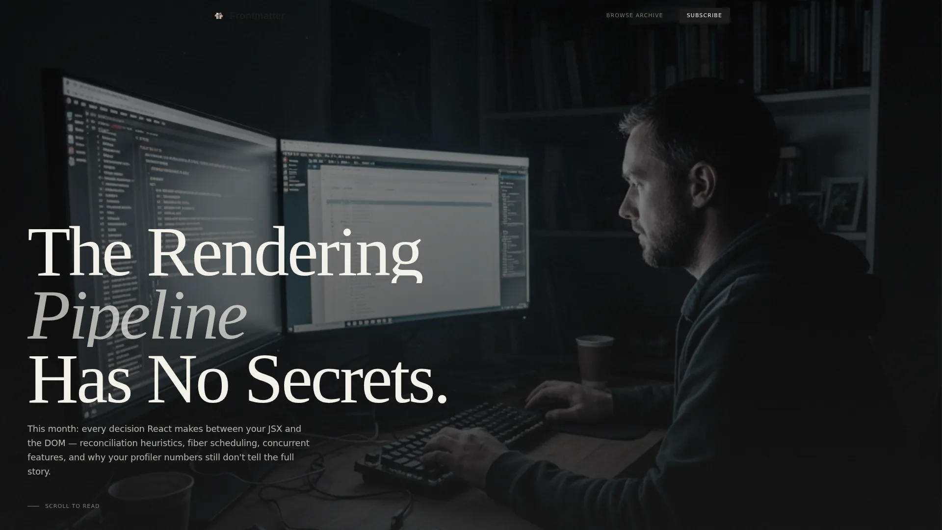
- A typographic hero section with a full-viewport serif headline over a desaturated atmospheric image
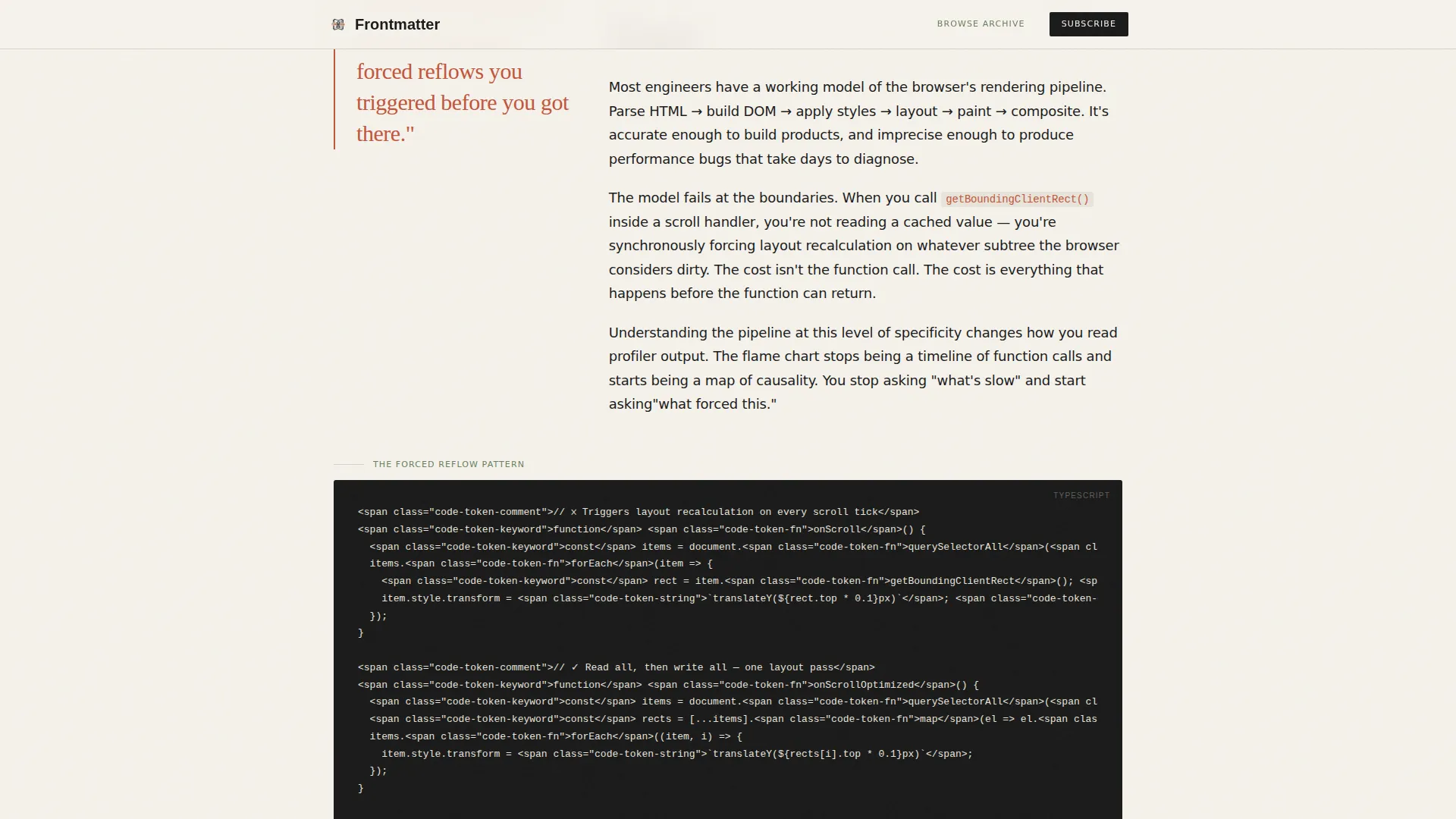
- Three formatted excerpt blocks, each with a pull quote, technical prose passage, and an editorial code snippet or diagram
- Two strategically placed calls to action and a quiet social proof callout between excerpts
Feature list
This template is built from a set of focused, purposeful components. Each one earns its place in the reading flow.
Type Over Image Hero
The header places an oversized sharp serif headline across a softly desaturated photograph. A one-sentence thesis statement sits beneath it in a lighter weight. The composition borrows confidence from the typography while the image provides atmosphere, not decoration.
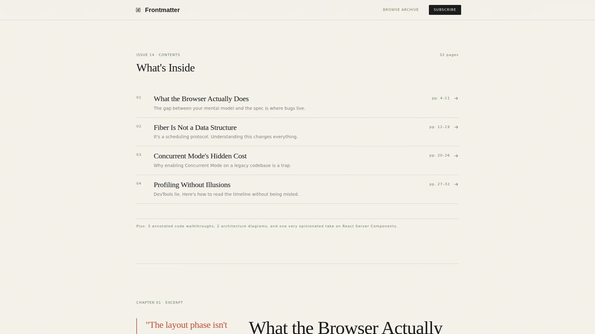
Designed Table of Contents
Scrolling past the hero reveals a table of contents treated as a visual artifact. Each chapter title functions as a smooth anchor link with a single provocative subtitle, giving readers an immediate sense of the issue's scope before a single excerpt loads.
Editorial Excerpt Blocks
Three excerpt sections each follow a magazine spread format. A bold pull quote opens each block, followed by a short passage of rigorous technical prose and a code snippet or diagram treated as editorial illustration. The blocks grow progressively more specific as the reader scrolls.
Inline and Full-Width Calls to Action
The primary call to action, "Read the Full Issue," appears twice. The first instance is an inline text link styled as a magazine callout after the second excerpt. The second is a full-width block at the bottom of the page with a single email field and no additional friction.
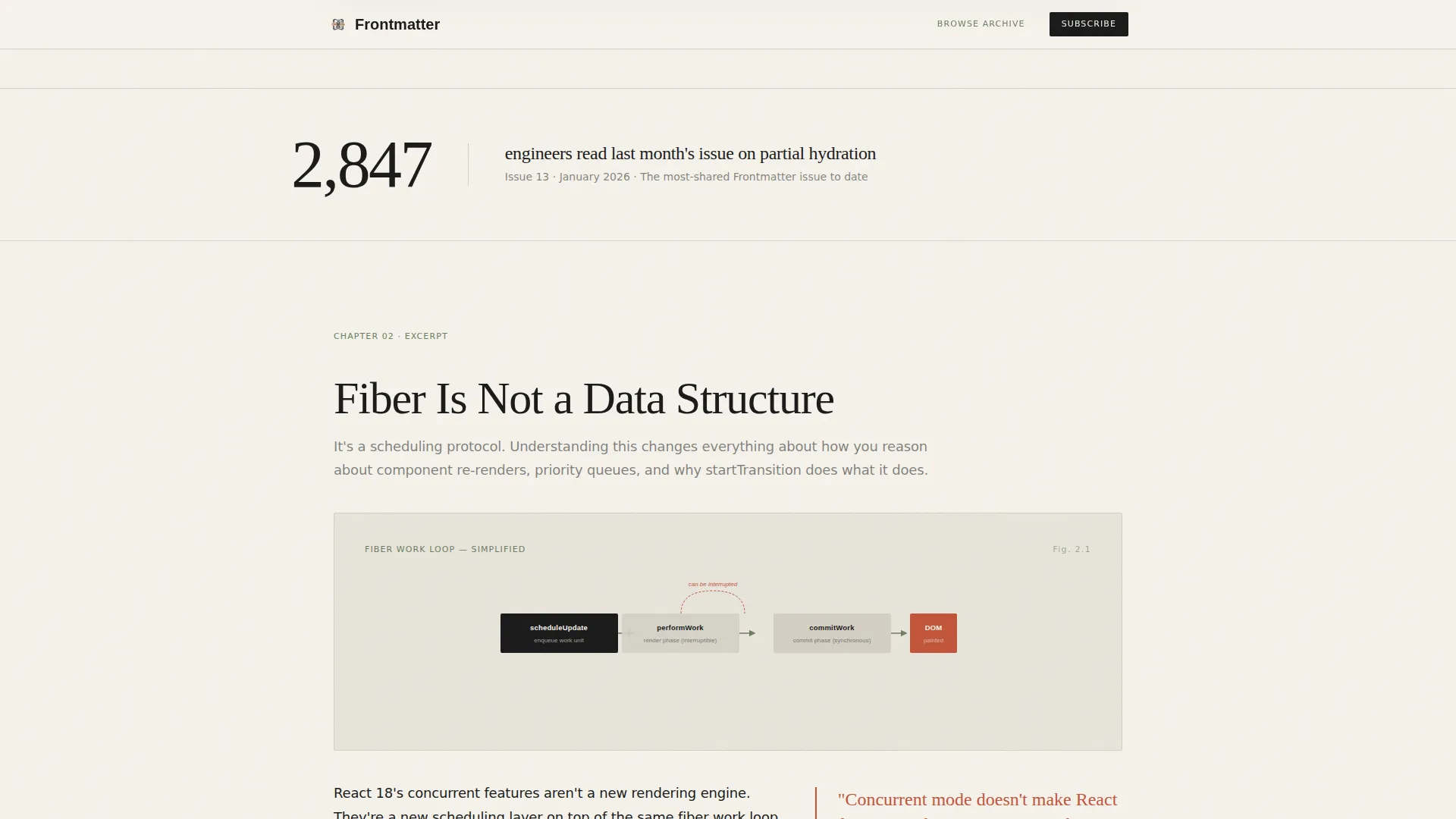
Social Proof Callouts
Quiet data callouts sit between excerpt blocks, sharing specific subscriber statistics and issue metrics. These numbers build trust without interrupting the reading rhythm or breaking the editorial tone.
Archive Browse Path
A secondary call to action links skeptical visitors to past issue summaries. This browse path lets readers self-qualify before subscribing, reducing drop-off from visitors who need more evidence before committing.
Page sections overview
| Section | Purpose |
|---|---|
| Hero header | Full-viewport serif headline over atmospheric image with thesis statement |
| Table of contents | Designed anchor-linked chapter list with provocative subtitles |
| Excerpt block one | Pull quote, technical prose, and code snippet on rendering pipelines |
| Social proof callout | Subscriber count data point placed quietly between excerpts |
| Excerpt block two | Pull quote, prose, diagram, and inline "Read the Full Issue" callout |
| Excerpt block three | Deepest technical glimpse, focused on state machines |
| Full-width call to action | Single email field capture with primary subscription prompt |
| Page footer | Minimal horizontal flow with secondary navigation and archive link |
Design & branding system
The visual identity follows an Editorial Magazine theme using a Japanese Zen color palette. Every color choice is deliberate, and nothing competes for the reader's attention.
- Stone white (#F5F2EB) dominates the background with generous vertical rhythm; sumi ink (#1A1A1A) carries all body text at confident sizes; bamboo matte (#6B7F5E) anchors secondary labels and metadata
- Kiln-fired red (#C2553A) appears sparingly on links, pull quotes, and the primary call to action, making every instance feel earned
- Typography uses Fraunces for serif headlines and DM Sans for body and interface text, creating a clear editorial hierarchy
Mobile & speed optimization
The template is desktop-first to match its primary audience of senior engineers at workstations, but the single-column flow adapts cleanly to smaller screens without sacrificing the editorial reading experience.
- Staggered reveal animations, scroll-triggered fades, and parallax effects are built in for desktop; the single-column structure collapses naturally for mobile viewports
- Server Components handle static content to keep JavaScript minimal, supporting a lean and focused page load
How this template helps you convert
This template is built around an Industry Report scroll cadence. It earns the subscription by demonstrating editorial quality before asking for anything.
- The hero and table of contents establish credibility immediately, signaling depth and seriousness to a skeptical technical reader before the first scroll
- Three excerpt blocks of increasing specificity create a felt gap between what the visitor has read and what the full issue contains, making the call to action feel like a natural next step rather than an interruption
Other information about this template
This template is part of a Blog and Editorial category designed for frontend development newsletters and deep-dive publications. It is built in a Single Column Flow style, which suits long-form content that rewards progressive reading.
- The template supports high animation complexity including staggered reveals, scroll-triggered fades, a marquee element, and parallax effects
- Interactivity is set at a medium level, covering hover states, smooth anchor navigation, and form submission handling
- The footer follows a Vercel-style horizontal flow pattern, keeping navigation minimal and on-brand
- The template is well-suited for B2B SaaS-adjacent publishing contexts where audience trust and demonstrated expertise drive conversions
Theme
Editorial Magazine
Creative direction
Industry Report
Color system
Japanese Zen
Style
Single Column Flow
Direction
Lead Generation
Page Sections
Type Over Image Hero Section
Designed Table of Contents
Three Editorial Excerpt Blocks
Dual Call to Action Placement
Social Proof Callouts
Archive Browse Secondary Path
Related questions
Who is this landing page template designed for?
Can I customize the color palette and typography?
How many calls to action does this template include?
Is the template suitable for a desktop-first audience?
What kind of content fits inside the excerpt blocks?



