Event Planning Digital Presence Pricing Website Template
Fête is a bold brutalist event planning landing page template built on a split-screen layout. It pairs a real-time cost estimator with a scrolling comparison section that puts traditional planning up against a design-forward studio approach. Raw concrete aesthetics meet iridescent color to create a page that feels like a statement before visitors even scroll.
by Rocket studio
Quick summary
Fête is a single-page event planning template with an edge. It opens with an interactive cost estimator and scrolls through a side-by-side comparison that makes traditional event planning look deliberately outdated. The design leans into bold brutalist structure and iridescent color to attract clients who want events that trend, not just happen.
Who this template is for
This template is built for event studios and planners who work with clients that expect more than a banquet-hall aesthetic. It speaks directly to the high-intent buyer who already knows what boring looks like.
- Creative directors planning product launches that need cultural traction
- Founders organizing company milestones that must feel nothing like a corporate retreat
- Couples who want a ceremony concept, not just a venue booking
What problem this template solves
Most event planning websites look identical. They rely on stock photography, passive copy, and a contact form buried at the bottom. That approach works fine for average bookings, but it fails entirely when your clients are choosing between you and an agency with a stronger visual identity.
- Visitors cannot feel the quality gap between your studio and a generic planner
- No interactive element lets prospects self-qualify by budget or event scale before they reach out
- The page gives no reason to act urgently or emotionally
What you get with this template
You get a fully structured, single-page layout built around two core conversion mechanisms: an interactive estimator at the top and a scrolling comparison section below it. Every visual and structural decision is made to create tension and curiosity.
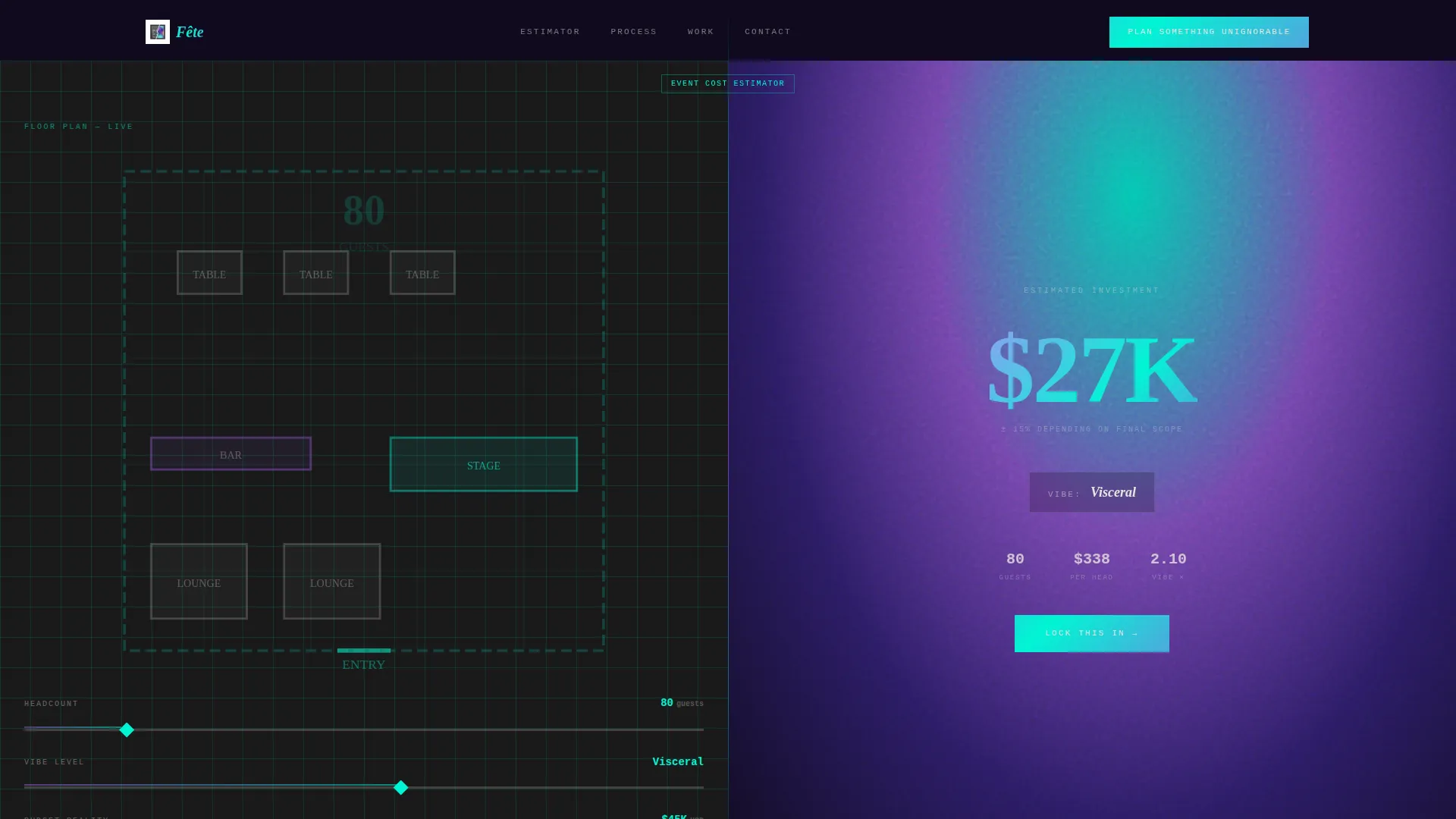
- A split-screen estimator header with draggable sliders and a live cost output display
- A multi-panel comparison section contrasting traditional planning with your studio approach
- A primary call-to-action block and a secondary gated lead-capture path requiring only an email and event type
Feature list
This template includes purpose-built components drawn directly from the brief. Each one serves the page's core goal: making visitors feel the difference before they decide.
Real-Time Cost Estimator Header
Visitors drag three sliders labeled "Headcount," "Vibe Level," and "Budget Reality." As inputs change, a large mono-type cost estimate updates instantly. The left panel shows a wireframe floor plan that populates with furniture icons, while the right panel renders an iridescent mood gradient that shifts from violet to teal as event scale increases.
Scrolling Comparison Panels
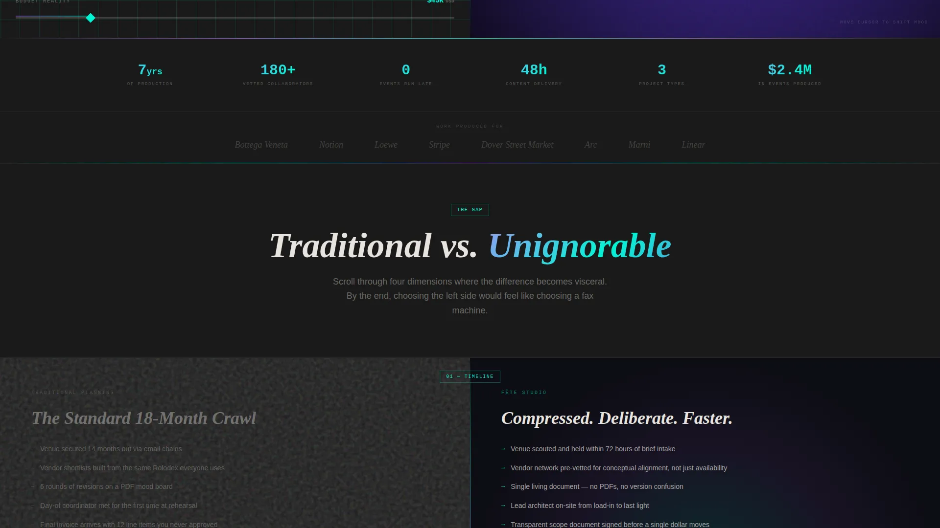
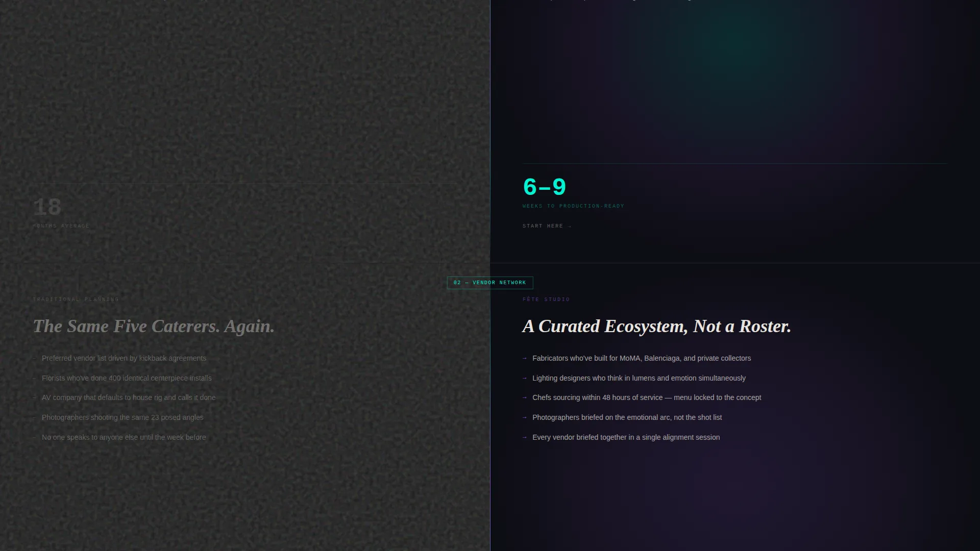
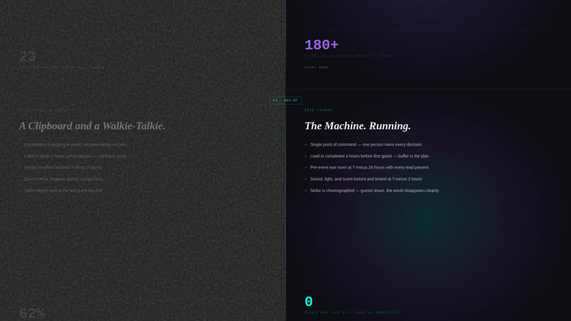
Each scroll section splits the screen 50/50. The left side shows traditional planning in flat concrete gray with static content. The right side shows the studio approach with iridescent animations, interactive three-dimensional venue walkthroughs, and cursor-responsive mood boards. The contrast escalates across four comparison topics: timelines, vendor networks, day-of coordination, and post-event content delivery.
Primary Conversion Block
After the final comparison panel, where the traditional side visually cracks apart, a full-width call-to-action button appears. It reads "Plan Something Unignorable" in iridescent type set against a concrete background.
Gated Lead Capture Path
A secondary conversion option offers a downloadable "Versus Breakdown" document. Visitors unlock it by entering only an email address and selecting an event type from four options: launch, wedding, milestone, or other.
Micro-calls to action Across Sections
Each comparison panel ends with a smaller, contextual call-to-action. These micro-calls to action keep conversion pressure consistent throughout the scroll without disrupting the comparison narrative.
Bold Brutalist Visual System
The design uses poured-concrete charcoal and exposed-aggregate off-white as structural base tones. Shifting holographic violet and liquid iridescent teal appear as accent and interactive colors. No stock photography is used anywhere on the page.
Page sections overview
| Section | Purpose |
|---|---|
| Estimator Header Split | Lets visitors input event parameters and see a live cost estimate with visual feedback |
| Timeline Comparison Panel | Contrasts planning timelines between traditional and studio approaches |
| Vendor Network Panel | Shows the difference in vendor access and coordination quality |
| Day-of Coordination Panel | Highlights real-time event management differences side by side |
| Post-Event Content Panel | Compares content delivery and follow-through between approaches |
| Primary call to action Block | Drives the main conversion action after the final comparison |
| Gated PDF Capture | Collects email and event type in exchange for the Versus Breakdown document |
Design & branding system
The visual language is built on the tension between industrial weight and iridescent impossibility. It does not soften either extreme. The result is a page that feels architectural and alive at the same time.
- Base palette uses poured-concrete charcoal (#2D2D2D) and exposed-aggregate off-white (#E8E4DF) for structural surfaces and body text
- Accent palette introduces shifting holographic violet (#9B5DE5) as the primary interactive color and liquid iridescent teal (#00F5D4) reserved strictly for hover states and interactive surfaces
- Typography uses large mono-type figures in the estimator, creating a stock-ticker quality that makes the live output feel urgent and precise
Mobile & speed optimization
The template is structured to retain its split-screen drama at smaller viewport sizes. The two-panel layout adjusts so the comparison experience remains clear and the estimator remains fully usable on touch devices.
- Slider inputs in the estimator are designed for touch interaction, keeping the live-output mechanic functional on mobile screens
- The comparison panels stack vertically on smaller screens while preserving the visual contrast between the traditional and studio sides
How this template helps you convert
The page is engineered so that by the time a visitor reaches the primary button, they have already made an emotional decision. The structure does the persuasion work across the entire scroll.
- The estimator immediately creates personal investment by letting visitors input their own numbers and see a result tailored to their event scale, making the studio feel responsive before any human contact occurs.
- The escalating comparison panels build cumulative contrast across four distinct dimensions, so the gap between traditional planning and the studio approach feels visceral rather than claimed.
Other information about this template
This template is built for the event planning digital presence category within a technology-focused template marketplace. It is designed to function as a standalone event planning website template for studios operating at the premium end of the market.
- The template style is split screen (50/50), maintained consistently from the estimator header through every comparison panel
- The creative direction follows an Interactive Explorer model, meaning the page rewards active engagement rather than passive reading
- The color system is classified as AI Iridescent, a palette framework that uses shifting, gradient-driven color to create surfaces that appear to move under different lighting conditions
- The theme is Bold Brutalist, a design approach that uses raw structural aesthetics as a deliberate style choice rather than a limitation
- This template does not use stock photography at any point; all visual interest comes from the color system, typography, and interactive components
Theme
Bold Brutalist
Creative direction
Interactive Explorer
Color system
AI Iridescent
Style
Split Screen (50/50)
Direction
Comparison/Versus
Page Sections
Real-time Cost Estimator with Live Visual Feedback
Escalating Split-screen Comparison Panels
Primary Conversion Block with Iridescent Call to Action
Gated Lead Capture for Qualified Prospects
Bold Brutalist Iridescent Design System
Related questions
Who is this landing page template designed for?
Does the cost estimator require a developer to set up?
Can I change the event types listed in the lead capture form?
Does this template use any photography?
What makes the comparison section effective at converting visitors?



