Event Planning Digital Presence Advanced Cost Calculator Website Template
Fête is a split-screen event planning landing page template built for online stores selling event décor, linens, lighting, and signage. It leads with an interactive budget calculator, uses a teal-and-gold visual identity, and drives visitors toward an app download. Every section balances a live planning tool with product photography to turn browsers into buyers.
by Rocket studio
Quick summary
Fête is a single-page, split-screen landing page template for event supply stores. It opens with a working budget calculator paired with styled product photography. Visitors build a real event plan before the first call-to-action appears. The design runs on a deep teal and champagne gold palette, and every section moves, panels slide, totals animate, bundles assemble in view.
Who this template is for
This template is built for event supply businesses that sell physical products online. It serves stores whose customers need to plan and buy at the same time, not just browse.
- Maid-of-honor planners pricing centerpieces and décor bundles late at night
- Corporate event coordinators sourcing branded backdrops under procurement deadlines
- Freelance wedding planners building vendor-free inventory for destination micro-weddings
What problem this template solves
Most event supply store pages show products without context. Visitors leave because they cannot figure out what to buy, how much they need, or whether it fits their budget. This template replaces that uncertainty with an interactive planning experience built into the page itself.
- Visitors arrive without a clear event budget and leave without buying
- Product pages feel disconnected from the real planning process
- There is no clear next step between browsing and committing to a purchase
What you get with this template
You get a fully designed, single-page layout structured around a calculator-first experience. Every visual and interactive element described in the brief is built into the template structure.
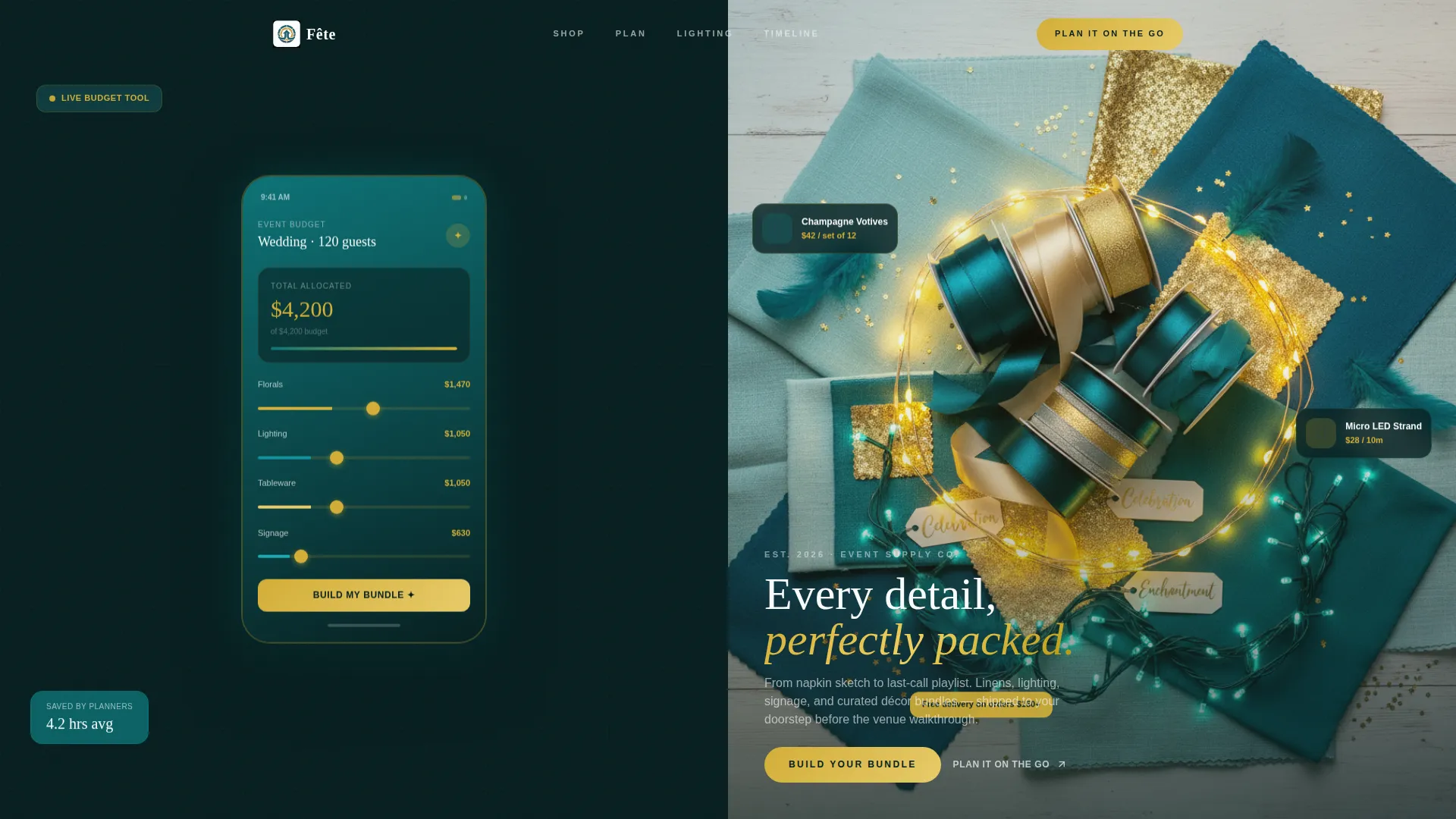
- A split-screen header with a phone screen showing a live Event Budget Calculator beside a styled flat-lay of event supplies
- Interactive planning sections including a lighting configurator, a color-match engine, and a delivery timeline planner
- A sticky app download bar and a secondary email capture path that collects event date and email
Feature list
This template is built around six tightly integrated sections, each pairing a planning tool with a product display. The result is a page that earns user trust before it asks for anything.
Interactive Event Budget Calculator
The header section shows the budget calculator mid-interaction on a phone screen. A wedding for 120 guests with a $4,200 décor budget is already loaded. Category sliders for florals, lighting, tableware, and signage are adjusted, and a live total updates at the bottom of the screen.
Dynamic Bundle Recommender
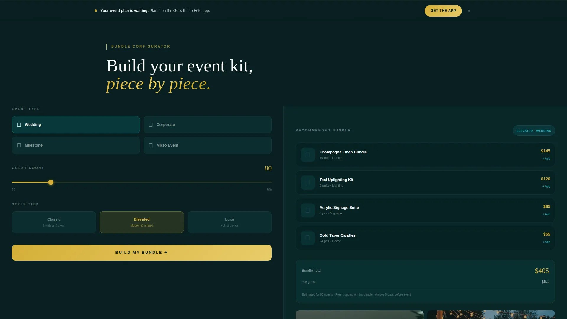
As visitors select event type, guest count, and style tier inside the calculator, the right panel populates a recommended product bundle with real prices. The bundle assembles piece by piece so visitors see exactly what they are getting.
Lighting Configurator Panel
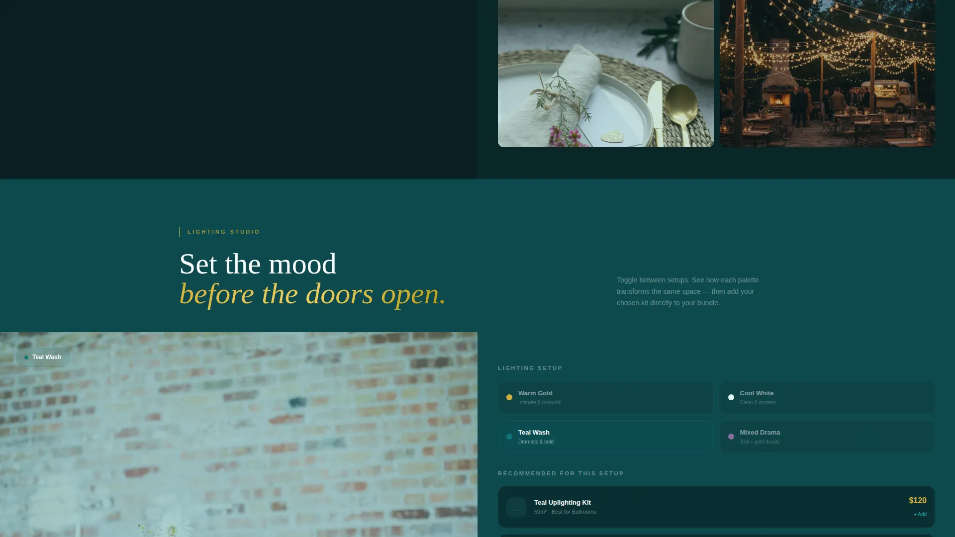
A dedicated section lets visitors preview warm versus cool lighting setups. The split-screen format shows the configurator on one side and matching product photography on the other, so the decision feels immediate and visual.
Linen and Signage Color-Match Engine
This section pairs a color-match tool with a linen swatch fan and signage kit imagery. Visitors select a palette and the panel updates to show coordinating products, reducing the guesswork of matching event elements.
Delivery Timeline Planner
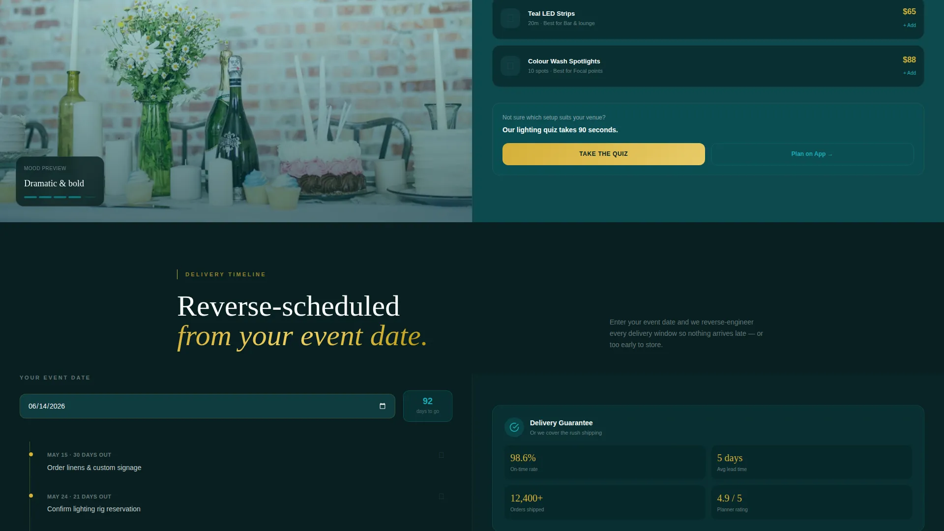
A reverse-scheduling tool takes the event date as input and maps out delivery windows for each product category. It gives coordinators a clear prep timeline without leaving the page.
App Download and Email Capture calls to action
The primary call-to-action reads "Plan It on the Go" with paired App Store and Google Play badges. It appears first beneath the budget calculator result, then again as a sticky bottom bar after the second scroll. A secondary path offers "Email My Event Plan" for visitors not ready to install the app.
Page sections overview
| Section | Purpose |
|---|---|
| Split-Screen Header | Pairs the budget calculator phone screen with a styled product flat-lay |
| Budget Calculator Panel | Lets visitors set guest count, event type, and décor budget with live totals |
| Bundle Recommender Panel | Populates a recommended product bundle based on calculator inputs |
| Lighting Configurator | Previews warm and cool lighting setups alongside matching product photos |
| Color-Match Engine | Matches linens and signage to a selected palette in real time |
| Timeline Planner Section | Reverse-schedules deliveries from the visitor's chosen event date |
| App Download Bar | Sticky call to action bar with App Store and Google Play badges after second scroll |
| Email Capture Section | Secondary path to collect email and event date for follow-up |
Design & branding system
The visual identity follows a Dynamic Motion theme using the Teal Catalyst color system. The palette is drawn directly from the atmosphere of a ballroom in the minutes before doors open.
- Deep event-night teal (#0D7377) anchors backgrounds, champagne gold (#D4AF37) lights up calls-to-action and hover states, crisp tablecloth white (#FAFCFD) fills content panels, and charcoal slate (#2C3E50) grounds body text
- Motion is constant throughout: panels slide into view, price totals animate as sliders move, and product bundles assemble themselves piece by piece on scroll
- The header flat-lay uses ribbon spools, a linen swatch fan, and a mini LED light strand, all styled within the teal-and-gold palette to reinforce the store's product range
Mobile & speed optimization
The template is designed so the split-screen layout adapts clearly to smaller screens. The calculator-first experience is built to work on a phone, which matches the app download goal of the page.
- The phone screen in the header shows the Event Budget Calculator mid-interaction, making the mobile use case immediately clear to visitors on any device
- The sticky app download bar appears after the second scroll and stays accessible throughout the rest of the page on mobile
- Interactive panels including the lighting configurator and color-match engine are structured for a touch-friendly experience consistent with the app-forward direction
How this template helps you convert
The page is built on a simple principle: earn the action before asking for it. By the time a visitor sees the primary call-to-action, they have already invested time building their event plan inside the tool.
- The budget calculator engages visitors immediately at the top of the page, creating a personalized plan that makes the product catalog feel relevant and necessary rather than generic.
- The sticky "Plan It on the Go" bar with App Store and Google Play badges stays visible after the second scroll, so the download prompt appears at the moment of highest intent without interrupting the planning experience.
- The "Email My Event Plan" secondary path captures visitors who are not ready to download the app, converting intent into a lead with just an email address and event date.
Other information about this template
This template is part of a broader event planning digital presence category. It is designed to support technology-forward event supply businesses that want to differentiate through interactive planning tools rather than standard product grids.
- The template style is a 50/50 split screen, meaning every section divides equally between a tool or configurator and a product photography panel
- The creative direction is Calculator/Tool First, which means the scroll journey begins with function and utility, not lifestyle imagery
- The header concept is a Product Screenshot, specifically a phone screen showing the Event Budget Calculator in an active state with real numbers loaded
- The theme is Dynamic Motion, so the page communicates energy and readiness through animation rather than static layouts
- This template fits event planning online stores that sell physical inventory such as linens, lighting rigs, signage kits, and curated décor bundles for shipping before events
Theme
Dynamic Motion
Creative direction
Calculator/Tool First
Color system
Teal Catalyst
Style
Split Screen (50/50)
Direction
App Download
Page Sections
Live Event Budget Calculator
Dynamic Bundle Recommender Panel
Lighting and Color Configurator Sections
Delivery Timeline Planner
Sticky App Download Call-to-action Bar
Email Capture Secondary Conversion Path
Related questions
What type of business is this template designed for?
Does the template include the budget calculator functionality?
What are the two conversion paths on this landing page?
Can the color system be adjusted to match a different brand?
How does the split-screen layout work across the page?



