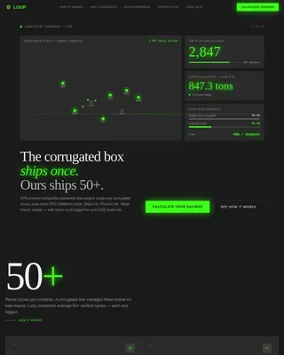
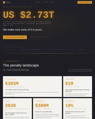
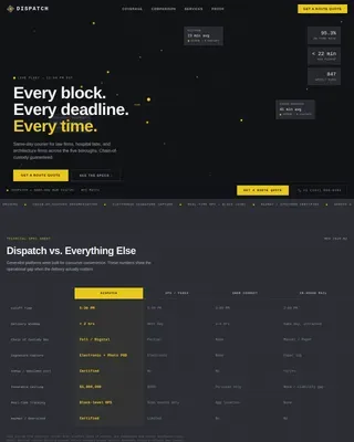
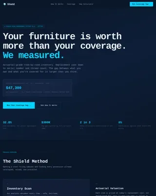
Advanced Warehouse & Distribution Professional Website Template
Fulfill is a modular card grid landing page built for micro-fulfillment centers targeting direct-to-consumer brands. It leads with a live dashboard screenshot, stat-first cards, and a dual conversion path: a fulfillment audit request form and a gated SLA download. The Monochrome Steel palette and operational-green accents give it the look of a warehouse system that already works.
by Rocket studio
Quick summary
Fulfill is a single-page, card grid template designed for micro-fulfillment operators pitching urban logistics to direct-to-consumer brands. Every section leads with a hard number before an explanation. The layout moves from performance proof to integration specs to SLA guarantees, closing around every objection before the visitor reaches the audit form.
Who this template is for
This template is built for logistics operators and fulfillment businesses that need to convert mid-size brands into partners. It speaks directly to the decision-maker who controls shipping costs.
- Direct-to-consumer brand operators processing 500 to 5,000 orders per day
- Subscription box companies and regional grocery platforms managing last-mile delivery costs
- Micro-fulfillment center operators pitching warehouse partnerships to growing Shopify merchants
What problem this template solves
Growing brands outpace their current fulfillment setup but cannot commit to a large warehouse lease. They bleed margin on slow, expensive last-mile delivery and have no easy way to evaluate a new partner. This template gives fulfillment operators a page that answers every hard question with proof, not promises.
- High last-mile delivery costs eat into margins for brands shipping from distant distribution centers
- Prospects need verifiable performance data before trusting a new logistics partner
- A generic service page fails to communicate speed, accuracy, and cost advantage at a glance
What you get with this template
You get a fully structured, single-page layout with every section pre-built for a fulfillment pitch. The modular card grid means you can adjust content without rebuilding the layout from scratch.
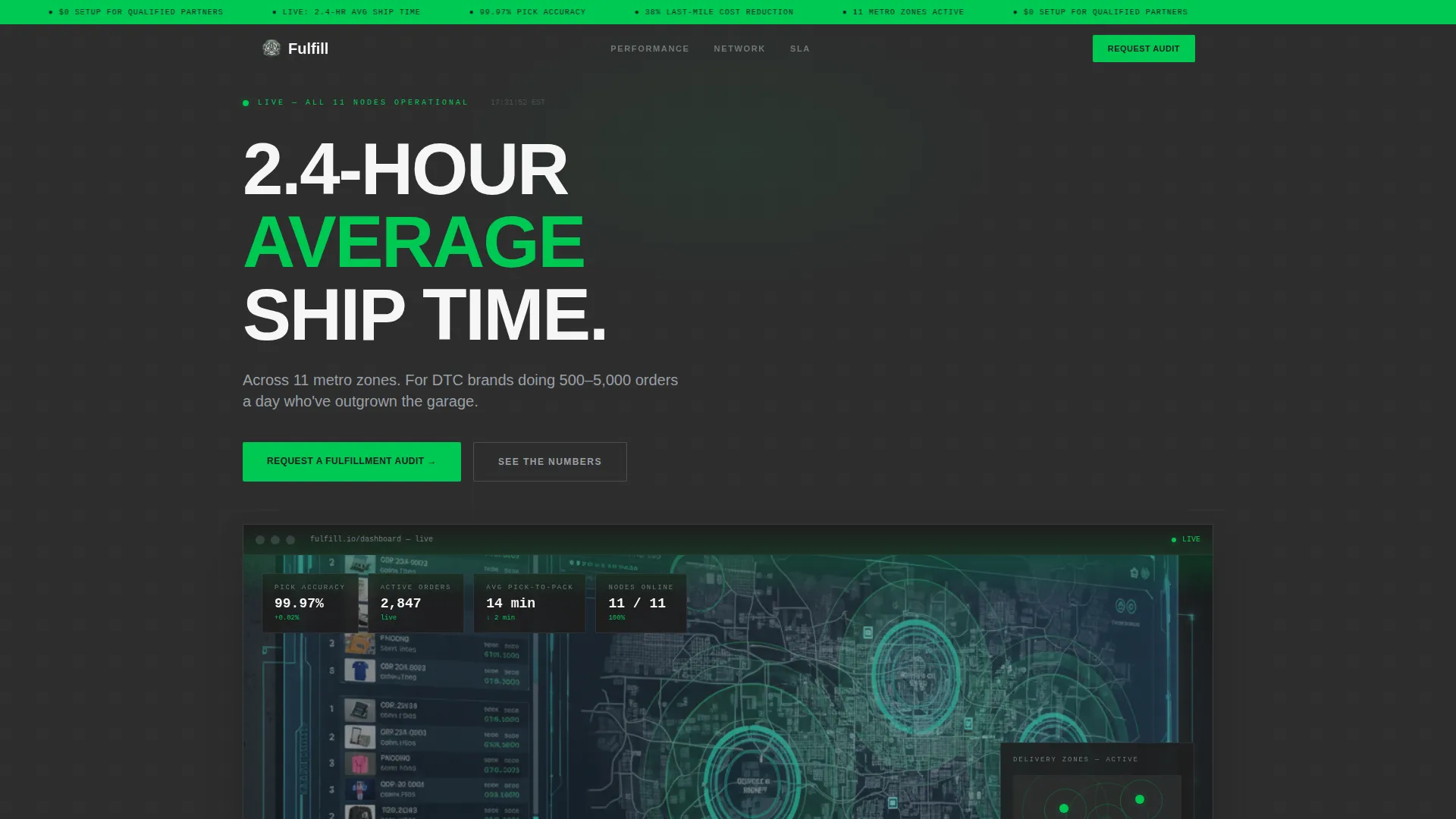
- A full-width product screenshot header displaying a live order queue, pick accuracy stat, and delivery zone map
- A stats-first card grid with hover interactions that reveal methodology, integration references, and mini case studies
- A dual conversion system including an audit request form and a gated SLA document download path
Feature list
This template is built around one core idea: let the numbers do the selling. Each feature below serves that purpose directly.
Stats-First Card Grid
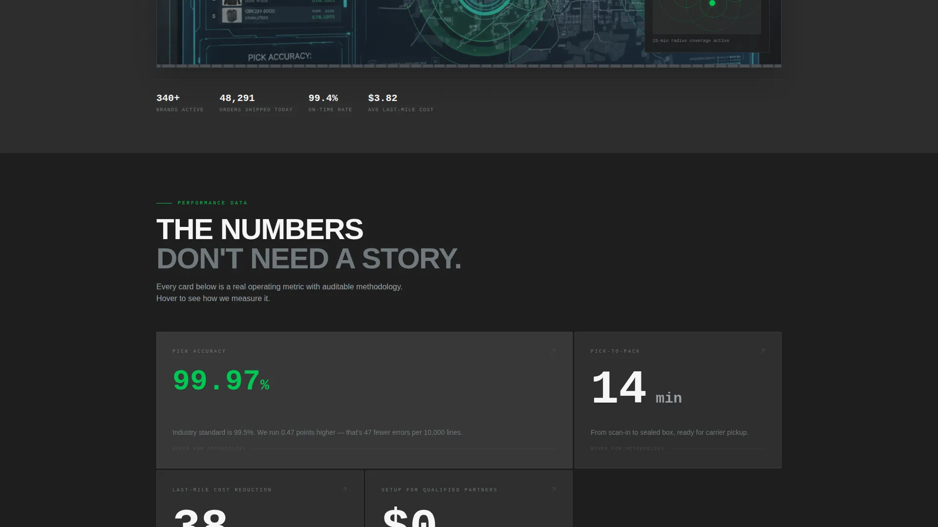
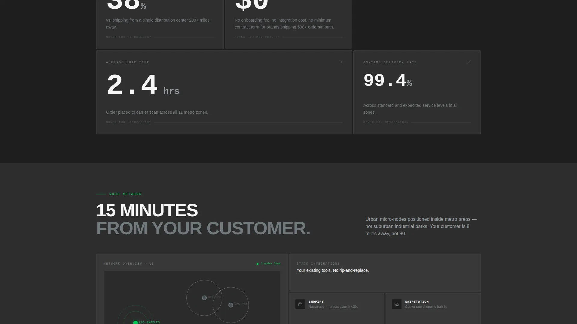
Each card in the grid opens with a large-format performance number. Cards flip or expand on hover to reveal the logic behind each metric. The grid tightens as the visitor scrolls, moving from speed and accuracy stats through integration specs to SLA guarantees.
Dashboard Screenshot Header
The header uses a full-width product screenshot rather than lifestyle imagery. It shows a live order queue, a real-time pick accuracy figure of 99.97 percent, and a radial delivery zone map with three active urban nodes. A stat headline in packing-slip white overlays the image.
Dual Conversion Path
The primary call to action is "Request a Fulfillment Audit," placed in a persistent top bar and as the final grid card. A secondary path offers a gated SLA Guarantee document download for prospects not yet ready to commit, capturing only email address and order volume.
Audit Request Form
The form captures four fields: company name, monthly order volume via dropdown, current fulfillment method, and primary sales channel. The framing positions the conversion as a free diagnosis rather than a sales call, lowering commitment anxiety.
Operational-Green Accent System
The single accent color, operational green at hex value #00C853, appears only on live metrics, active states, and call-to-action elements. This restraint makes every green element feel like a signal rather than decoration, directing attention exactly where action is needed.
Modular Section Architecture
The card grid layout is modular by design. Each card block operates independently, so operators can swap in their own metrics, case studies, or integration references without restructuring the page. The grid responds to content changes without breaking the visual rhythm.
Page sections overview
| Section | Purpose |
|---|---|
| Persistent Top Bar | Anchors the primary audit call to action at all scroll depths |
| Dashboard Screenshot Header | Delivers instant proof via a live fulfillment dashboard visual |
| Stat Headline Overlay | Surfaces the 2.4-hour ship time claim above the header image |
| Performance Stats Grid | Leads with pick accuracy, pick-to-pack time, and cost reduction figures |
| Hover Reveal Cards | Expands each stat card to show methodology and integration context |
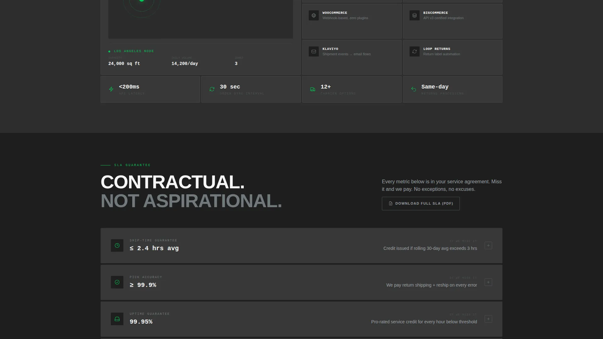
| Integration Specs Row | Details compatible sales channel and fulfillment tool connections |
| SLA Guarantee Section | Presents service level commitments with a gated PDF download path |
| Audit Request Form | Captures company details and order volume for the primary conversion |
| Final call to action Card | Closes the grid with a second audit request prompt |
Design & branding system
The visual identity follows a Service Utility theme built on a Monochrome Steel color system. The palette is deliberately cold and functional, referencing the physical environment of a working warehouse at operational hours.
- Charcoal (#2D2D2D) dominates backgrounds; cold-rolled steel (#71797E) carries body text and card borders; packing-slip white (#F5F5F5) opens breathing room inside each module
- Operational green (#00C853) is reserved strictly for live metrics, active card states, and call-to-action elements to maximize signal value
- No lifestyle imagery or decorative elements appear anywhere; the product screenshot header and hard numerical data carry all visual weight
Mobile & speed optimization
The modular card grid layout is built to reflow cleanly across screen sizes. On smaller viewports, the multi-column grid collapses into a readable single-column stack without losing the stat-first hierarchy.
- Each card module is self-contained, which keeps reflow predictable and prevents layout breakage on narrow screens
- The header screenshot scales responsively so the order queue data and zone map remain legible on mobile devices
- Hover interactions on cards are designed with touch-equivalent states in mind, keeping the expand behavior accessible on tap-based devices
How this template helps you convert
This template is engineered around a single sales principle: eliminate every reason to leave before the audit form appears. The layout sequence is deliberate.
- The stat headline and dashboard screenshot establish credibility in the first viewport, before the visitor has scrolled at all
- The card grid builds a cumulative case using performance data, integration context, and SLA proof, so objections are addressed section by section
- The dual conversion path captures both ready-to-talk prospects through the audit form and research-stage visitors through the gated SLA download, maximizing total lead capture from a single page visit
Other information about this template
This template sits at the intersection of logistics technology and B2B conversion design. It is purpose-built for the micro-fulfillment niche within the broader warehouse and distribution category.
- The template style is a Card Grid (Modular) layout, making it straightforward to repopulate with your own operational metrics and case study references
- The creative direction is Stats-First Impact, a deliberate choice for logistics audiences who respond to verifiable data over narrative copy
- The header concept is a Product Screenshot, meaning no stock photography is required to launch the page
- The landing page direction is Partnership and B2B, meaning every design decision prioritizes lead qualification over broad awareness
- The Service Utility theme and Monochrome Steel color system are consistent with industrial and logistics brand identities across the warehouse and distribution sector
Theme
Service Utility
Creative direction
Stats-First Impact
Color system
Monochrome Steel
Style
Card Grid (Modular)
Direction
Partnership/B2B
Page Sections
Stats-first Card Grid Layout
Dashboard Screenshot Header
Hover-reveal Card Interactions
Dual Conversion Path
Persistent Top Bar Call to Action
Modular Section Architecture
Related questions
What kind of business is this landing page designed for?
Can I update the stats and metrics shown in the card grid?
What does the dual conversion path include?
Does the template require lifestyle photography or stock images?
How does the hover interaction work on the stat cards?