Crowdfunding Platform Comparison Landing Page Template
Fund is a high-impact crowdfunding comparison landing page template built for platforms that need to win visitors at 2 a.m. A live interactive preview, an animated comparison table, and a real-time fee calculator work together to show founders, serial creators, and agencies exactly how much more they keep by choosing your platform.
by Rocket studio
Quick summary
Fund is a single-page crowdfunding platform template designed around one goal: turning a comparison visit into a launch decision. The page opens with a functioning mock campaign dashboard, moves through an animated competitor comparison table, and closes with a dynamic fee calculator that shows personalised net payout figures before a visitor ever fills out a form.
Who this template is for
This template is built for crowdfunding platforms that compete on fees, speed, and creator tools. It speaks directly to three audiences who arrive with sharp questions and limited patience.
- First-time founders who are comparing platforms late at night and need clear, honest numbers fast.
- Serial creators who have run campaigns before and understand exactly what platform fees cost them over time.
- Marketing agencies evaluating crowdfunding tools on behalf of clients preparing product launches.
What problem this template solves
Most crowdfunding platform pages bury their advantages inside marketing language. Visitors who want real comparisons leave to find a third-party review site, and the platform loses the conversion. Fund fixes that directly.
- Visitors can interrogate fee structures, payout timelines, and feature gaps without leaving the page.
- The interactive dashboard and calculator replace vague claims with live, personalised numbers.
- The two-step form and gated PDF capture leads at every stage of readiness, not just the ready-to-launch segment.
What you get with this template
Fund delivers a complete, conversion-focused landing page layout. Every section is purposeful and the template ships ready to adapt to your platform's real numbers.
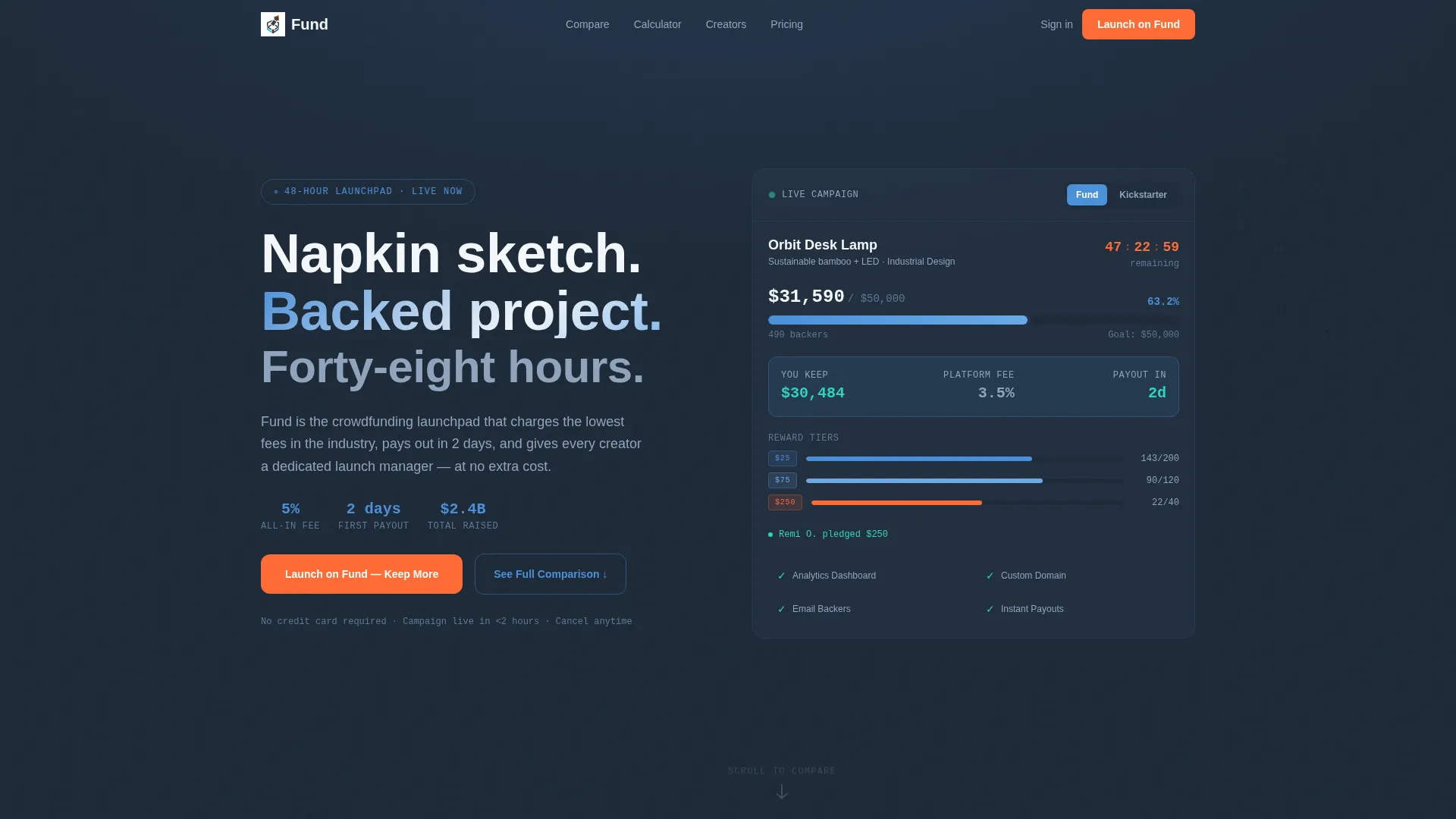
- An interactive header dashboard showing a mock campaign with a live pledge counter, funding thermometer, and reward tier display.
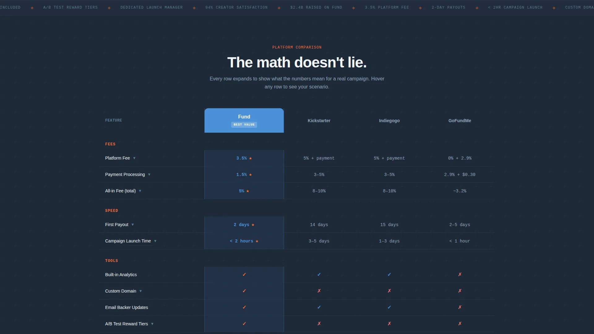
- A spine-level comparison table with expandable rows, animated percentage calculations, and a pinned call-to-action below it.
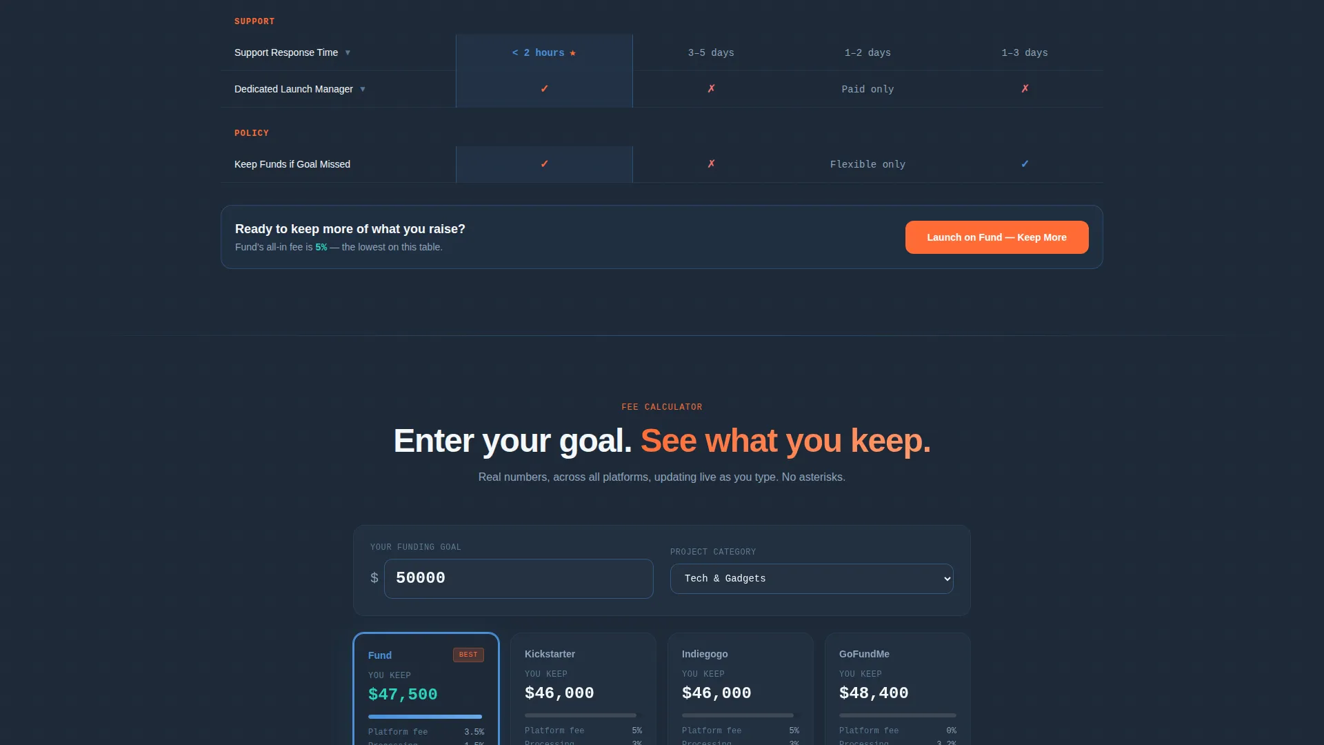
- A real-time fee calculator where visitors enter their goal amount and instantly see net payouts across all compared platforms.
Feature list
This template includes purpose-built interactive components that go beyond static layout blocks.
Live Campaign Dashboard Header
The header places a functioning mock campaign in front of visitors the moment the page loads. A pledge counter increments, a funding thermometer fills, and reward tiers populate in real time. Visitors can toggle between "Your Campaign on Us" and "Your Campaign on Them" to watch fees deduct and feature badges disappear from the competitor view.
Animated Comparison Table
The comparison table is the structural spine of the page. Each row animates in as the visitor scrolls, and hovering over any row expands it to show a concrete scenario such as "You raise $50K, here is what you keep." Real percentage calculations replace vague checkmarks throughout, making the advantage gap impossible to ignore.
Real-Time Fee Calculator
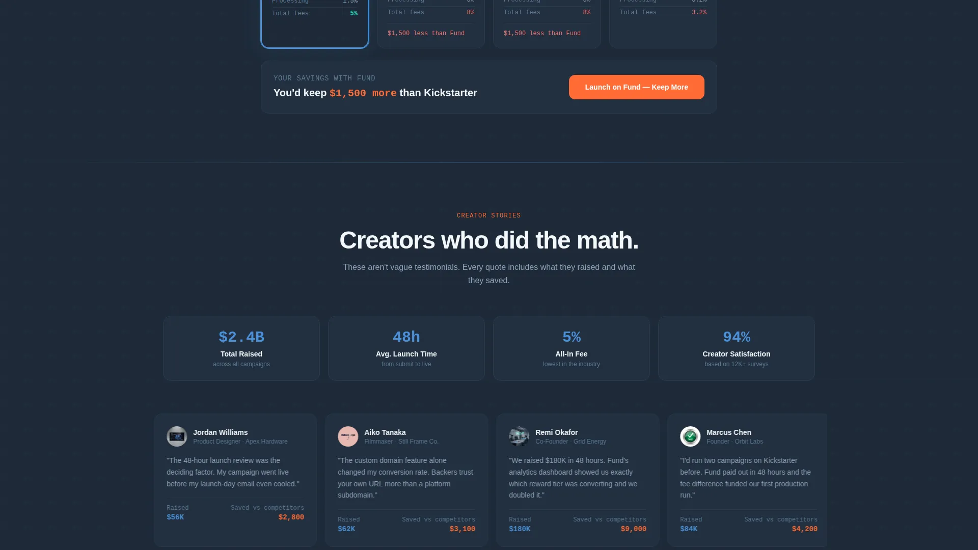
Below the comparison table, visitors enter their own funding goal and watch net payout figures update simultaneously across all four platform columns. The dynamic primary call-to-action beneath the calculator updates to reflect the visitor's specific savings figure, turning a general pitch into a personalised case.
Two-Step Lead Capture Form
The form asks only for email address and project category on the first click. A second step then collects funding goal and launch timeline. This progressive approach reduces early drop-off while still gathering the data needed to qualify and follow up with leads.
Gated PDF Secondary Path
A "Download the Full Platform Breakdown" option runs alongside the primary conversion path. It captures leads who are still in research mode and have done the math but are not yet ready to commit, keeping them in the funnel without pressure.
Pinned and Repeated Call-to-Action
The primary call-to-action reads "Launch on Fund, Keep More" and appears pinned at the bottom of the comparison table. It repeats after the fee calculator with dynamic text that updates to show the visitor's specific savings amount, reinforcing urgency at the two highest-intent moments on the page.
Page sections overview
| Section | Purpose |
|---|---|
| Interactive Dashboard Header | Hooks visitors with a live mock campaign showing real pledge and fee behaviour |
| Platform Toggle View | Lets visitors switch between home platform and competitor views side by side |
| Comparison Table | Presents fees, payout speed, tools, and support benchmarks row by row |
| Expandable Row Scenarios | Adds context to each table row with a concrete dollar-amount outcome |
| Fee Calculator Block | Personalises net payout figures based on the visitor's own goal input |
| Dynamic call to action Block | Reinforces the savings message with a visitor-specific figure and primary action |
| Two-Step Capture Form | Collects email and project category first, then goal and timeline |
| PDF Gated Download | Offers a secondary lead path for visitors still in research mode |
Design & branding system
The visual identity follows a Startup Velocity theme built around a Slate and Sky color system. The palette feels like a mission control screen: dark, data-dense, and calm until something lights up.
- Deep gunmetal slate (#1E2A38) is used for primary backgrounds, keeping the interface focused and readable.
- Stratosphere blue (#4A90D9) activates on interactive states and highlights the winning platform column.
- Cloud-deck white (#F4F7FA) fills table cells and spacing areas, giving data room to breathe.
- Ignition orange (#FF6B35) is reserved exclusively for calls-to-action and competitive advantage checkmarks, so every orange element demands attention.
Mobile & speed optimization
The template is structured so the comparison table, calculator, and interactive dashboard remain usable on smaller screens. High-intent visitors comparing platforms on a phone at midnight should see the same clarity as desktop users.
- The comparison table layout adapts to narrower viewports so key columns and data remain visible without horizontal scrolling.
- The fee calculator input and output fields are sized and spaced for comfortable thumb use on mobile devices.
- No stock photography or illustration assets are used anywhere in the template, keeping visual weight low and load behaviour predictable.
How this template helps you convert
Fund is designed around a Comparison and Versus conversion strategy. Every section builds pressure toward a decision by making the data gap between platforms undeniable.
- The interactive dashboard creates immediate product credibility before a visitor reads a single line of text, anchoring trust in the platform's real behaviour rather than marketing claims.
- The expanding comparison table and real-time calculator move the visitor from general curiosity to a specific, personalised savings figure, making the cost of choosing a competitor concrete and visible.
- The two-path conversion system (direct sign-up form plus gated PDF download) captures leads at two levels of intent, so no high-value visitor leaves the page empty-handed.
Other information about this template
Fund sits within the Technology category, specifically the Consumer App and Platform subcategory, targeting the crowdfunding platform niche. It is designed for teams that need a ready-to-deploy comparison page without building interactive components from scratch.
- The template style is a Comparison Table layout, making it a natural fit for any crowdfunding platform positioning itself against established alternatives in the market.
- The creative direction follows an Interactive Explorer approach, where scrolling triggers progressive information reveal rather than a passive reading experience.
- The header concept is an Interactive Preview, meaning the product itself serves as the hero rather than photography or illustration.
- The countdown timer component on the mock campaign dashboard reinforces urgency visually, aligning with the fast-moving nature of crowdfunding campaigns that typically close within days.
- The Intersection Match Score for this template is 13, reflecting strong alignment between the template's visual system, interactive components, and the specific conversion needs of a crowdfunding comparison page.
Theme
Startup Velocity
Creative direction
Interactive Explorer
Color system
Slate & Sky
Style
Comparison Table
Direction
Comparison/Versus
Page Sections
Live Campaign Dashboard Header
Animated Comparison Table
Real-time Fee Calculator
Two-step Lead Capture Form
Pinned and Repeated Call-to-action
Gated PDF Secondary Path
Related questions
Can I update the competitor names and fee percentages in the comparison table?
How does the two-step form reduce drop-off?
Does the fee calculator require developer work to configure?
What is the gated PDF path and do I need to supply the document?
Can the countdown timer be removed if my platform uses rolling campaigns?



