Study Abroad & Admissions Professional Website Template
Funded is a playful geometric landing page template built for scholarship and financial aid platforms. It features a bold centered headline, an animated scholarship counter, and a hub-and-spoke anchor navigation that introduces real student and counselor stories. A three-step freemium signup flow proves value before asking for an email, making it ideal for platforms that match students with funding they never knew existed.
by Rocket studio
Quick summary
Funded is a single-page, hub-and-spoke landing page template designed for scholarship matching platforms. It opens with a giant typographic headline and a live counter of unclaimed scholarships, then guides visitors through story-led spoke sections before capturing signups through a progressive three-step profile. The design feels energetic and hopeful, built to resonate with first-gen students and high school seniors.
Who this template is for
This template is built for teams running scholarship discovery or financial aid matching platforms. It speaks directly to the students and families who need funding the most, while giving platform owners a credible, conversion-ready page to launch from.
- Scholarship platform founders targeting high school juniors, first-generation college students, and community college transfer students
- Financial aid counselors or education nonprofits that want a story-driven page to build trust quickly
- Edtech startups launching a freemium matching tool that needs to prove value before asking for an email
What problem this template solves
Most financial aid pages feel clinical and intimidating. Students either bounce before they understand the offer, or they hand over their email before seeing anything useful. That mismatch kills conversions and trust at the same time.
- Students leave without signing up because the page never proves the platform actually has relevant scholarships for them
- First-gen students and transfer students distrust generic pages that don't reflect their specific situation
- Platform owners lose qualified signups because the value exchange is unclear until after the form is submitted
What you get with this template
You get a complete, ready-to-customize landing page built around storytelling, urgency, and a trust-first signup flow. Every section is intentional, from the animated headline to the sticky mobile call-to-action bar.
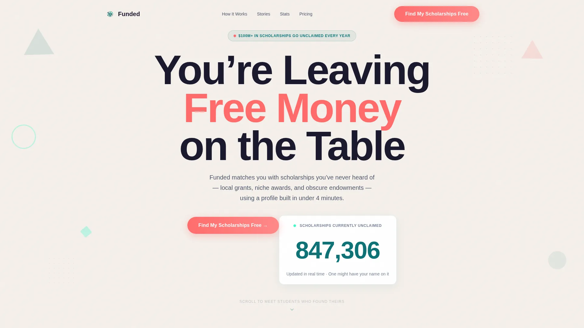
- A giant centered headline section with an animated counter showing unclaimed scholarships in real time
- A hub-and-spoke anchor navigation system with named spoke sections featuring individual student, counselor, and donor stories
- A three-step progressive profile capture flow that shows a live matching count before the email gate
Feature list
This template packs in several distinct features, each grounded in the brief's stated design and interaction goals.
Animated Scholarship Counter
A live-ticking counter sits beneath the headline and climbs upward as the page loads. It shows the total number of unclaimed scholarships in the database, creating immediate urgency before the visitor has read a single feature description.
Hub and Spoke Anchor Navigation
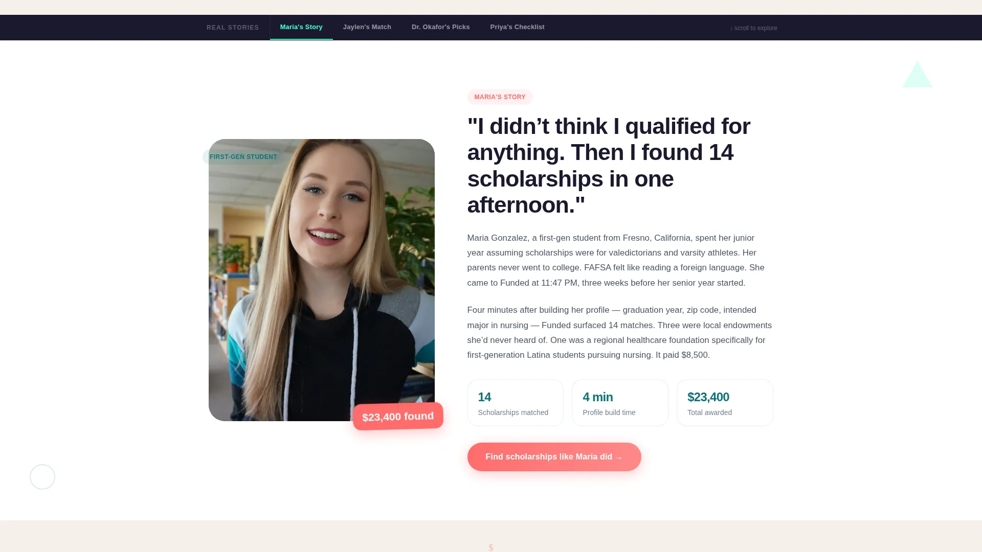
A persistent anchor navigation bar labels each section by a first name: "Maria's Story," "Jaylen's Match," "Dr. Okafor's Picks," and "Priya's Checklist." Visitors can jump directly to any story, and the nav stays visible as they scroll, making the page feel organized and personal at the same time.
Story-Led Spoke Sections
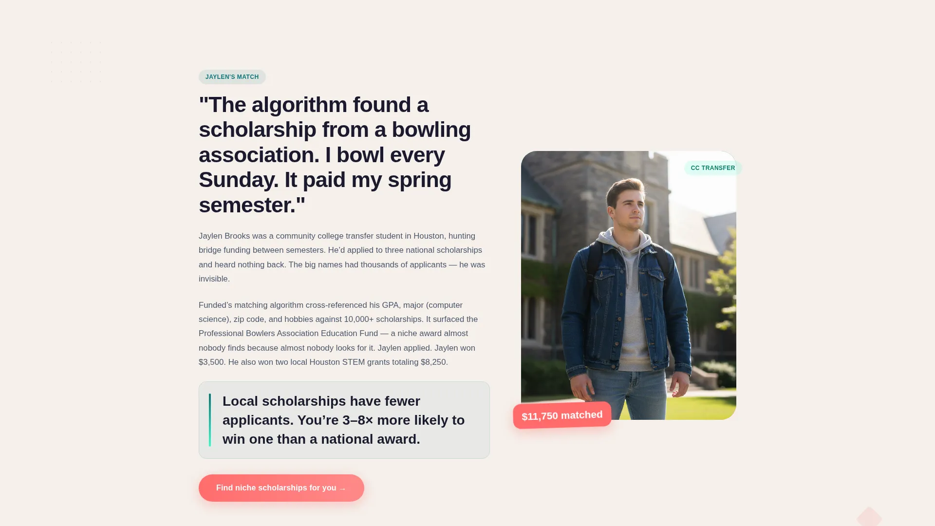
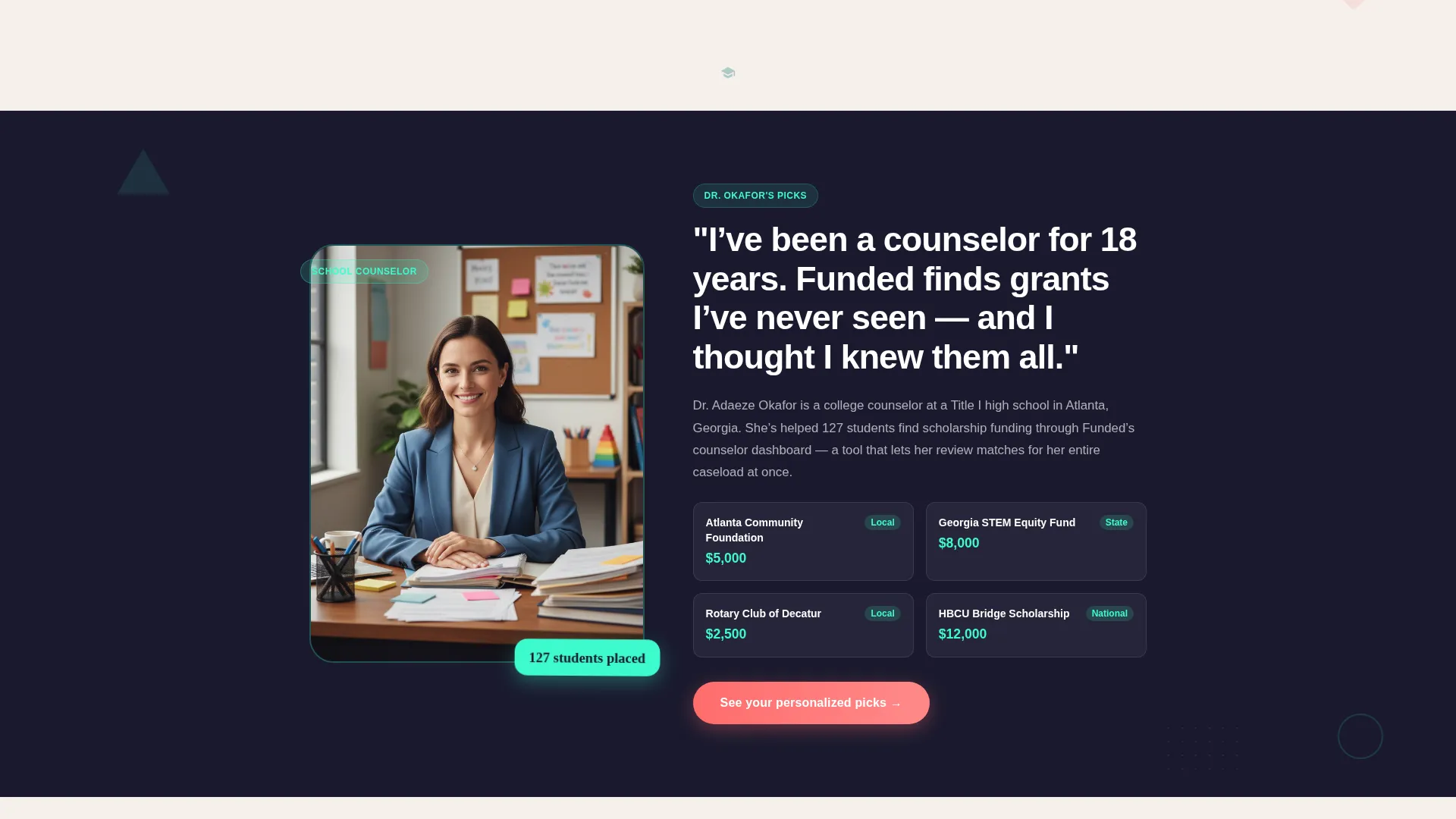
Each spoke section features a real person, a student who found funding, a counselor, or a grant donor. Their face, voice, and specific dollar amounts anchor the content, so scrolling feels like meeting people at a financial aid office rather than reading a features list.
Three-Step Progressive Profile Flow
Clicking the primary call-to-action opens a three-step signup sequence. Step one collects graduation year and zip code. Step two asks for grade point average range and intended major. Step three requests an email to unlock the full match list. Steps one and two return a live matching count, proving value before asking for anything.
Geometric Scroll Animations
Triangles, offset circles, and dotted grids float behind content blocks and rotate subtly on scroll. Between spoke sections, geometric dividers animate into dollar signs and graduation caps. The motion stays playful without distracting from the content.
Sticky Mobile Call-to-Action Bar
On mobile, the primary "Find My Scholarships Free" call-to-action appears as a persistent bottom bar throughout the page. It also repeats at the header and at the close of each spoke section, so the conversion opportunity is never more than a tap away.
Page sections overview
| Section | Purpose |
|---|---|
| Giant Headline Header | Hooks visitors with bold typography and an animated unclaimed-scholarship counter |
| Anchor Navigation Bar | Lets visitors jump between named story spokes and stays visible while scrolling |
| Maria's Story | Shows a real student's funding win with a specific dollar amount to build credibility |
| Jaylen's Match | Demonstrates how the matching profile surfaces niche and local scholarships |
| Dr. Okafor's Picks | Adds counselor authority by featuring curated grant recommendations |
| Priya's Checklist | Guides transfer students through a financial aid bridge-funding checklist |
| Progressive Profile Flow | Captures signups through a three-step form that returns a live match count |
| Mobile Sticky Bar | Keeps the primary call-to-action visible at the bottom of the screen on mobile |
Design & branding system
The visual identity follows a Playful Geometric theme built on the Teal Catalyst color system. The palette is optimistic and energetic, designed to feel like a well-organized desk covered in colorful sticky notes rather than a government form.
- Colors: deep scholarship teal (#0D7377) as the primary anchor, electric mint (#3DFACC) for interactive highlights and progress indicators, soft chalk (#F5F0EB) for section backgrounds, and punchy coral (#FF6B6B) reserved for calls-to-action and alert badges
- Typography: bold oversized geometric sans-serif for the headline, with individual letters subtly filled by rotating teal and coral triangle shapes
- Geometric shapes including triangles, offset circles, and dotted grids float behind content blocks like confetti frozen mid-toss, with subtle scroll-triggered rotation
Mobile & speed optimization
The template is designed with mobile visitors in mind. High school students and first-gen applicants are most likely browsing late at night on a phone, not a desktop.
- A sticky coral call-to-action bar stays pinned to the bottom of the screen on mobile throughout the full scroll experience
- The three-step progressive profile flow is built for thumb-friendly interaction, collecting only the minimum information at each step before revealing the next
- Section layouts and typography scale cleanly for smaller screens, keeping the bold headline and story sections readable without horizontal scrolling
How this template helps you convert
The conversion strategy in this template is built on proving value before asking for commitment. Every design and copy decision works toward that single goal.
- The animated scholarship counter creates urgency at the very top of the page. Visitors see a rising number of unclaimed scholarships before they read a single word about features, which makes them curious enough to keep scrolling.
- The story-led spoke sections build trust through specific people and real dollar amounts. By the time a visitor reaches the call-to-action at the end of a spoke, they already feel like they know someone who benefited from the platform.
- The three-step progressive profile flow earns the email by delivering a live scholarship match count first. Steps one and two show real results, so handing over an email at step three feels like a fair trade rather than a blind leap.
Other information about this template
This template fits naturally within the education technology and financial aid space. It is well suited for platforms targeting underserved student audiences, including students navigating college admissions for the first time without family guidance.
- The template structure supports a freemium or free-trial conversion model where the first value moment happens before any account creation
- The hub-and-spoke layout makes it straightforward to swap in different student profiles, counselor names, or donor stories to match your actual platform community
- The "no hero image" approach means the headline typography and counter carry the full visual weight of the above-the-fold experience, reducing production time for launch
- This template is a strong fit for scholarship search platforms, financial aid tools, college funding guides, and grant discovery services in the education and training category
Theme
Playful Geometric
Creative direction
Team & People
Color system
Teal Catalyst
Style
Hub & Spoke (Anchor Nav)
Direction
Freemium/Trial
Page Sections
Animated Scholarship Counter
Hub and Spoke Anchor Navigation
Story-led Spoke Sections
Three-step Progressive Profile Flow
Geometric Scroll Animations
Sticky Mobile Call-to-action Bar
Related questions
Can I replace the student and counselor stories with my own?
How does the three-step profile flow work without a backend?
Is this template a good fit for platforms targeting first-generation college students?
Can I launch this template with a small scholarship database?
Is the sticky mobile call-to-action included out of the box?



