Gamegrid - Powerful Sportsbooking Landing Page Template
Gamegrid is a bold, brutalist-styled sports booking landing page template built for scheduling software aimed at facility managers, rec league coordinators, and tournament directors. It features a live sandbox grid, an interactive comparison table, and dark glass panel header cards. The design uses a Slate and Sky color system to deliver a data-dense, high-trust first impression.
by Rocket studio
Quick summary
Gamegrid is a single-page, dashboard-style landing page template for sports booking and facility scheduling software. It combines a bold brutalist visual identity with interactive sections that let visitors drag blocks onto a mock calendar, compare features against competitors, and start a free season simulation. The result is a landing page that sells through evidence and interaction, not marketing language.
Who this template is for
This template is built for software teams and product marketers promoting sports facility scheduling tools. It speaks directly to the buyers who live inside the problem every day.
- Park district coordinators managing multiple overlapping leagues across shared fields
- Club presidents and tournament directors who need to move beyond manual bracket emails
- Multi-sport complex owners looking to fill unused court and turf time with visible availability
What problem this template solves
Scheduling software for sports facilities often looks the same as any other SaaS tool. Generic hero images and feature lists do not communicate the real complexity of managing a rec league season. Gamegrid solves that gap.
- Visitors cannot see how a scheduling engine actually works from a static screenshot
- Competitor comparison is buried in help docs instead of placed front and center at the point of decision
- Sign-up friction is too high when forms ask for too much before delivering any value
What you get with this template
You get a fully structured, single-page landing page template with every section designed around the sports booking buyer journey. The layout moves visitors from curiosity to confidence to conversion without a single wasted scroll.
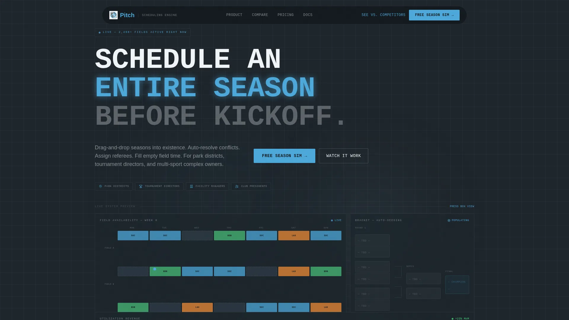
- A dark glass panel header with three animated data views showing live field availability, bracket population, and a revenue utilization curve
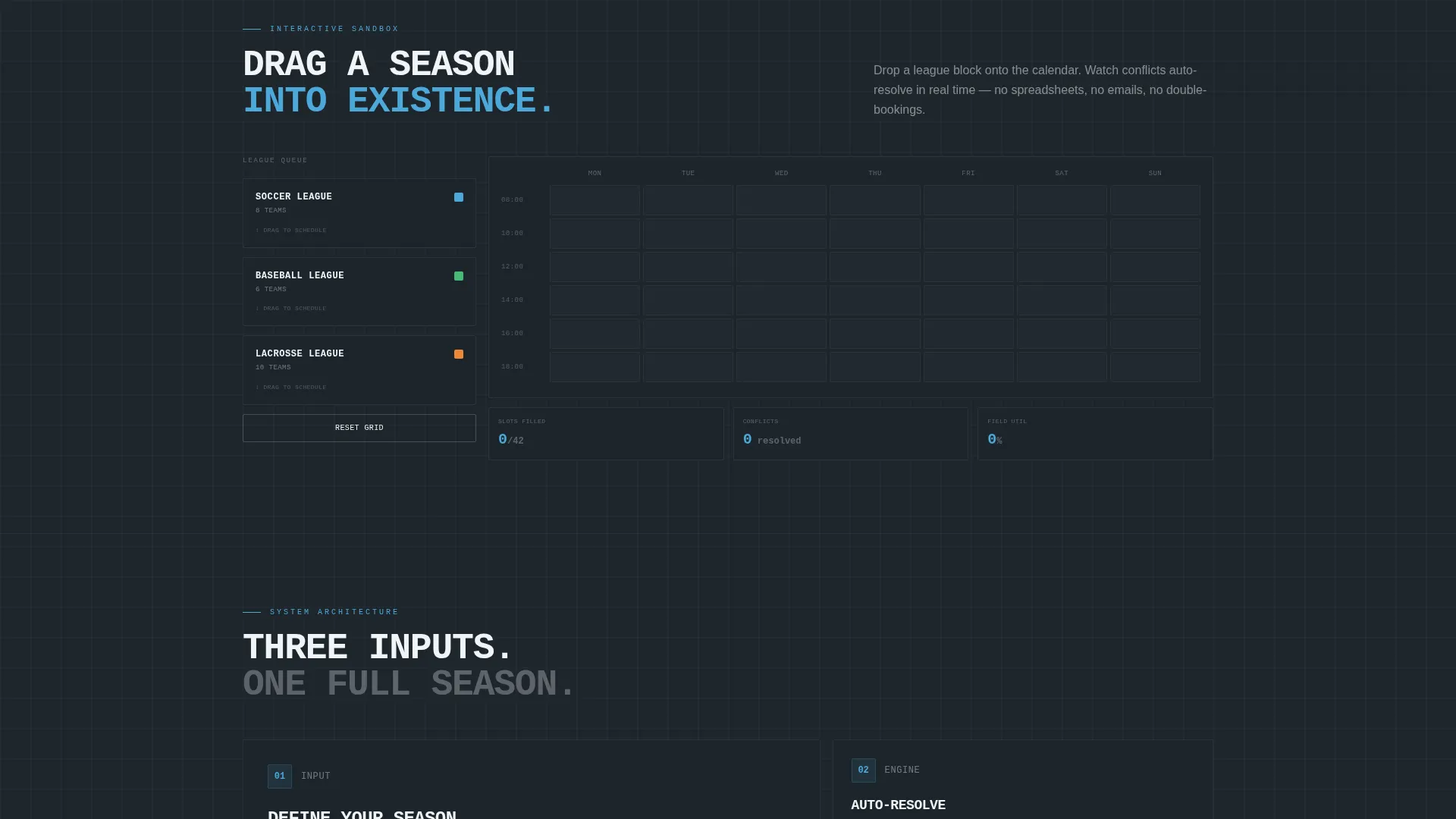
- A live sandbox section where visitors can drag a league block onto a mock calendar and watch conflict resolution in action
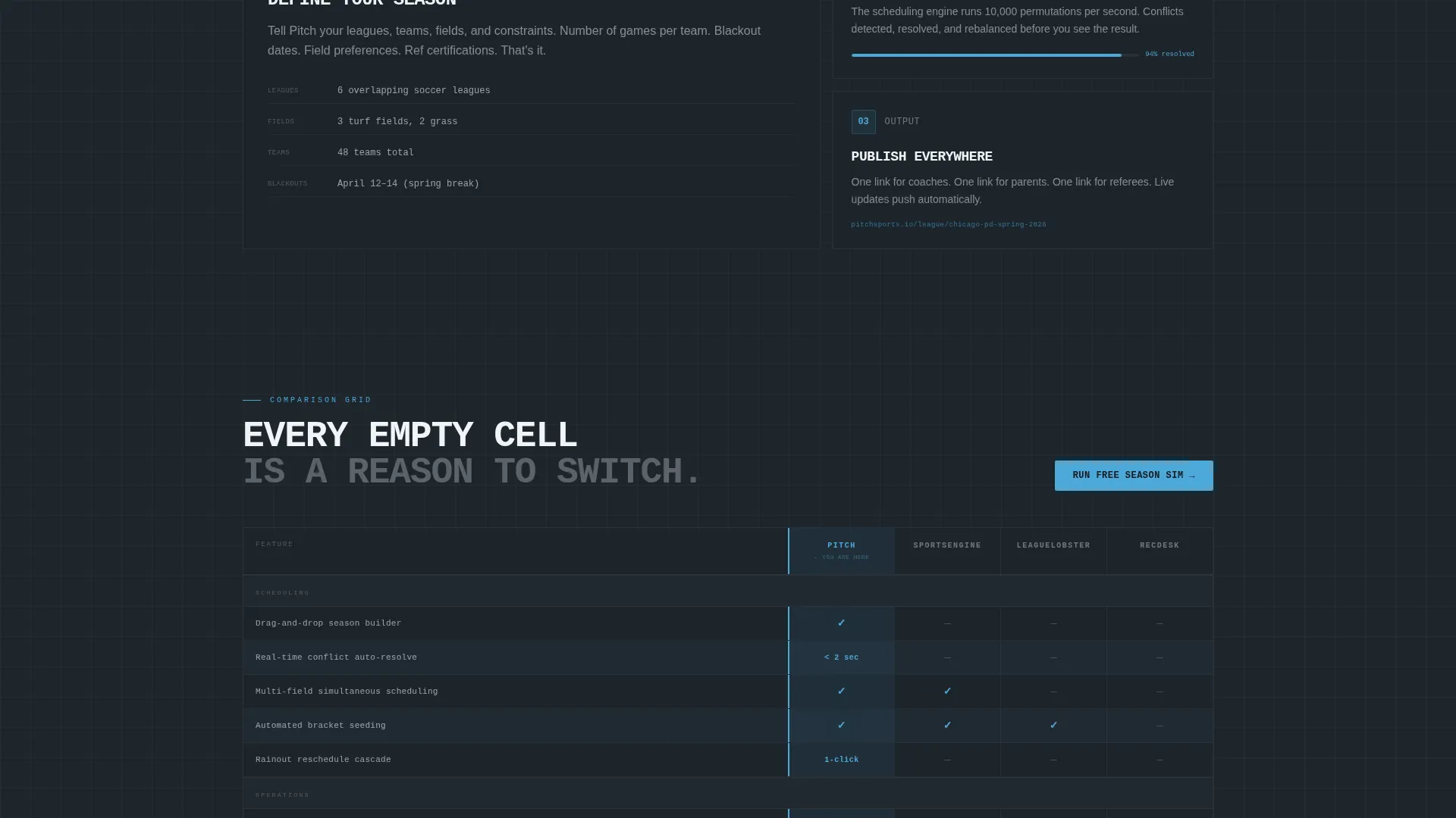
- A brutalist feature comparison table pitting three competitor columns against a highlighted fourth column, row by row
Feature list
This template ships with purpose-built sections and design components rooted in the sports scheduling use case.
Dark Glass Panel Header
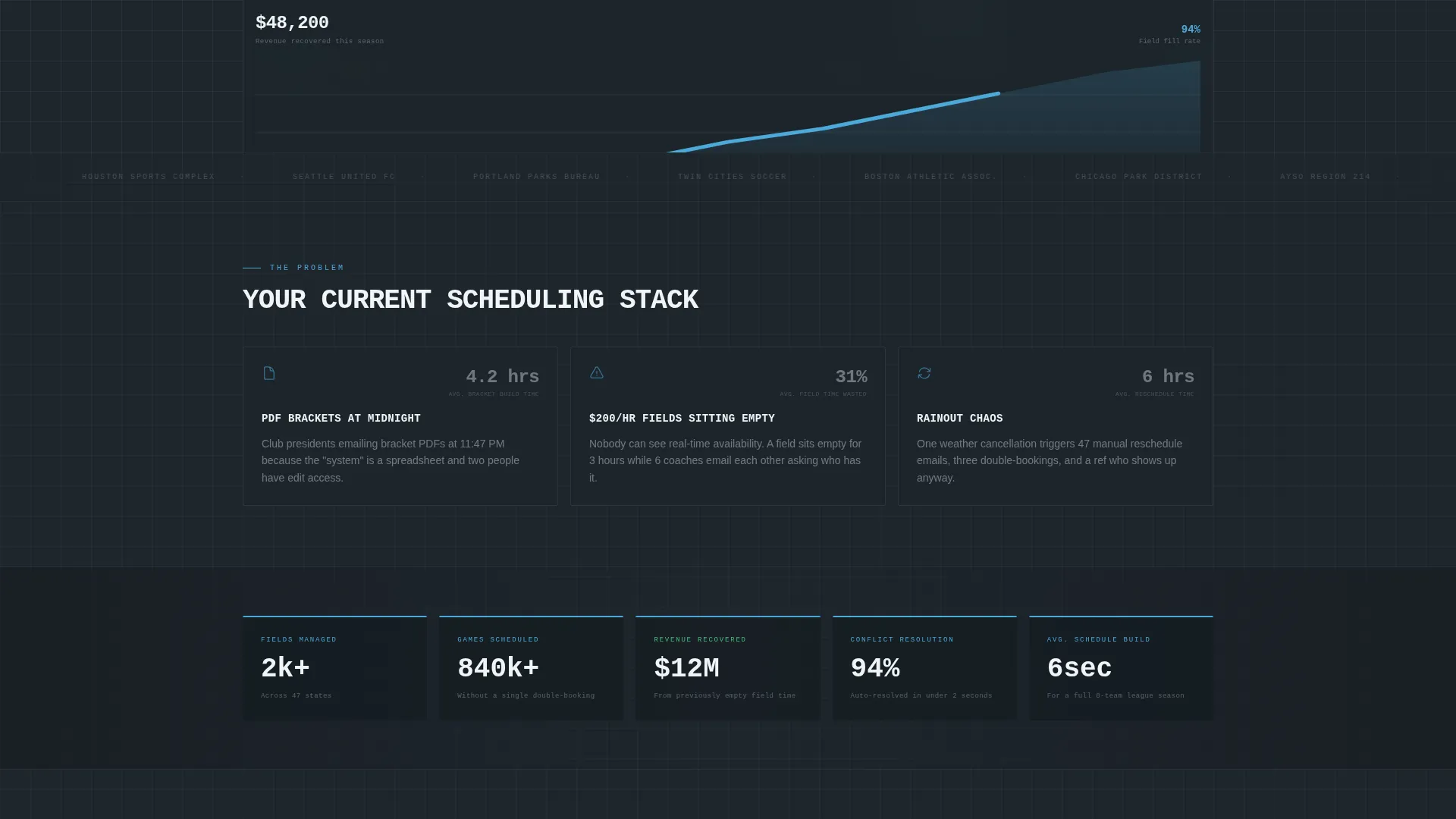
Three frosted, translucent cards float over a near-black background. Each panel shows a different real-time data view: a weekly field-availability grid, an auto-populating bracket mid-animation, and a revenue dashboard with a climbing utilization curve. A single sky-blue cursor dot moves between panels to simulate an active facility manager at work.
Interactive Sandbox Grid
Below the header, a live mock calendar invites visitors to drag a "Soccer League, 8 Teams" block into an open slot. The grid responds with visual conflict resolution, showing how the scheduling engine handles overlapping bookings. This turns passive browsing into hands-on product discovery.
Brutalist Comparison Table
Four columns sit side by side: three competitor platforms and one highlighted column for the featured product. Each row covers a specific capability such as automated rescheduling, payment processing, referee assignment, and public-facing booking links. Empty competitor cells are left visually stark to make gaps impossible to ignore.
Pinned Primary Call to Action
The "Run Your Free Season Sim" call to action appears twice: once in the top-right navigation and once pinned directly after the comparison grid. This placement catches visitors both before they engage and at the moment they finish comparing.
Migration Calculator Path
A secondary conversion path offers a "See How We Replace Competitor" link leading to a migration calculator. The calculator asks three questions: current platform, number of facilities, and weekly bookings. This path serves buyers who are already using another tool and need a clear switching case.
Minimal Two-Field Sign-Up Form
The sign-up form keeps friction low with just two fields: work email and number of fields managed. This reflects the template's overall conversion philosophy of reducing barriers at the moment of intent.
Page sections overview
| Section | Purpose |
|---|---|
| Dark Glass Header | Show live data views and establish product credibility immediately |
| Interactive Sandbox | Let visitors drag and explore the scheduling engine in a mock environment |
| Feature Comparison Table | Compare capabilities row by row against competitor platforms |
| Primary call to action Block | Prompt visitors to start a free season simulation after the comparison |
| Migration Calculator Link | Offer a secondary path for visitors switching from another platform |
| Two-Field Sign-Up Form | Convert intent into a lead with minimal friction |
Design & branding system
The visual identity follows a Bold Brutalist theme built on the Slate and Sky color system. Every design decision reinforces a sense of precision, authority, and live data.
- Core palette: deep gunmetal (#1E252B) for backgrounds, poured-concrete mid-gray (#3D4F5F) for cards, open-sky blue (#4DA8DA) for all interactive and live-data elements, and chalk-line white (#F0F4F7) for text and grid borders
- Typography uses brutalist mono-spaced labels throughout, giving the interface a scoreboard-and-press-box feel rather than a typical marketing page
- Sky blue appears exclusively where something is clickable, live, or in motion, so every accent guides the eye toward an action
Mobile & speed optimization
The template is structured for clarity across screen sizes. The dashboard-style layout scales down without losing its data-dense character.
- Grid panels and comparison table columns are designed to reflow cleanly on smaller viewports
- The two-field form stays prominent and accessible at any screen width, keeping conversion paths intact on mobile devices
How this template helps you convert
Every section of this template is sequenced to move a skeptical buyer from interest to action through evidence rather than persuasion.
- The interactive sandbox section lets visitors experience the core product mechanic before they read a single feature claim, building trust through direct engagement
- The comparison table places the strongest argument for switching directly in the path of the most comparison-ready buyers, with empty competitor cells doing the persuasion work silently
- The pinned call to action and low-friction two-field form remove every remaining barrier at the exact moment a visitor is most likely to convert
Other information about this template
This template is categorized under Technology, specifically Sports Software and SaaS, with a niche focus on sports booking software. It is designed as a single landing page, not a multi-page site.
- The template style is Dashboard and Data Grid, making it well suited for any scheduling or operations software that benefits from showing live data states
- The creative direction is Interactive Explorer, meaning the scroll experience is designed to escalate from viewing to touching to comparing
- The header concept is Dark Glass Panels, a distinctive visual treatment that positions the product as the hero rather than relying on photography
- The landing page direction is Comparison and Versus, prioritizing side-by-side evidence over brand storytelling
Theme
Bold Brutalist
Creative direction
Interactive Explorer
Color system
Slate & Sky
Style
Dashboard/Data Grid
Direction
Comparison/Versus
Page Sections
Dark Glass Panel Header
Interactive Sandbox Drag Grid
Brutalist Comparison Table
Pinned Season Sim Call to Action
Migration Calculator Path
Minimal Two-field Sign-up Form
Related questions
Who is this landing page template designed for?
Can I adapt the comparison table for my own competitor set?
Does the interactive sandbox require custom development?
What makes this template different from a standard SaaS landing page?
How does the two-field form keep sign-up friction low?



