API Integration | Free Website Template | Rocket
Endpoint is a single-page API reference landing page built for developers who need clarity fast. It maps HubSpot API routes across contacts, deals, workflows, and webhooks into a searchable, interactive comparison table. A terminal-inspired design, tab-switching header, and sticky call-to-action bar make it easy for developers to explore and act without friction.
by Rocket studio
Quick summary
Endpoint is a dark-themed, developer-focused API reference landing page. It surfaces every major HubSpot API route in a searchable, clickable comparison table. The design feels like an open terminal: instant, precise, and built for people who read JSON before they read marketing copy.
Who this template is for
This template is designed for technical builders who need a fast, credible API reference surface. It speaks directly to people who judge a tool by its documentation before anything else.
- Startup founders and CTOs connecting a SaaS product to a CRM at odd hours
- Agency developers shipping client integrations on tight sprint timelines
- Solo builders who want to read a clean endpoint schema instead of raising a support ticket
What problem this template solves
Most API documentation pages are either buried inside a developer portal or formatted for a general audience. Developers waste time scanning irrelevant content to find what they actually need. This template fixes that by making the reference itself the landing page.
- No signup wall blocking the content on entry
- No narrative-heavy copy burying the technical details
- No flat, static layout that forces developers to click away for code samples
What you get with this template
You get a fully structured, single-page API reference landing page with a terminal-inspired visual identity and interactive layout. Every section is designed to reward a developer who scrolls with more specificity, not more noise.
- A Feature Tab Switcher header showing live request and response panels for Contacts, Deals, and Workflows
- An expandable comparison table with side-by-side rows across categories like Search Speed, Auth Flow Clarity, and Webhook Coverage
- A sticky bottom bar with a primary call-to-action and a secondary ghost-button for the architecture view
Feature list
This section covers the core built-in components that make Endpoint work as both a reference tool and a conversion surface.
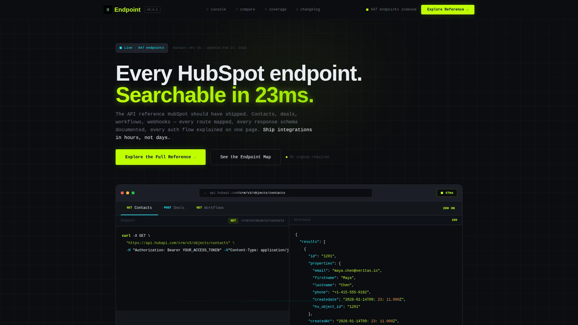
Feature Tab Switcher Header
The header renders a browser chrome frame containing three tabs: Contacts, Deals, and Workflows. Clicking any tab swaps the panel below to show a sample request on the left and a live JSON response on the right. A pulsing latency badge in acid lime reads "47ms," reinforcing the speed narrative before the visitor reads a word of copy.
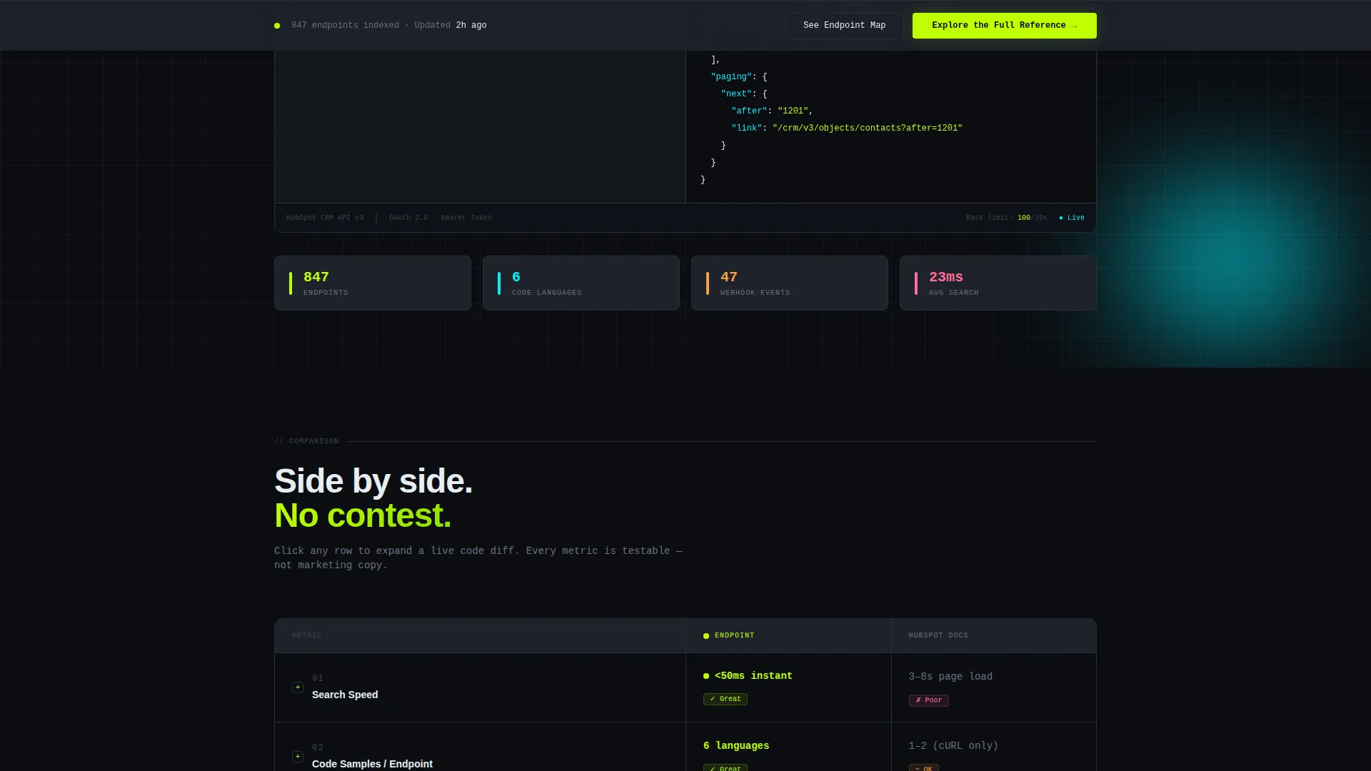
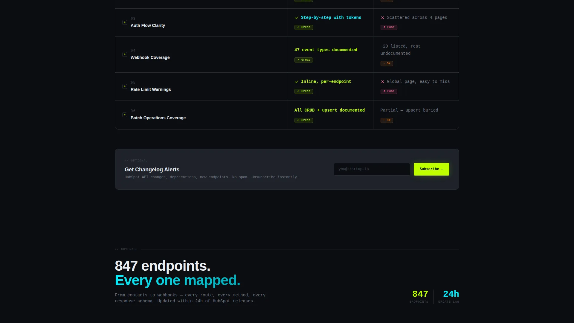
Expandable Comparison Table
The main body is a structured comparison table that pits a native documentation experience against this reference across rows including Search Speed, Code Samples per Endpoint, Auth Flow Clarity, Webhook Coverage, and Rate Limit Warnings. Each cell expands on click to reveal a live code example, so visitors can diff the experience in real time rather than taking claims at face value.
Sticky Conversion Bar
After a visitor interacts with any table row, a sticky bottom bar appears. It pins the primary call-to-action, "Explore the Full Reference," in acid lime and pairs it with a ghost-button labeled "See the Endpoint Map" for visitors who want the architecture overview first.
Inline Email Capture Field
After the third table section, an optional inline field labeled "Get Changelog Alerts" appears. There is no signup gate on entry. The email prompt appears only after the template has already demonstrated depth and speed, so the ask feels earned rather than forced.
Drill-Down Scroll Architecture
The scroll is structured as a drill-down, not a story. Each section deepens the comparison: overview metrics at the top, side-by-side code snippets further down. Developers who keep scrolling get more granular data, which rewards curiosity and extends time on page naturally.
Terminal-Inspired Visual System
The design uses void black as the base canvas, graphite card surfaces to separate content blocks, electric lime for active states and calls to action, and phosphor cyan to mark live data and success responses. The result looks like a syntax-highlighted terminal running in a dark room, which earns developer trust before any copy does.
Page sections overview
| Section | Purpose |
|---|---|
| Tab Switcher Header | Shows live API request and response panels per route category |
| Comparison Table Top | Pits reference quality across high-level metrics with expandable rows |
| Code Snippet Layer | Delivers side-by-side diffs as scroll depth increases |
| Inline Changelog Field | Captures optional email after value has been demonstrated |
| Sticky call to action Bar | Pins primary and secondary actions after first table interaction |
Design & branding system
The visual identity follows a Startup Velocity theme using the Acid Digital color system. Every color choice has a functional role, so the palette communicates meaning without relying on text labels alone.
- Void black (#0B0D11) as the base canvas so content appears to float forward
- Electric lime (#BFFF00) for calls to action and active user interface states, phosphor cyan (#00F0FF) for live data indicators and success responses
- Muted graphite (#1E222A) for card and section surfaces, functioning like code folds that visually separate content blocks
Mobile & speed optimization
The layout is designed to remain usable and legible on smaller screens without losing the terminal aesthetic. Interactive components are touch-friendly so the exploration experience carries across devices.
- Tab switching and table row expansion are designed for both mouse and touch input
- The sticky call to action bar is sized and positioned to stay accessible on mobile viewports
- Graphite card surfaces and high-contrast color pairings keep content scannable at any screen size
How this template helps you convert
This template converts by proving its value before it asks for anything. The sequence is deliberate: engage first, then present the action.
- The interactive header drops developers directly into a realistic API console view, establishing credibility within the first scroll position before any call to action appears.
- The expandable comparison table lets visitors validate the depth of the reference themselves, which builds trust more effectively than a feature list ever could.
- The sticky call to action bar and inline email field appear only after interaction, so every ask is timed to a moment of demonstrated interest rather than a cold entry point.
Other information about this template
This template is built specifically for the HubSpot API reference use case and fits naturally within a HubSpot documentation or developer portal context.
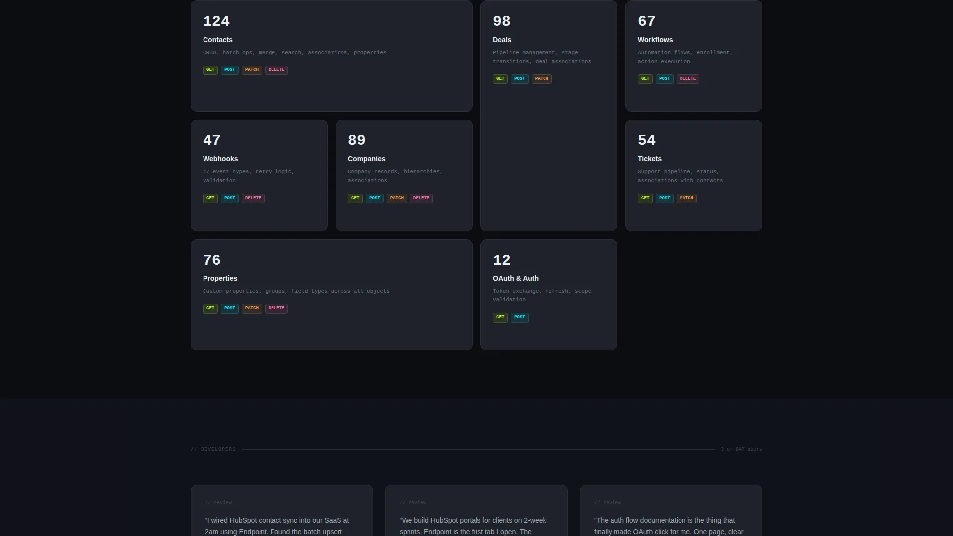
- The template covers HubSpot API routes across contacts, deals, workflows, and webhooks as core documented entities
- It is suited for teams building on or presenting HubSpot integrations as part of a SaaS product or agency service offering
- The comparison table structure makes it adaptable for any API reference scenario where side-by-side clarity improves developer decision-making
Theme
Startup Velocity
Creative direction
Interactive Explorer
Color system
Acid Digital
Style
Comparison Table
Direction
Comparison/Versus
Page Sections
Feature Tab Switcher Header
Expandable Comparison Table
Drill-down Scroll Architecture
Sticky Conversion Bar
Inline Email Capture Field
Terminal-inspired Visual Identity
Related questions
Do visitors need to sign up to access the reference content?
Can the tab labels and API route content be customized?
When does the sticky call-to-action bar appear?
Is this template only useful for HubSpot API documentation?
What makes this template feel different from a standard documentation page?


