API Documentation Professional Website Template
Endpoint is a split-screen API reference and explorer landing page built for developers who need to read docs and run calls on the same screen. It pairs a structured request panel with a live JSON response view, presents real latency data, and keeps the primary call to action just one click away from a sandbox console.
by Rocket studio
Quick summary
Endpoint is a single-page API reference and explorer template designed for developer audiences. It uses a 50/50 split-screen layout to show request and response side by side. Real status codes, latency tables, and rate limit cards build quiet confidence. The primary call to action drops engineers directly into an interactive console, no sign-up required.
Who this template is for
This template is built for teams who need to communicate that their API is production-ready without lengthy sales pitches. It speaks the language of people who read status codes before marketing copy.
- Backend engineers integrating microservices who need to verify endpoints quickly
- Front-end developers testing pagination logic against a staging environment
- DevOps leads evaluating whether a new API can replace an unreliable internal one
What problem this template solves
Most API landing pages force a choice: read the documentation or try the tool. Developers lose context switching between tabs, and trust erodes when they cannot see a real response before committing.
- Developers cannot verify API behavior without leaving the documentation page
- Rate limits, versioning history, and auth flows are buried or missing entirely
- There is no clear path from "reading about it" to "actually running a call"
What you get with this template
You get a complete single-page layout that puts documentation and live interaction in the same viewport. Every section is designed to reduce friction and add evidence.
- A 50/50 split-screen layout with a structured request panel on the left and a live JSON response view on the right
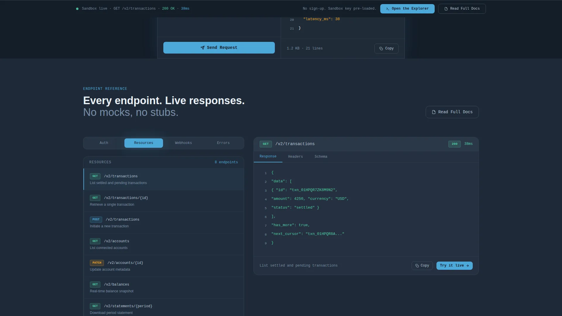
- Endpoint category navigation covering Auth, Resources, Webhooks, and Errors
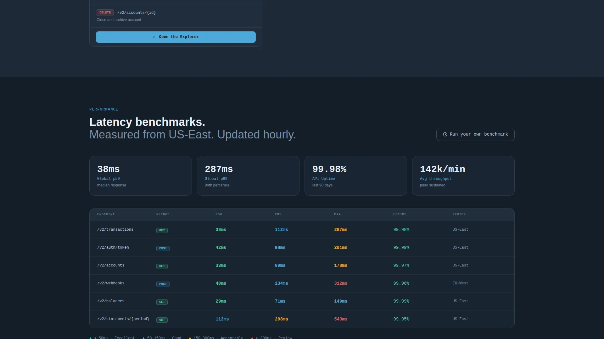
- Latency benchmark tables, a versioning timeline spanning eighteen months, and rate limit policy cards
- A persistent bottom call-to-action bar that appears after the first scroll, linking directly to a sandbox console with a pre-loaded key
Feature list
This template delivers several purpose-built components that work together to earn developer trust before asking for any action.
Split-Screen Request and Response View
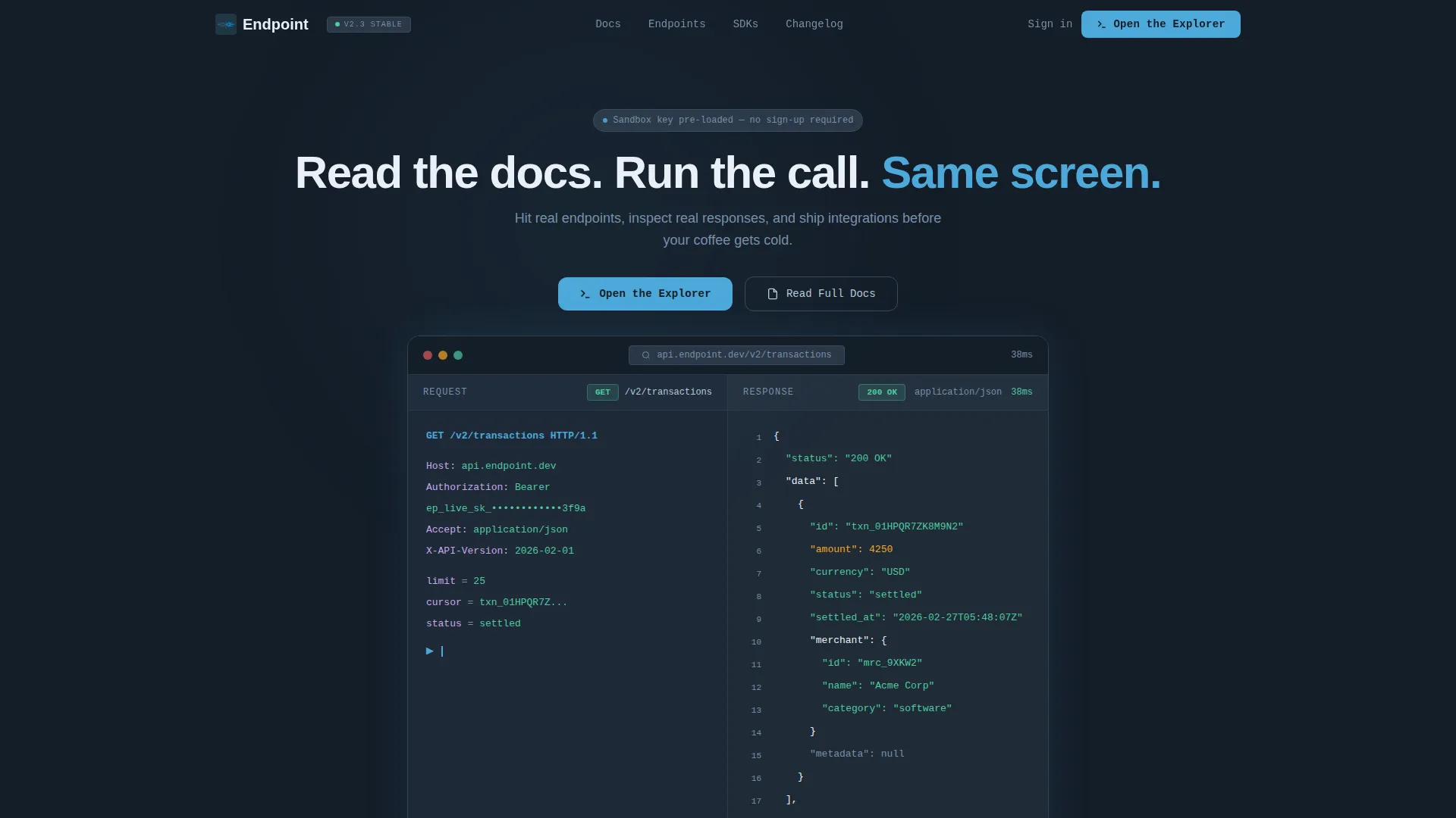
The left panel displays a structured request, including a GET /v2/transactions call with neatly collapsed headers and a partially masked auth token. The right panel shows the corresponding JSON response with syntax highlighting and a 200 OK status badge. Both panels share the same viewport so context never breaks.
Live Response Panel with Status Codes
Real JSON responses are displayed as the visitor scrolls through endpoint categories. Each response includes a visible HTTP status code rendered in sky blue, giving engineers the kind of proof they need before deciding to integrate.
Latency Benchmark Tables
Clean data tables present latency numbers in a format engineers trust immediately. The tables follow the Industry Report cadence of the page, presenting evidence without embellishment.
Versioning Timeline
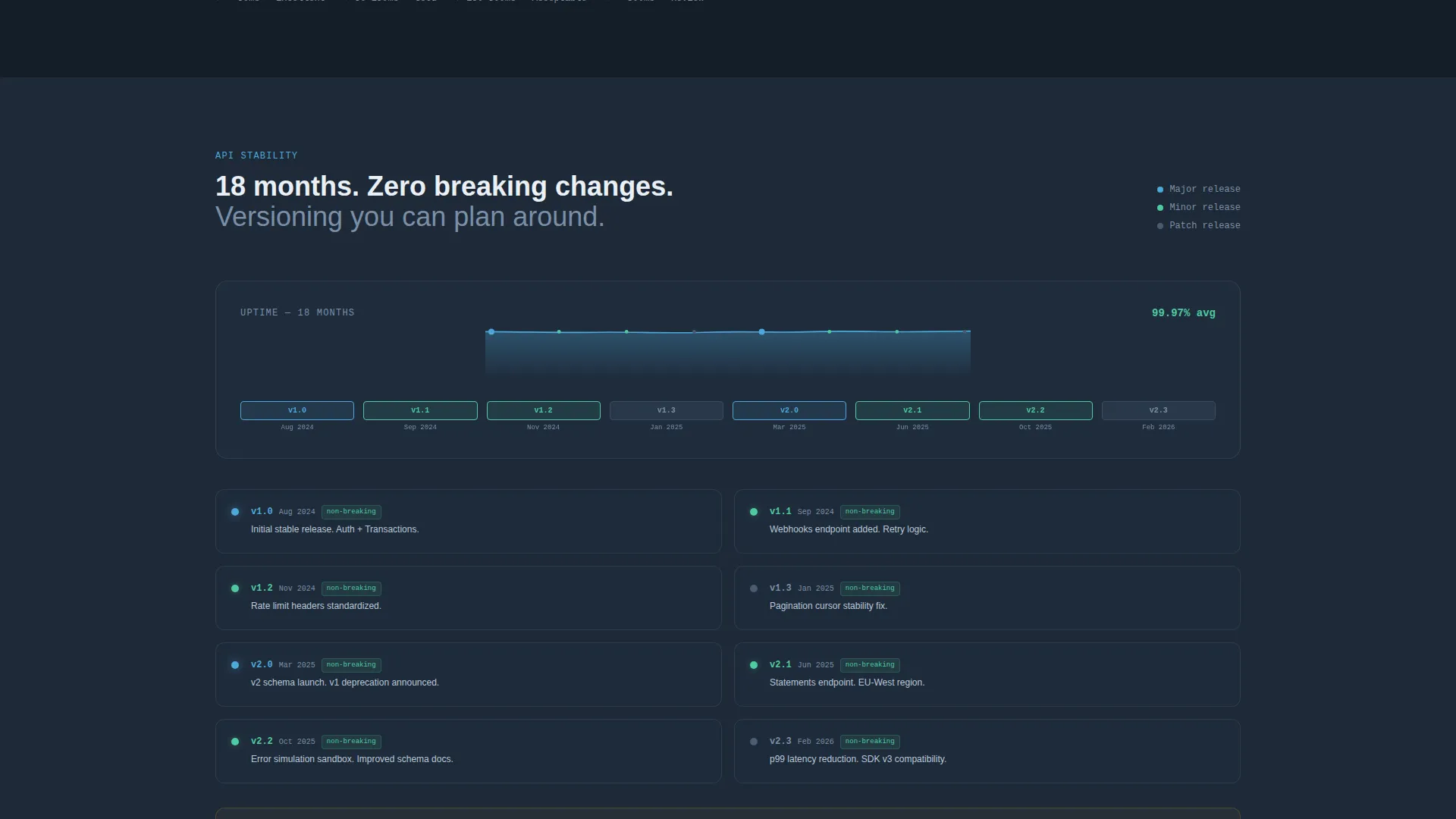
A timeline component shows API stability across eighteen months of version history. This single element addresses one of the most common concerns engineers raise when evaluating a new API.
Rate Limit Policy Cards
Rate limit policies are rendered as scannable cards rather than buried in paragraphs. Each card is easy to read at a glance, reducing the time it takes an engineer to assess whether the API fits their use case.
Persistent Explorer Call to Action
The primary call to action, "Open the Explorer," appears in the header and again as a fixed bottom bar after the first scroll. A secondary call to action, "Read Full Docs," anchors beside each endpoint section. Neither requires a form or a sign-up gate.
Page sections overview
| Section | Purpose |
|---|---|
| Header with screenshot | Establishes split-screen layout and primary call to action |
| Endpoint category nav | Organizes Auth, Resources, Webhooks, and Errors |
| Live response panel | Swaps real JSON examples as the visitor scrolls |
| Latency benchmark tables | Presents real performance data in a scannable format |
| Versioning timeline | Shows eighteen months of API version stability |
| Rate limit cards | Communicates usage policies in a skimmable card format |
| Persistent bottom bar | Keeps "Open the Explorer" accessible after the first scroll |
Design & branding system
The visual identity follows a Data Command theme using a Slate and Sky color system. The palette is built for long reading sessions in low-light environments without sacrificing legibility or visual hierarchy.
- Deep charcoal slate (#1E2A38) for primary backgrounds, mid-tone gunmetal (#3B4B5E) for code block surfaces, crisp sky blue (#4DA8DA) for interactive highlights, and pale cloud white (#EAF0F7) for documentation text areas
- The header product screenshot sits against the deep slate background with a subtle drop shadow, giving the impression of a monitor floating in a dark room
- Interactive elements such as selected tabs and status badges use sky blue as a focal accent, guiding the eye without creating visual noise
Mobile & speed optimization
The template is structured with a clean, lightweight layout that avoids heavy decorative assets. Responsiveness is built into the split-screen structure so the layout adapts across viewport sizes.
- The 50/50 split-screen reflows cleanly for narrower viewports, keeping the request and response panels readable on smaller screens
- Code blocks and data tables use contained surface colors that render crisply without relying on image-heavy assets
How this template helps you convert
The page is engineered around a Click-Through direction, where every design and content decision reduces the distance between "reading about it" and "running the first call."
- Real responses and real status codes are visible before any call to action appears, so trust is established through evidence rather than promise
- The "Open the Explorer" call to action requires no form or sign-up and pre-loads a sandbox key, removing every possible point of hesitation between interest and action
- The persistent bottom bar keeps the primary call to action in view throughout the entire scroll, so an engineer who finishes reading the rate limit cards never has to scroll back up to take the next step
Other information about this template
This template fits naturally into documentation portals, developer relations sites, and API product pages where technical credibility is the first purchase decision. It is categorized under API Documentation and API Reference and Explorer use cases.
- The template style is Split Screen (50/50), making it well suited for any API that benefits from showing input and output simultaneously
- The Industry Report creative direction means the page earns trust through structured evidence rather than marketing language, which resonates with engineering audiences
- The header concept is a Product Screenshot, meaning the first thing a visitor sees is the tool in action rather than an abstract illustration
- The page type is a landing page, with a single linear scroll designed to move a developer from first impression to first interaction
Theme
Data Command
Creative direction
Industry Report
Color system
Slate & Sky
Style
Split Screen (50/50)
Direction
Click-Through
Page Sections
Split-screen Request and Response Layout
Live JSON Response Panel
Latency Benchmark Data Tables
Eighteen-month Versioning Timeline
Rate Limit Policy Cards
Persistent Explorer Call to Action Bar
Related questions
Does this template require a sign-up to try the API explorer?
Can I customize the endpoint categories shown in the navigation?
What does the versioning timeline component show?
Is this template suitable for both internal and external APIs?
What is the color scheme used in this template?



