Restaurant Software Professional Website Template
The Openings landing page template is built for restaurant development teams managing multiple concurrent buildouts. It uses a split-screen layout, a dark carbon fiber color system, and scroll-linked data storytelling to move development directors from problem recognition to free trial signup. No spreadsheet workaround required, this template speaks the language of permits, punch lists, and opening-day pressure.
by Rocket studio
Quick summary
Openings is a purpose-built landing page template for a restaurant project management platform. It targets multi-unit operators, development directors, and hospitality consultants who manage five or more concurrent buildouts. The 50/50 split-screen layout pairs industry problem data on the left with live product proof on the right, building an evidence case that earns the free trial click before asking for anything.
Who this template is for
This landing page is designed for a specific, high-stakes audience inside the real estate industry and restaurant development world. It speaks directly to people who already know the chaos, and are ready for a tool that matches their scale.
- Multi-unit restaurant operators running aggressive expansion programs across multiple states
- Restaurant development directors juggling five or more active buildouts simultaneously
- Hospitality consultants managing client portfolios and tired of duct-taping Gantt charts in spreadsheets
What problem this template solves
Managing a single restaurant buildout is complex. Managing six at once, in staggered phases, across different jurisdictions, with overlapping contractor schedules and permit timelines, is a different category of problem. Most general project management tools do not understand that a hood inspection delay in one location can cascade into FF&E delivery conflicts in three others.
This landing page template frames that exact dysfunction, then presents the product as the only property management solution that speaks restaurant development natively. The page builds the case methodically, section by section, so that by the time a visitor reaches the call to action, the status quo feels genuinely reckless.
- Development directors lose weeks to disconnected tools, untracked milestones, and spreadsheet errors that compound across a portfolio
- Multi-regional operators face financial exposure when buildout delays push a launch date back, eroding pre-opening revenue projections
- Consultants lack a single property management landing view that shows every client project, milestone flag, and status at once
What you get with this template
This template delivers a fully structured, dark-themed landing page ready for a restaurant project management platform. Every section is pre-built with real layout logic and scroll-triggered storytelling. The entire process from hero to conversion is mapped and sequenced.
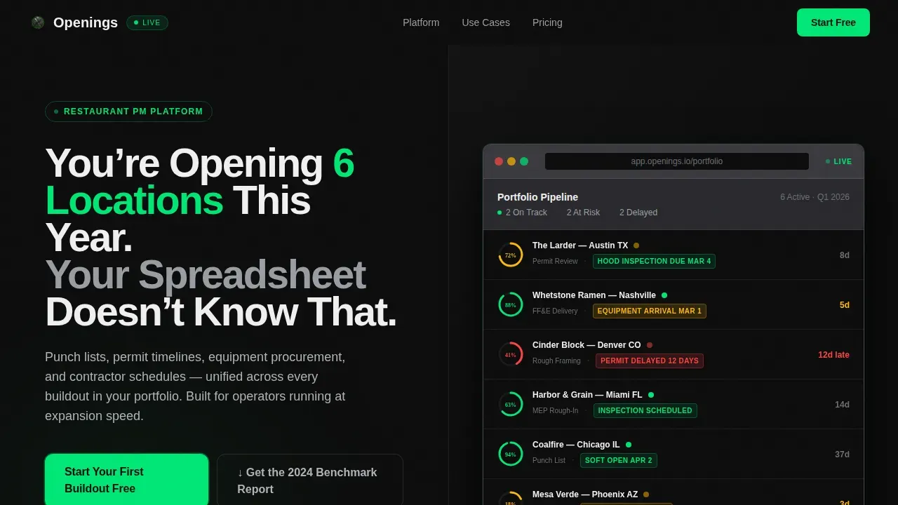
- A 50/50 split-screen layout with a bold condensed headline on the left and a live-looking dashboard screenshot on the right
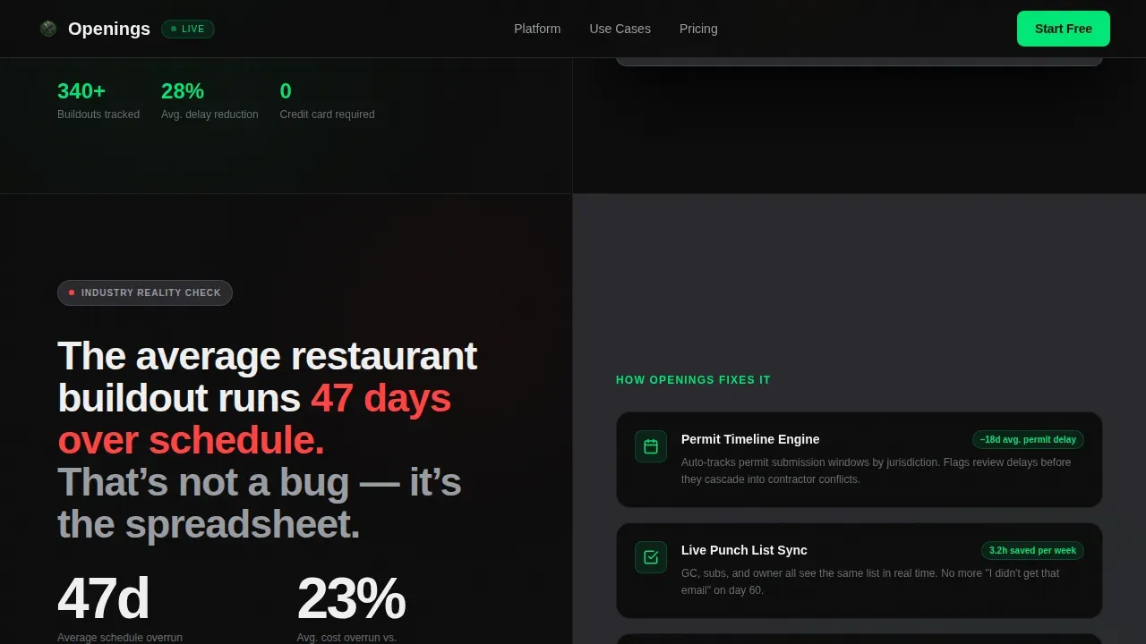
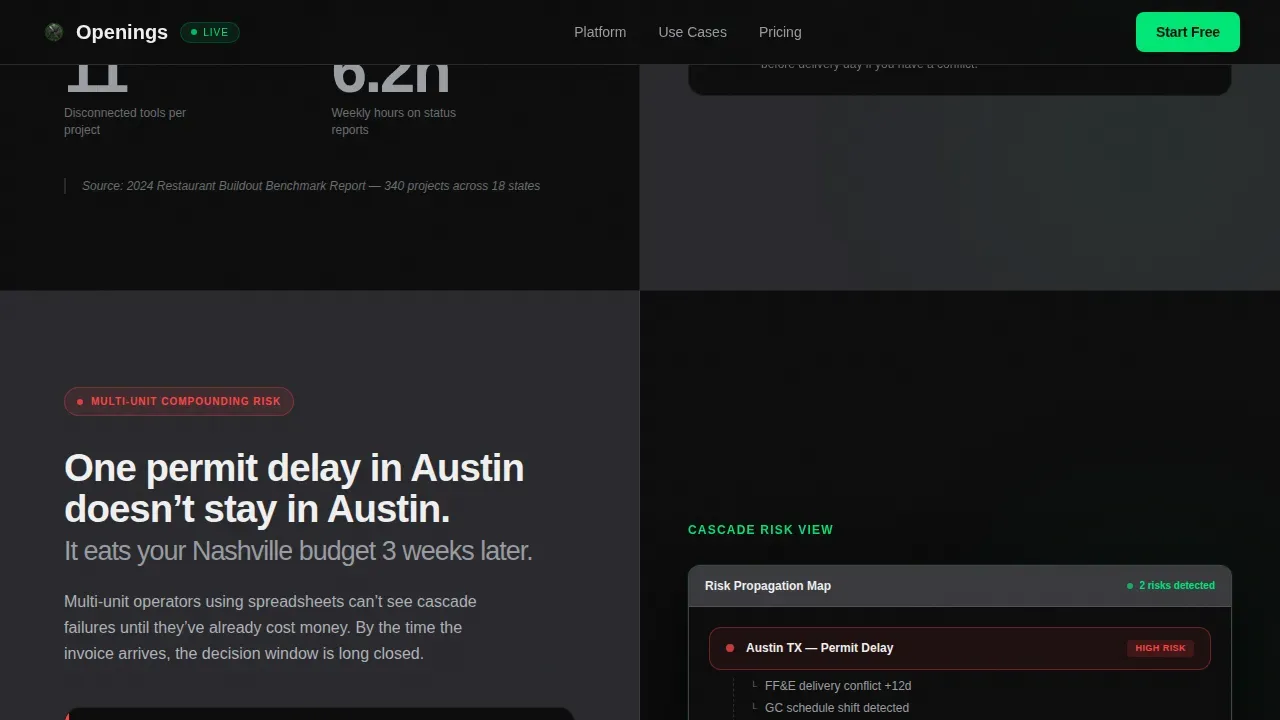
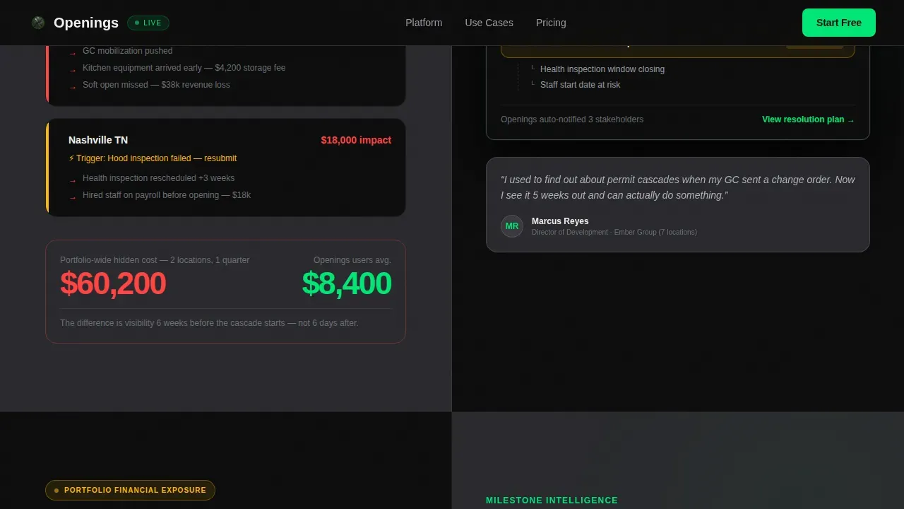
- Four scrolling data sections that escalate from single-location delays to portfolio-level financial exposure, each pairing problem statistics with product proof
- A dual-conversion section with a three-field free trial signup form and a secondary lead capture path offering a gated benchmark report download
Feature list
This landing page template includes six core capabilities built directly from the project brief. Each one serves a specific conversion or communication function.
Split-Screen Hero Section
The header divides the viewport exactly 50/50. The left half carries the main headline, set in a condensed sans-serif at large scale, against a deep black background. The right half displays a dashboard screenshot showing six restaurant projects in staggered phases, each with a progress ring, a next-milestone flag, and a red, yellow, or green status dot. The screenshot is cropped tight, angled slightly, and shadowed for depth. A development director looking at this for the first time will immediately recognize their own workflow, that first impression matters enormously for conversion.
Scroll-Linked Industry Report Sections
As visitors scroll, the page reveals four sequential data sections in an industry report format. The left panel surfaces problem data, average buildout delays, cost overrun percentages, the number of disconnected tools a typical project uses. The right panel simultaneously shows the product solving each problem in real user interface panels. Each section escalates the stakes. The scroll rhythm is problem-data left, product-proof right. This structure keeps the conversion goal clearly in focus without feeling like a sales pitch.
Animated Dashboard Components
The right-panel product views include animated progress rings, pulsing status dots, and live-data-style milestone flags. These elements are built with scroll-linked reveal timing and staggered entrance animations. The visual language, high-voltage accent green for active states, titanium for supporting data, white for labels, makes the dashboard feel operational rather than decorative. Visitors do not just read about the product; they watch it process a real buildout scenario in front of them.
Dual-Conversion Call to Action Section
The primary call to action, "Start Your First Buildout Free," appears after the third data section. By that point, visitors have absorbed enough industry pain to recognize the value. The signup form uses exactly three fields: email address, number of active projects (1, 2 to 5, or 6+), and role (operator, developer, or consultant). No credit card is required. A secondary conversion path sits below, offering a gated benchmark report download, capturing email and company name from visitors not yet ready to commit. This dual-path approach means the page captures leads at two different commitment levels, maximizing the total number of new leads from a single visit.
Social Proof and Benchmark Data Layer
The template includes dedicated space for social proof across multiple sections. Role-specific client testimonials, industry statistics, and benchmark data are woven into the scroll narrative. Written testimonials and video testimonials can be placed within the relevant sections as visitors scroll. Social proof signals such as client logos and industry certifications appear alongside the data panels, helping the page build trust and build credibility with a skeptical, experienced audience.
Linear Single-Row Footer
The footer uses Pattern 1, a linear single-row layout. It is designed to stay out of the way. Contact info, legal links, and minimal brand elements sit in a clean row against the deep graphite background. Nothing competes with the conversion goal above it.
Page sections overview
| Section | Purpose |
|---|---|
| Split-Screen Hero | Headline left, dashboard screenshot right |
| Industry Data Section | Delay and cost overrun problem data versus. product proof |
| Multi-Unit Chaos Section | Compounding failure data versus. pipeline view |
| Portfolio Exposure Section | Financial stakes data versus. milestone tracking view |
| Dual Conversion Section | Free trial signup and benchmark report lead capture |
| Linear Footer | Contact info and legal links in single row |
Design & branding system
The visual identity follows a Startup Velocity theme using a Carbon Fiber color system. The palette is built around deep cockpit black and brushed graphite backgrounds, with titanium and white for readable body text. A high-voltage accent green fires only when something demands action, call to action buttons, progress bars, and live data pulses. The color scheme feels like the instrument panel of a performance vehicle at night: dark, information-dense, and engineered to surface what matters fast.
- Typography uses DM Sans for condensed display headlines and Manrope for body copy, creating a strong hierarchy between data labels and narrative text
- The modern aesthetic stays dark and technical throughout, with no decorative softness, every visual element earns its place by carrying information
- High quality photos and professional photos of dashboard states, milestone panels, and pipeline views are positioned as product proof, not marketing decoration
Mobile & speed optimization
The template is designed desktop-first, reflecting the reality that development directors work on large screens with complex data views. However, the layout is fully responsive for mobile access, which matters because construction teams and consultants often access pages from job sites. A landing page that loads slowly on mobile loses potential clients before they read a single word.
- Static sections use server-side rendering for fast initial load, while animated dashboard components use client-side rendering to keep interactions smooth without blocking the page
- Touch-friendly call to action button sizing and readable font scales are maintained at all breakpoints, so the page remains usable when accessed on a phone at a job site
- The split-screen layout stacks vertically on smaller screens, keeping the headline and dashboard screenshot both visible without requiring horizontal scrolling
How this template helps you convert
This landing page is engineered around a single, disciplined conversion goal: get qualified restaurant development professionals to start a free buildout. Every design and content decision supports that objective.
- The scroll narrative builds an evidence case first. Visitors absorb three escalating data sections before the call to action appears. By the time they reach the signup form, the platform's unique value proposition is already established, making the click feel like a logical next step rather than a leap of faith.
- The dual-path conversion section captures leads at two commitment levels. Visitors ready to act sign up with three fields and no credit card. Visitors who need more time download the benchmark report, entering a separate lead capture flow. Either way, the page does not lose the visit.
- The form keeps friction minimal. Three form fields, email, project count, and role, reduce hesitation and increase submission rates. A simple landing page form with a clear call to action button performs better than a long intake form, especially for a busy development director who values their time.
Other information about this template
This template is fully customizable without any coding experience required. Teams can adapt the color scheme, replace dashboard screenshots with their own product visuals, and adjust copy in all relevant sections using a drag and drop builder interface. No prior development background is needed to launch the page.
The template is well-suited for teams looking to quickly create a new website presence for a platform launch, drive traffic from Google Ads or other paid channels, and convert visitors who land on the page from targeted campaigns. Because it focuses on a single call to action from the first scroll to the final section, it avoids the distraction problem that hurts conversion rates on general-purpose homepages.
From a real estate and property management context, this template shares structural DNA with high-converting landing pages used across the real estate industry. Platforms in the property management company space use similar evidence-led, data-first landing page structures to convert visitors into leads. A property management landing page that leads with pain data and follows with product proof consistently outperforms a generic homepage in head-to-head tests.
This template can support dynamic content swaps, allowing teams managing multi-regional buildouts to adjust landing page messaging based on visitor location or campaign source. It can also serve as an attractive landing page for conference and event traffic, where development directors arrive already primed by a specific pitch.
The page is the right template for SaaS platforms targeting experienced operators who are skeptical of generic tools. It earns the click by demonstrating industry fluency before asking for anything. Visitors who reach the bottom of this page are pre-qualified: they have already agreed, by staying on the page, that their current approach is not working.
- The template supports role-specific testimonial blocks, including written testimonials and video testimonials, in the social proof layer
- Contact info, an office address placeholder, and footer link slots are pre-built in the linear footer row
- The pricing page and blog post link slots can be added to the footer navigation without structural changes
- Property owners and real estate agents in adjacent development verticals can adapt this template for property management landing use cases beyond restaurant buildouts
- The template works well for running alongside a property listings section if a platform expands to include property data views
- Teams can use the benchmark report download as a lead magnet to build and grow an email list of qualified potential clients, including current clients being migrated to a new platform
- Virtual tours of completed buildout projects, before-and-after visuals of multi-unit spaces, and square footage data can be incorporated into the portfolio showcase area for broader real estate industry positioning
- The leasing commissions section placeholder in the footer accommodates commercial real estate platforms that need to surface that data point for property owners and real estate agents reviewing the page
Platforms like Leadpages, Unbounce, Instapage, ClickFunnels, Thrive Architect, GetResponse, Carrot, HubSpot, and Wix each offer real estate landing page templates with their own strengths, from A/B testing and heat mapping to email automation and WordPress integration. This template was built specifically for the restaurant development niche, filling a gap that general-purpose real estate landing page platforms do not address with the same depth or industry fluency.
Theme
Startup Velocity
Creative direction
Industry Report
Color system
Carbon Fiber
Style
Split Screen (50/50)
Direction
Freemium/Trial
Page Sections
Split-screen Hero with Dashboard Screenshot
Scroll-linked Industry Report Narrative
Animated Progress Rings and Status Pulses
Dual-path Conversion Section
Social Proof and Benchmark Data Blocks
Linear Single-row Footer
Related questions
Who is this landing page template built for?
Does this template require coding experience to customize?
How does the dual-conversion section work?
Can this template be adapted for property management landing pages outside restaurant development?
What social proof elements does the template support?



