School (K-12) Comparison Website Template
Gather is a single-page landing page built for homeschool co-ops and family resource groups. It uses a comparison table to show families exactly what changes when they stop going it alone. A warm, welcoming visual style, a clear event registration flow, and a Problem-to-Solution layout make it easy to invite families and fill open house seats.
by Rocket studio
Quick summary
Gather is a warm, conversion-focused landing page template designed for homeschool co-ops. It leads with a bold headline, walks visitors through a side-by-side comparison of solo homeschooling versus co-op life, and ends with a simple event registration form. The result is a page that feels personal, builds trust fast, and turns curious parents into confirmed attendees.
Who this template is for
This template speaks directly to the families running or building a homeschool co-op. It is also a strong fit for resource groups, parent-led learning communities, and microschool coordinators who host regular open houses or info nights.
- Homeschool co-op organizers who want to grow their membership through open house events
- Parent educators looking to present their group as a real, structured alternative to solo homeschooling
- Community learning groups that need a welcoming, professional page without hiring a designer
What problem this template solves
Most homeschool co-op pages either look too informal to earn trust or too corporate to feel warm. Parents arriving at these pages cannot quickly tell what the co-op actually offers, how it differs from going it alone, or what the next step is. Gather solves all three problems in a single scroll.
- Families do not know how to compare co-op membership against the DIY approach they are already using
- Organizers lose interested leads because the registration path is unclear or buried
- The page needs to feel like a genuine community, not a sales pitch or a school brochure
What you get with this template
You get a fully structured, single-page layout that moves a first-time visitor from curiosity to registration. Every section is purposeful and sequenced to build confidence before asking for a commitment.
- A bold centered headline section with subtext for your open house date, time, and location
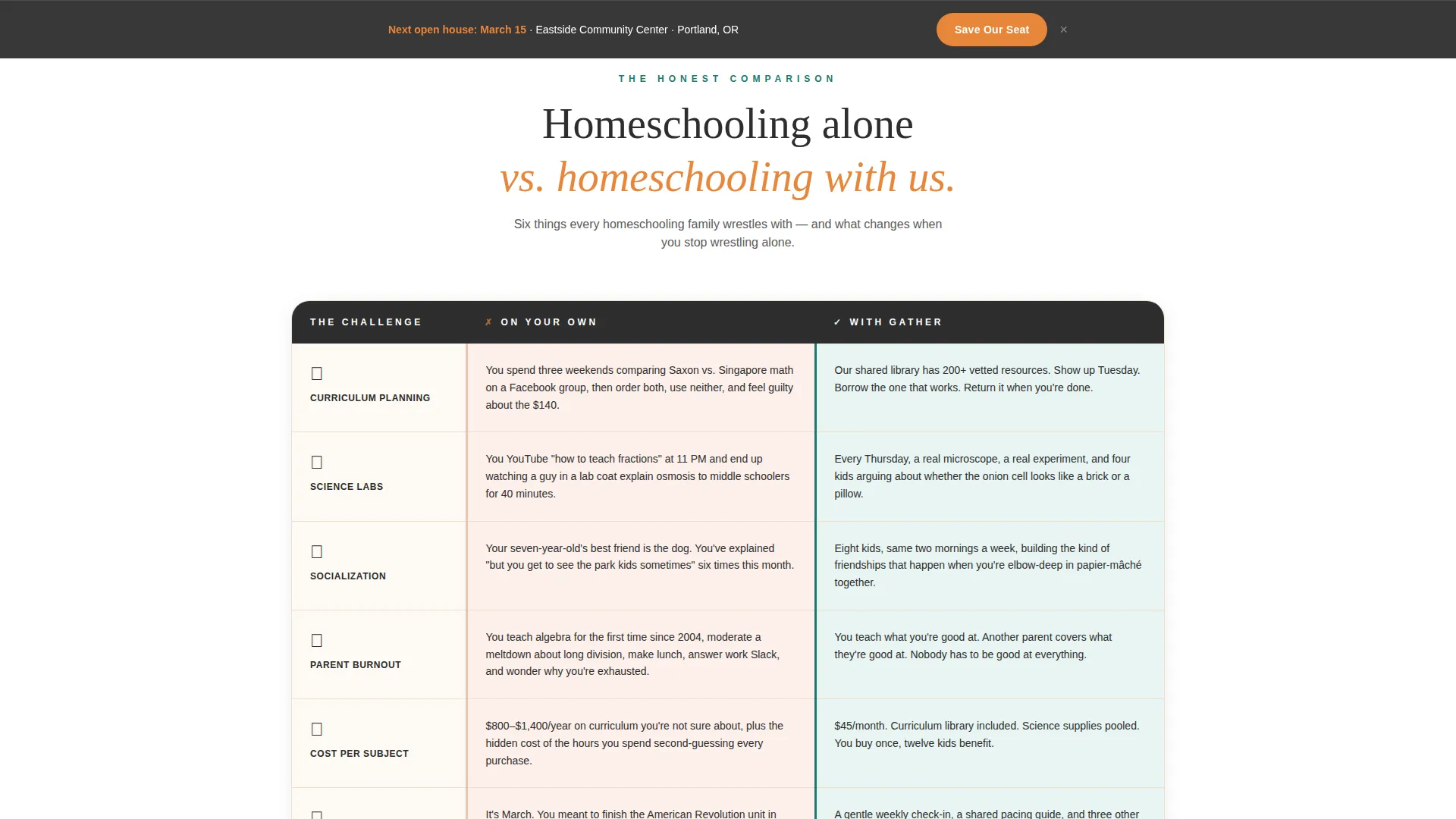
- A six-row comparison table contrasting solo homeschooling with co-op membership across curriculum, labs, socialization, parent burnout, cost, and accountability
- An event registration form collecting parent name, children count and ages, and preferred open house date, plus a secondary download link for earlier-stage leads
Feature list
This section walks through the core built-in capabilities that make Gather work as a high-converting co-op landing page.
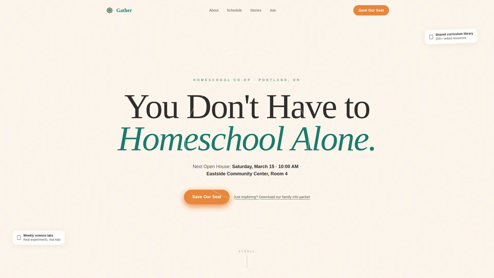
Giant Headline Header Section
The page opens with a single oversized serif headline centered on a chalk-dust cream background. A one-line subtext field sits beneath it for your open house date, time, and location. No competing imagery. The whitespace does the work.
Side-by-Side Comparison Table
The table spans six rows covering curriculum planning, science labs, socialization, parent burnout, cost per subject, and accountability. Each "alone" cell holds a specific, relatable pain point. Each "co-op" cell answers it with a concrete offering. This is the persuasion engine of the page.
Dual Call-to-Action Registration Flow
The primary "Save Our Seat" button appears first directly beneath the header. It then reappears locked to the bottom of the viewport after the comparison table. This keeps registration always within reach without interrupting the read.
Event Registration Form
The form is short and intentional. It collects parent first name, number of children with age-group dropdowns, and a choice between two open house dates. A secondary text link below offers a downloadable family info packet for parents who are still exploring.
Social Proof Sections
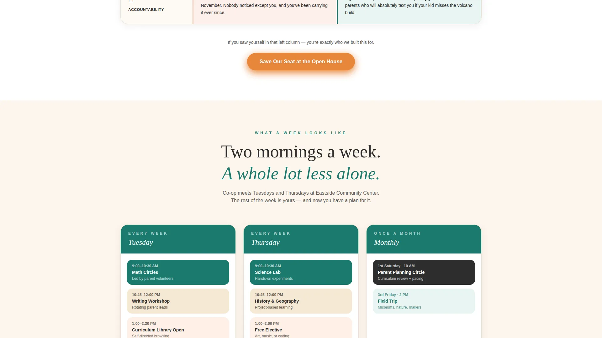
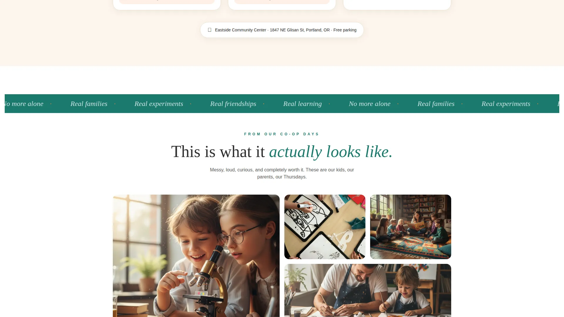
Below the comparison table, the page builds credibility through a weekly schedule section, parent testimonials, and a photo grid of real co-op days. The photo grid is designed to show candid, in-progress moments rather than polished stock imagery.
Problem-to-Solution Page Arc
The entire page follows a deliberate narrative arc. It opens in the familiar loneliness of solo homeschooling, moves through the comparison, and lands the reader inside the co-op community. Each section builds on the last so visitors arrive at the form already convinced.
Page sections overview
| Section | Purpose |
|---|---|
| Headline Header | Anchor attention with open house details |
| Comparison Table | Show solo versus. co-op side by side |
| Weekly Schedule | Demonstrate real structure and rhythm |
| Parent Testimonials | Build trust through peer voices |
| Co-op Photo Grid | Prove community exists and is active |
| Primary call to action Button | Drive open house seat registration |
| Sticky Bottom call to action | Keep registration reachable at all times |
| Event Registration Form | Collect name, children info, date preference |
| Info Packet Link | Capture leads who are not yet ready to register |
Design & branding system
The Teal Catalyst color system gives Gather the feel of a well-loved children's book. Every color choice is deliberate: warm enough to feel human, structured enough to feel credible.
- Deep schoolhouse teal (#1A7A6D) anchors headers and section backgrounds, charcoal (#2D2D2D) carries body text, and chalk-dust cream (#FDF6EC) gives the page room to breathe
- Warm clementine (#E8863A) is reserved for every clickable moment, including both the primary call to action button and highlights, so the action step always stands out
- The Family First theme uses warm serif typography for headlines alongside clean body text, creating contrast that feels welcoming rather than institutional
Mobile & speed optimization
The layout is built to hold up on any screen size a busy parent is likely to use. Whether someone opens the page between school sessions on a phone or reviews it on a laptop at the kitchen table, the experience stays clear and usable.
- The sticky bottom call to action and the registration form are structured to remain accessible and easy to interact with on small screens
- The comparison table is designed to reflow cleanly so the side-by-side contrast stays readable without horizontal scrolling on mobile devices
How this template helps you convert
Gather is not just a pretty page. Every design and copy decision is sequenced to move a skeptical, tired parent from "just looking" to "yes, save our seat."
- The comparison table does the persuasion before the form appears. By the time a parent reaches the registration button, they have already seen themselves in the "alone" column and identified a reason to change.
- The dual call to action placement (below the header and locked to the viewport bottom) means registration is always one tap away without ever feeling pushy or interrupting the content flow.
- The secondary info packet link creates a second capture path for families who are interested but not yet ready to commit to an event date, keeping them in reach for a future follow-up.
Other information about this template
Gather is part of the Education and Training template category, sitting specifically within the School (K-12) subcategory and the Homeschool Co-op and Resource niche. It carries a high intersection match score, meaning the template style, theme, and conversion direction are all tightly aligned to this specific use case.
- Template style is Comparison Table, which is well suited to audiences who need to justify a decision to themselves or a co-parent before signing up
- The landing page direction is Event Registration, making it practical for any recurring open house, info night, or enrollment window
- The creative direction follows a Problem-to-Solution Arc, a structure that works especially well for community-based offers where emotional resonance matters as much as logistics
Theme
Family First
Creative direction
Problem→Solution Arc
Color system
Teal Catalyst
Style
Comparison Table
Direction
Event Registration
Page Sections
Giant Headline Header with Open House Details
Six-row Comparison Table
Dual Placement Call to Action Button
Short Event Registration Form
Social Proof Content Blocks
Related questions
Can I use this template for a single open house event or an ongoing enrollment period?
Is the comparison table editable to match our co-op's specific offerings?
What is the secondary info packet link for?
Can a small co-op with just a few families use this template effectively?
Does the sticky call to action button stay visible as visitors scroll through the whole page?



