Industrial Vertical SaaS Cost Estimator Website Template
The Gauge Industrial Analytics Comparison Landing Page Template is built for industrial SaaS platforms that need to prove their edge before asking for a sign-up. It opens with a live ROI estimator, moves into a 28-row competitor comparison table, and closes with a benchmark call to action. Every section speaks the language of reliability engineers, not marketers.
by Rocket studio
Quick summary
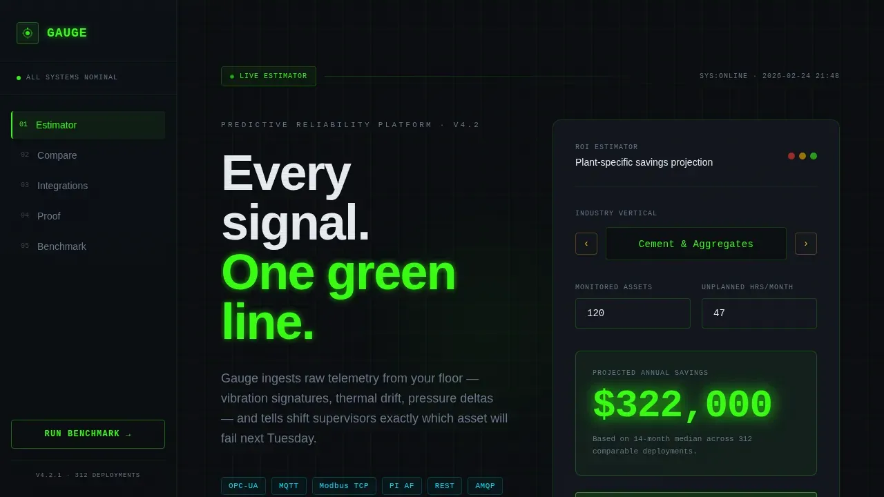
This is a single-page comparison landing page template purpose-built for industrial analytics platforms. The hero section is a live ROI calculator. Below it sits a 28-row expandable competitor comparison table, an integration directory, a social proof rail, and a gated benchmark form. The visual identity is a dark oscilloscope aesthetic using phosphorescent neon on void black.
Who this template is for
This template is built for industrial B2B SaaS teams who sell predictive maintenance, asset reliability, or manufacturing analytics software. The target audience is technical and comparison-driven. They need proof before they convert, and this landing page delivers that proof systematically, section by section.
The primary visitors this comparison landing page is designed for include:
- Reliability engineers at cement, steel, food and beverage, and pulp and paper plants who are evaluating analytics platforms against legacy tools or spreadsheet-based workflows
- Operations directors who need honest Overall Equipment Effectiveness (OEE) numbers and budget justification for a capital decision
- Maintenance planners who have been hurt by unplanned shutdowns and are now actively comparing platforms before committing
What problem this template solves
Potential customers in the industrial analytics space do not buy on emotion. They compare specifications, check ingestion protocols, evaluate alert latency, and want to know what your platform does that the incumbent does not. A generic landing page cannot answer those questions. A competitor comparison landing page built around their exact pain points can.
This template directly addresses the common pain points that stall industrial SaaS deals:
- Buyers arrive mid-funnel after researching competitor content and need a single page that gives them a side by side comparison without requiring a demo call first
- Operations teams cannot internally justify a purchase without quantified ROI, so the live estimator removes that friction point before the first form field appears
- Reliability engineers want technical depth, ingestion protocols, anomaly detection methods, deployment models, and the expandable 28-row comparison table delivers exactly that in plant-floor language
What you get with this template
This comparison landing page template ships as a fully structured, single-page layout. Every section is a self-contained conversion tool. There is no filler and no stock photography. The tool is the hero, and the data does the persuading.
Included in this template:
- A live ROI calculator hero with a rotating drum industry selector covering cement, steel, food and beverage, and pulp and paper verticals, plus an instant projected savings output rendered in oversized reactor-green type
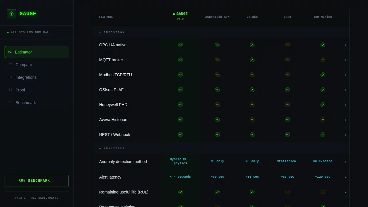
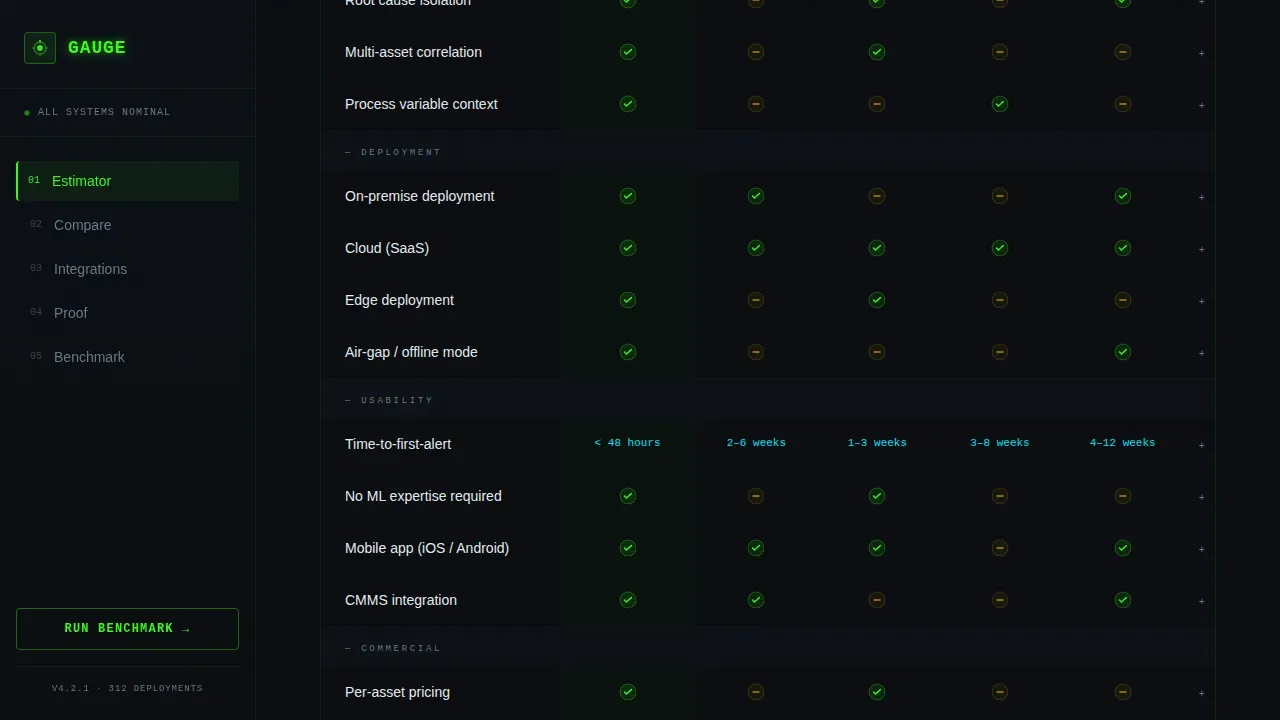
- A 28-row expandable competitor comparison table pitting the platform against four named competitors across ingestion protocols (OPC-UA, MQTT, Modbus, PI AF), alert latency, anomaly detection method, deployment model, and pricing transparency, with reactor-green checkmarks and amber dashes
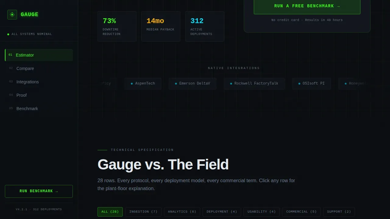
- An integration directory in bento tile grid format covering protocols, certified hardware, and historian connectors, a social proof testimonial rail with plant-specific quotes and hard downtime-reduction numbers, a gated benchmark call to action form, and a linear single-row footer
Feature list
This template is built around a small number of high-impact functional components. Each one is designed to move a skeptical technical buyer closer to a decision without shortcuts or vague claims.
Live ROI Estimator Hero
The header is a functional calculator, not a headline and a stock image. Visitors select their industry vertical using a rotating drum selector, enter their number of monitored assets and monthly unplanned downtime hours, and the page instantly renders a projected annual savings figure in oversized reactor-green type. The number pulses once, like a heartbeat monitor locking onto a signal. Below it, a single credibility line reads: "Based on 14-month median across 312 comparable deployments." This above-the-fold value proposition gives potential customers a quantified reason to keep reading before any competitor comparison begins.
28-Row Expandable Comparison Table
The core of this comparison landing page is a full competitor comparison table that runs 28 rows deep. It covers technical specifications that reliability engineers actually care about: ingestion protocols such as OPC-UA, MQTT, Modbus, and PI AF; alert latency; anomaly detection method; deployment model; and pricing transparency. Reactor-green checkmarks and amber dashes make the competitive gaps visceral at a glance. Each row expands on click to reveal a plain-language micro-explanation. This side by side comparison is the most direct way to highlight key features and show where competitors fall short without overstating claims.
Integration Directory Bento Grid
Below the comparison table, the page shifts into a scannable discovery directory. Protocol tiles, certified hardware cards, and historian connector entries are laid out in a bento tile grid. Each tile is designed to be read like a parts catalog, not a marketing brochure. This section supports decision making for engineers who need to confirm that their existing historian software, OSIsoft PI, Honeywell PHD, Aveva, or others, is already supported before they fill in the sign up form.
Gated Benchmark Call to Action Form
The primary call to action is "Run a Free Benchmark." It appears twice: once inside the estimator output and again as a sticky bar that activates after the visitor scrolls past the comparison table. The form collects work email first, then plant type, historian software in use, and number of critical assets. A secondary path offers a full specification sheet as a downloadable PDF, gated behind email only. This two-path structure captures both the ready-to-talk buyer and the engineer who needs to circulate visual proof internally before a purchasing decision.
Social Proof Testimonial Rail
The testimonial section is a horizontal rail of plant-specific customer testimonials. Each entry includes a named facility, a specific downtime-reduction figure, and a quote written in operational language rather than marketing language. Real customer feedback from comparable deployments builds credibility that no competitor comparison chart alone can provide. The "312 deployments" data point and median return on investment figure anchor the credibility claim with a concrete user count.
Sticky Conversion Bar
After the visitor scrolls past the comparison table, a sticky bar appears at the bottom of the viewport. It carries the "Run a Free Benchmark" call to action and stays visible as the reader continues through the integration directory and testimonial sections. This removes friction points that arise when a buyer is ready to convert but has already scrolled past the primary entry point.
Page sections overview
| Section | Purpose |
|---|---|
| ROI Estimator Hero | Quantifies projected savings instantly using industry vertical, asset count, and monthly downtime inputs |
| Competitor Comparison Table | Delivers a 28-row side by side comparison across technical specs, with expandable row explanations |
| Integration Directory | Scannable bento tile grid of supported protocols, certified hardware, and historian connectors |
| Social Proof Rail | Plant-named customer testimonials with specific downtime-reduction numbers and the 312-deployment credibility anchor |
| Benchmark call to action Form | Email-gated form collecting plant type, historian software, and asset count for a personalized benchmark |
| PDF Download Path | Secondary conversion path offering the full specification sheet gated behind email only |
| Linear Footer | Single-row footer following Pattern 1 layout |
Design & branding system
The visual identity is built around what the prompt describes as an oscilloscope in a darkened control room. Every color decision reinforces the industrial data environment rather than decorating it. The typography system separates heading text from data text to maintain the engineering datasheet feel.
Core design elements in this template:
- Color system: void black (#0B0E11) as the background, reactor green (#39FF14) for status indicators and positive metrics, warning amber (#FFB300) for threshold markers and hover states, and scanner blue (#00E5FF) for interactive elements and hyperlinks
- Typography: DM Sans for all headings and body copy, JetBrains Mono for data values, numbers, code references, and the ROI estimator output, creating a visually appealing contrast between narrative and numeric content
- Animation approach: drum selector spin on the vertical picker, a single pulse on the savings figure output, spotlight effect on integration tiles, clip-in entrance for the hero section, and a marquee element for the social proof rail, all implemented as high-motion but purposeful micro-animations
Mobile & speed optimization
This template is designed desktop-first. Reliability engineers reviewing a 28-row comparison table typically work at wide control room terminals, and the visual layout of the comparison table requires horizontal space to render clearly. That said, the template is structured to scale down gracefully so engineers comparing options on other devices are not left with a broken layout.
Key considerations for device and speed handling:
- Static sections such as the footer, testimonial rail, and integration directory are built as Server Components to reduce client-side rendering overhead, while the live calculator and expandable table rows are Client Components
- The comparison table uses horizontal scroll on narrower viewports so that no column is hidden and the full competitor comparison landing remains readable regardless of screen width
- Fast loading behavior is prioritized at the structural level to prevent high bounce rates, since potential customers researching competitor comparison landing pages tend to leave slow pages quickly
How this template helps you convert
Competitor comparison landing pages work because they meet comparison-shopping buyers exactly where they are in their decision making process. This template is structured to earn trust through data before it ever asks for contact information. The conversion sequence is deliberate and linear.
- The ROI estimator at the top of the landing page gives every visitor a personalized savings number on their first scroll, establishing a concrete value proposition before the competitor comparison table even begins. This immediately addresses the budget-justification problem that blocks many industrial SaaS deals.
- The 28-row comparison table with expandable row explanations converts competitive analysis into plant-floor evidence. Each row answers a specific technical question that a reliability engineer or operations director would ask during an evaluation. By the time a visitor reaches the benchmark call to action form, they have already seen the side by side comparison, read the customer testimonials, and confirmed integration support for their existing platforms stack.
- The dual conversion path, "Run a Free Benchmark" for ready buyers and "Download the Full Spec Sheet as PDF" for internal champions, captures two distinct buyer stages with a single landing page. This is how high converting landing pages handle industrial B2B audiences: by respecting that some engineers need to convince a committee before they can start free trial conversations.
Other information about this template
This template is relevant across several practical scenarios beyond its primary use case as a competitor comparison landing page for industrial analytics. The following points cover additional context that may be useful when evaluating or adapting this template.
- Content strategy alignment: the landing page copy is structured as an engineering datasheet that becomes progressively more persuasive as the visitor scrolls, which mirrors how successful saas comparison pages handle technically literate audiences who resist traditional marketing language
- Competitive analysis coverage: the template is designed so that each section contributes to a complete picture of platform differentiation, the estimator handles ROI, the comparison table handles feature depth, the directory handles integration breadth, and the testimonials handle real customer feedback, making it easier to convince potential customers who arrive mid-funnel from competitor landing pages or ad campaigns
- Surfer-adjacent use cases: teams running google ads or other paid campaigns pointed at comparison-intent queries will find that this competitor comparison landing page structure aligns well with the decision-stage user behavior those campaigns attract; the landing page is also structured to support organic search visibility for long-tail comparison queries, which can generate more targeted traffic over time
- Keyword and seo strategies: because the page is built around technical specification rows and named protocol support, it naturally surfaces relevant keywords that technical buyers use during their research phase; this supports keyword research and keyword strategy efforts without requiring separate landing page variants for each protocol or vertical
- Page examples from well-known saas comparison pages show that the most effective layouts share several traits with this template: Duda's comparison page delivers a quick side by side comparison that builds authenticity; ActiveCampaign's comparison page leads with more value for less money framing; BambooHR's comparison page uses simple text blocks focused on customer pain points; Shopify's comparison page uses a neat table to highlight advantages over a direct competitor; Webflow's comparison page uses design and animations to highlight platform superiority; Asana's comparison page is written from a potential customer asking questions perspective; ZenDesk's comparison page features detailed tables that make it easy to find answers; Klaviyo's comparison page combines feature highlights with an frequently asked questions section; Monday.com's comparison page lets users tab between competitor platforms; and Unbounce's comparison page pairs a side by side table with customer testimonials, all of these page examples reinforce that structured comparison landing pages with customer testimonials and clear calls to action consistently outperform generic product pages
- Adaptability for saas comparison: while this template is built for the industrial analytics niche, the core structure, estimator hero, comparison table, integration directory, gated call to action, is transferable to any saas comparison or industrial vertical SaaS context where technical buyers need a competitor comparison chart and real deployment data before converting
- Google analytics integration: teams using google analytics or similar tracking tools can instrument the estimator output, table row expansions, sticky bar clicks, and form submissions as engagement metrics and conversion events, giving marketing teams campaign effectiveness data without modifying the core template structure
- Industry trends: manufacturing analytics is shifting rapidly from spreadsheet-based reporting to real-time IIoT (Industrial Internet of Things) platforms; this template is built specifically for that transition moment, where potential customers have identified their pain points and are now actively running a competitive analysis before committing; teams that identify opportunities early in that research cycle and meet buyers with a well-structured competitor comparison landing page gain a measurable conversion advantage
- SEO tools and organic search: the template's structured data rows, named protocol coverage, and industry-specific testimonials create natural opportunities for organic search visibility on comparison and alternative queries; seo tools can help teams track engagement metrics and competitor traffic patterns to refine the page over time
- The social proof rail highlights customer testimonials with specific numbers, which provides the visual proof and real customer feedback that engineering buyers use to validate purchasing decisions internally; client testimonials with hard downtime-reduction figures are more persuasive than general satisfaction statements in this vertical; this approach supports customer satisfaction signals that compound over time as the deployment base grows
Theme
Directory & Discovery
Creative direction
Spec Sheet
Color system
Acid Digital
Style
Comparison Table
Direction
Comparison/Versus
Page Sections
Live ROI Estimator with Industry Selector
Row Expandable Comparison Table
Integration Directory Bento Grid
Dual-path Gated Conversion Form
Social Proof Testimonial Rail
Related questions
Who is this comparison landing page template built for?
Can I adapt the comparison table for a different set of competitors?
Does the template support two different conversion paths?
What makes this different from a standard SaaS product landing page?
Is this template suitable for running paid ad campaigns?



