Gem — Luxury Diamond Landing Page Template
Facet is a split-screen landing page template built for diamond booking platforms. It presents a real-time inventory search interface alongside sharp, spec-driven copy, targeting memo desks, sight holders, and independent jewelers who need to search, hold, and reserve certified stones fast. The design uses an Acid Digital color system to project clinical precision and immediate credibility.
by Rocket studio
Quick summary
Facet is a single-page, split-screen landing page template designed for diamond vertical software-as-a-service platforms. It combines a product screenshot header with a spec-sheet content rhythm to communicate platform capability without lifestyle fluff. Every section is built for buyers who read numbers first and trust clarity over decoration.
Who this template is for
This template is built for teams behind diamond booking and inventory platforms that serve trade professionals. The intended audience operates under time pressure and expects the interface to match the precision of the industry it serves.
- Diamond dealers, memo desks, and sight holders who manage certified stone inventory across multiple sources
- Independent jewelers sourcing engagement-quality stones and needing fast, reliable hold confirmation
- Platform operators and developers who want a landing page that communicates speed, depth, and trade credibility instantly
What problem this template solves
Diamond sourcing professionals lose stones to competing buyers in seconds. A landing page that leads with lifestyle imagery or generic copy fails the moment a trade buyer lands on it. Facet solves that mismatch directly.
- It replaces vague promises with data-dense, spec-style panels that mirror how dealers already think
- It removes friction between a visitor's first impression and the moment they click through to a live demo environment
- It gives platform operators a credible visual identity that signals the product is built for the trade, not for retail browsers
What you get with this template
Facet delivers a fully structured, single-page layout with a clear visual hierarchy and a conversion-focused flow. Every element is mapped to a specific job: attract the right buyer, demonstrate capability, and drive the click.
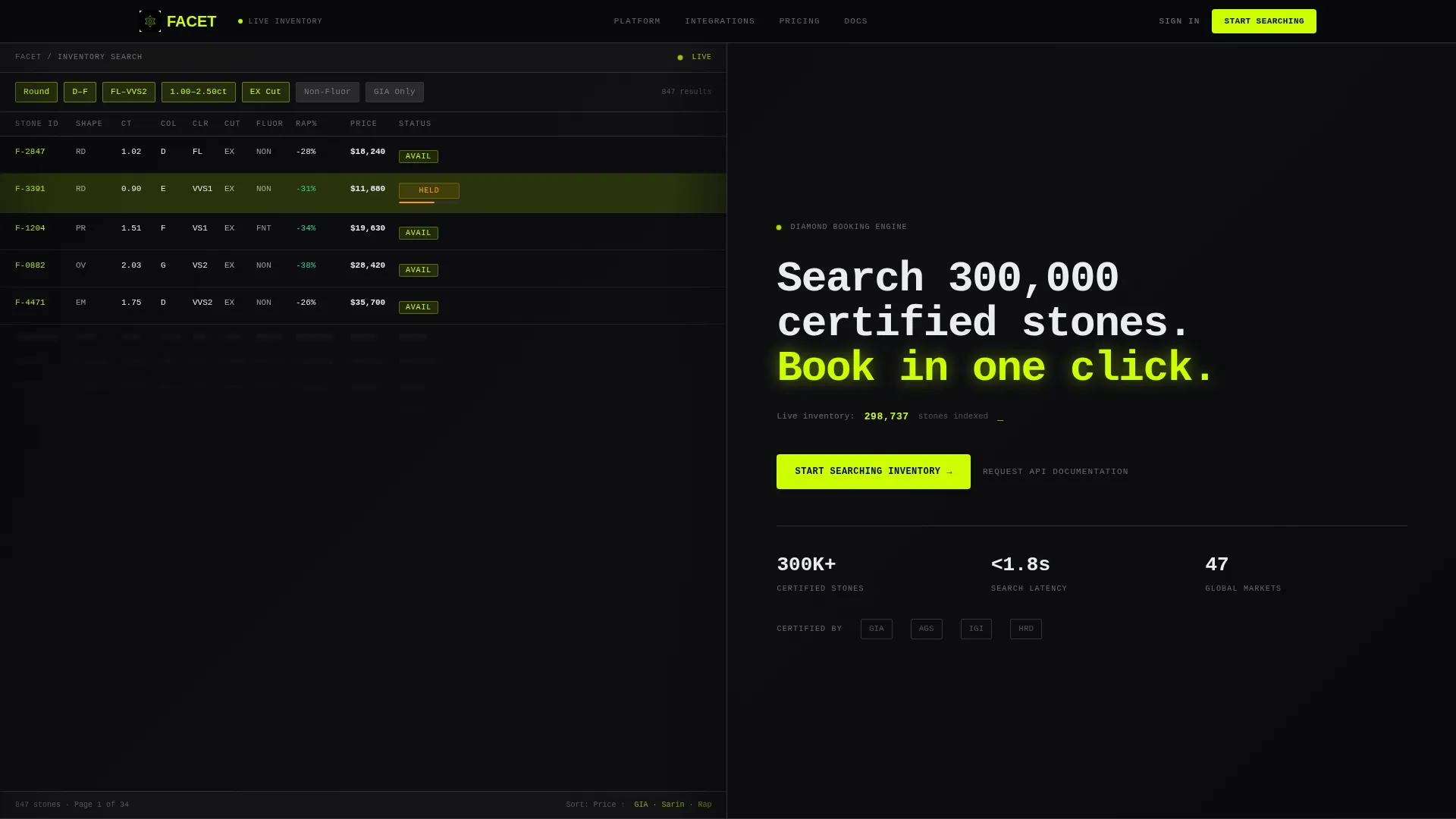
- A 50/50 split-screen header with a product screenshot on the left and a direct, inventory-count headline on the right
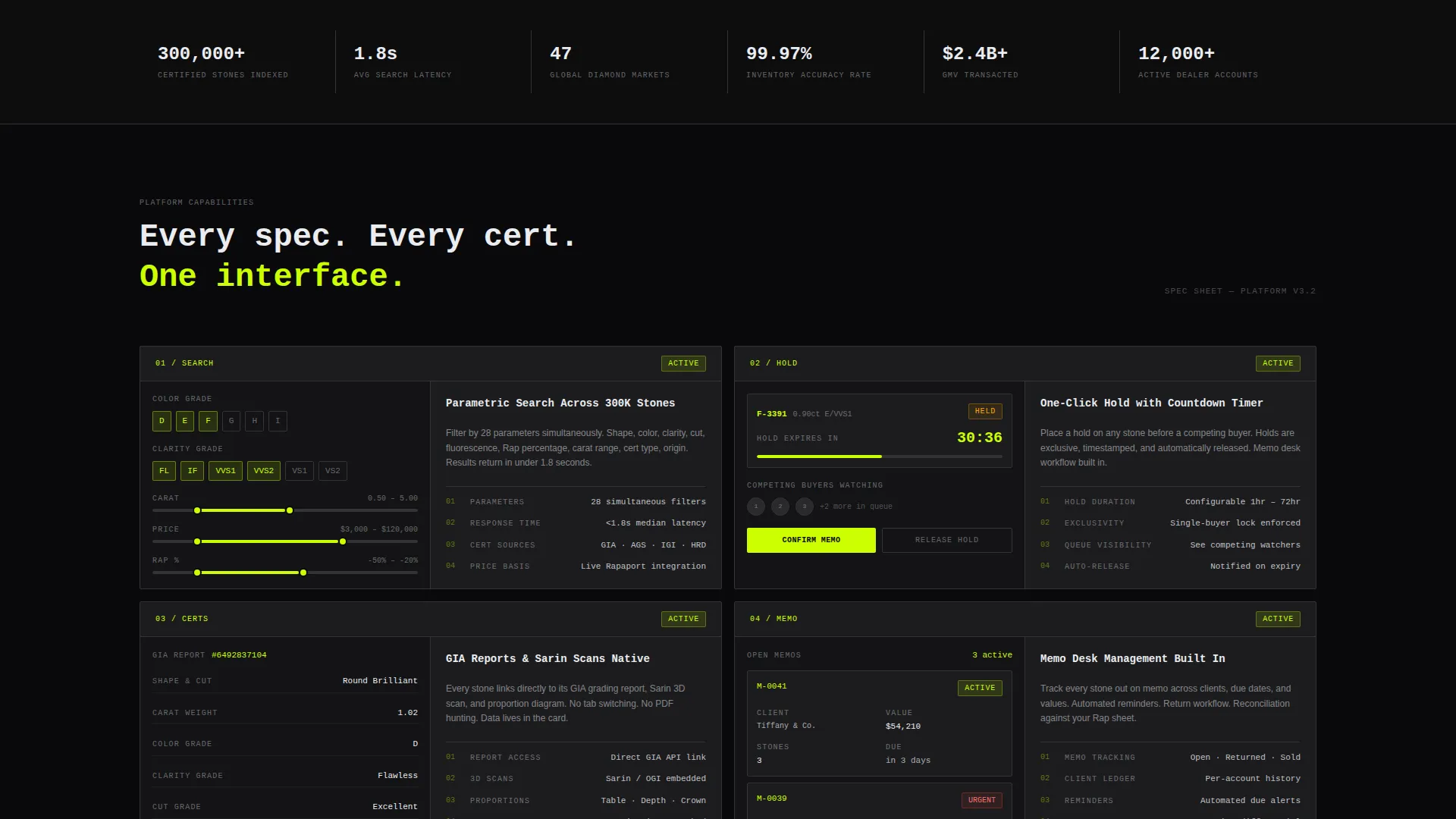
- A series of spec-sheet content panels, each presenting one platform feature in a device frame paired with numbered capability details
- A primary chartreuse call-to-action button, a sticky bottom bar that reappears after the third section, and a secondary text link for integrators
Feature list
Facet includes purpose-built layout components that reflect how a diamond booking system actually works. Each feature is grounded in the platform's core workflow.
Split-Screen Header with Live Inventory Signal
The header divides into two equal halves. The left side holds a cropped, pixel-sharp dashboard screenshot mid-search, showing filtered stone thumbnails, carat weights, clarity grades, and fluorescence tags, with one highlighted row in chartreuse indicating a stone being held. The right side carries a tight headline and a live-implied inventory count subline.
Spec-Sheet Content Panels
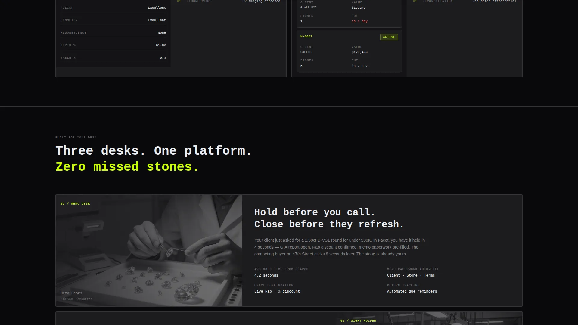
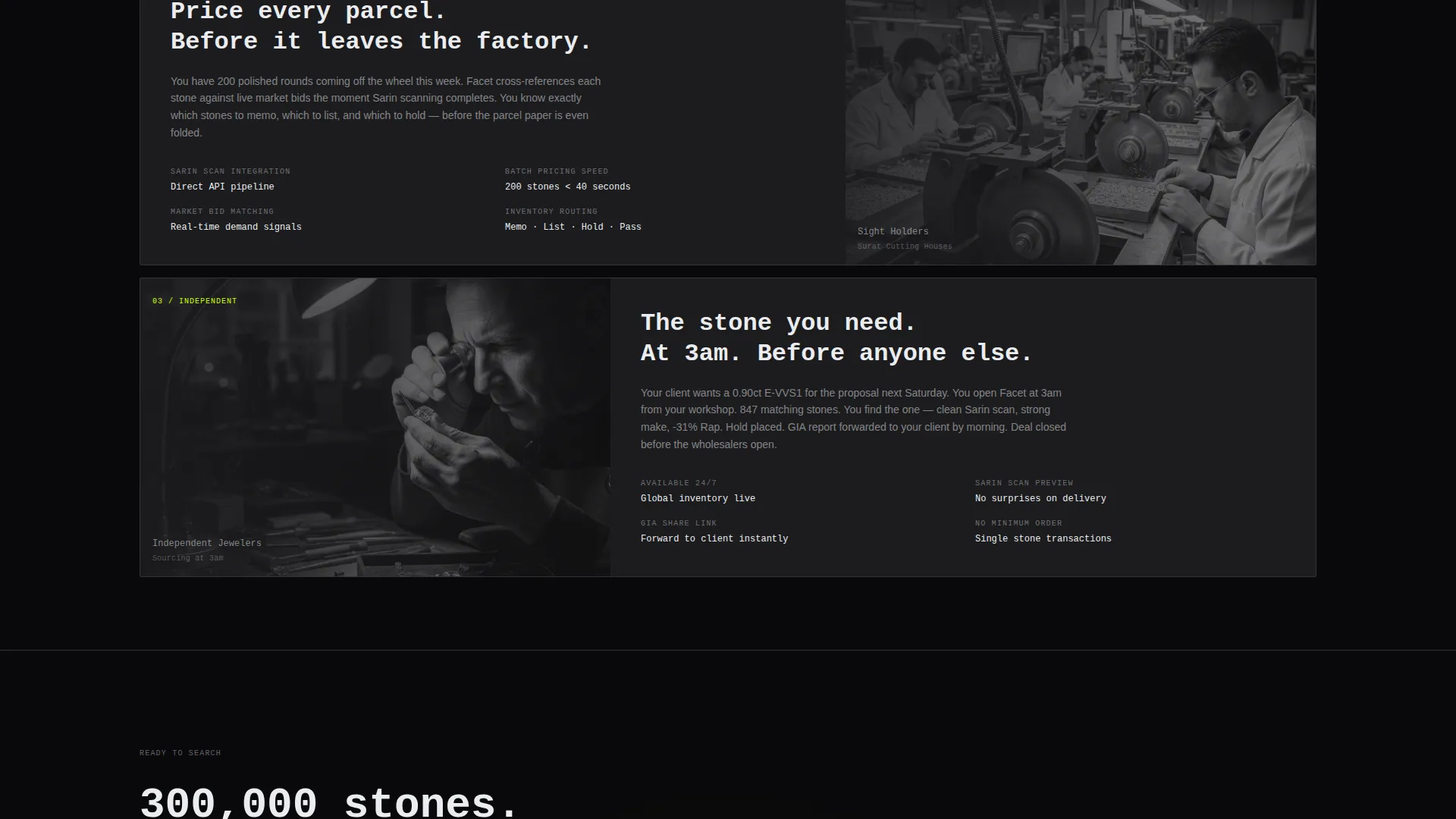
Each scroll section presents a single platform capability as a self-contained data panel. The left side shows the feature inside a device frame; the right side lists numbered specifications in the style of a grading certificate. Sections cover search filters, memo management, price-list integration, hold timers, and buyer analytics.
Click-Through Conversion Layout
The primary call-to-action, "Start Searching Inventory," is placed in the header right panel and repeated as a sticky bottom bar after the third section. No form is present. The click routes directly to a live demo environment pre-loaded with sample inventory, so the visitor experiences platform speed before creating an account.
Secondary API Access Link
A text link labeled "Request API Documentation" sits beneath the primary call-to-action. It serves enterprise buyers and integrators who need programmatic access before committing, without cluttering the main conversion flow.
Acid Digital Color System
The palette uses void black for backgrounds, electric chartreuse for calls-to-action and active states, deep graphite for card surfaces, and phosphor white strictly for spec text and table values. The result is a terminal-screen aesthetic that reads as synthetic, high-voltage, and zero-ornamentation.
Monospaced Typography
Headlines and spec labels use a tight monospaced typeface throughout. This typographic choice reinforces the platform's positioning as a precision tool rather than a consumer product, and it keeps numerical data immediately legible at every scroll depth.
Page sections overview
| Section | Purpose |
|---|---|
| Split-Screen Header | Anchor first impression with dashboard screenshot and inventory headline |
| Search Filters Panel | Demonstrate real-time stone filtering by carat, clarity, and fluorescence |
| Memo Management Panel | Show hold and reservation workflow inside a device frame |
| Price-List Integration Panel | Present Rap percentage and pricing data as a numbered spec block |
| Hold Timers Panel | Communicate time-sensitive availability and competing-buyer urgency |
| Buyer Analytics Panel | Display platform intelligence features in spec-sheet format |
| Sticky call to action Bar | Reinforce primary action after the third section scroll |
Design & branding system
The visual identity follows a Directory and Discovery theme executed through an Acid Digital color system. The aesthetic is deliberate: it should feel like a terminal screen glowing in a dark office, not a polished consumer storefront.
- Void black (#09090B) anchors every background; deep graphite (#1C1C1E) holds card and panel surfaces; electric chartreuse (#CCFF00) hits all calls-to-action, active filters, and availability badges; phosphor white (#EAECF0) is reserved strictly for spec text and numerical values
- A tight monospaced typeface is used for headlines, spec labels, and data readouts to reinforce clinical precision and keep numbers visually authoritative
- Zero ornamentation: no gradients, no lifestyle photography, no decorative elements that dilute the spec-sheet rhythm
Mobile & speed optimization
The layout is designed so the split-screen structure adapts cleanly at smaller viewport widths without losing the panel-by-panel content rhythm. Trade buyers access inventory tools from multiple devices, and the template accounts for that.
- The 50/50 split columns are structured to stack vertically on mobile without breaking the headline-to-screenshot relationship
- Sticky call-to-action bar positioning is built for thumb-reach usability on smaller screens
- Device frame presentations in each spec panel are sized to remain legible when the layout collapses to a single-column flow
How this template helps you convert
Facet is optimized specifically for click-through conversion, not lead capture. The page is designed to remove every barrier between a visitor's first look and their first real interaction with the platform.
- The header places a live-implied inventory count directly beside the primary call-to-action, so the visitor's first read connects product scale with immediate action
- Each spec-sheet panel builds confidence incrementally by presenting one capability at a time, reducing cognitive load and keeping the scroll purposeful
- The sticky bottom bar ensures the primary call-to-action remains reachable at every point in the page, and the secondary API link captures enterprise intent without competing with the main conversion goal
Other information about this template
Facet is a strong fit for platforms operating in the diamond vertical software-as-a-service space, where buyers are trade professionals who evaluate tools the same way they evaluate stones: by reading the numbers. The template's creative direction is Spec Sheet, its header concept is Product Screenshot, and its landing-page direction is Click-Through.
- The template style is Split Screen (50/50), and the theme is Directory and Discovery, making it well-suited for inventory-browsing and search-led platform experiences
- The design system is Acid Digital, a color and typography approach that suits high-density data interfaces where legibility and visual hierarchy matter more than decoration
- This template is category-matched to the Technology vertical with a Diamond Booking System niche, and it is built to present a platform that handles certifications such as Gemological Institute of America grading reports, Sarin proportion scans, and Rapaport price-list percentage values within a single interface
Theme
Directory & Discovery
Creative direction
Spec Sheet
Color system
Acid Digital
Style
Split Screen (50/50)
Direction
Click-Through
Page Sections
Split-screen Header with Inventory Signal
Spec-sheet Content Panels
Click-through Conversion Flow
Secondary API Access Link
Acid Digital Color System
Monospaced Spec Typography
Related questions
Is this template suitable for a platform that displays GIA grading report data?
Does this landing page include a sign-up or contact form?
Who is the secondary call-to-action designed for?
How many scrollable sections does this template include?
Can the Acid Digital color system be remapped to a different brand palette?



