Event Planning Digital Presence Specialist Professional Website Template
Gig is a single-page event staffing job board landing page built for freelance crew, staffing agencies, and venue operators. It combines a cinematic dark dashboard aesthetic with animated comparison tables, a role-toggle call to action system, and live trust signals. The design drives visitors toward signup by making the platform's speed and specificity immediately clear.
by Rocket studio
Quick summary
Gig is a comparison table landing page designed for an event staffing job board. It targets freelance crew members and employers in live events, festivals, and corporate productions. The Electric Indigo color system and Dashboard Pro theme create a focused, mission-control feel. Every section escalates the case for using the platform over legacy hiring methods.
Who this template is for
This template is built for anyone operating in the fast-moving world of live event labor. It speaks equally well to the people looking for work and the people doing the hiring.
- Freelance event crew: audio-visual technicians, stage managers, and catering coordinators hunting for short-term shifts and last-minute bookings.
- Employers and agencies: staffing agencies building festival rosters, venue managers posting urgent shifts, and production companies assembling crews for trade shows, galas, and concert tours.
- Platform founders and product teams launching a dedicated event staffing job board and needing a high-converting entry point.
What problem this template solves
The event staffing industry still runs on scattered, unreliable channels. Crew members and employers waste time chasing bookings through methods that were never designed for shift-based, high-volume, deadline-driven work.
- Outdated hiring channels: email chains, Facebook groups, and word-of-mouth leave both sides guessing about availability, rates, and reliability.
- Generic job boards miss the mark: platforms built for full-time roles do not account for urgent crew calls, shift-swap needs, or verified crew ratings.
- Slow time-to-fill costs money: a single unfilled role the night before a festival can collapse an entire production schedule.
What you get with this template
This template delivers a fully structured, single-page layout purpose-built for the event staffing niche. Every visual and functional element comes from the source brief.
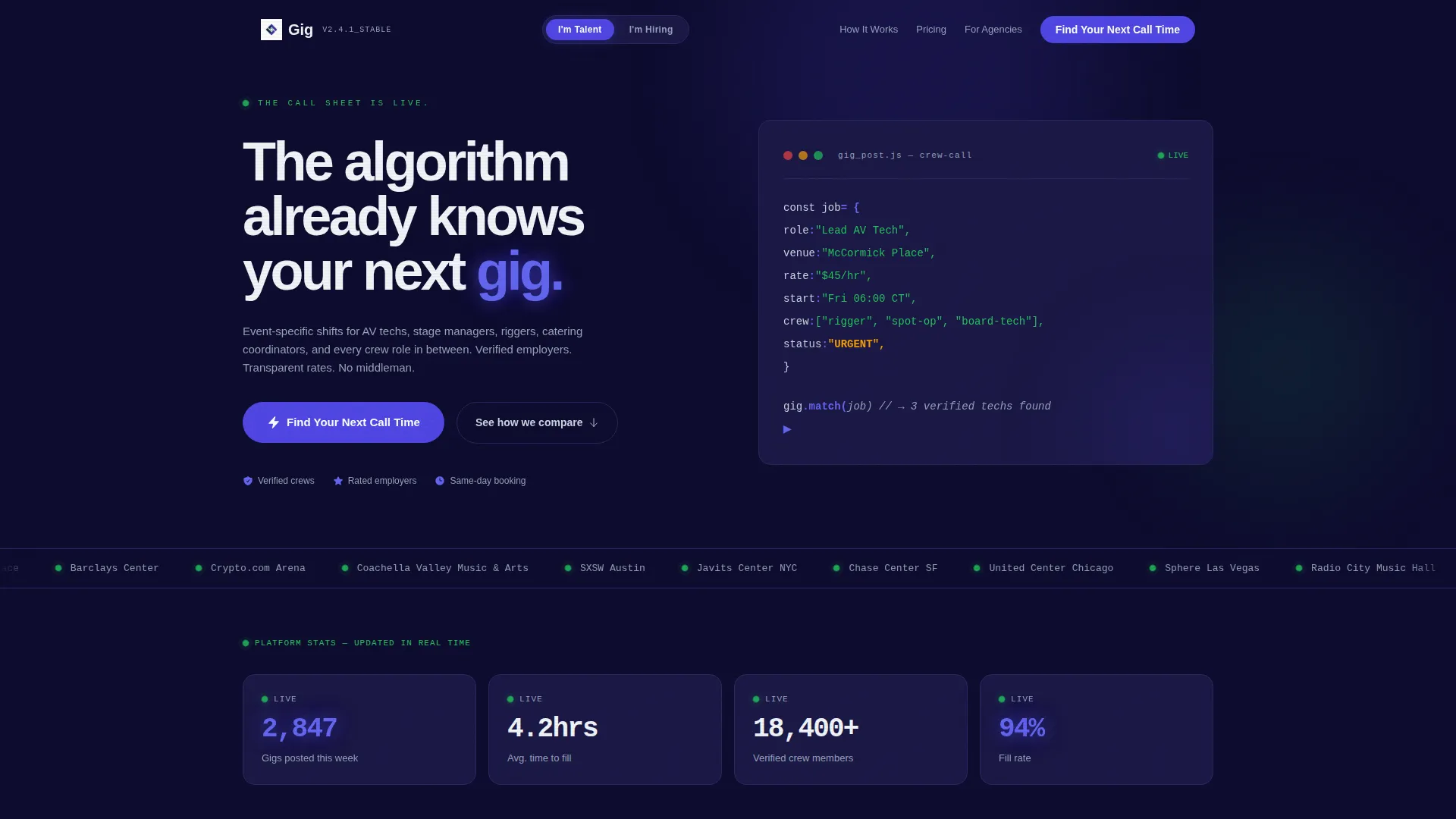
- Animated code snippet header: a self-writing pseudo-code block assembles a live job posting line by line, setting the platform's tone immediately.
- Role-toggle call to action system: a single toggle at the top of the page reframes all comparison tables and swaps call to action copy between talent-facing and employer-facing versions.
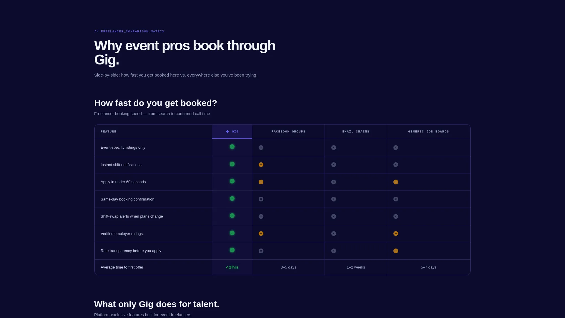
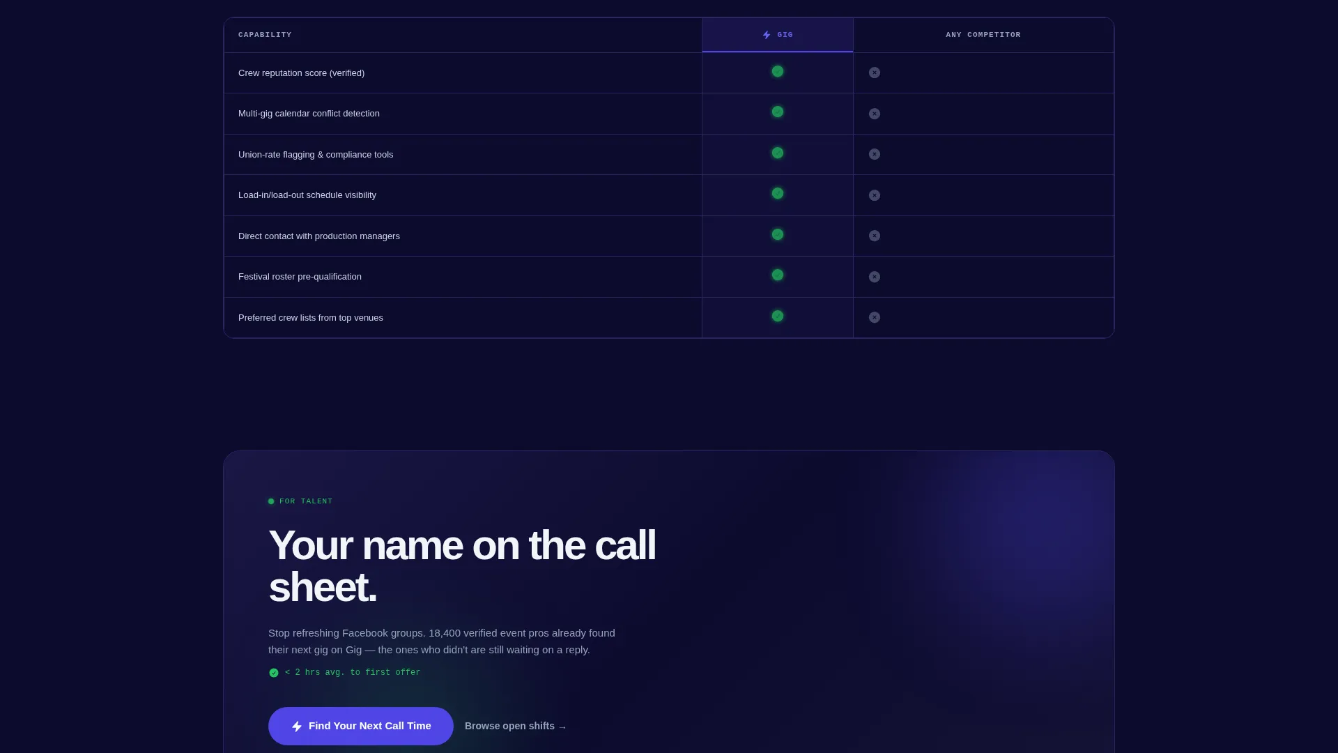
- Stacked comparison tables: three distinct table sections let freelancers, employers, and agencies each evaluate the platform against the methods they currently use.
- Live trust signals: visible counters show gigs posted this week, average time-to-fill, and a scrolling ticker of real venue names currently hiring.
- Click-through optimized flow: no form appears on the landing page itself; each call to action carries context into the signup flow.
Feature list
This section details the core template components drawn directly from the design brief.
Animated Code Snippet Header
The header opens with a monospaced pseudo-code block that writes itself line by line. Each line, including role, venue, rate, and status fields, appears with a keystroke rhythm against a deep navy background. A blinking cursor and indigo-glowing type create an immediate sense of live activity.
Role-Toggle call to action System
A toggle at the top of the page switches the entire page context between talent and employer views. call to action button copy updates from "Find Your Next Call Time" to "Post a Crew Call" accordingly. Every comparison table below reframes its column headers and value propositions to match the selected audience.
Stacked Comparison Tables
Three progressively detailed comparison tables build the scrolling argument for the platform. The first table addresses freelancers and booking speed. The second targets employers and covers cost-per-hire and fill rates. The third focuses on agencies and roster management tools. Columns highlight in indigo on hover, and green check marks pulse subtly against the dark background.
Live Trust Signal Bar
Real-time counters display gigs posted this week and average time-to-fill. A scrolling ticker shows real venue names currently hiring on the platform. These signals give first-time visitors immediate proof of activity without requiring a single sign-in.
Click-Through Optimized calls to action
No form appears anywhere on the landing page. Every call to action button carries contextual information from the role toggle into the signup flow. This reduces friction and keeps the landing page focused entirely on persuasion and clarity.
Dashboard Pro Dark Theme
The full layout follows a dark dashboard aesthetic using a carefully defined color palette. Deep terminal navy forms the base, live-wire indigo highlights interactive elements, status-green marks active listings, and cool interface gray handles secondary text and table borders.
Page sections overview
| Section | Purpose |
|---|---|
| Animated Code Header | Opens with self-writing pseudo-code to signal live platform activity |
| Role Toggle Bar | Lets visitors switch between talent and employer page contexts |
| Freelancer Comparison Table | Shows booking speed advantages over email chains and Facebook groups |
| Employer Comparison Table | Compares cost-per-hire and fill rates against generic job boards |
| Agency Comparison Table | Highlights roster management tools versus word-of-mouth methods |
| Live Trust Signals | Displays gig counters, time-to-fill stats, and a venue name ticker |
| Primary call to action Block | Drives role-aware clicks into the platform signup flow |
Design & branding system
The visual identity is built around the Dashboard Pro theme with an Electric Indigo color system. The palette is intentionally dark and focused, designed to feel like a mission control screen running at full capacity during festival season.
- Core palette: deep terminal navy (#0D0B2E) as the base, live-wire indigo (#4F46E5) for interactive highlights, status-green (#22C55E) for active listings and match indicators, and cool interface gray (#94A3B8) for secondary text and table borders.
- Typography: monospaced type is used in the animated code header; the headline below the snippet uses a clean fade-in treatment for contrast and emphasis.
- Motion and interaction: column hover states light up in indigo, green check marks pulse subtly, and the code snippet animates with a keystroke rhythm to create a sense of live, working data.
Mobile & speed optimization
The template is designed to hold its dark, data-rich visual identity across screen sizes. Comparison tables and the animated header are structured to remain legible and functional on smaller viewports.
- Comparison tables are structured to scroll horizontally on narrow screens, keeping column data readable without collapsing content.
- The role-toggle and primary call to action block are positioned for thumb-friendly interaction on mobile devices.
- The live trust signal ticker and counter elements are designed to remain visible and uncluttered at any screen width.
How this template helps you convert
This landing page is built entirely around one goal: moving a visitor from curiosity to a signup click. Every layout decision reduces hesitation and increases confidence.
- The role-toggle personalizes the entire page experience instantly, so a freelance AV tech and a venue manager both feel the page was built specifically for them.
- The escalating comparison tables replace doubt with evidence, moving from "here is what we replace" to "here is what only we do" as the visitor scrolls deeper.
- Live trust signals, including active gig counters and real venue names, give new visitors immediate proof that the platform is already working before they commit to signing up.
Other information about this template
This template is part of a broader set of niche-specific landing page designs built for digital platforms in the event planning and live production space. A few additional notes are worth keeping in mind before customizing.
- The template style is Comparison Table, which means the primary persuasion mechanism is structured side-by-side evaluation rather than narrative storytelling or portfolio showcase.
- The header concept, Code Snippet, is designed to signal a technology-forward platform identity and works best when the pseudo-code content reflects real roles and venues relevant to your market.
- The lp_direction is Click-Through, meaning the page is intentionally form-free; all conversion happens at the call to action click, and the signup or onboarding flow lives on a separate page.
- The Dashboard Pro theme with the Electric Indigo color system is particularly well suited for platforms targeting tech-comfortable users who work in high-pressure, deadline-driven environments.
- This template fits within the Event Planning Digital Presence subcategory, making it a strong match for platforms that serve production crews, staffing agencies, and venue operators in the live events industry.
Theme
Dashboard Pro
Creative direction
Feature Matrix
Color system
Electric Indigo
Style
Comparison Table
Direction
Click-Through
Page Sections
Animated Code Snippet Header
Role-toggle Call to Action System
Stacked Comparison Tables
Live Trust Signal Bar
Click-through Optimized Ctas
Dashboard Pro Dark Theme
Related questions
Who is this landing page template designed for?
Does this template include a signup form?
Can I customize the comparison table content?
How does the role-toggle work visually?
What makes this template different from a general job board layout?



