Specialist Retail Software Professional Website Template
Giveback is a split-screen landing page template built for retail micro-donation platforms. It combines a glassmorphic dark-theme design with interactive simulators, a scrubable donor-impact timeline, and a two-step app download flow. Franchise owners, retail ops managers, and nonprofit directors get a polished, conversion-focused page that lets visitors simulate real donation numbers before ever being asked to install anything.
by Rocket studio
Quick summary
Giveback is a single-page landing page template designed for retail donor management platforms. It uses a 50/50 split-screen layout, deep glassmorphic styling, and interactive explorers to show visitors exactly how spare-change micro-donations work. The page is built to drive app downloads by letting users simulate their own impact first, then nudge them toward a two-step install flow.
Who this template is for
This template is built for teams who need cause-marketing reach without the operational complexity. It speaks directly to people who already run retail at scale and want a frictionless way to add giving to every transaction.
- Franchise owners managing multiple store locations who want cause-marketing without building custom infrastructure
- Retail operations managers looking to replace patched-together donation prompts on legacy point-of-sale systems
- Nonprofit development directors who need a consistent stream of unrestricted funds rather than relying on single large-event donations
What problem this template solves
Most retail donation programs feel bolted on. They interrupt checkout, confuse staff, and produce sporadic results. This template addresses the gap between a retailer's desire to give back and the practical friction that stops them from doing it.
- No clear way to show franchise owners or retail managers the real financial impact of micro-donations before they commit
- Nonprofit teams struggle to communicate the value of steady, small contributions versus one-off event fundraising
- Existing pages for donation platforms are static and fail to engage visitors long enough to build trust
What you get with this template
You get a fully designed, section-led landing page built around interactive proof. Every section is built to remove doubt and reward exploration before the visitor ever taps the download button.
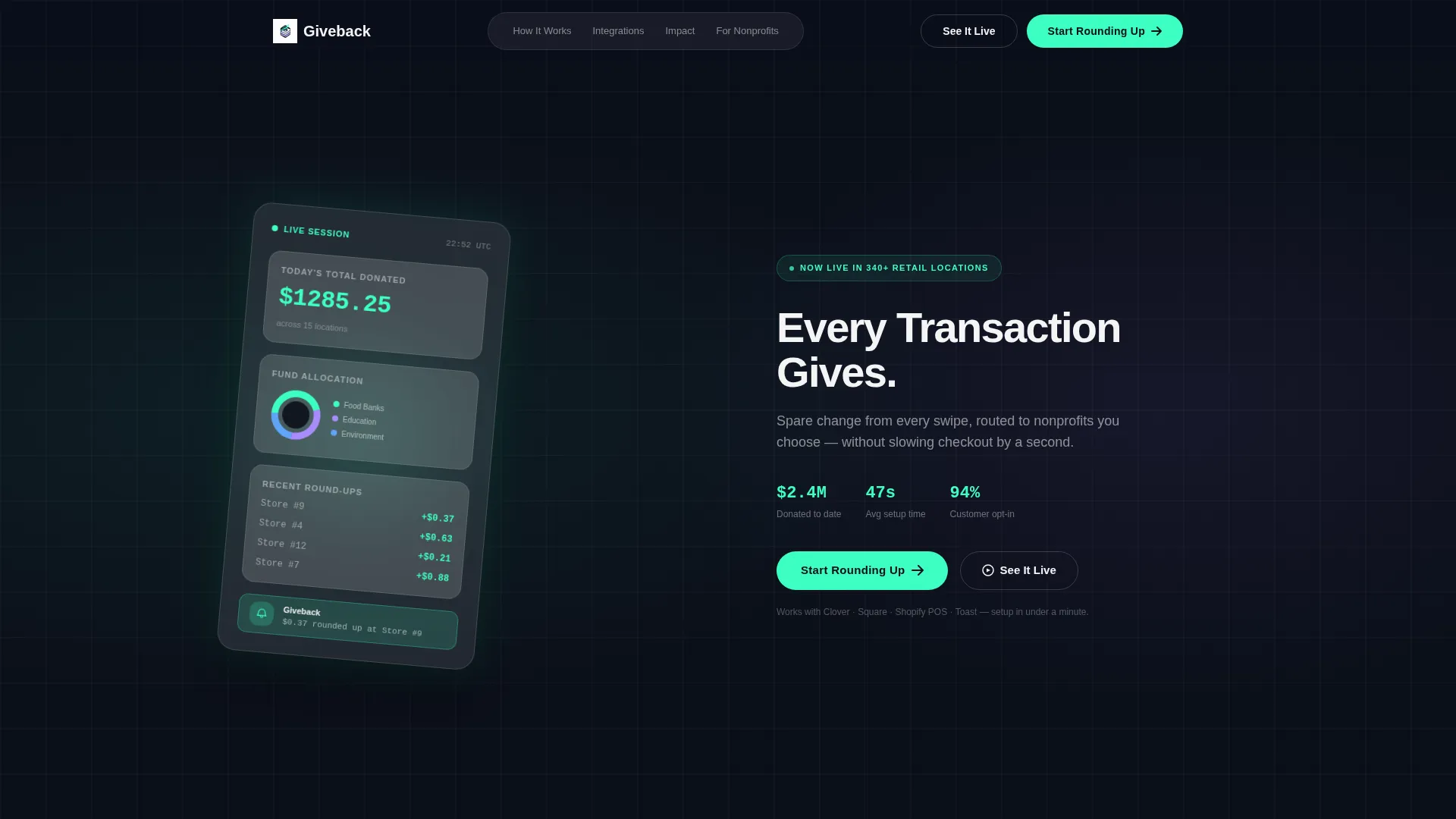
- A split-screen header with a live-session product screenshot on the left and a headline-plus-call to action block on the right
- A real-time donation simulator, an interactive point-of-sale integration diagram, and a scrubable donor-impact timeline
- A two-step app download micro-flow that detects the visitor's device and serves the correct app store badge automatically
Feature list
This template delivers six distinct interactive and visual components, each grounded in the source brief.
Split-Screen Header Layout
The header divides evenly into two halves. The left side locks a product screenshot in place, showing a live donation ticker, a donut chart splitting funds across three nonprofits, and a push notification preview. The right side carries a 56-pixel weight-700 headline with a subhead and a mint-green call-to-action button that pulses once on load.
Live Donation Simulator
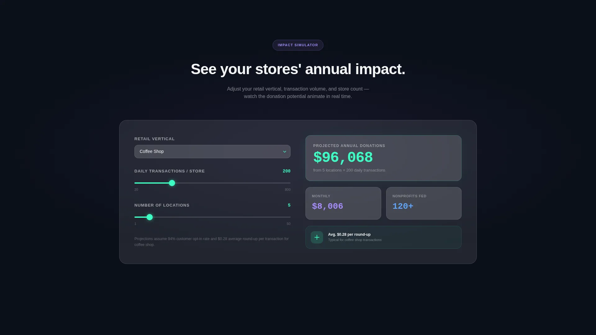
Section two lets visitors pick a retail vertical from a frosted dropdown, such as coffee shop, grocery, or apparel, and set an average transaction count. A glassmorphic counter animates the projected annual donation total in real time, giving franchise owners and ops managers a concrete number tied to their own business before they commit to anything.
Isometric Integration Diagram
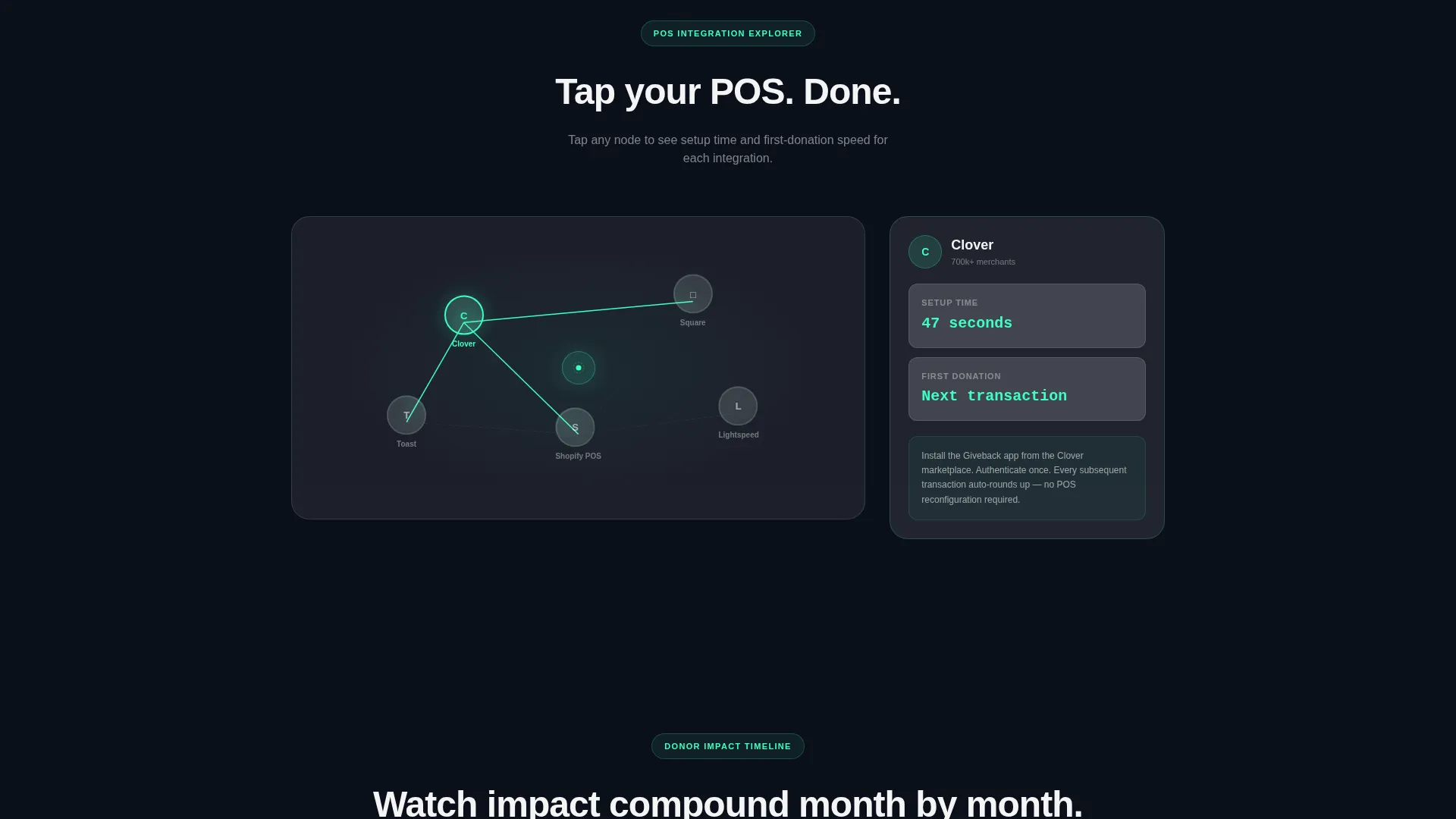
Section three presents an exploded isometric diagram of point-of-sale integration. Visitors tap each node to open a frosted tooltip showing setup time and first-donation speed for that provider. It turns a technical question into a moment of discovery rather than a wall of text.
Scrubable Donor-Impact Timeline
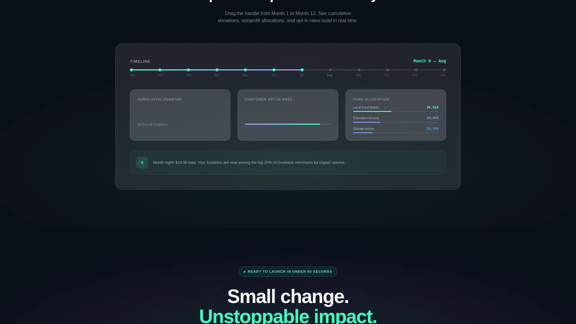
Section four works like a video scrubber. Visitors drag a handle from Month 1 to Month 12 and watch cumulative donations, nonprofit fund allocations, and customer opt-in rates build progressively. It makes twelve months of impact tangible in a single gesture.
Two-Step App Download Flow
The primary call-to-action opens a micro-flow with just two steps. Step one asks for store count and point-of-sale provider using two dropdowns with no typing required. Step two detects the visitor's device and serves the correct App Store or Google Play badge directly, removing any guesswork from the install moment.
Glassmorphic Modal Video Path
A secondary call-to-action labeled "See It Live" triggers an embedded 45-second product video inside a glassmorphic modal. The video ends with the same app download badges, giving skeptical visitors a low-commitment path to the same conversion goal.
Page sections overview
| Section | Purpose |
|---|---|
| Split-Screen Header | Anchors product screenshot and primary call to action |
| Donation Simulator | Lets visitors project their annual giving impact |
| Integration Diagram | Shows POS setup time per provider node |
| Impact Timeline | Scrubable view of cumulative 12-month results |
| App Download Close | Full-width final call to action with two-step install flow |
Design & branding system
The visual identity runs on a Startup Velocity theme expressed through a glassmorphic color system. Dark backgrounds keep frosted panels floating, while accent colors fire only on interactive moments so every tap feels purposeful.
- Deep space black (#0B0F1A) as the base background, frosted translucent white (white at 12% opacity) on every card and panel, crisp white (#F4F4F5) for body text on dark surfaces
- Electric mint (#3DFFC2) reserved for hover states, live counters, toggle switches, and the primary call-to-action button so interactive moments feel powered-on
- Soft lavender (#A78BFA) used as a secondary accent on tags and badges, giving the palette a second point of luminosity without competing with mint
Mobile & speed optimization
The template is structured with a sticky mobile navigation bar that keeps the primary call-to-action visible as visitors scroll. Interactive components are designed to remain responsive and accessible at smaller screen sizes.
- Sticky mobile nav carries the "Start Rounding Up" pill button so the download path is always one tap away
- The two-step download flow detects the visitor's device automatically, removing the need to choose between app store links manually
- Frosted glass cards and ink-dark backgrounds are defined in CSS-friendly variables, making visual adjustments straightforward without redesigning from scratch
How this template helps you convert
The page is structured to earn trust through exploration before asking for any commitment. Each section progressively moves a skeptical visitor toward the download tap.
- The live donation simulator gives franchise owners and managers a personalized impact number early in the scroll, making the value proposition feel real and specific rather than generic.
- The integration diagram and impact timeline answer the two most common objections, setup complexity and long-term results, through direct interaction rather than marketing claims.
- The two-step micro-flow and device-aware badge delivery reduce the friction at the final conversion moment to two dropdown choices and one tap.
Other information about this template
This template is built inside a Startup Velocity theme framework, meaning the layout conventions and interactive patterns are consistent with modern software product pages. It pairs well with retail software platforms, retail donor management tools, and cause-marketing product launches.
- The template style is a 50/50 split screen, which balances visual proof on the left with persuasive copy on the right throughout the header
- The creative direction is Interactive Explorer, meaning no section is passive; every major block rewards a click, drag, or selection
- The header concept centers on a Product Screenshot rather than an illustration, grounding the first impression in real product user interface
- The primary landing page direction is App Download, with every conversion path leading to either the App Store or Google Play badge
Theme
Startup Velocity
Creative direction
Interactive Explorer
Color system
Glassmorphic
Style
Split Screen (50/50)
Direction
App Download
Page Sections
Split-screen Header with Product Screenshot
Real-time Donation Simulator
Isometric POS Integration Diagram
Scrubable Donor-impact Timeline
Two-step Device-aware Download Flow
Glassmorphic Product Video Modal
Related questions
Who is this landing page template designed for?
Can I change the retail verticals shown in the donation simulator?
Does the template handle both App Store and Google Play downloads?
How does the "See It Live" video path work?
Is the integration diagram limited to specific point-of-sale providers?



