Cleaning Service Digital Presence Reviews Website Template
Gleam is a modular card-grid landing page built for a cleaning operations membership platform. It opens with a live-style analytics dashboard preview, then walks visitors through an industry-report scroll that quantifies the gap between untracked operations and data-driven ones. The result is a high-trust, comparison-led page designed to earn the diagnostic call to action click.
by Rocket studio
Quick summary
Gleam is a Tech Glass landing page template built for a cleaning service membership platform. It uses a modular card-grid layout and an industry-report scroll structure to show visitors exactly where their operation stands against platform members. The dashboard header, comparative data cards, and a three-field diagnostic call to action work together to turn curiosity into committed action.
Who this template is for
This template is built for cleaning business owners who need to present a membership platform with authority and precision. The layout speaks directly to operators who already understand numbers and want proof before they commit.
- Solo operators scaling past their first few employees who need operational structure
- Franchise owners managing anywhere from twelve to forty units across multiple sites
- Commercial janitorial companies bidding on large contracts who need sharper data than their competitors
What problem this template solves
Most cleaning business owners manage scheduling, chemical costs, and client retention through scattered tools or gut feeling. A platform selling data-driven discipline needs a page that proves the value before asking for a subscription.
- Visitors arrive skeptical and leave without context about what the platform actually measures
- Owners do not see a credible side-by-side comparison of their current performance versus platform benchmarks
- The page fails to capture leads who are curious but not yet ready to commit
What you get with this template
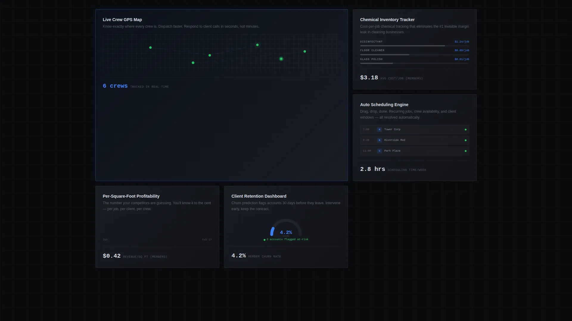
The template delivers a full single-page layout with every section pre-structured around the comparison-versus conversion model. Each block is ready to receive your real platform data, brand copy, and call to action links.
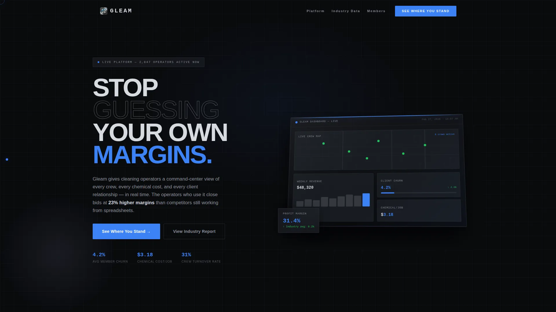
- A full-width isometric dashboard preview header with animated scanning line and live-style metric callouts
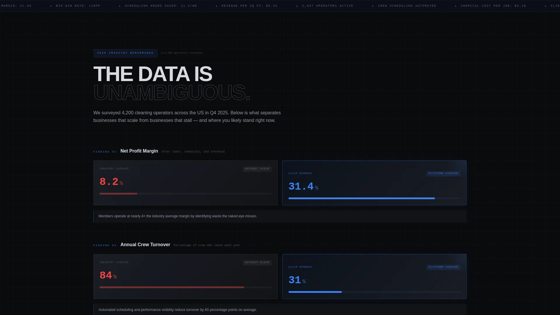
- A modular card-grid section built in comparative pairs, steel-gray for industry baseline and electric-blue-bordered for platform members
- A primary "See Where You Stand" diagnostic form with three fields, plus a secondary email-gate lead capture for the industry report download
Feature list
This section highlights the core built-in capabilities included in the Gleam template.
Isometric Dashboard Header
The header renders a pixel-accurate preview of the membership platform's analytics view. It shows a live crew map, a weekly revenue chart, a client churn gauge, and a chemical cost-per-job ticker. A thin scanning line sweeps horizontally once across the dashboard, illuminating each metric as it passes.
Comparative Card Grid
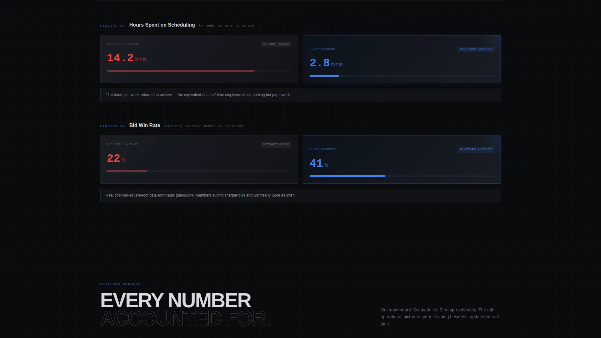
Cards are arranged in side-by-side pairs throughout the scroll. The left card uses a steel-gray finish to represent the industry baseline. The right card uses an electric-blue border to represent platform member performance. As the visitor scrolls, the visual gap between the two columns widens to reinforce the contrast.
Diverging Data Visualizations
Each card pair includes a single data finding presented as a bar chart or percentage callout. Charts stretch progressively further apart as the visitor moves down the page, creating a consulting-report rhythm that makes the performance gap feel undeniable and personal.
Three-Field Diagnostic call to action
The primary call to action leads to a short diagnostic with three fields: current number of crews, monthly revenue range selected from a dropdown, and biggest operational headache chosen from four options. This low-friction form qualifies leads while making the conversion feel like a personalized assessment rather than a signup wall.
Email-Gate Lead Capture
A secondary conversion path offers the full industry report as a downloadable asset behind a single email field. This path captures visitors who have absorbed the data story but are not ready to commit, keeping them in the funnel without pressure.
Tech Glass Visual System
Card surfaces float in brushed aluminum with a frosted-glass blur effect. Backgrounds stay in the gunmetal-to-black range. The electric-blue accent appears only on interactive states and live data points, so every blue element signals activity and draws the eye immediately.
Page sections overview
| Section | Purpose |
|---|---|
| Dashboard Preview Header | Opens with analytics hook and scanning line animation |
| Hero Headline Block | Frames the platform's core value proposition |
| Industry Stat Cards | Presents single-finding data cards in comparative pairs |
| Profit Margin Comparison | Shows average owner margins versus member margins |
| Crew Turnover Module | Compares industry-wide turnover to platform member rates |
| Scheduling Time Card | Quantifies manual scheduling hours versus automated |
| Diverging Chart Section | Widens the visual gap between benchmarks as scroll progresses |
| Diagnostic call to action Section | Hosts the three-field "See Where You Stand" form |
| Report Download Gate | Captures emails behind the industry report asset |
| Footer Navigation | Closes with supporting links and trust signals |
Design & branding system
The Monochrome Steel color system gives every surface a cold, precise character that matches the platform's data-driven positioning. Typography lands in chrome-white against dark gunmetal backgrounds, keeping contrast high and text instantly readable.
- Core palette: deep gunmetal (#1C1F26) for backgrounds, brushed aluminum (#A8ADB5) for card surfaces, polished chrome (#D6DAE0) for typography, and electric blue (#3B82F6) reserved strictly for interactive states and live data points
- Card surfaces use a frosted-glass blur treatment with subtle reflections along edges, giving the layout a layered, three-dimensional feel
- The blue accent is purposefully withheld from static elements so every glowing indicator, hovered card, and toggled column immediately draws the visitor's attention
Mobile & speed optimization
The modular card-grid structure is built to reflow cleanly from wide desktop layouts down to single-column mobile views. Comparative card pairs stack vertically on smaller screens while preserving the visual contrast between steel-gray and blue-bordered cards.
- Card components are self-contained modules, so each pair resizes independently without breaking the comparison logic
- The isometric dashboard header scales proportionally, keeping the metric callouts legible on tablet and mobile viewports
- Heavy visual elements like the frosted-glass blur and scanning line animation are contained within defined layout regions to avoid layout shift during scroll
How this template helps you convert
Every design and copy decision in Gleam is built around a single outcome: getting the visitor to recognize the gap between their current operation and what the platform makes possible, then taking the smallest possible next step.
- The dashboard header creates immediate aspiration by showing a command-center view the visitor does not yet have access to, setting up the comparison story before a single word is read.
- The progressive card-grid scroll acts as a data briefing that makes the visitor feel increasingly aware of measurable underperformance, so the diagnostic call to action arrives at exactly the right psychological moment.
- The two-path conversion architecture captures both ready buyers through the diagnostic form and research-mode visitors through the email-gated report download, widening the top of the funnel without diluting the primary call to action.
Other information about this template
The Gleam template is built specifically for the cleaning service membership site niche within the broader cleaning service digital presence category. It is categorized under Technology templates and carries a high intersection match score, meaning the design system, creative direction, and conversion model all align tightly with the intended niche.
- Template style: Card Grid (Modular), suited for platforms that need to present multiple data points without overwhelming the visitor
- Creative direction: Industry Report structure, which builds authority by presenting findings rather than making claims
- Header concept: Dashboard Preview, which filters for the right audience immediately by showing the product's core value in the first viewport
- The template is designed to support platform branding swaps, meaning colors, metric values, and copy blocks can be updated to reflect your real platform data
Theme
Tech Glass
Creative direction
Industry Report
Color system
Monochrome Steel
Style
Card Grid (Modular)
Direction
Comparison/Versus
Page Sections
Isometric Dashboard Preview Header
Comparative Card Grid Layout
Diverging Data Visualizations
Three-field Diagnostic Form
Email-gated Report Download
Tech Glass Visual System
Related questions
Who is the Gleam template designed for?
Can I update the dashboard metrics with my own platform data?
What does the 'See Where You Stand' call to action do?
Does the template include the email-gate lead capture for the report download?



