Car Detailing Landing Page Template for Black-Owned Businesses
Gleam is a card-grid landing page built for a hand-wash car detailing business. It uses a Comparison Journey layout where every package card shows a before-and-after vehicle panel split by a gold divider. The page flows from a cinematic header into an inline booking experience, guiding visitors from first impression to confirmed appointment in a single scroll.
by Rocket studio
Quick summary
Gleam is a single-page detailing template designed for a Black-owned hand-wash business that earns trust through visual proof. A floating phone mockup opens the experience, package cards carry before-and-after transformations, and every card ends with a "Book My Wash" call to action. The inline booking flow keeps the entire purchase journey on one page.
Who this template is for
This template fits detail-focused operators who want a page that sells the experience before it asks for a credit card. It works best for small hand-wash businesses with tiered service menus and a loyal local clientele.
- Car detailers offering multiple wash packages at different price points
- Black-owned service businesses that want design that signals quality without shouting
- Solo operators or small teams who take appointments and want an on-page booking flow
What problem this template solves
Most service pages describe what they do using plain bullet lists. Gleam replaces that approach with visual evidence. Visitors see the neglected-to-pristine transformation on every card, so the value of each package tier becomes obvious before a price is ever questioned.
- Clients who need convincing before booking get a side-by-side visual comparison on every card
- Operators lose bookings when pricing feels abstract; the journey format grounds each tier in real outcomes
- Mobile visitors need a frictionless path to book; the pinned "Book My Wash" button keeps the action step always in reach
What you get with this template
You get a fully structured landing page with a modular card grid, an inline booking flow, and a visual identity built around a single gold accent color. Every component is arranged to move a visitor from curiosity to confirmed booking without leaving the page.
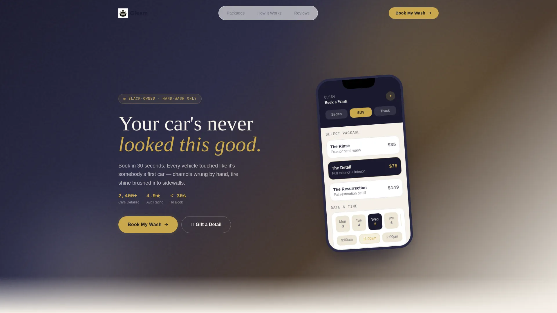
- A header section with a floating phone mockup, headline, and pre-populated booking interface preview
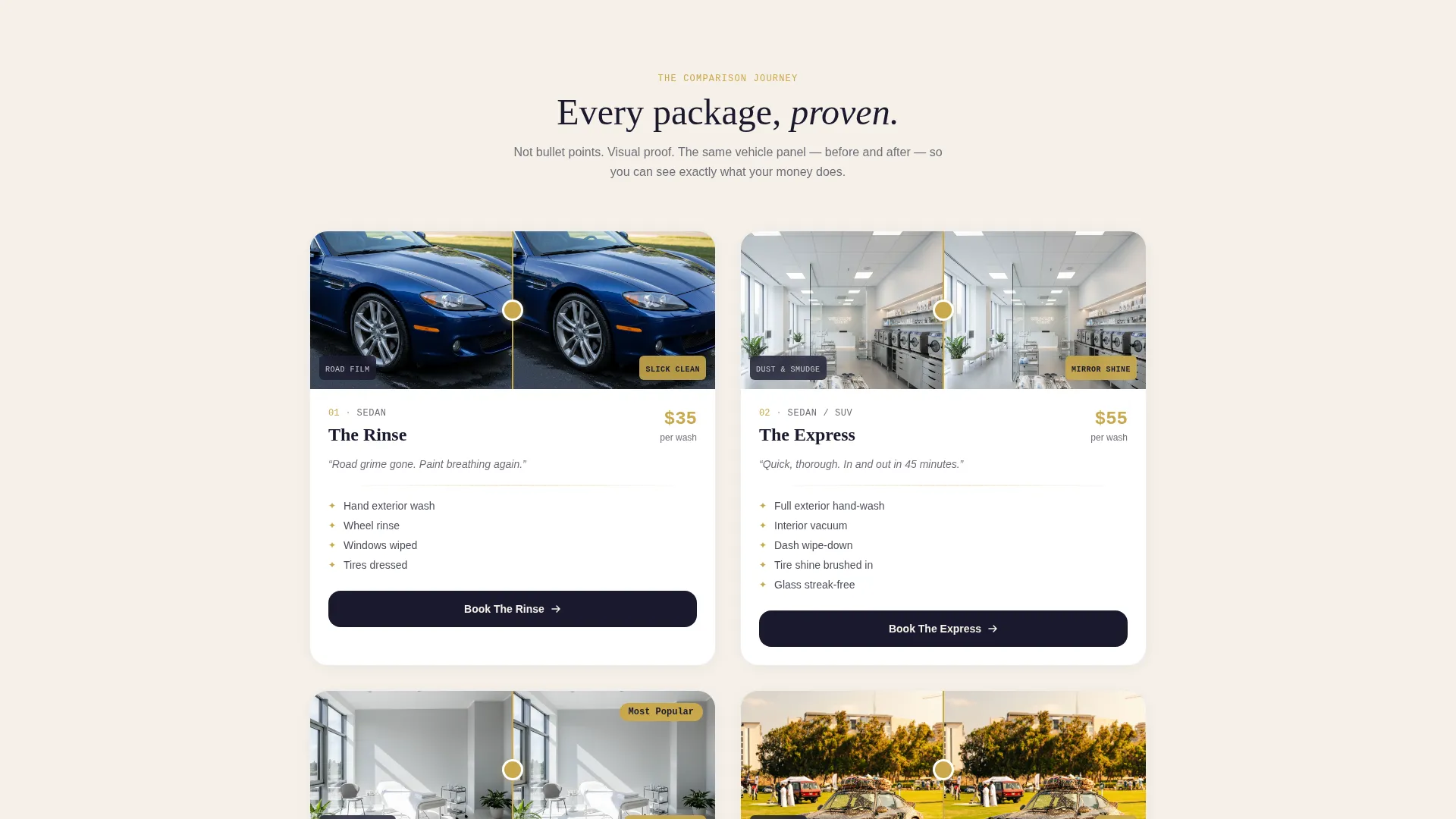
- A card grid where each package card features a split before-and-after image, package name, pricing in gold, and a booking call to action
- An inline booking flow covering vehicle size selection, package tier, date and time slot, and payment via Apple Pay, Google Pay, or card
Feature list
A short paragraph introduces what makes this template's feature set coherent: every element exists to move a visitor one step closer to a booking. The layout, the color choices, and the card structure all work together rather than independently.
Comparison Journey Card Grid
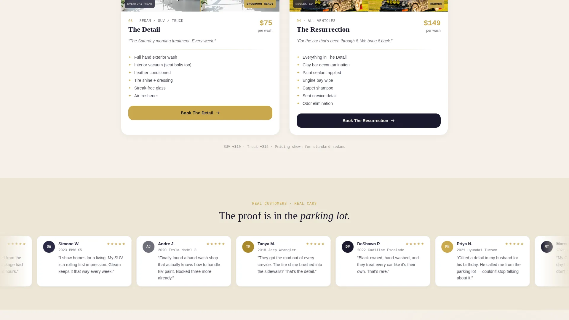
Each package card holds a split image of the same vehicle panel, showing its neglected state on the left and its post-wash state on the right. A thin gold divider line separates the two halves. As visitors scroll, the transformations escalate from a basic exterior rinse to a full interior-exterior detail, building the case for each tier upgrade through sight rather than words.
Floating Phone Header
The header centers a phone mockup on a soft ink-to-parchment gradient. The screen shows a live-style booking interface with a vehicle selector, date picker, and package tier already filled in. The phone casts a subtle shadow as if hovering above a marble counter, giving the first impression a tactile, premium quality.
Inline Booking Flow
Tapping "Book My Wash" opens a booking experience directly on the page. Visitors choose vehicle size (sedan, SUV, or truck), select a package tier, pick a date and available time slot, and complete payment without being redirected to a separate site or app.
Pinned Mobile Call to Action
On mobile, the "Book My Wash" button is fixed to the bottom of the viewport. It stays visible throughout the scroll so the booking step is never more than one tap away, regardless of where a visitor is in the page.
Gift a Detail Path
A secondary conversion path lets visitors purchase a detail as a gift. The "Gift a Detail" option sits alongside the primary booking flow and supports holiday and birthday use cases without disrupting the main purchase journey.
Gold Leaf Pricing Highlights
Package pricing and all primary call-to-action buttons use the gold leaf accent color exclusively. This color appears nowhere else on the page, so it acts as a reliable visual signal: wherever gold appears, a transaction or decision is available.
Page sections overview
| Section | Purpose |
|---|---|
| Header with mockup | Establishes premium feel and previews the booking interface |
| Package card grid | Presents tiers through visual before-and-after comparisons |
| Inline booking flow | Captures vehicle size, package, date, time, and payment |
| Gift a Detail | Offers a secondary purchase path for gifting occasions |
| Pinned mobile button | Keeps the primary call to action visible throughout scroll |
Design & branding system
The Soft Gradient theme uses an Ink and Paper color system that feels like a freshly printed menu at a high-end barbershop. Every color has a specific role, and the palette holds its discipline across every section of the page.
- Deep sumi ink (#1A1A2E) anchors headlines and body typography; warm parchment (#F5F0E8) dominates the background; graphite mist (#6E6E7A) softens secondary text
- Gold leaf (#C9A84C) appears only on pricing figures and call-to-action buttons, making those elements instantly recognizable as action points
- The ink-to-parchment gradient in the header and the subtle phone shadow give the page a tactile, three-dimensional quality without relying on photography
Mobile & speed optimization
The template is built with mobile visitors in mind, since a large share of local service bookings happen from a phone in a parking lot or driveway. The layout adapts cleanly from desktop card grid to a stacked single-column view on smaller screens.
- The card grid reflows to a single-column stack on mobile, keeping each before-and-after comparison readable at phone width
- The pinned "Book My Wash" button stays fixed to the bottom of the viewport on mobile so the booking action is always one tap away
- The inline booking flow is touch-friendly, with large tap targets for vehicle size, package tier, date, and payment selection
How this template helps you convert
The entire page is structured as a persuasion sequence, not a menu. Visitors arrive at a premium visual moment, move through escalating proof, and reach payment without friction.
- The header phone mockup shows the booking interface before a visitor reads a single word, making the process feel simple and already in motion
- The Comparison Journey grid replaces skepticism with visual proof on every card, so by the time a visitor reaches the last tier, the price feels earned rather than arbitrary
- The pinned mobile button and inline payment options (Apple Pay, Google Pay, card) remove the final hesitation point by keeping the checkout experience fast and on-page
Other information about this template
This template was designed for the Retail and E-Commerce category under the Black-Owned Business subcategory. It carries a high intersection match score, reflecting how closely the visual and functional design aligns with the hand-wash detailing niche it serves.
- The Comparison Journey creative direction is well suited to any service business where the before-and-after result is the strongest selling point
- The card-grid (modular) layout makes it straightforward to add or remove package tiers as the service menu evolves
- The "Gift a Detail" secondary path makes this template useful beyond standard appointment bookings, covering holiday and birthday gifting scenarios
Theme
Soft Gradient
Creative direction
Comparison Journey
Color system
Cloud Canvas
Style
Masonry/Pinterest
Direction
Direct Sales
Page Sections
Comparison Journey Card Grid
Floating Phone Header Mockup
On-page Inline Booking Flow
Pinned Mobile Booking Button
Gift a Detail Secondary Path
Gold Leaf Pricing Highlights
Related questions
Can I change the number of package cards in the grid?
What payment options does the inline booking flow support?
Does this template work for a business offering both interior and exterior services?
Is the 'Gift a Detail' option a separate page?
Can the color scheme be updated to match a different brand identity?



