Y2K Fashion Blog Website Template
Glitter is a holographic Y2K landing page template built for lifestyle blogs and vintage marketplaces. It layers frosted-glass cards, cursor-reactive gradients, and staggered scroll animations into one immersive, shoppable experience. Dual conversion paths guide visitors toward the shop or the newsletter. The result is a page that feels less like a website and more like a mood board you can buy from.
by Rocket studio
Quick summary
Glitter is a single-page Y2K lifestyle and marketplace template with an overlap-and-layered layout. It combines editorial content with a shoppable storefront, all wrapped in a holographic chrome visual identity. Interactive moments, a spinning CD, a flip-phone newsletter modal, and a scratch-off discount reveal, reward visitors as they scroll deeper into the aesthetic.
Who this template is for
This template is built for creators and sellers who live inside the Y2K aesthetic, not just reference it. If your brand breathes nostalgia and your audience expects visual intensity, this is the page that matches their energy.
- Y2K lifestyle bloggers and vintage resellers showcasing curated editorial content alongside shoppable products
- Thrift-flippers and vintage marketplace owners selling physical or digital goods with a strong aesthetic identity
- Graphic designers and creative studios building mood-board-style landing pages for Gen Z and Millennial audiences
What problem this template solves
Most lifestyle and vintage store templates force you to choose between editorial depth and a clean storefront. The result is either a blog that looks like a shop, or a shop that forgot it had a personality. Glitter solves that split by treating the scroll itself as the brand experience.
- Visitors are immersed in the aesthetic before they see a single product, so trust and desire build naturally
- Two conversion paths, shop and newsletter, run in parallel without competing for attention
- The layered, overlap layout creates visual hierarchy without a rigid grid, matching the Y2K maximalist style
What you get with this template
You get a complete, ready-to-customize single-page layout with every section pre-built and styled. The template ships with high-interactivity components that would otherwise require significant custom development time.
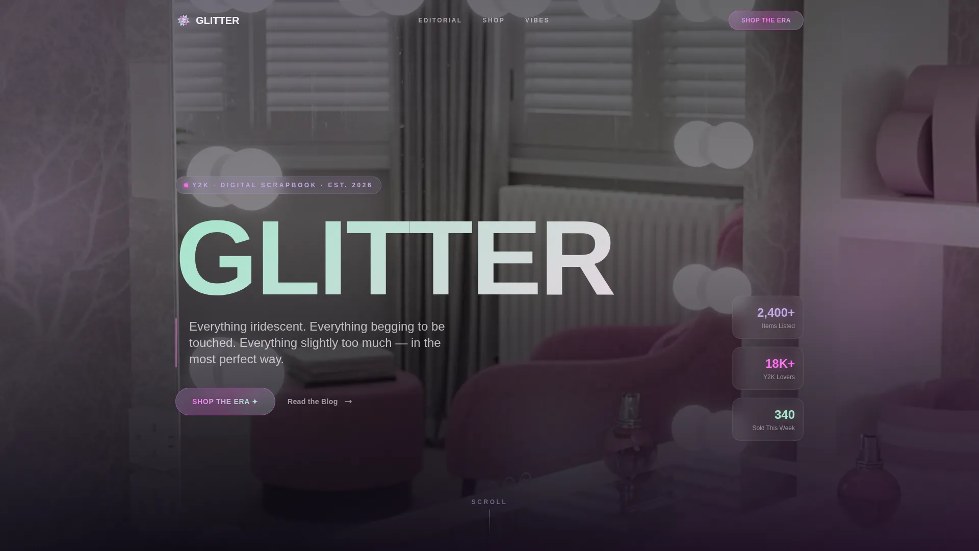
- A hero section with a holographic display-type headline, parallax vanity photo, and cursor-reactive gradient fill
- An editorial collage section, a tilted product card storefront, and two interactive engagement moments
- A floating "Shop the Era" call-to-action button and a flip-phone newsletter modal with a single "Send Me the Vibes" form
Feature list
This template packages a dense set of visual and interactive capabilities into a single cohesive layout. Every feature serves the core goal: making visitors feel the aesthetic before asking them to act.
Cursor-Reactive Holographic Hero
The hero headline "GLITTER" is set in a chunky, inflated Y2K display font and stretches edge to edge over a soft-focus vanity photograph. As visitors move their cursor, the holographic gradient fill shifts in real time. The image beneath drifts with a subtle parallax effect, keeping the first impression in constant, gentle motion.
Staggered Editorial Collage
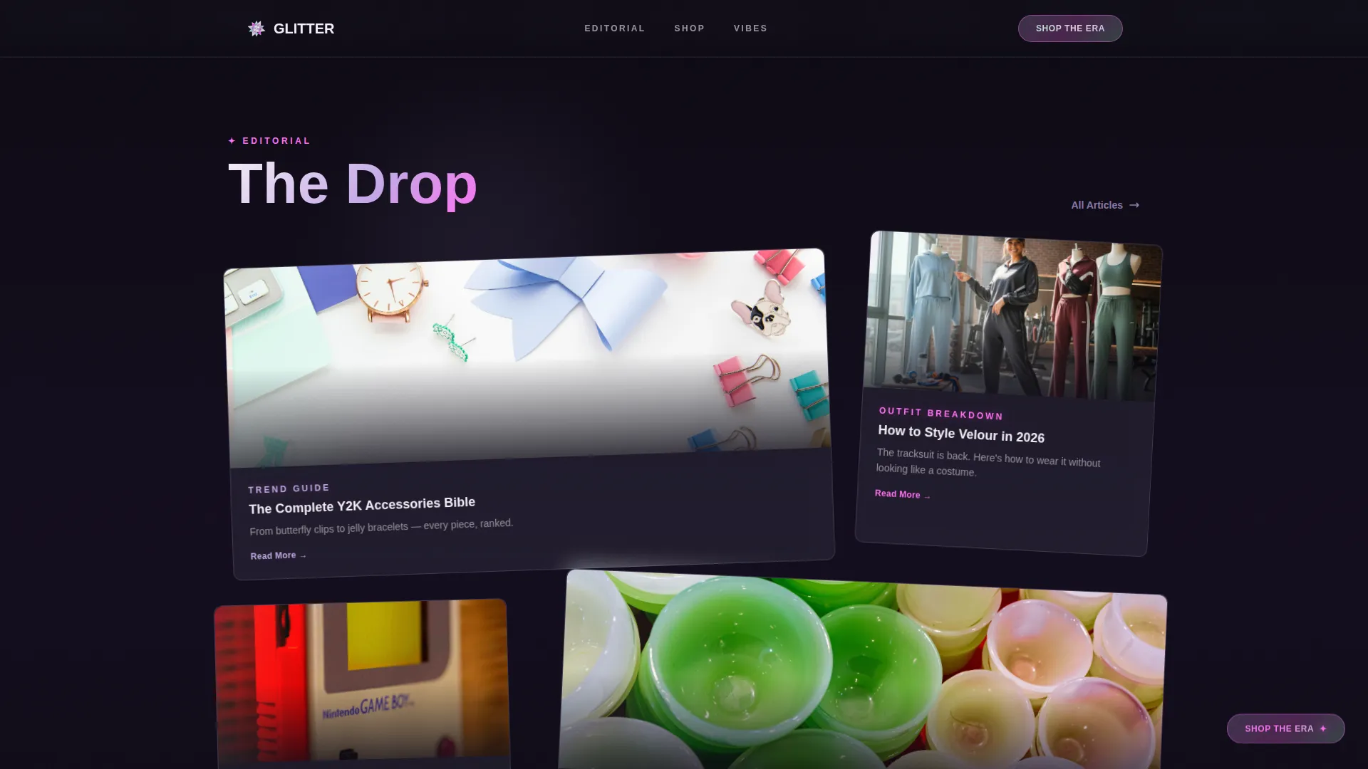
Trend guides, outfit breakdowns, and nostalgic tech reviews are presented as layered cards that slide over each other at different scroll speeds. The collage effect mimics a physical scrapbook. It creates visual momentum that pulls visitors further down the page without feeling like a list.
Tilted Product Card Storefront
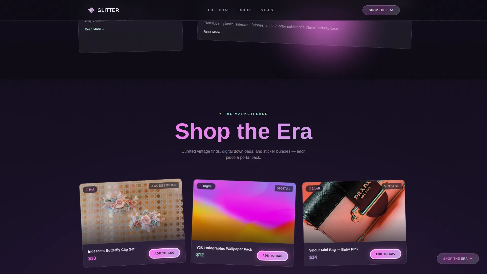
The shop section presents curated vintage pieces, digital wallpaper packs, and sticker bundles as product cards tilted and stacked like trading cards. Each card carries an "Add to Bag" button styled as a puffy sticker label. The layout shifts from editorial to commerce without breaking the aesthetic.
Interactive Scroll Moments
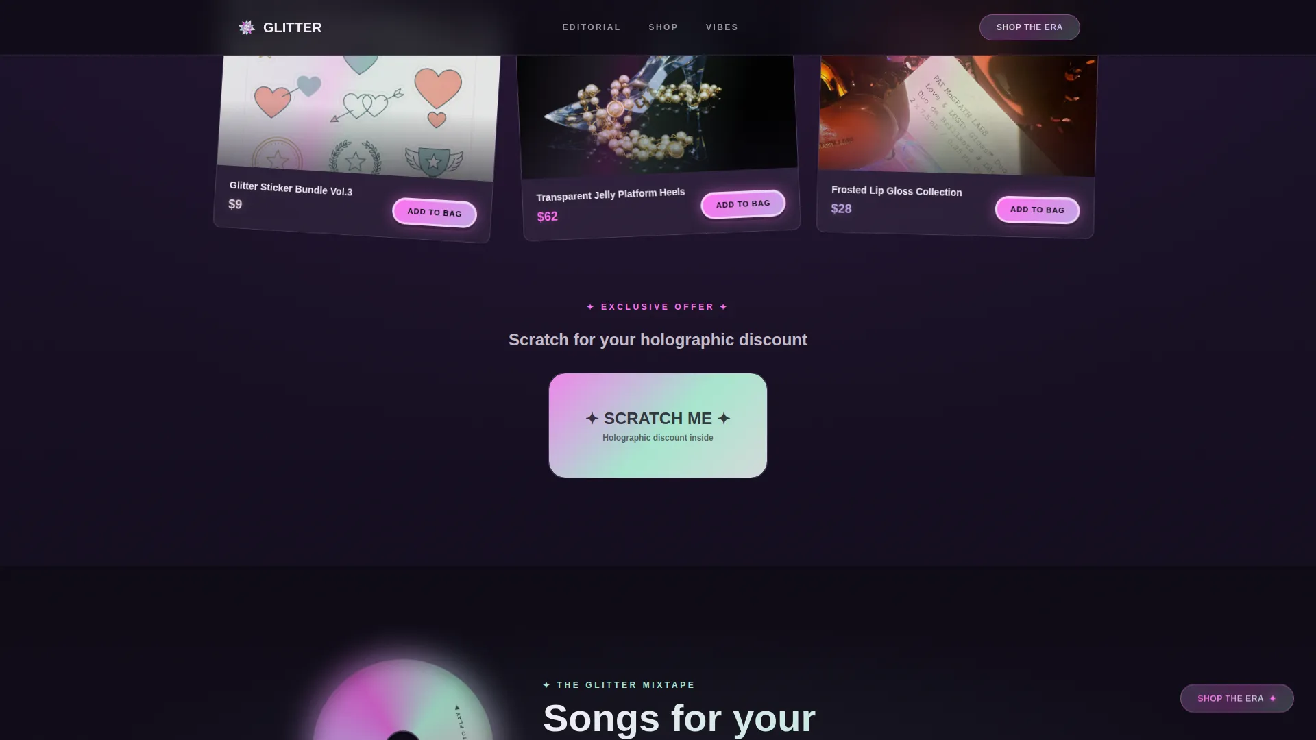
Three interactive moments punctuate the scroll journey. A spinning CD animation reveals a curated playlist. A flip-phone animation opens into the newsletter subscriber form. A scratch-off holographic patch unveils a discount code. Each moment rewards the visitor who keeps scrolling.
Floating Chrome Call-to-Action
A frosted pill button reading "Shop the Era" in chrome-gradient text follows the visitor as they scroll. It stays accessible at every point in the page without interrupting the visual experience. This persistent anchor reduces friction for visitors ready to buy at any moment.
Flip-Phone Newsletter Modal
The newsletter section uses a flip-phone animation to frame the subscriber form. It asks only for a first name and email address. The call to action reads "Send Me the Vibes," keeping the tone consistent with the overall brand personality.
Page sections overview
| Section | Purpose |
|---|---|
| Hero Type Overlay | Introduces the brand with a holographic headline and cursor-reactive gradient over a parallax vanity photo |
| Editorial Collage Cards | Presents trend guides, outfit breakdowns, and nostalgic tech reviews as staggered, layered scroll cards |
| Shop the Era | Displays tilted, stacked product cards for vintage pieces, digital goods, and sticker bundles |
| CD Spinner Playlist | Delivers an interactive spinning CD animation that reveals a curated playlist on engagement |
| Flip-Phone Newsletter | Captures first name and email via a flip-phone animation modal with a "Send Me the Vibes" call to action |
| Minimal Footer | Closes the page with an ultra-minimal horizontal flow footer |
Design & branding system
The visual identity is built on a Holographic Chrome color system layered over a Soft Gradient theme. No element sits flat. Every surface shifts, overlaps, or blurs slightly, keeping the aesthetic feeling alive even between scroll interactions.
- Color palette: shifting lilac (#C4A7E7), molten silver-pink (#E8D5E0), prismatic aqua (#A8E6CF), and hot chrome magenta (#FF6FF2) used across backgrounds, hover states, and call-to-action buttons
- Typography pairing: Bricolage Grotesque for display headlines and Manrope for body text, both chosen to balance Y2K maximalism with modern readability
- Layout style: translucent gradient panels at staggered depths, frosted-glass text cards with soft blur edges, and product tiles overlapping like Polaroids on a bedspread, with no strict grid alignment
Mobile & speed optimization
This template is designed desktop-first, with its richest interactions built for larger screens. Mobile visitors receive a graceful, toned-down version of the experience that preserves the aesthetic without breaking the layout.
- GSAP ScrollTrigger powers the staggered scroll reveals, parallax drift, and CD spin animation for smooth, controlled performance across modern browsers
- CSS custom properties drive the holographic shimmer and color-shift effects, keeping visual fidelity high without relying on heavy image assets
- Mobile degradation is intentional and graceful, preserving frosted-glass cards and gradient palette while simplifying the most complex layered interactions
How this template helps you convert
The page is structured so that desire builds before the ask arrives. By the time visitors reach the shop section, they have already spent time inside the world the brand has created.
- The editorial collage section builds trust and brand affinity first, priming visitors with content before they encounter any product or call to action.
- The floating "Shop the Era" button stays visible throughout the scroll, giving purchase-ready visitors a low-friction path to act at any moment.
- The flip-phone newsletter modal offers a second, softer conversion path for editorial readers who are not yet ready to buy, keeping them inside the community.
Other information about this template
This template is built for creators who want a landing page that functions as both a content platform and a storefront. It is a strong fit for Y2K-adjacent niches beyond pure fashion, including nostalgia-driven digital goods shops, zine creators, and aesthetic content platforms targeting Gen Z and Millennial audiences.
- The page layout follows an overlap and layered structure, meaning sections visually bleed into each other rather than sitting in isolated rows
- Scarcity signals and community-vibe cues are built into the product card and editorial card designs, supporting social proof without requiring a separate section
- The template ships ready for English-language, USD-priced, US date-format content, matching standard North American marketplace conventions
- Footer uses a horizontal flow pattern, keeping the close of the page clean and uncluttered without sacrificing navigation
Theme
Soft Gradient
Creative direction
Immersive Visual
Color system
Holographic Chrome
Style
Overlap/Layered
Direction
Marketplace/Multi
Page Sections
Cursor-reactive Holographic Hero
Staggered Editorial Collage
Tilted Product Card Storefront
Interactive Scroll Engagement Moments
Floating Chrome Call-to-action Button
Holographic Chrome Color System
Related questions
Is this template suitable for selling both physical and digital products?
Can I use this template for a blog-only site without the shop section?
How does the newsletter conversion path work?
What typography does this template use?
Is the interactive scratch-off discount reveal included?