Gloss - Highperformance Beauty Landing Page Template
Gloss is a high-performance beauty landing page template built for indie beauty professionals who need their first email to make an impression. It uses a comparison table layout to show exactly how this welcome email outperforms generic sends. Dark, sleek, and unapologetically bold, it turns a simple template preview into a convincing product story.
by Rocket studio
Quick summary
Gloss is a single-page comparison table landing page designed to sell a welcome email template to indie beauty professionals. The page uses a deep obsidian color system, spec-sheet data tables, and a fuchsia-lit 3D email mockup to demonstrate real performance advantages. It guides visitors from curiosity to confident purchase without a form or friction.
Who this template is for
This template is built for solo beauty professionals who are just starting to grow an email list. If you have your first subscribers and need your first send to perform, this page is built for you.
- Lash technicians growing their clientele through social media
- Nail artists launching their own product lines
- Independent estheticians who recently left a franchise to run their own business
What problem this template solves
Most beauty professionals send a generic welcome email and wonder why it does not convert. The Gloss landing page solves the problem of convincing buyers that a purpose-built template outperforms a blank start.
- Generic welcome emails lack specific calls to action, brand recall, and mobile accuracy
- First-time email senders have no benchmark to compare performance against
- Beauty brand owners need social proof in a format they can actually read and trust
What you get with this template
You get a fully structured single-page landing page that sells one focused product: a beauty-specific welcome email template. Every section is engineered to build trust through visible data, not marketing language.
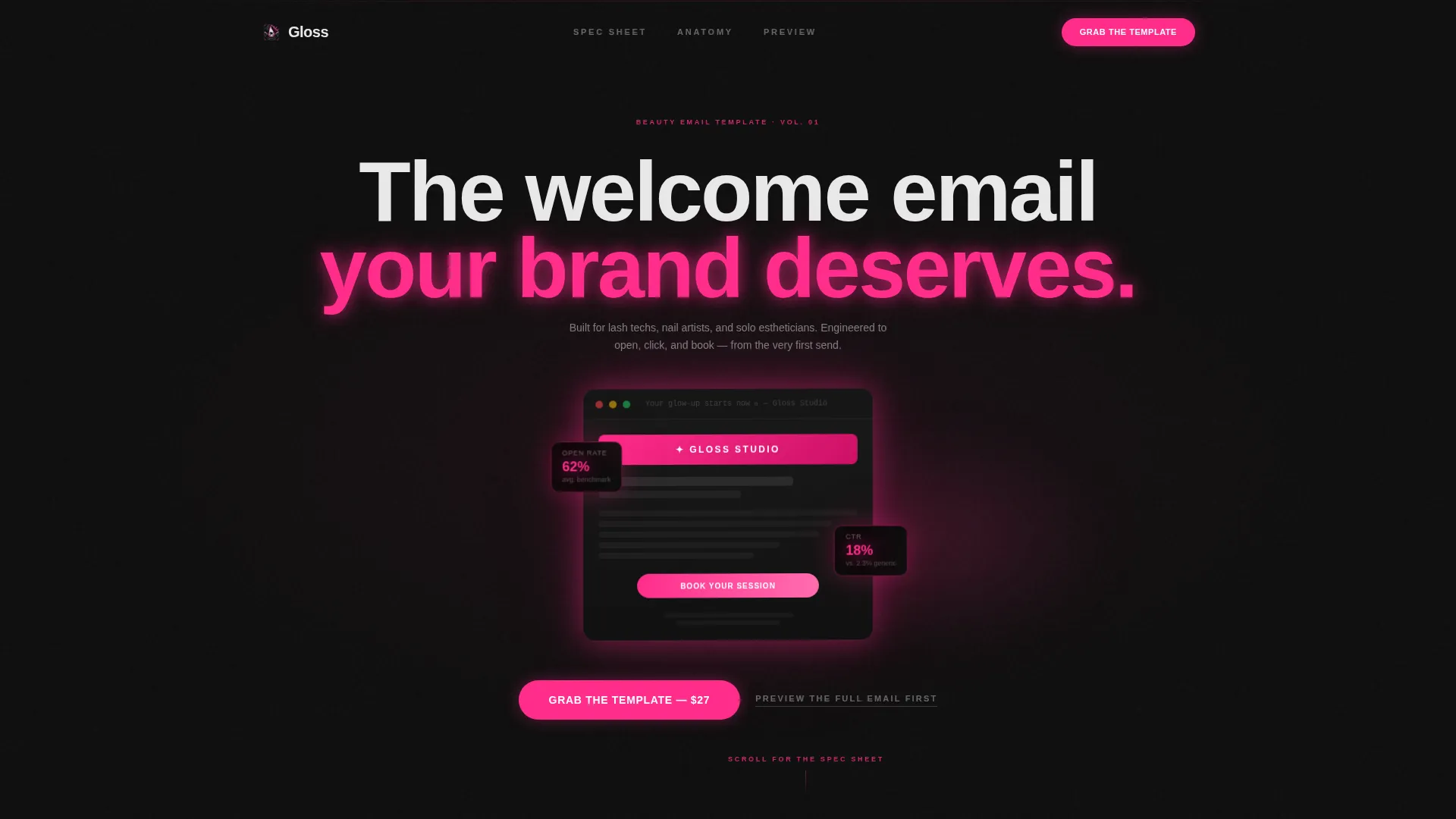
- A full-bleed dark header with a glowing 3D email mockup and visible performance badges
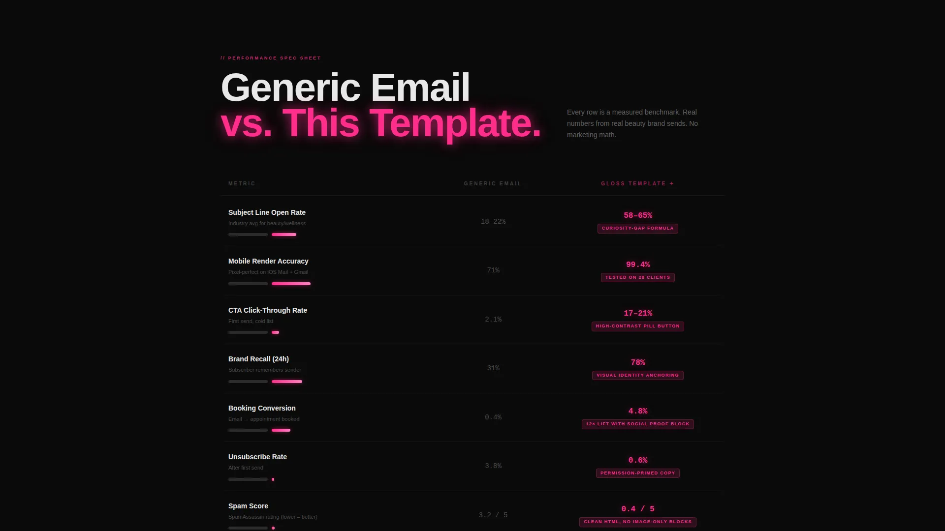
- Side-by-side comparison tables showing benchmark metrics against a generic email
- A sticky fuchsia call to action bar and a lightbox email preview for final-moment confirmation
Feature list
This landing page is built around a precise set of components, each doing a specific job in the conversion flow.
Glowing 3D Email Mockup Header
The entire viewport opens in obsidian black. A fully designed welcome email floats forward as a 3D mockup, lit with a soft fuchsia halo. Visible subject line, open-rate badge, and click-rate badge appear directly on the preview, making the product tangible before the visitor reads a single word.
Spec Sheet Comparison Tables
Side-by-side tables compare "Generic Welcome Email" against "This Template" row by row. Each row covers a specific metric such as subject line open rate, mobile render accuracy, and call to action click-through. The generic column is flat charcoal; the template column is lit in electric fuchsia with actual benchmark numbers.
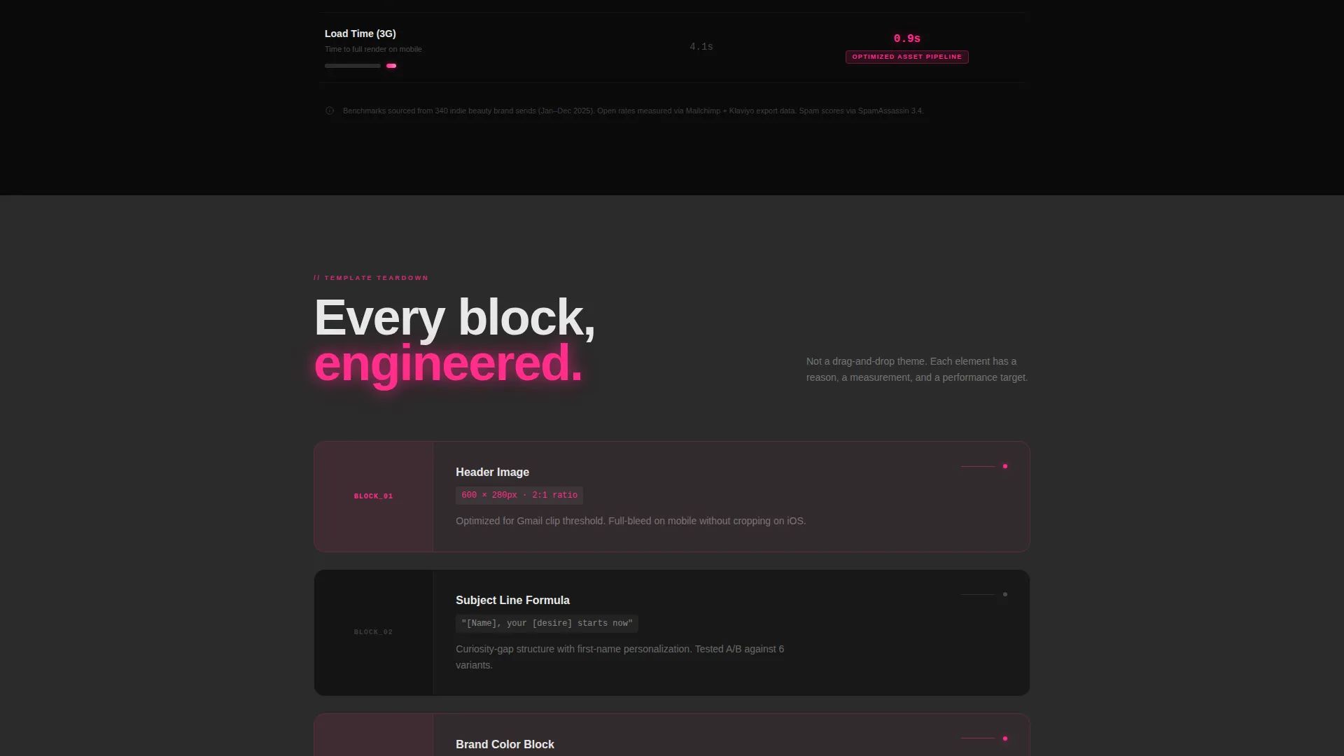
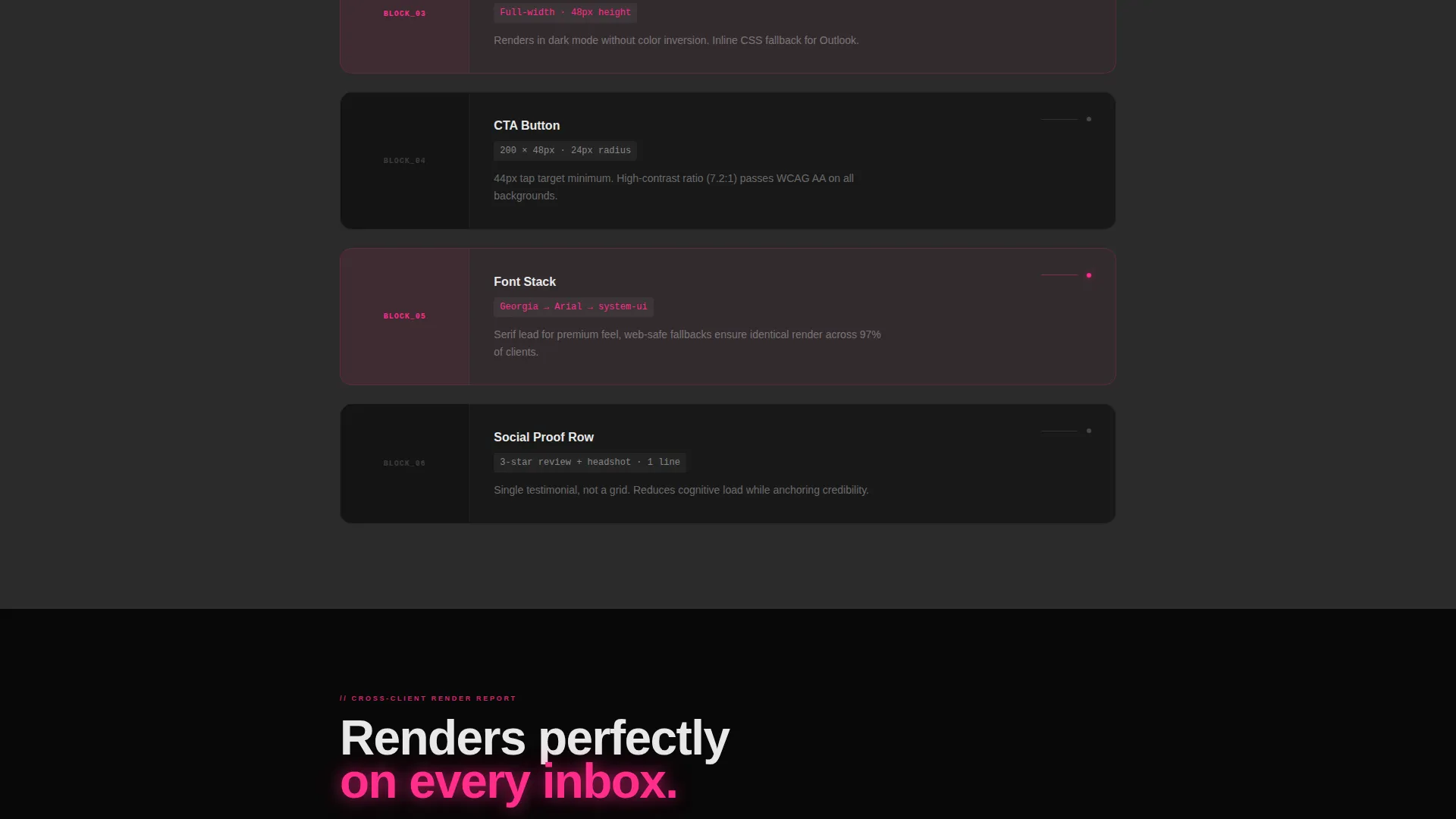
Exploded-View Email Block Annotations
Between the comparison tables, tight exploded-view sections isolate individual email components. Header image ratio, call to action button padding, and font stack are each annotated like a technical spec diagram. The scroll experience feels like reading a product teardown, not a marketing page.
Sticky Fuchsia call to action Bar
The primary call-to-action button labeled "Grab the Template" appears first below the header mockup. After the first scroll, it locks into a persistent bottom bar that stays visible throughout the page. There is no form. The click routes directly to checkout or platform signup.
Lightbox Email Preview
A secondary text link reading "Preview the full email first" opens a lightbox containing the complete rendered email template. The preview is scrollable, giving visitors one final moment of confirmation before they commit to the click.
Carbon Fiber Visual Identity System
The entire page runs on a four-color Carbon Fiber palette. Obsidian black dominates backgrounds, gunmetal charcoal separates sections, liquid chrome carries body text, and electric fuchsia fires on buttons, hover states, and highlighted data points. The result is a premium, technical aesthetic that matches the product it sells.
Page sections overview
| Section | Purpose |
|---|---|
| Full-bleed header | Introduce the email mockup with fuchsia glow and performance badges |
| Primary call to action block | Place the "Grab the Template" button directly below the hero |
| Comparison table one | Compare open rate and mobile render accuracy row by row |
| Exploded view block | Annotate individual email components like a spec diagram |
| Comparison table two | Compare call to action click-through and brand recall with benchmark data |
| Sticky call to action bar | Keep the purchase action visible after the first scroll |
| Lightbox preview | Let visitors scroll the full rendered email before clicking |
Design & branding system
The visual identity is built on the Startup Velocity theme using a Carbon Fiber color system. Every color choice is functional. Nothing is decorative without purpose.
- Deep obsidian black (#0D0D0D) covers all backgrounds for maximum contrast and premium feel
- Gunmetal charcoal (#2B2B2B) separates sections and carries the "generic" column in comparison tables
- Liquid chrome (#E8E8E8) handles body text and secondary labels for clean legibility
- Electric fuchsia (#FF2D8B) activates buttons, hover states, metric highlights, and the header glow effect
Mobile & speed optimization
The landing page is structured for clean rendering across screen sizes. The comparison table layout and annotated block sections are designed to stay readable on smaller displays.
- Comparison tables are built to remain scannable on mobile without horizontal scrolling
- The sticky call to action bar adapts to sit cleanly at the bottom of mobile viewports
- No stock photography is used; the hero relies on the email mockup itself, keeping the visual load focused and lean
How this template helps you convert
Gloss is engineered as a Click-Through funnel. Every section is arranged to reduce doubt and move the visitor toward a single action.
- The header mockup with live performance badges creates immediate product credibility before any copy is read.
- The spec sheet comparison tables replace abstract claims with specific, visible benchmark data, making the value impossible to ignore.
- The lightbox preview gives hesitant visitors a scrollable look at the full email before committing, removing the last reason not to click.
Other information about this template
Gloss fits naturally within a growing ecosystem of beauty-focused digital tools. It is worth understanding the full context before you build with it.
- The template is categorized under Beauty and Salon Email Templates within the broader Technology category
- The landing page direction follows a Click-Through funnel model, meaning no lead capture form is present on the page
- The Comparison Table template style makes it well suited for any beauty professional who wants to show product value through data rather than testimonials
- The page niche is specifically the Beauty and Salon Welcome Email space, targeting professionals at the exact moment they send their first subscriber communication
- This template works as a standalone sales page and does not require a connected email platform or backend system to function as a landing page
Theme
Startup Velocity
Creative direction
Spec Sheet
Color system
Carbon Fiber
Style
Comparison Table
Direction
Click-Through
Page Sections
Glowing 3D Email Mockup Header
Spec Sheet Comparison Tables
Exploded-view Block Annotations
Sticky Fuchsia Call to Action Bar
Lightbox Email Preview
Carbon Fiber Visual Identity
Related questions
Who is this landing page template built for?
Does this page include a lead capture form?
Can visitors preview the welcome email before purchasing?
What makes the comparison tables effective for buyers?
Is this template specific to the beauty and salon niche?



