Beauty & Salon Digital Presence Specialist Professional Website Template
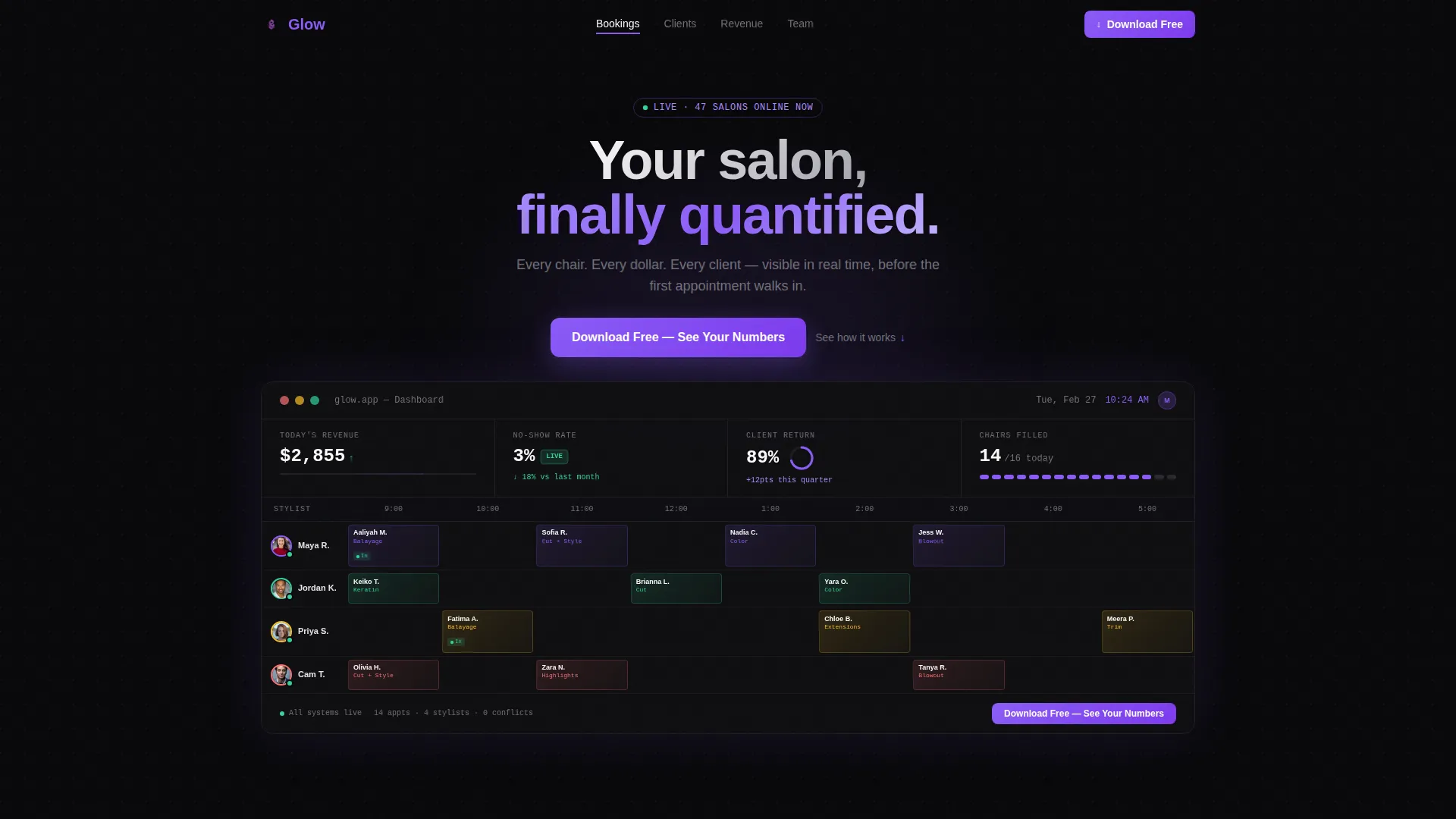
Glow is a Hub & Spoke landing page template built for salon management apps. It leads with a live-style dashboard header, stats-first spoke sections, and a persistent anchor nav. The Void & Violet color system and Dashboard Pro theme make your product feel premium before a visitor reads a single word.
by Rocket studio
Quick summary
Glow is a single-page, anchor-nav landing page template designed for beauty and salon management platforms. It opens with a pixel-perfect dashboard preview, walks visitors through Bookings, Clients, Revenue, and Team sections, and closes every spoke with a clear app download call to action. The result is a page that earns the tap before it asks for it.
Who this template is for
This template is built for teams who need a landing page that converts on first impression. It suits anyone launching or promoting a salon management app to a professional beauty audience.
- Independent salon owners who want a page that speaks directly to their daily scheduling pain
- Multi-location spa directors or software founders targeting a professional salon audience
- Freelance hairstylists or beauty tech marketers who need a polished, app-focused landing page fast
What problem this template solves
Running a salon means managing bookings, staff, and revenue at the same time. Most app landing pages bury the product behind stock photos and vague benefit headlines. Glow fixes that.
- Visitors land on a real-looking dashboard mockup instead of a generic hero illustration
- Each section leads with a specific metric, making the product's value clear before the scroll ends
- The app download path is designed to remove friction, with device-detect modals, app store badges, a QR code fallback, and a one-field SMS option
What you get with this template
Glow delivers a complete, structured landing page ready to customize for any salon management app. Every section is purposeful and connected through a persistent anchor navigation bar.
- A full-width dashboard header showing a live appointment grid, revenue ticker, no-show rate badge, and client return gauge
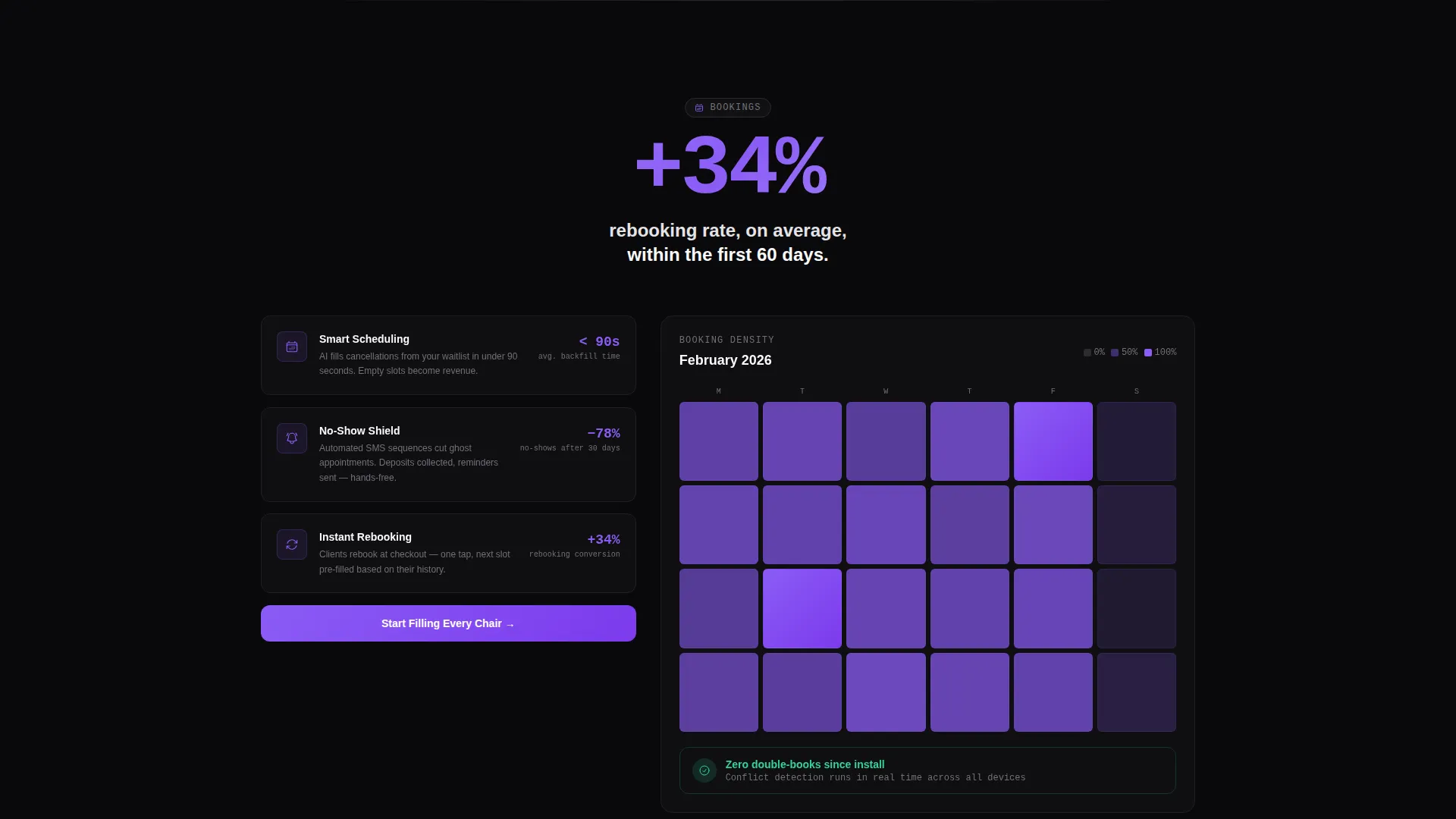
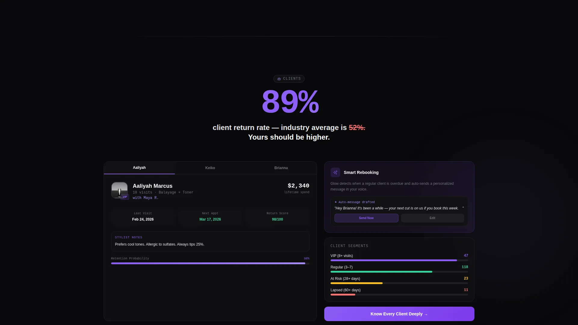
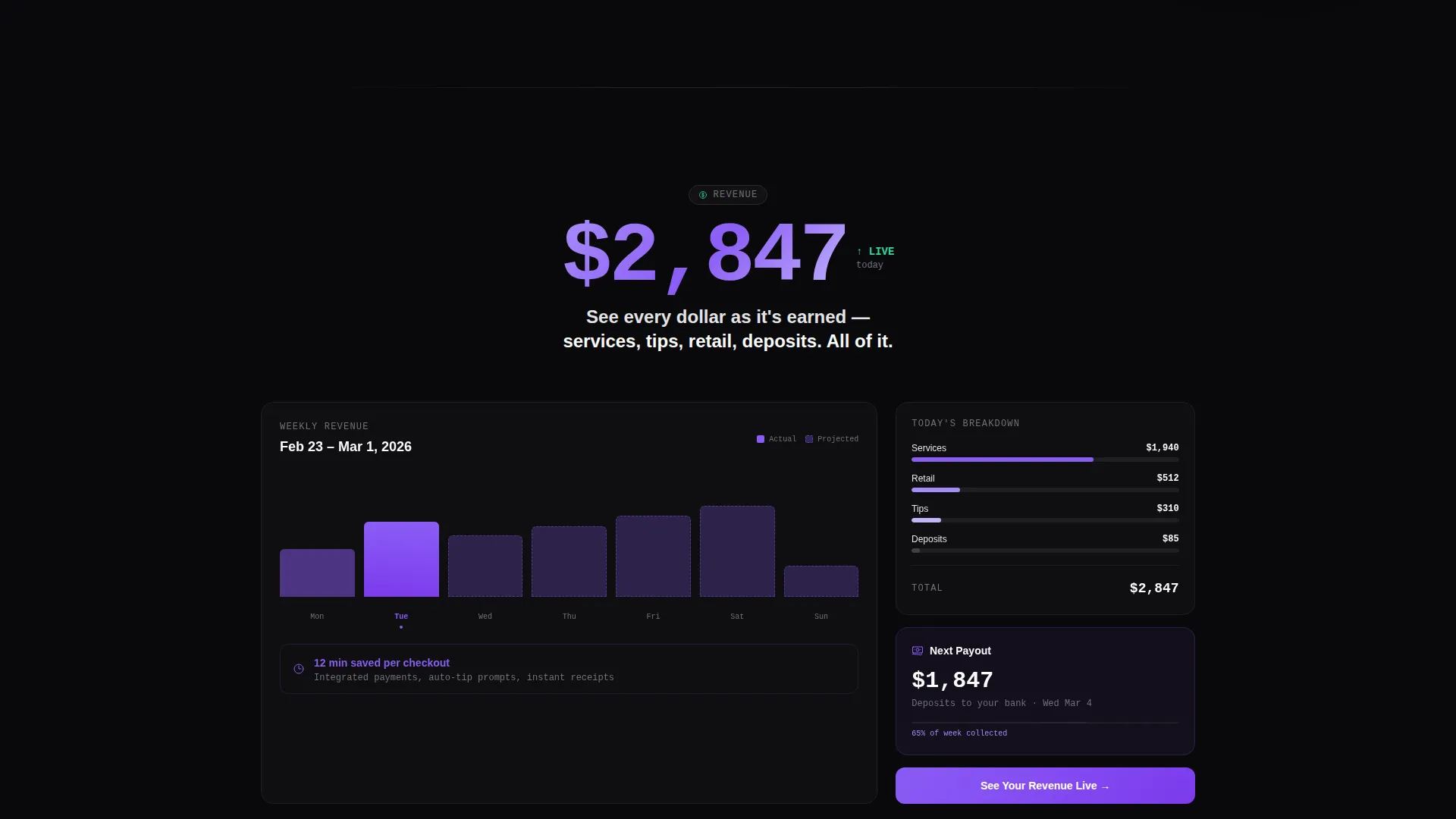
- Four spoke sections (Bookings, Clients, Revenue, Team) each opening with an oversized stat before revealing the feature behind it
- A repeated, friction-reduced call to action system including a device-detect modal, iOS and Android badges, a QR code, and a "Text Me the Link" field
Feature list
This template includes a focused set of layout and interaction components drawn directly from the design brief.
Living Dashboard Header
The header renders a full-width app command center mockup. It shows today's appointment grid with stylist avatars, a revenue ticker climbing past $2,847, a no-show rate badge at 3%, and a client return gauge at 89%. The data feels real enough to stop a scroll mid-swipe.
Persistent Anchor Navigation
A sticky top bar holds four violet-underlined labels: Bookings, Clients, Revenue, and Team. Visitors can jump directly to any spoke section without losing their place. The hub metric bar stays visible throughout the entire page scroll.
Stats-First Spoke Sections
Each of the four spoke sections opens with a single oversized metric. Examples include "+34% rebooking rate," "12 min saved per checkout," and "Zero double-books since install." The stat appears first, then the feature that produces it is revealed below.
Device-Detect Download Modal
Tapping the primary call-to-action triggers a modal that detects the visitor's device. iOS and Android app store badges appear alongside a QR code fallback for desktop visitors. This reduces the path to download to a single tap on mobile.
Low-Friction SMS Path
A secondary conversion option lets visitors enter one phone number to receive the app download link by text. This "Text Me the Link" field is designed for one-thumb use and sits alongside the primary download modal.
Void & Violet Design System
The page uses absolute void black (#09090B), electric violet (#8B5CF6), muted orchid (#A78BFA), and clinical white (#FAFAFA). The palette mimics a premium phone screen glowing in a dim salon, making every white data numeral read with surgical clarity against the dark background.
Page sections overview
| Section | Purpose |
|---|---|
| Dashboard Header | Anchors the page with a live-style app mockup and the primary call to action |
| Anchor Nav Bar | Pins to the top and lets visitors jump between spoke sections |
| Bookings Spoke | Leads with a rebooking stat, then surfaces the scheduling feature |
| Clients Spoke | Opens with a client return metric before showing client profile tools |
| Revenue Spoke | Highlights a revenue or checkout time stat before the finance feature |
| Team Spoke | Surfaces a utilization or staff metric before showing team management |
| call to action Repeat Block | Resurfaces the download prompt after each spoke section |
| Download Modal | Device-detect popup with app badges, QR code, and SMS fallback |
Design & branding system
The Void & Violet color system is built around contrast and legibility. Every color choice in this template serves a functional role on a dark-background layout.
- Absolute void black (#09090B) forms the page background, giving the dashboard mockup infinite depth
- Electric violet (#8B5CF6) drives all interactive elements including nav labels, call to action buttons, and stat highlights
- Clinical white (#FAFAFA) is reserved for card surfaces and data numerals, ensuring every metric floats forward clearly
Mobile & speed optimization
The template is designed with a mobile-first audience in mind. Salon owners and stylists check their numbers on a phone, and the page mirrors that habit.
- The device-detect modal delivers iOS or Android badges automatically, removing the need for manual platform selection
- The "Text Me the Link" SMS option reduces the entire conversion path to a single phone number field
- The hub-and-spoke layout keeps content modular, so each section loads as a clean, self-contained block
How this template helps you convert
Glow is structured to build confidence before making any request. The conversion logic follows a deliberate sequence designed to earn the download.
- The dashboard header shows real-looking product data instantly, so the visitor understands the app's value within seconds of landing
- Each spoke section pairs a specific, credible metric with the feature that produces it, turning social proof into a product demo
- The call to action resurfaces after every spoke with a low-friction path, meeting the visitor exactly when their confidence peaks
Other information about this template
Glow is a strong fit for beauty tech founders, salon software marketers, and product teams presenting a salon management app to a professional audience. A few additional notes help complete the picture.
- The template style is Hub & Spoke with anchor navigation, making it easy to add or reorder spoke sections during customization
- The Dashboard Pro theme and Stats-First Impact creative direction are designed to work together across both desktop and mobile viewports
- The page type is a single landing page, not a multi-page website, which keeps the visitor focused on one action: downloading the app
- The header concept (Dashboard Preview) replaces traditional hero imagery entirely, positioning the product interface as the primary visual
Theme
Dashboard Pro
Creative direction
Stats-First Impact
Color system
Void & Violet
Style
Hub & Spoke (Anchor Nav)
Direction
App Download
Page Sections
Living Dashboard Header Mockup
Persistent Anchor Navigation Bar
Stats-first Spoke Sections
Device-detect Download Modal
One-field SMS Conversion Path
Void & Violet Visual Identity
Related questions
Who is the Glow template designed for?
Can I customize the dashboard mockup in the header?
Does this template include multiple call to action placements?
What makes the Stats-First layout effective for an app landing page?
Is this a single landing page or a full website?



