Beauty & Salon Digital Presence Cost Calculator Website Template
The Glow Priority Beauty Membership landing page template is a high-converting, single-page hub-and-spoke layout built for beauty and salon membership brands. It features an animated stats dashboard, a five-spoke anchor navigation system, horizontally scrollable tier comparison matrices, an interactive savings calculator, and a sticky call-to-action bar, all styled in a Midnight Blue and rose-gold palette.
by Rocket studio
Quick summary
Glow is a beauty membership landing page template designed for salons, spas, and beauty subscription brands. It opens with a live-data hero dashboard, guides visitors through five anchor-linked sections, and closes with a personalized savings calculator that updates the primary call-to-action in real time. The result is a beauty landing page that sells the membership before a visitor finishes scrolling.
Who this template is for
This template fits any beauty brand or platform that sells priority access, tiered membership, or subscription-based beauty services. It is built for founders and marketers who need a landing page that does the convincing through data and comparison, not just pretty imagery.
- Salon groups and multi-location spas launching a paid membership program across partner locations
- Skincare subscription brands, nail studios, and beauty professionals who want structured tier pricing on a single beauty landing page
- Bridal coordinators, makeup artists, and high-frequency beauty customers who represent the target audience this page is designed to convert
What problem this template solves
Booking-frustrated beauty customers need more than a promise. They need proof. A generic beauty landing page with a hero image and a single sign-up form cannot carry the weight of a tiered membership pitch. Visitors leave before they understand the value, and conversion rates suffer.
This template solves the confidence gap. It replaces vague benefit lists with live metrics, comparison matrices, and a savings calculator that makes the value proposition feel personal and immediate.
- Hair salons and spas lose potential members to competitors simply because their landing page cannot communicate tier differences clearly
- Beauty brands with multiple service levels need a landing page structure that guides visitors from curiosity to purchase intent without friction
- Skincare-focused membership sites need a beauty landing that surfaces product perks, appointment booking priority, and pricing side by side
What you get with this template
You get a fully structured, single-page beauty landing page built around five anchor-linked spoke sections. Every section serves a specific conversion role, from proving demand at the top to personalizing savings at the bottom.
- Animated stats dashboard hero, five-spoke anchor navigation, three horizontally scrollable membership tier matrices, a bento-grid product perks section, and alternating booking priority splits
- An interactive savings calculator that updates a personalized call-to-action with estimated annual savings, plus a sticky bottom bar that shifts from translucent to solid as visitors scroll
- A three-field sign-up form covering email capture, preferred salon neighborhood, and most-booked service, keeping form fields minimal to reduce drop-off
Feature list
This template includes six core features drawn directly from its hub-and-spoke architecture and Dynamic Motion design system.
Animated Stats Dashboard Hero
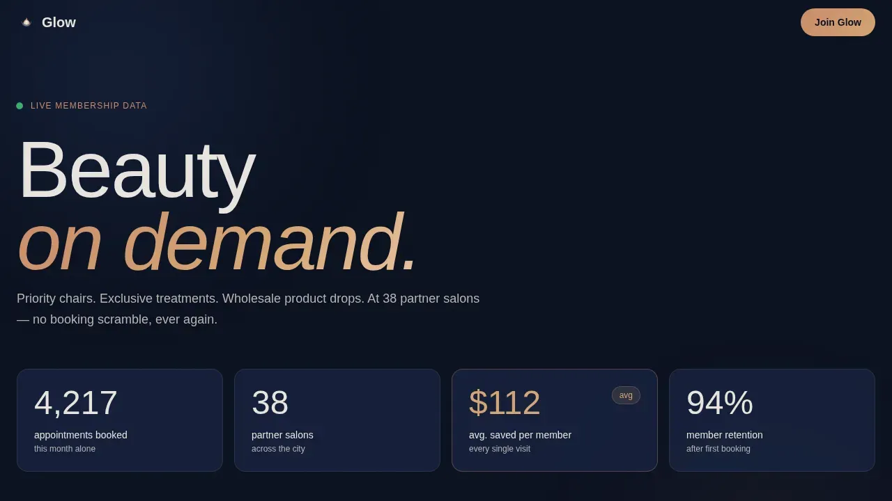
The header replaces a traditional hero image with a living counter wall. Four glassmorphic metric cards display real membership data, bookings, partner salon count, average savings, and a pulsing next-available-chair ticker. Numbers animate on load, rolling upward like departure boards. Social proof is built into the very first thing a visitor sees, establishing demand before a single benefit is read.
Five-Spoke Anchor Navigation
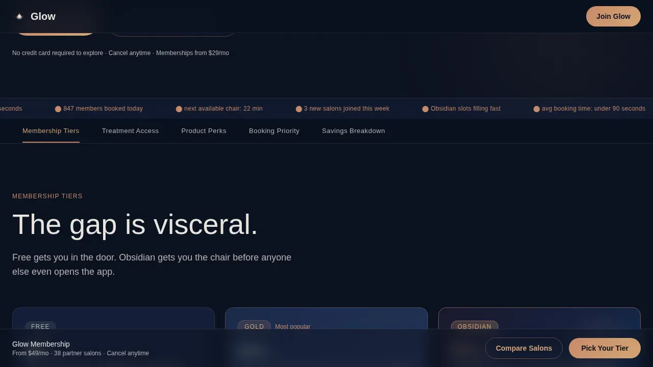
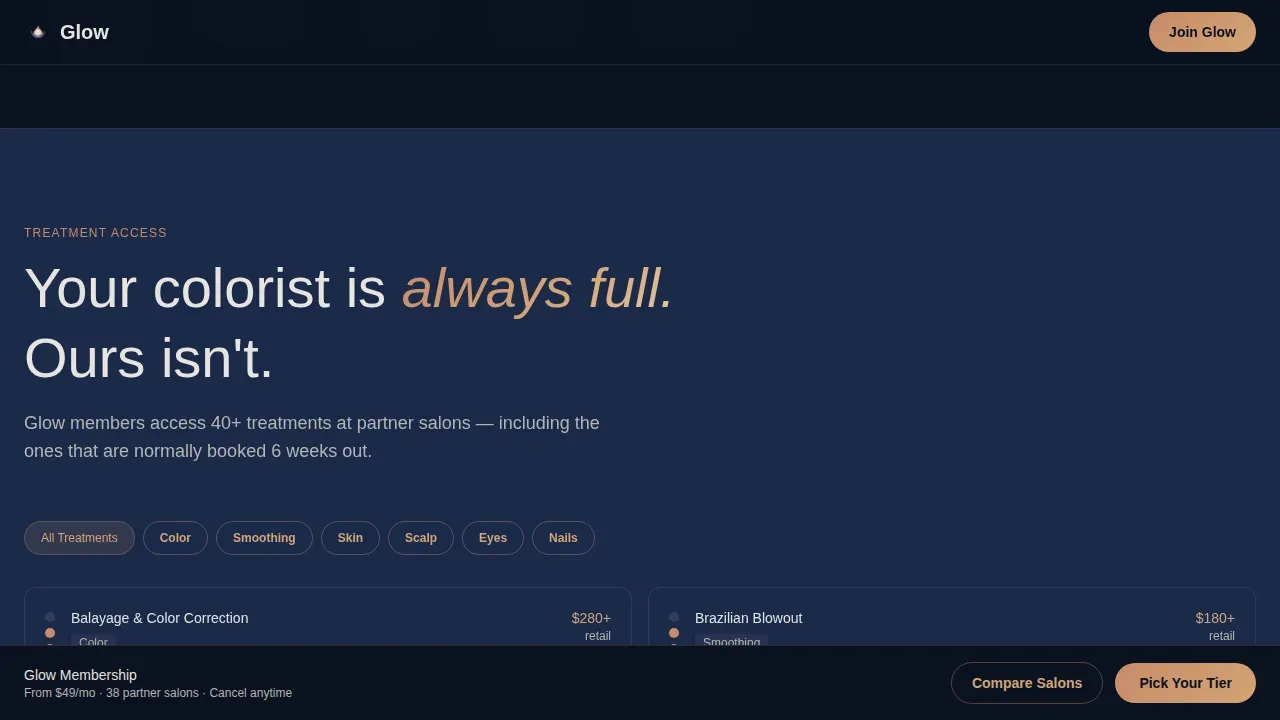
A sticky anchor navigation bar pins to the top of the beauty landing page after the hero. Five labeled spokes link directly to: Membership Tiers, Treatment Access, Product Perks, Booking Priority, and Savings Breakdown. This gives visitors clarity and control over where they jump, reducing the friction that kills engagement on long-form landing pages.
Horizontally Scrollable Tier Comparison Matrix
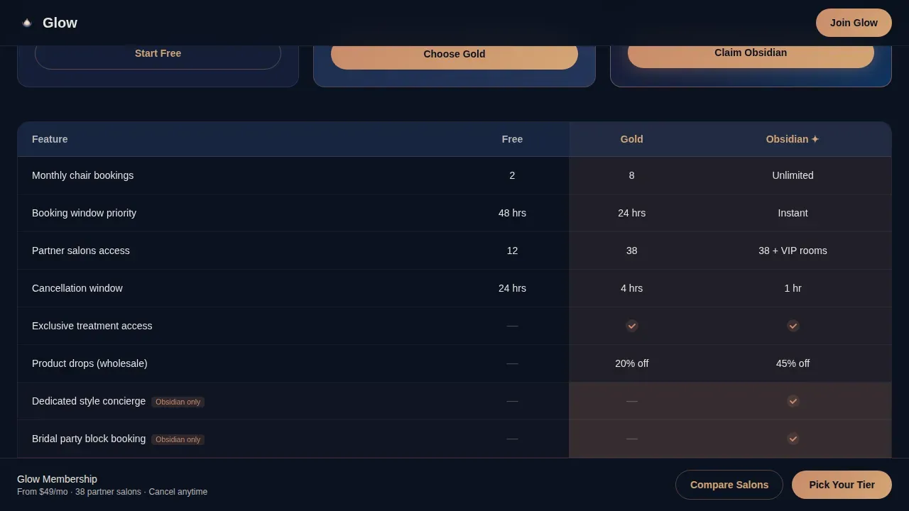
Each spoke section opens with a comparison table covering Free, Gold, and Obsidian tiers. Cells light up in rose-gold on hover, and exclusive Obsidian features pulse gently to signal scarcity. The matrix format lets visitors scan service menus, treatment access, and pricing differences at a glance, making tier escalation feel logical, not pushy.
Interactive Savings Calculator
A floating savings calculator follows the scroll and updates dynamically as visitors toggle the services they actually use. By the final section, it displays a projected annual savings figure in rose-gold numerals. The primary call-to-action then updates to reflect that number, turning a generic "join now" into a personalized "Start Saving $1,340/yr" prompt that raises conversion rates.
Product Perks Bento Grid
The Product Perks spoke renders as a bento-style grid showcasing wholesale beauty products available to members. This section gives skincare-focused visitors a visual inventory of the product line benefits they gain, making the membership feel tangible beyond just appointment booking priority. It supports product launches and communicates exclusive access to cosmetic products at member pricing.
Sticky Call-to-Action Bar with Personalized Output
A sticky bottom bar carries the primary "Pick Your Tier" call-to-action throughout the scroll. After the first matrix, it transitions from translucent to solid midnight. Once the calculator has run, the bar updates to display the personalized savings figure, shifting purchase intent from passive browsing to active commitment. A secondary path opens a filterable map overlay showing all 38 partner salons.
Page sections overview
| Section | Purpose |
|---|---|
| Stats Dashboard Hero | Prove live demand with animated metrics |
| Membership Tiers Matrix | Compare Free, Gold, Obsidian pricing |
| Treatment Access Matrix | Show service access by tier |
| Product Perks Grid | Display wholesale beauty product benefits |
| Booking Priority Splits | Highlight instant booking advantages |
| Savings Breakdown Calculator | Personalize projected annual savings |
| Sticky call to action Bar | Drive tier selection throughout scroll |
| Filterable Salon Map | Explore all 38 partner salon locations |
| Three-Field Sign-Up Form | Capture email and service preference |
| Single-Row Footer | Close with brand links and legal text |
Design & branding system
The Midnight Blue color system gives this beauty landing page its after-hours salon atmosphere. Deep indigo-black (#0B1120) forms the primary background. Midnight sapphire (#1B2A4A) surfaces card backgrounds and section dividers. Soft pearl (#E8E4DF) handles body text with breathing room and white space. Liquid rose-gold (#C98B6B) activates every interactive element, toggle, hover state, and call-to-action.
- Color psychology is central to this palette: the deep blue signals luxury and exclusivity, while rose-gold communicates warmth and high-end beauty brand positioning, color choice signals brand tone instantly
- Typography uses Plus Jakarta Sans for headings and DM Sans for body text, pairing high-contrast legibility with the premium feel expected in the beauty space
- Motion is constant but controlled: cards slide in from alternating sides, counter animations roll on load, hover states light up in rose-gold, and the sticky bar transitions smoothly as visitors scroll
Mobile & speed optimization
This template is desktop-first in its comparison matrix layout, with responsive mobile fallbacks built into every section. Long comparison tables reflow for smaller screens. Tap-friendly buttons are sized for phones. Mobile optimization ensures that beauty customers browsing on phones still reach the savings calculator and the sign-up form without friction.
- Fast loading is supported by a Server Components approach for static sections, while the calculator and animations use Client Components, keeping speed high where it matters most for engagement
- Image optimization practices such as compress images techniques and properly sized assets keep the page lean despite its motion-heavy design
- The three-field form is designed for one-tap completion on mobile devices, reducing drop-off at the final conversion step
How this template helps you convert
A great landing page template guides visitor attention, surfaces value at every scroll point, and drives action before doubt can set in. This template is engineered for that exact sequence. Social proof appears before benefits. Benefits appear before pricing. Pricing appears before the form. Every section builds the case the next section closes.
- The animated stats dashboard delivers social proof at zero scroll, real booking volume, live partner salon count, and average savings figures build immediate credibility and raise purchase intent before a visitor reads a single bullet point
- The comparison matrices and floating savings calculator work together to make the value proposition feel personal: as visitors toggle their services, the calculator updates their projected savings, and the sticky call-to-action shifts to reflect their specific number, turning passive browsing into active decision-making that lifts conversion rates
Other information about this template
This template belongs to the Hub and Spoke landing page category, which means the anchor navigation and spoke sections can support a wide range of beauty business models beyond tiered membership. The structure adapts well to beauty professionals launching new service menus, nail studios adding spa services, or any beauty brand that needs to compare offerings side by side on a single web page.
- For beauty professionals running content marketing alongside a membership offer, the footer and spoke structure can support links to a beauty blog or editorial landing without cluttering the primary conversion path
- The filterable salon map overlay supports lead generation from visitors who want to explore partner salons before committing, this secondary path complements the primary email signups flow without competing with it
- Cosmetic makeup studios, skincare landing page operators, and multi-location hair salons benefit from the product filtering capability built into the map overlay, which lets visitors sort partner salons by neighborhood and service type
- The template supports sell products messaging within the Product Perks bento grid, giving beauty brands a structured way to promote their product line and upcoming product launches to members
- Beauty website design on this template combines color psychology, conversion-focused layouts, and a strong visual hierarchy to represent the beauty brand accurately, over 90% of product assessment is driven by color alone, and the rose-gold interactive layer is calibrated for that
- Influencer collaborations and testimonials can be inserted into the Booking Priority split sections or the Savings Breakdown section to add social proof from recognizable voices in the beauty world
- The Glow priority beauty membership landing page template is built for the USA market with USD pricing, English copy, and a localization-ready structure for any city-based beauty membership expanding its web traffic reach
Theme
Dynamic Motion
Creative direction
Feature Matrix
Color system
Midnight Blue
Style
Hub & Spoke (Anchor Nav)
Direction
Comparison/Versus
Page Sections
Animated Stats Dashboard Hero
Five-spoke Anchor Navigation
Horizontally Scrollable Tier Matrix
Interactive Savings Calculator
Product Perks Bento Grid
Sticky Personalized Call-to-action Bar
Related questions
Can I customize the membership tiers and pricing in this template?
Does this template work for a single salon or only for multi-location networks?
How does the savings calculator personalize the call-to-action?
Is this template suitable for skincare brands as well as hair salons?
What information does the sign-up form collect?



