Specialist Design System & Component Library Professional Website Template
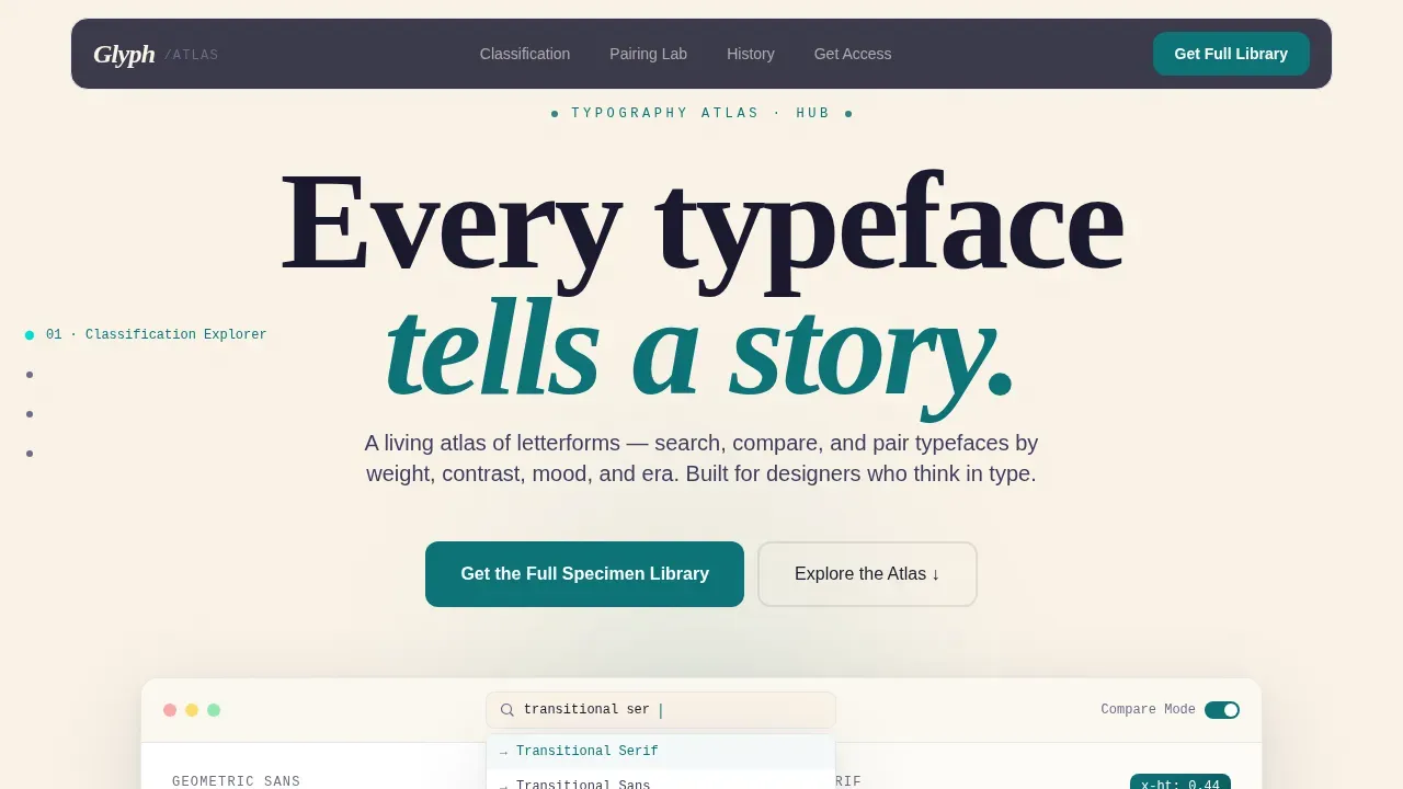
Glyph is a hub and spoke landing page template built for typography tools and font discovery platforms. It features a split-panel dashboard preview, interactive classification explorer, pairing lab, and a history timeline. The layout guides designers from curiosity to conversion, letting them experience font pairings hands-on before a single form appears.
by Rocket studio
Quick summary
Glyph is a single-page, anchor-navigated landing page template designed for interactive typography tools. It puts typeface exploration, pairing, and classification at the center of the experience. Visitors scroll through live specimen comparisons, draggable sliders, and a history timeline before reaching a lead-generation hub that earns every click.
Who this template is for
This template was built for teams and creators who take typography seriously. It fits products and platforms where the font itself is the story.
- Junior designers who feel overwhelmed choosing the right typeface from hundreds of options
- Creative directors and brand strategists who need typographic rationale they can defend in a boardroom
- Founders and product teams launching typography tools, font libraries, or design reference platforms
What problem this template solves
Finding the perfect font pair among thousands of existing options can be daunting for designers. Using overly similar fonts can create a monotonous or disorienting experience in design, and pairing two busy fonts can visually exhaust viewers. Most landing pages for type tools describe features rather than demonstrate them. Visitors leave before they feel the value.
- Designers cannot judge font pairings from a screenshot alone; they need to see letters in real layout contexts
- A static marketing page fails to show how spacing, weight, and contrast interact across body text and headings
- Lead-generation forms placed too early collect nothing because visitors have not yet experienced what the tool does
What you get with this template
You get a fully structured, interactive landing page organized as a hub with five anchor-linked spokes. Every section is designed to create forward momentum. Font pairing tools help create visually appealing and harmonious web designs that clearly communicate a website's message, and this template puts that principle into practice from the first screen.
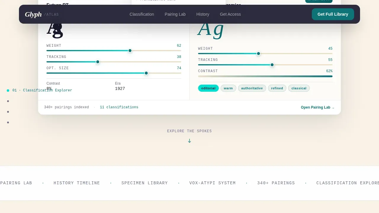
- A dashboard hero with a split-panel typeface comparison, live sliders for weight and tracking, and search autocomplete mid-use
- Four interactive spoke sections covering classification, pairing, history, and lead generation
- A dual conversion path: a full specimen library form and a free PDF pairing cheat sheet for lower-friction sign-ups
Feature list
This template delivers six core capabilities directly grounded in the project brief. Each one is built to make the visitor feel like they are already inside the tool.
Split-Panel Dashboard Hero
The header presents a live-looking dashboard showing two typefaces side by side. A geometric sans serif is placed against a humanist serif, with visible sliders for weight, tracking, and optical size. Real metrics appear on screen including x-height ratios and contrast percentages. A search field is half-typed with autocomplete suggestions dropping below, making the interface feel active rather than staged.
Classification Explorer Spoke
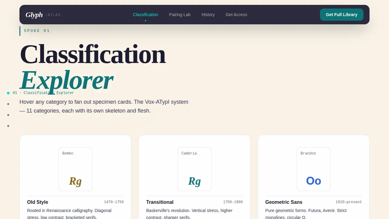
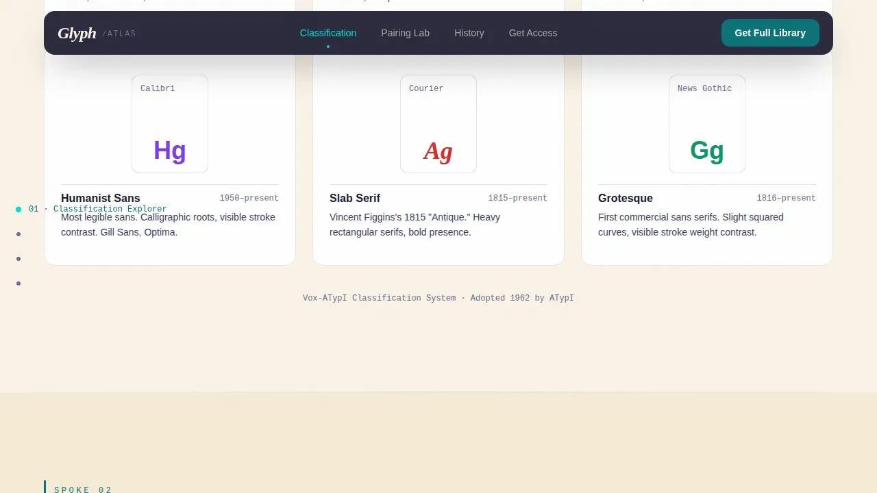
This spoke organizes typefaces into hover-responsive cards. When a visitor moves the cursor over a category such as Slab Serif or Transitional, specimen cards fan outward to display letters, styles, and descriptive mood tags. The section demonstrates how each font family sits within a broader classification system, helping designers understand the structural logic behind the type choices they make.
Pairing Lab Spoke
The Pairing Lab shows font pairings in real layout contexts rather than abstract swatches. A magazine spread, a mobile app screen, and a wayfinding sign each display the same golden-ratio hierarchy applied differently. This gives designers a concrete example of how display fonts and body text interact when spacing, line height, and scale are applied correctly. Good font pairs harmonize to produce a unified experience, and this section demonstrates exactly that.
History Timeline Spoke
A horizontally scrollable timeline runs from Jenson in 1470 to variable fonts in 2016. Visitors can scrub through type history to explore how letterforms evolved across eras. The section shows mood, contrast, and classification at each stop, giving designers and brand strategists the historical grounding to justify a new typeface selection with confidence.
Dual Lead Generation Hub
The conversion section offers two paths. The primary path asks for email, role, and one optional question: what are you typesetting? The secondary path offers a free downloadable PDF pairing cheat sheet in exchange for email alone. By the time either form appears, the visitor has already used three interactive tools. The ask feels earned rather than forced.
Anchor Navigation System
A persistent anchor menu links every spoke back to the hub. The navigation keeps visitors oriented across a long, dense page without requiring a full scroll back to the top. Each anchor label corresponds to a spoke, creating a clear mental map of the tool's scope before the visitor has committed to anything.
Page sections overview
| Section | Purpose |
|---|---|
| Hero Hub Dashboard | Introduce the tool via a live-looking split-panel typeface comparison with sliders and autocomplete |
| Classification Explorer | Let visitors hover to fan out specimen cards by typeface category |
| Pairing Lab | Show font pairings across real layout contexts using golden-ratio hierarchy |
| History Timeline | Scrub from 1470 to variable fonts to explore type evolution by era |
| Lead Generation Hub | Capture emails via a dual-path form with role selector and free PDF offer |
| Footer | Display horizontal flow credits, links, and secondary navigation |
Design & branding system
The visual identity follows a Directory and Discovery theme that feels like a modern design textbook printed on uncoated paper. The palette is intellectual but alive, and every color choice has a clear editorial function.
- Deep teal at hex code 0D7377 anchors the navigation and section headers; bright catalyst cyan at hex code 00E0D0 activates on hover states and interactive highlights; near-black ink at hex code 1A1A2E handles body text and specimen display text
- Warm parchment at hex code FAF3E8 provides the background field, giving every specimen and icon visual breathing room
- DM Sans handles interface text and body copy; Fraunces provides editorial serif accents at display scale, reinforcing the print-shop character of the design
Mobile & speed optimization
The template is built desktop-first to support its complex interactive panels, with deliberate mobile fallbacks for each spoke section. Body text is set to scale using relative units so that line height and spacing remain readable across screen sizes.
- Interactive panels such as the split-panel comparison and the timeline scrub degrade gracefully on smaller screens into static specimen views
- Anchor navigation collapses into a compact menu on mobile, keeping the site navigable without clutter
- Server components handle static sections while client components manage interactive tools, distributing the rendering load intelligently
How this template helps you convert
A high-converting typography landing page should follow a natural, scannable flow. This template earns the conversion by letting visitors play first and commit second.
- Visitors experience three interactive tools before any form appears, making the value of the platform tangible before the ask
- The dual conversion path reduces friction by offering a low-commitment PDF download alongside the fuller sign-up form, giving hesitant visitors a reason to share their email
- The primary call to action, "Get the Full Specimen Library," repeats at the close of each spoke, so visitors encounter it at the moment of highest engagement rather than only at the top or bottom of the page
Other information about this template
This section covers additional context that helps designers and developers understand how the template handles typographic detail and tool-adjacent functionality.
- Glyphs are any special characters that are an addition to a font file; each font file will vary in the glyphs it contains, with some having just a few and others having many
- The template's specimen displays draw on the principle that the headline font should be significantly larger and bolder than the body font to clearly indicate structure; display fonts appear at bold weight in headings while body text remains readable at a comfortable scale with appropriate line height
- Kerning is the adjustment of space between two letters, known as a glyph pair; adjusting kerning can significantly impact the overall design and user experience of text in web applications and sites; proper kerning enhances visual appeal and readability, and this template's specimen cards reflect correct kerning as a default state
- The Glyphs Panel in tools like Silhouette Studio allows users to access special characters and glyphs associated with the selected font; similarly, the Glyphs palette in InDesign displays every character in a font set and allows users to double-click on alternate settings to replace characters in their text; this template references those workflows as part of its educational positioning
- Glyph Discover leverages AI to find typefaces that work well together based on structural similarities; font pairing tools can be curated by humans, artificial intelligence, or both to help find ideal font combinations; choosing fonts that evoke similar associations helps create a cohesive visual experience
- Paired fonts should share a common mood or similar x-heights for compatibility; intentional contrast, such as pairing a geometric sans serif with a traditional serif, produces stronger results than fonts that are subtly different but clash
- The template supports sentence case labels and uppercase headings as separate typographic registers, giving designers clear examples of how case affects tone and formality across a logo, heading, and body text hierarchy
- Small caps, italic variants, lowercase numerals, monospace code blocks, script accents, and punctuation-sensitive spacing are all represented across the specimen and classification sections, giving visitors a complete picture of what each typeface can do
- The glyph discover pair and explore typefaces landing page template is available on the platform and can be customized to fit a range of typography-adjacent products and services
Theme
Directory & Discovery
Creative direction
Interactive Explorer
Color system
Teal Catalyst
Style
Hub & Spoke (Anchor Nav)
Direction
Lead Generation
Page Sections
Split-panel Typeface Comparison Hero
Hover-fan Classification Explorer
Pairing Lab with Real Layout Contexts
Scrubable Type History Timeline
Dual-path Lead Generation Hub
Persistent Anchor Navigation
Related questions
Can I use this template without being a typography expert?
How does the dual conversion path work?
Does the Pairing Lab show font pairings in real contexts?
What typeface categories does the Classification Explorer cover?
Can I customize the colors and fonts to match my brand?



